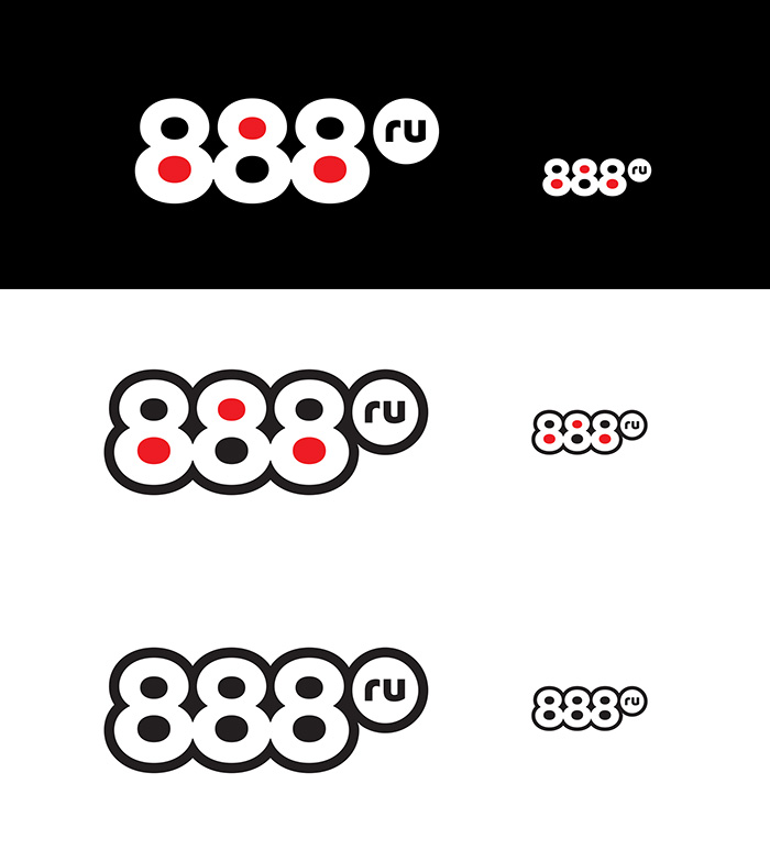
Receiving the task: to develop a logo and a corporate identity for a betting company that offers legal gambling entertainment (lotteries, bets on sporting events and outcomes of state lotteries, etc.) on its own website and in a network of betting shops. The image of the company should be similar both online and offline. The purpose of the logo is to reflect the wide range of the company’s activities.
We start by exploring the current situation on the bookmaking market in Russia and in the world as well as looking into visual identification of various gambling establishments.
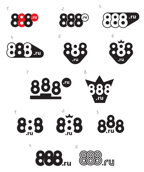
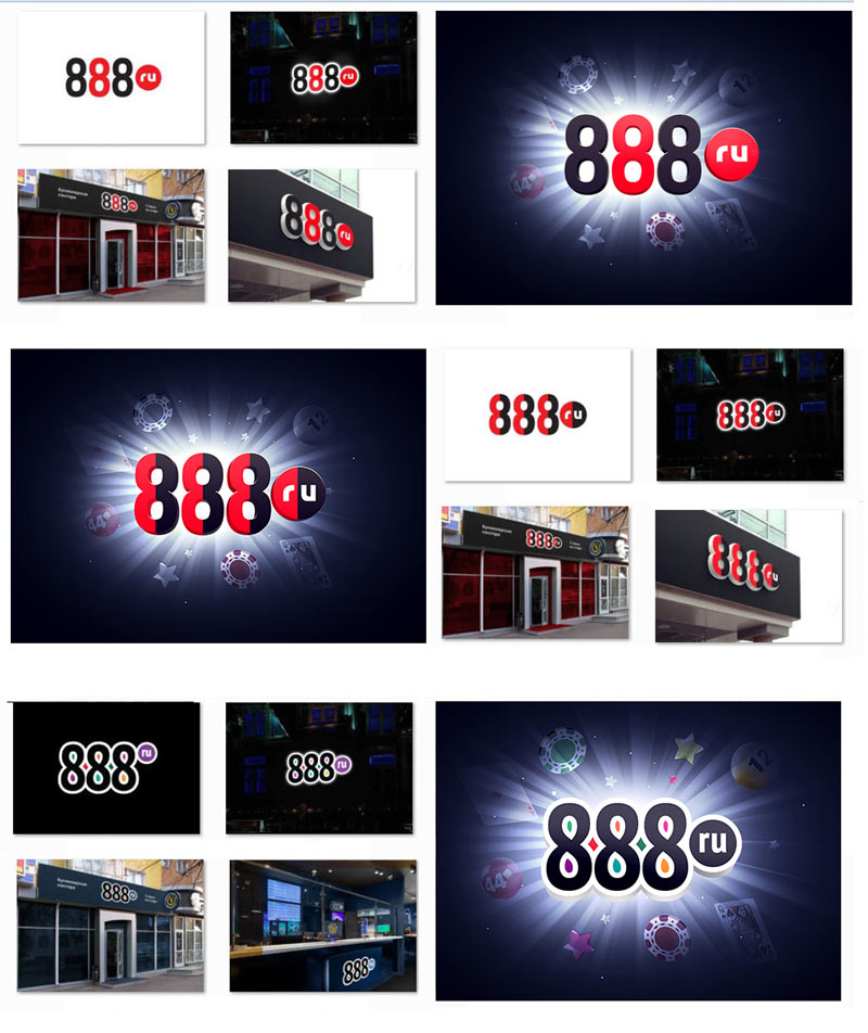
Triple eights make a very geometric and clear image, we want to present it in an interesting way. Making the first approach.

The art director chooses four designs. Slightly improving them and preparing a presentation.
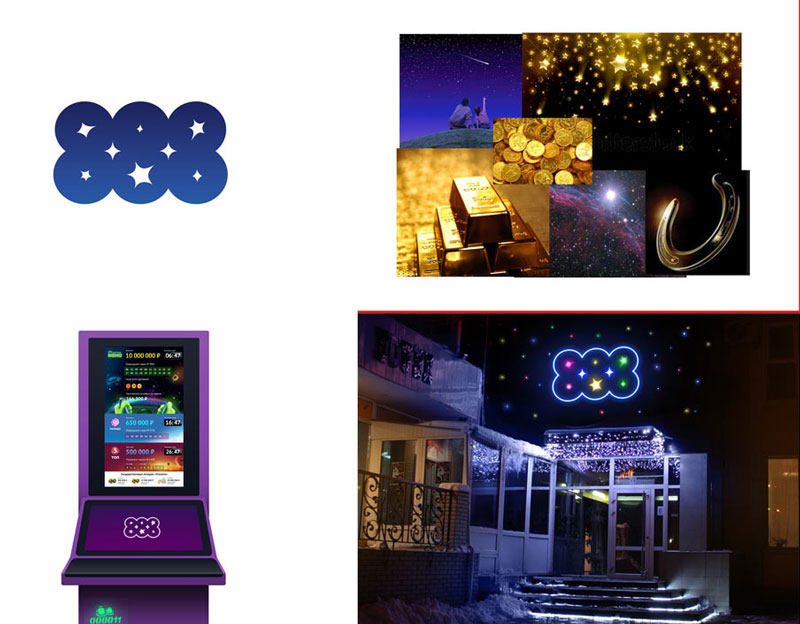
Starry eights.
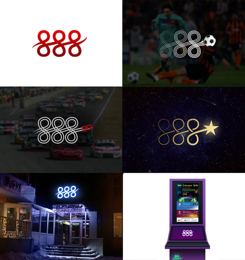
Eights in a line.
Contrasting eights.
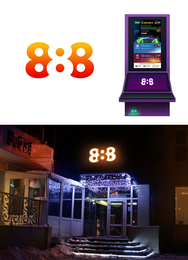
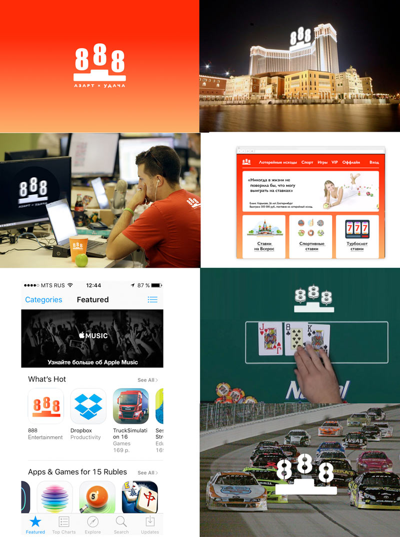
Eights on a pedestal.
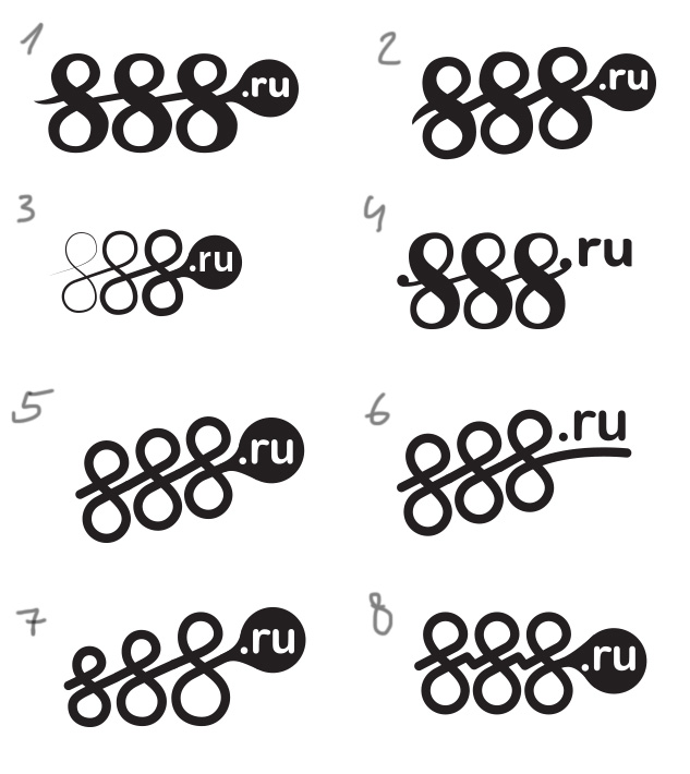
The client likes the eights in a single line but asks to make the digits more readable and add the .ru to the logo.
Trying to improve and presenting draft sketches to the client.
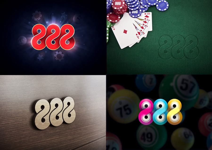
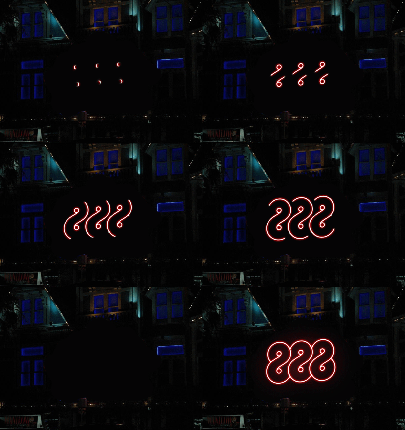
Suddenly another interesting geometric design gets created. The art director approves, showing to the client.
The client doesn’t like it. Going back to the contrasting eights and eights on a pedestal. All with the .ru of course.
Showing to the art director.
The art director chooses a couple of versions and asks to sketch ideas in real-world constraints rather than on white background.
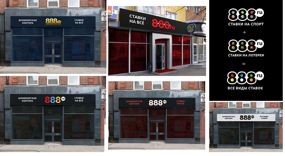
Meanwhile, the work continues on the State Lottery Outcome Betting logo which should also take place in the company’s corporate identity.
Designer: Something like that. The State lottery betting logo will be there as a window sticker or a separate light box.
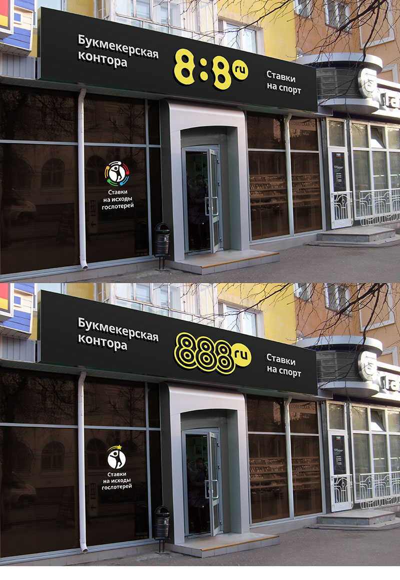
Art director: I think there will be many more variants here, from printing on main plastic panel to LEDs: light boxes won’t always work and the window sticker is barely visible. The sticker can be round, by the way. 888 looks like 8:8. What if we introduce a new color for the central eight and the inner circles of the outermost digits?
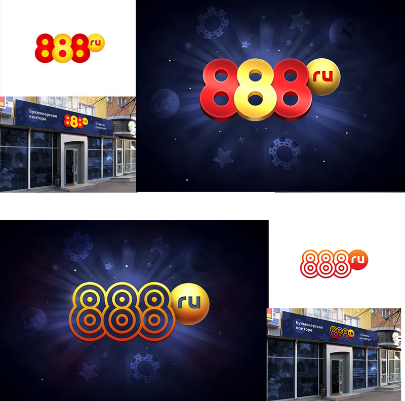
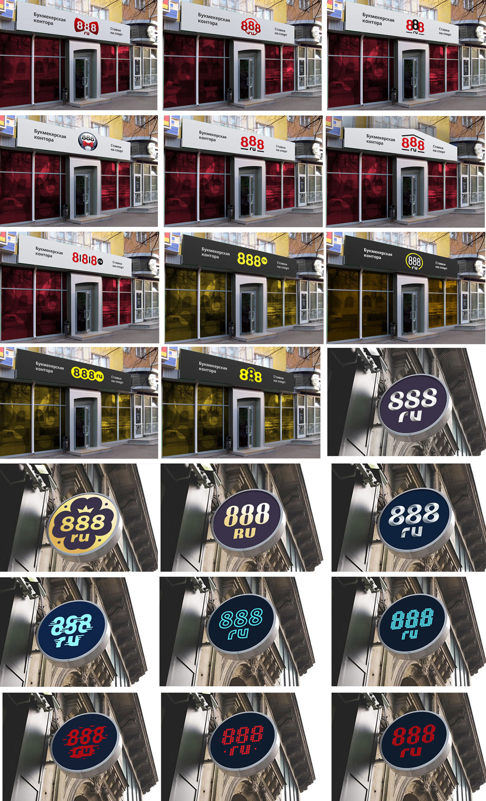
Elaborating the designs and assembling another presentation.
The round eights and the circle eights.
Meanwhile, another designer is finalizing the eights on a pedestal.
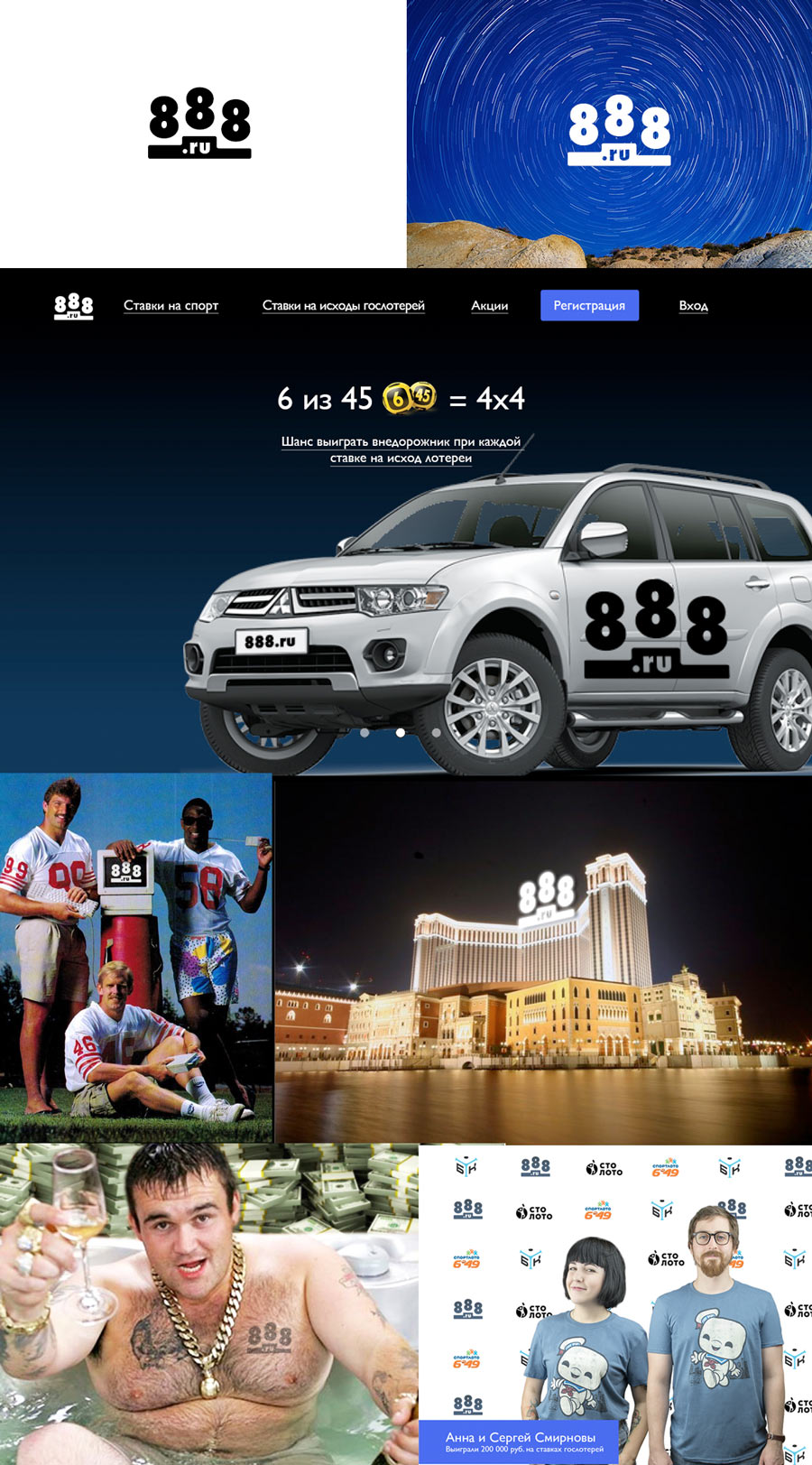
The client doesn’t approve. Thinking.
No.
Designer: What about this? X as multiplication or a coefficient.
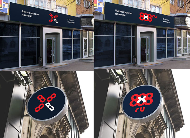
Art director: The X here is a foreign element that steals all the attention. Yes, the logo becomes recognizable but at the cost of losing the symbol. The most important symbol here are the triple eights, any other elements will only make the logo unnecessarily complex.
Designer: Or how about this: a two-color solution hinting at the duality of betting (win or lose, even or odd, to bet or not to bet).
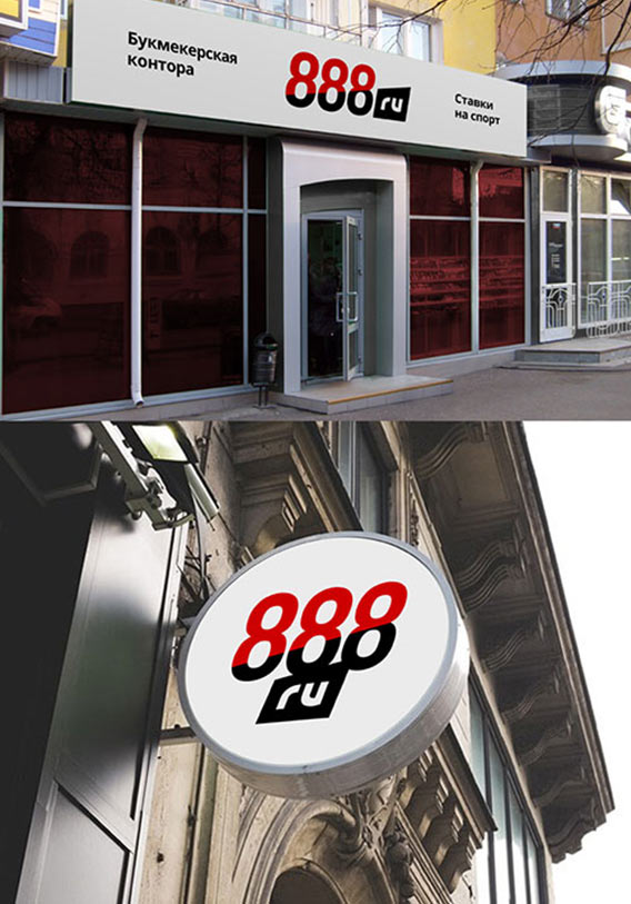
The art director approves the idea. Developing it further.
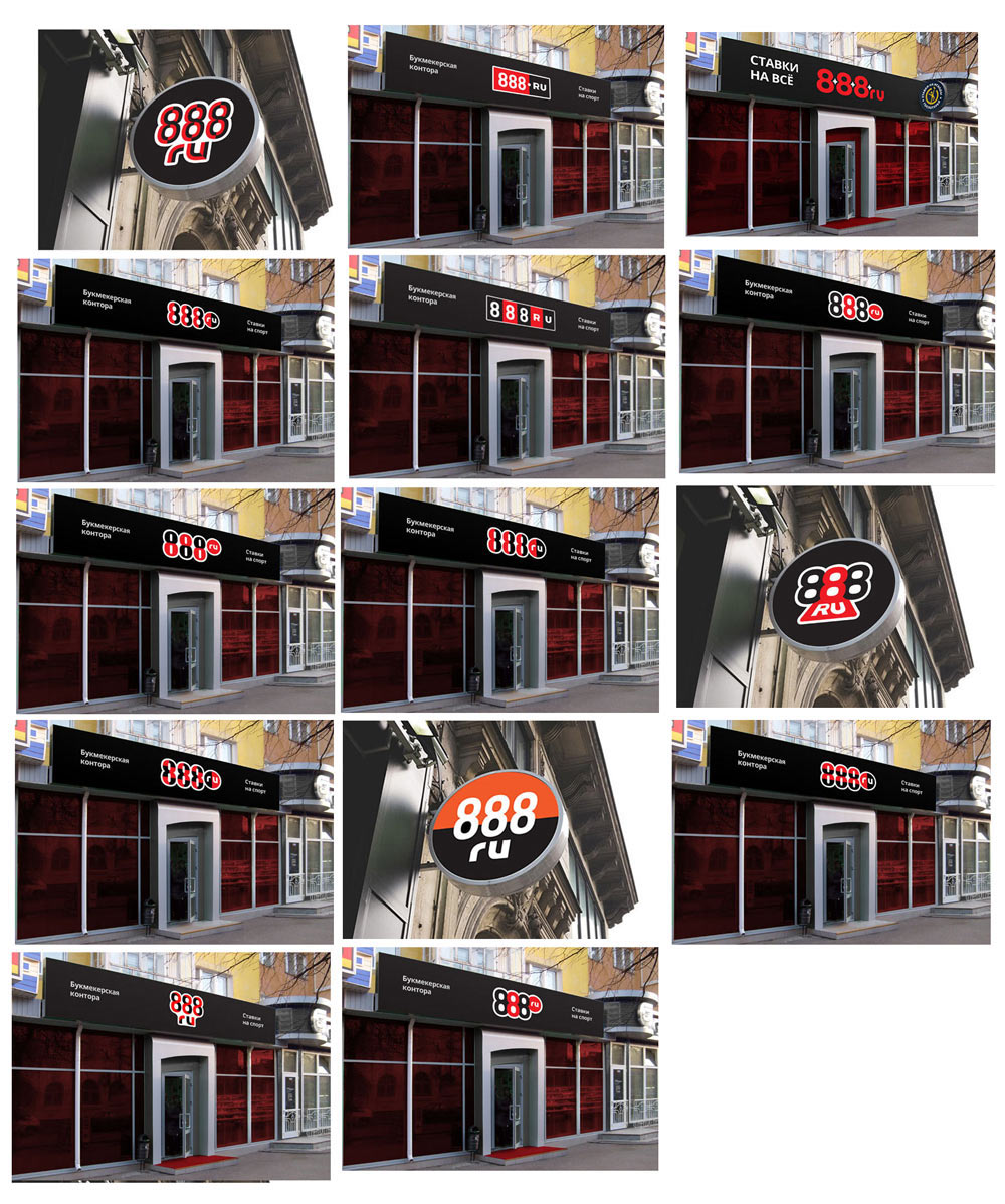
The art director chooses two designs and sends one of his own. Preparing a presentation.
Doesn’t work. Piling up more designs. The red and black combination looks promising, not rejecting it just yet.
The design with black and red counterforms looks the most interesting. Presenting.
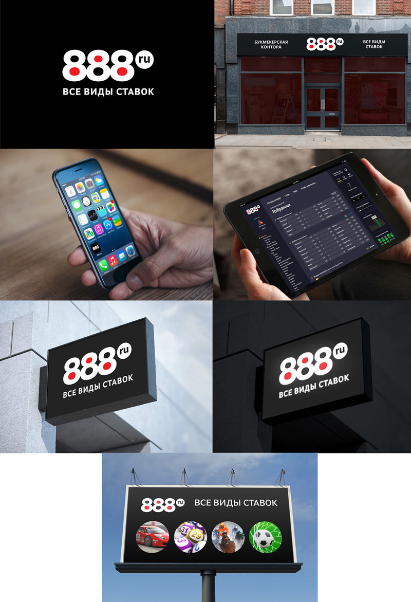
The client approves the logo. Thinking about the slogan and suggesting this:
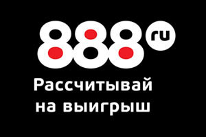
It turns out that any slogan using the word “gamble” or similar ones can’t be registered. Continuing to think.
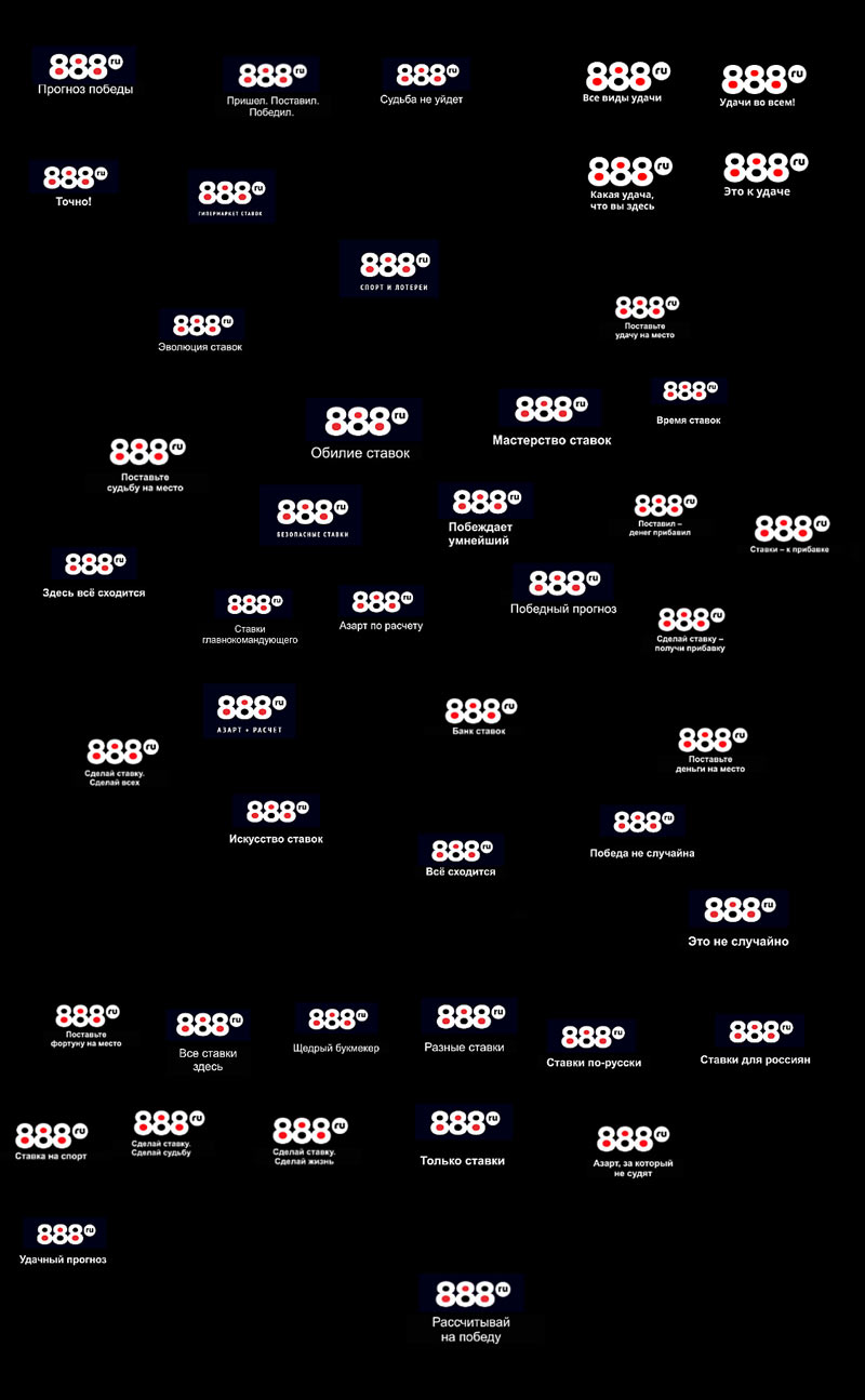
At the end, the slogan is not needed. Drawing final versions of the logo and typesetting the guide.
