Suggesting the first idea. Trying to convey the sporty character and reveal the potential of the text by using an interesting effect for the letters. For example, by graphically rhyming the N and the S.
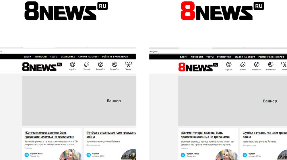
The art director says it reads as 8newz. Fixing.
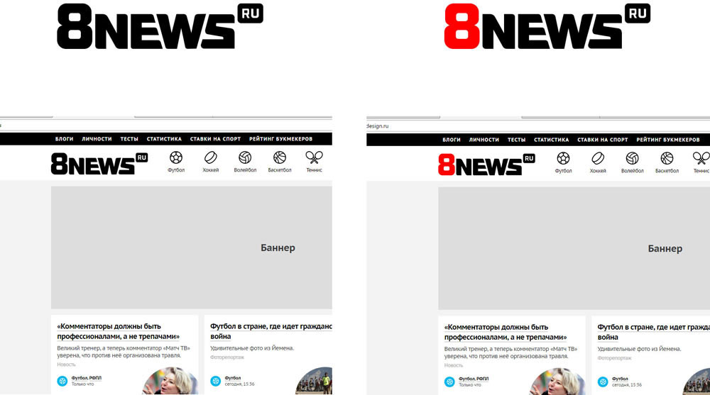
Still, it’s more clumsy than beautiful.
Another design is born.


This has an interesting rhyme of the E and the W, while the ovals in the number eight resemble stadiums. The logo has a sporty nature, clean typography, plus it looks well on the website.
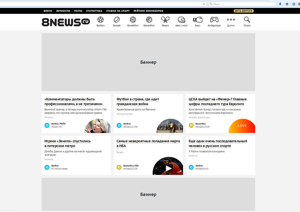

The client changes the task based on the updated requirements and suggests we start exploring a different direction.
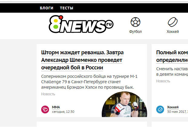
Moving further: changing the shape of the letters and equalizing density of the entire logo.
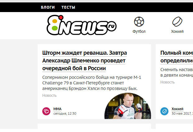
The client realizes that the idea of a red circle resembling the record button does not work well and asks us to keep looking.
Making another attempt.
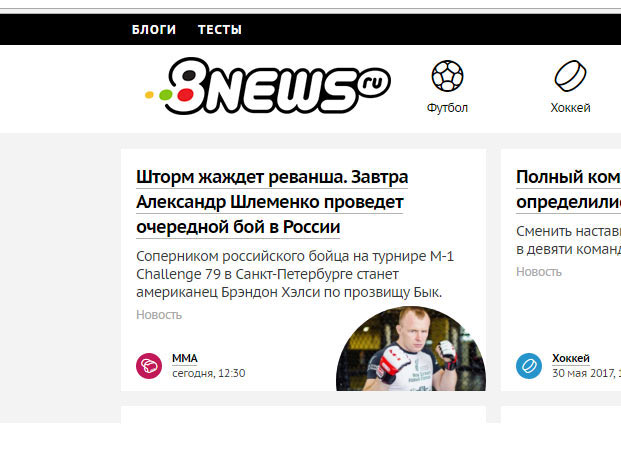
Client: OK.
Rendering the final image in versions for both colored and black backgrounds.

