The making of the universal Russian age rating system icons
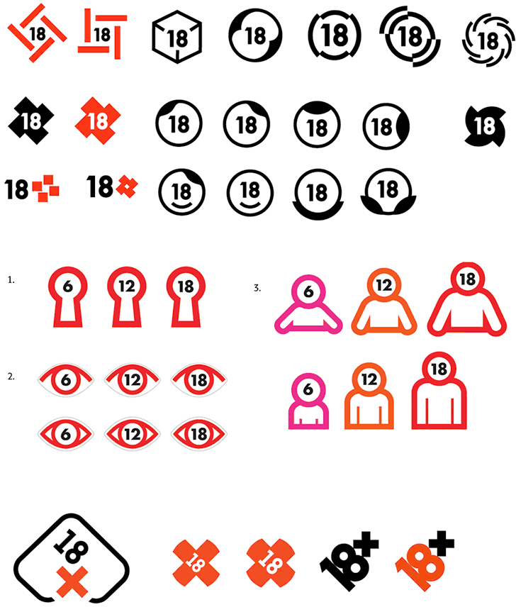
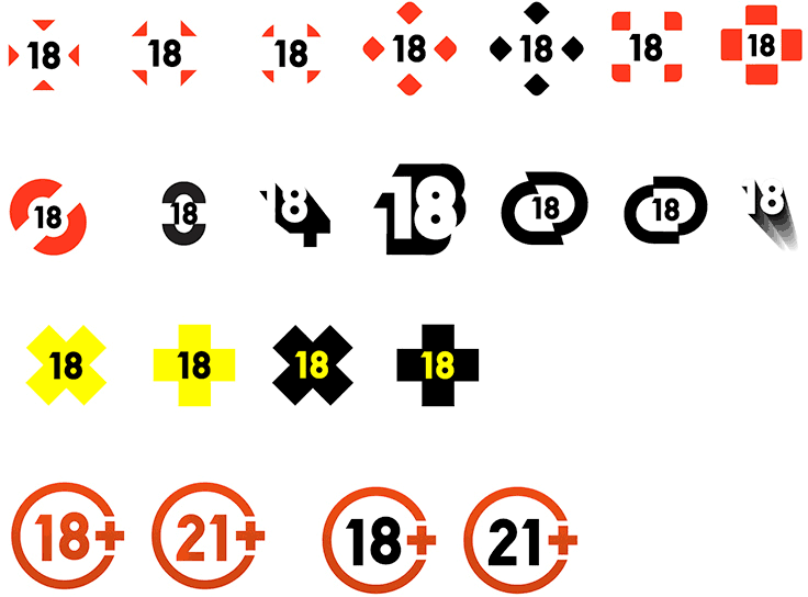
Proposing first options.
Designer: I’ve tried making the plus in reverse to make it a bit more subtle. Also, I’ve tried looking for simpler forms.
That’s better. Continuing.
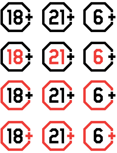
Designer: I’ve corrected all the sharp corners and inscribed the plus into an octagon to make the shape more closed and comfortable.

Art director: I think here we have a shape that’s simple, yet with a distinct character. The modern plastics gives it an air of a forbidden fruit. The stop sign is easily readable in both color and monochrome variants.
Artistic director: I can see the advantages. Now for the problems. How will it look against color backgrounds? The shape is not closed. It looks like a pharmacy sign. The digits are too bright for the eyes.
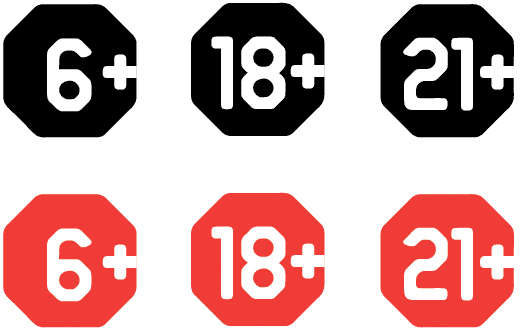
Making corrections.
Sending to the type designer.
