The making of the US Independence Day poster (2013)
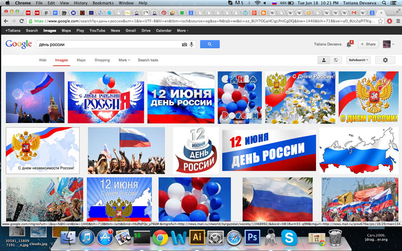
The people of the US really do celebrate this holiday, but after all, in many respects America truly is a very special country. We want to help it display its independence in a fitting way. The American Instant Patriot Kit is assembled the same way as the Russian one, only the one from America is more eagerly reproduced on cakes and souvenirs.
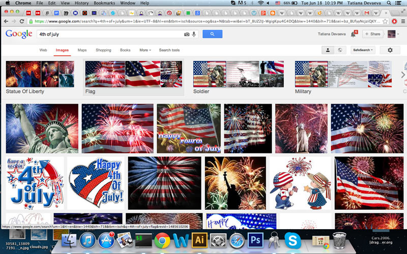
Eagles-shmeagles, flags-shmags, fireworks-shmireworks, stars—all right, we get it. Not what we need. Making a list of all American values we can think of. At the bottom of the list are some vague ideas about St. Columba. At the top is a burger with a candle, good but old. As for the bucks, we just can’t seem to squeeze an idea out of them.
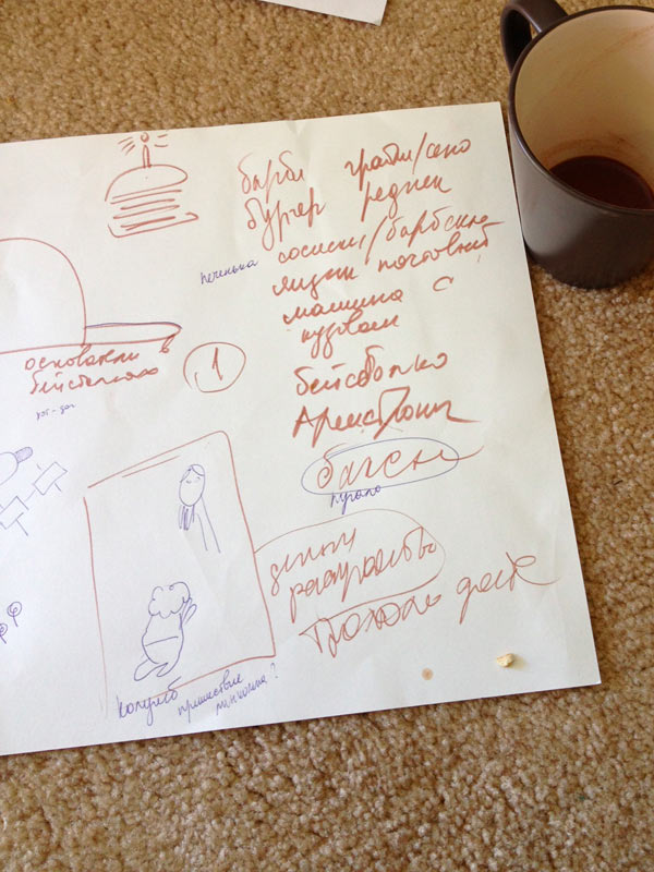
The left side of the page has some phallic crap about baseball. Baseball, baseball caps, baseball bats.
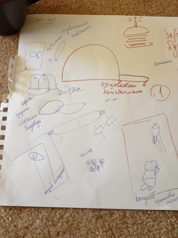
From baseball we slowly move on to American football. Maybe, draw football players from two continents? There can be something there, but the metaphor will come out too lengthy. A soccer ball is round, but a football is—yeah! That’s it!
Definitely.
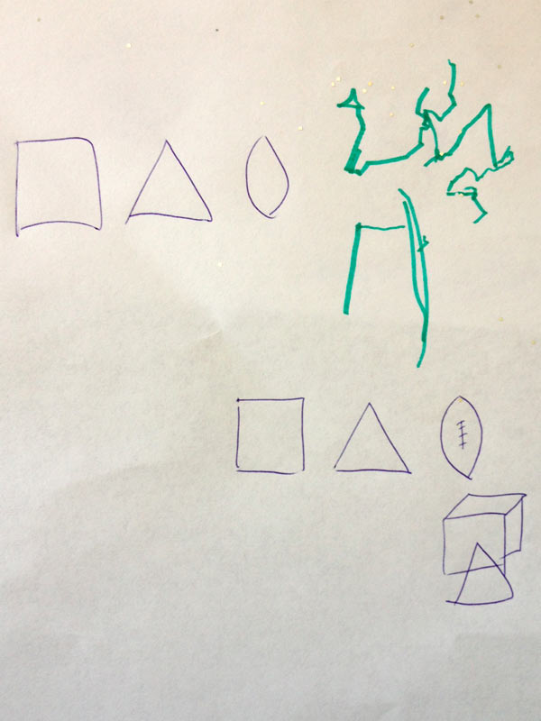
Designer: American plaster primitives.
Art director OK.
Designer (suddenly in doubt): Maybe, a baseball will look better?
Art director: It will be even more subtle with a lentil.
The idea now goes to the hands of those who can use them.
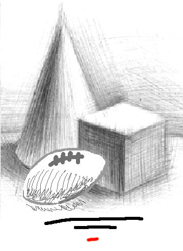
The day of independence from computer has come and the designer starts to draw, remembering the basics of academic drawing.
Creating a perspective, thinking about light, falling shadows and reflections, not forgetting about hatchwork. Getting inspired by a real football. A hatch, another hatch.
Scanning and getting back to computer and Photoshop.
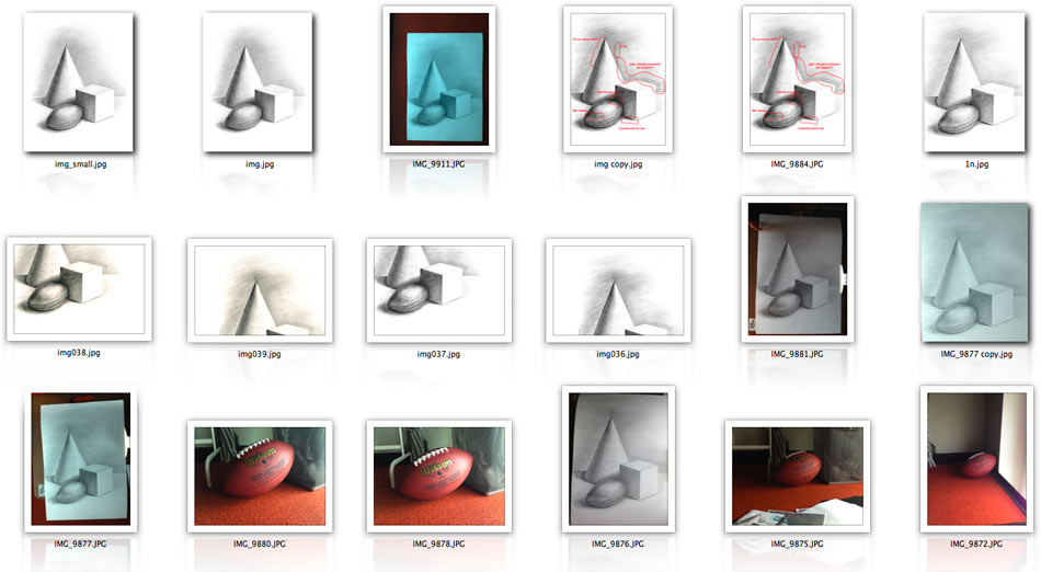
Art director: The technique is all right, but the spots and the irregularities look unpleasant. Especially at the top of the cone, it’s just trash up there.
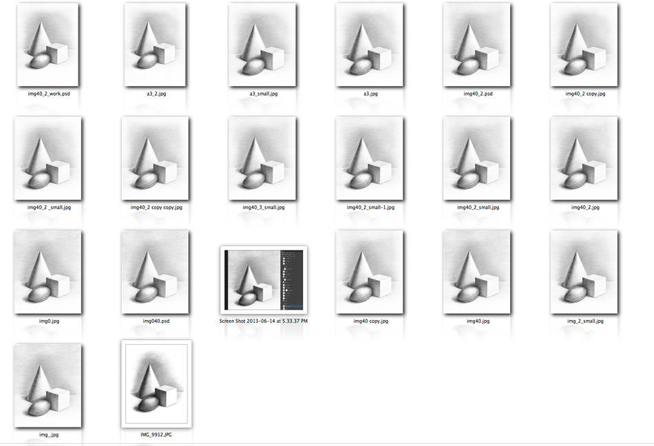
Improving again, getting rid of the spots in shadows, of flat side light. Equalizing the background, the outlines. Detailing the hatchwork. Showing to the art director.
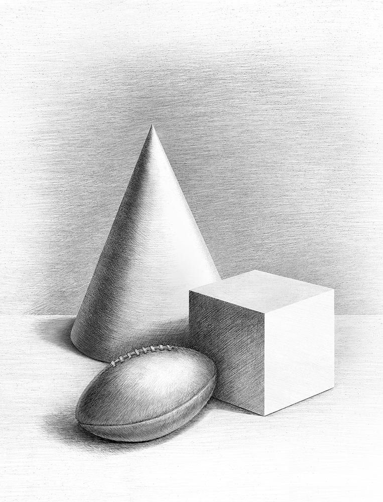
Art director: OK.
Sending out for typesetting.
