The copywriter sends name ideas to the designer:
— Sirin-Sirin (sweet-sweet)—only they have a special kind of s
— Agrojian
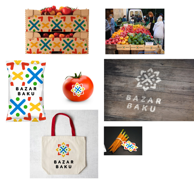
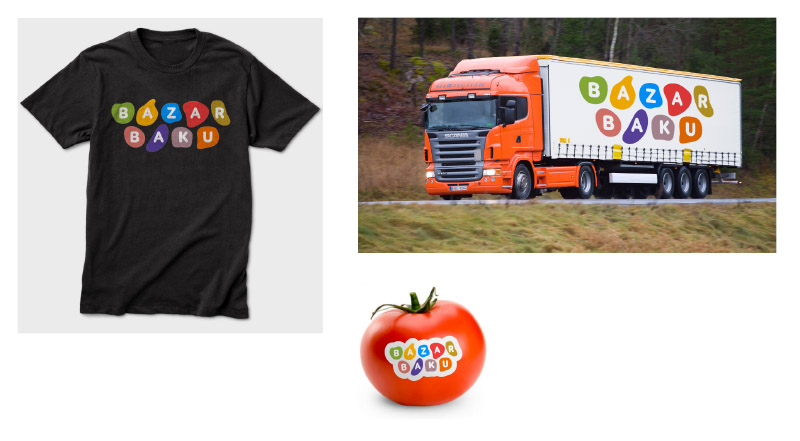
— Bazaar Baku
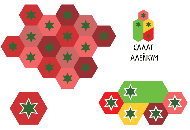
— Salad alaykum
— Merci Baku
— Azerbio
— Azerveggian
— Elsad
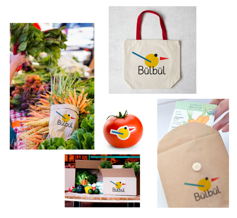
— Bülbül
OK, starting to implement the ideas.
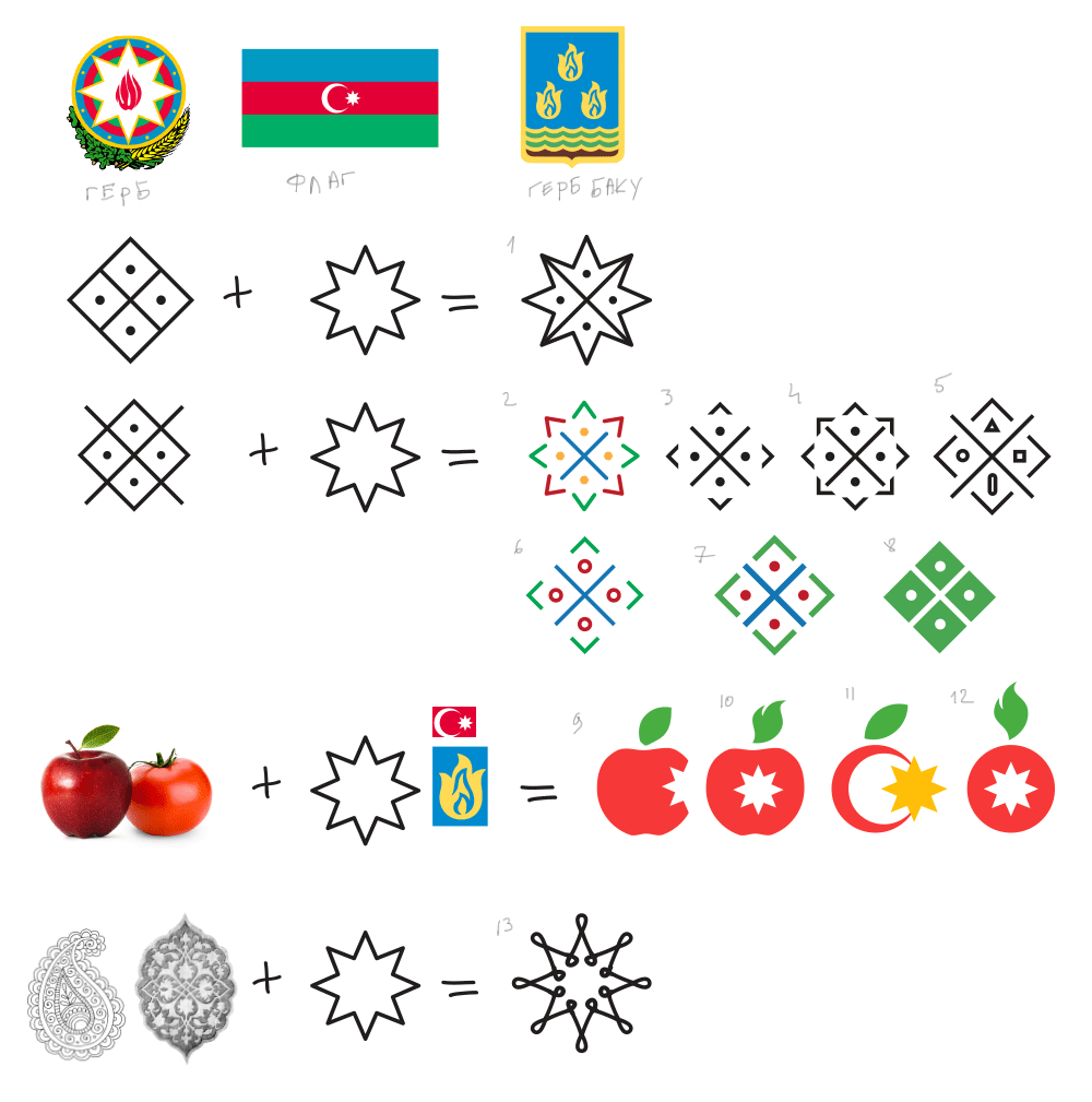
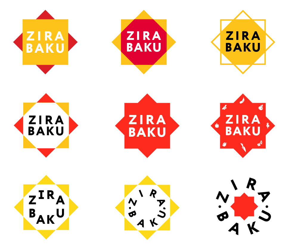
1–8. At the core is the ancient symbol of fertility and an eight-pointed star. It should work well with the greenhouse theme.
9–12. Combining understandable symbols.
Reading about the eight-pointed star, learning that an octagram represents order, creation and balance.
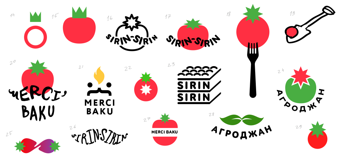
The art director suggests to start with packaging right away.

Art director: I’m not sure we need to use the star in the logo, it makes the tomato look like it was punched.
The second star lacks density, on the tiny real-life sticker it wouldn’t work at all.
OK, moving on.
The leaves look fun. Breaking them down.
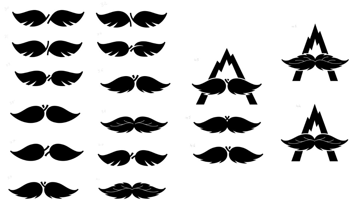
Art director: The leaves are poorly recognizable, right now it looks like a logo about hair.
Art director: The softer ones look like leaves of an oak tree. The mountain outline is of place. The leaves are too large, the А looks like a decorated Л. Boring. And the leaves are too much like wings.
Going back to other names.
A Suprematist bülbül.
Another idea with a geographic reference is born. The artistic director suggests to use an octagon as the base.
Art director: Let’s try to trace and repeat the corners, they should become sun rays.
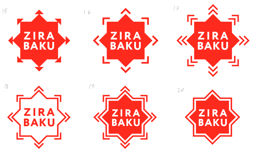
Art director: 16 (only make it thinner) and 20.
Designer: Right now I like Number 24 the most.
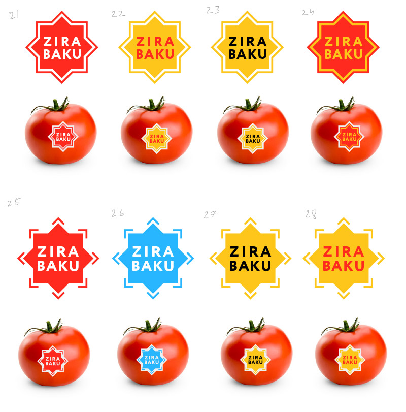
Art director: You need to work on legibility in 24, it also looks dry. How about tomatoes and cucumbers?
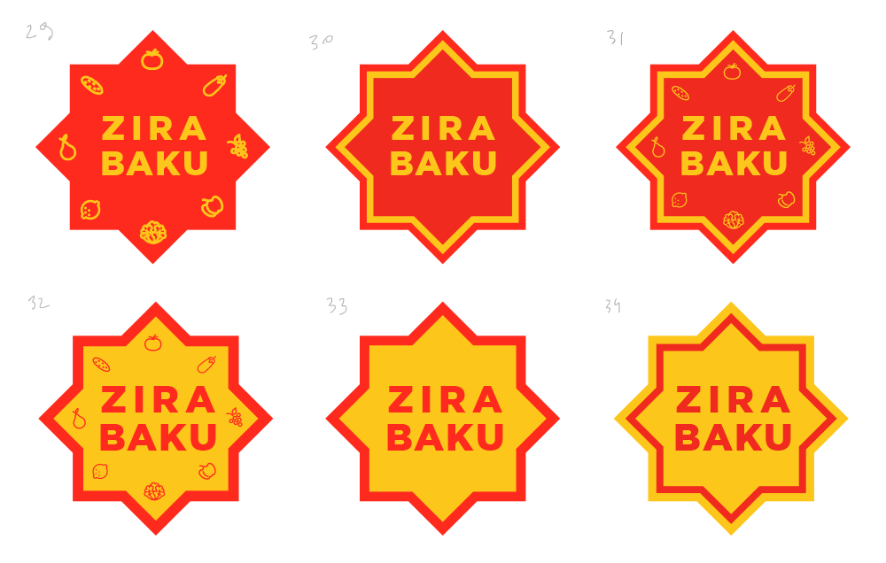
Designer: We can use tomatoes and cucumbers to create a supplementary design.
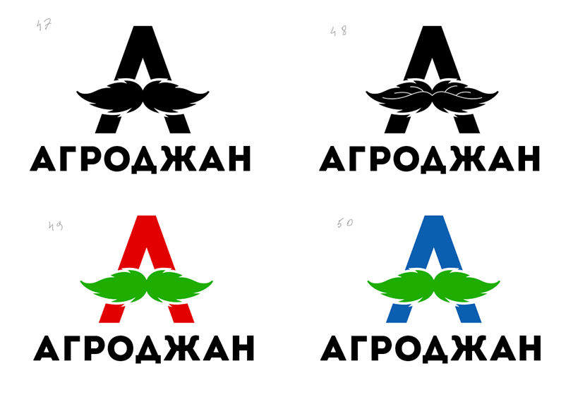
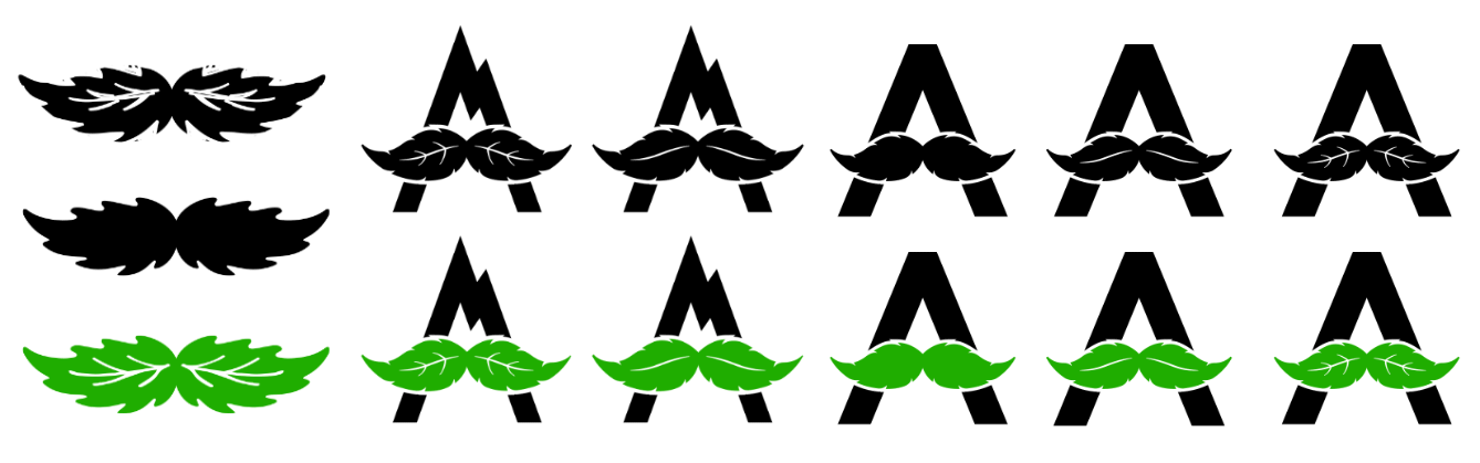
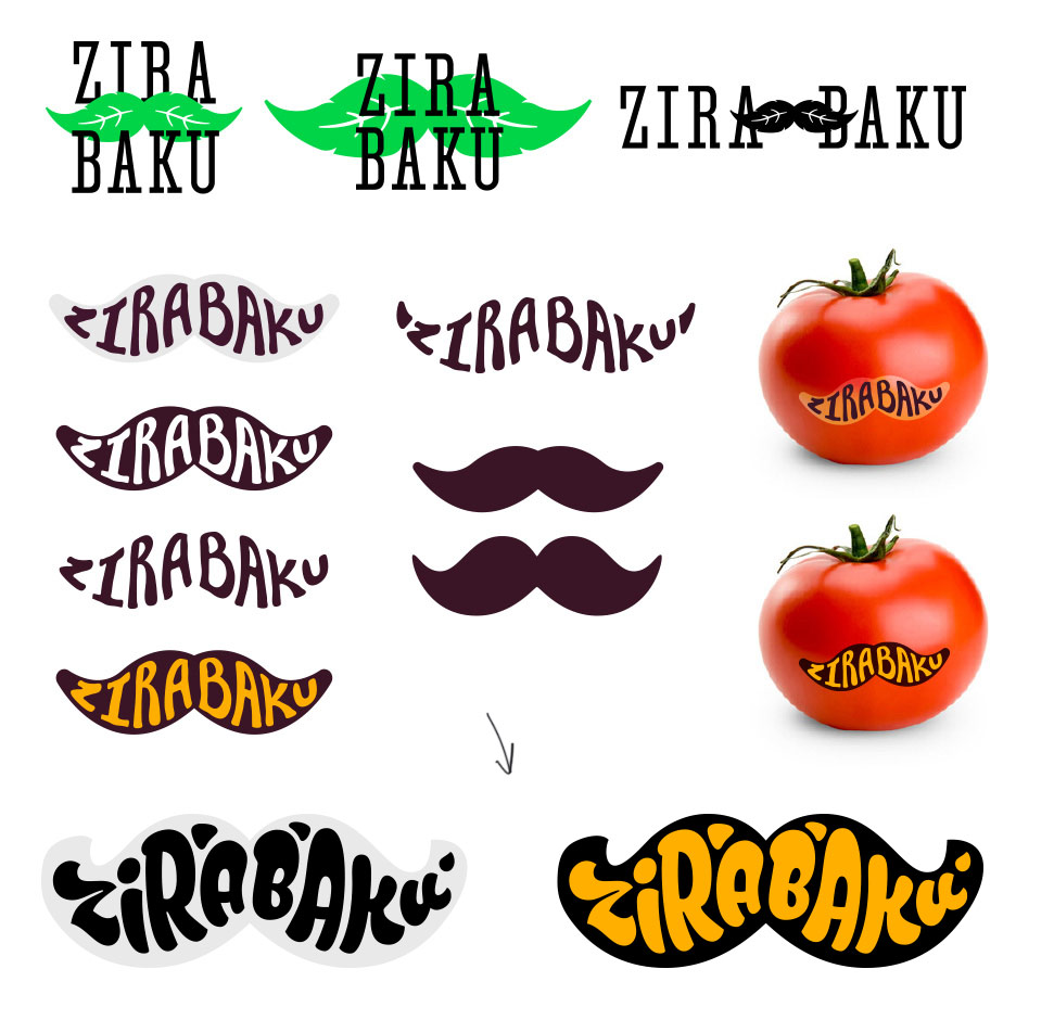
Finalizing the mustache approach.
Assembling a presentation.
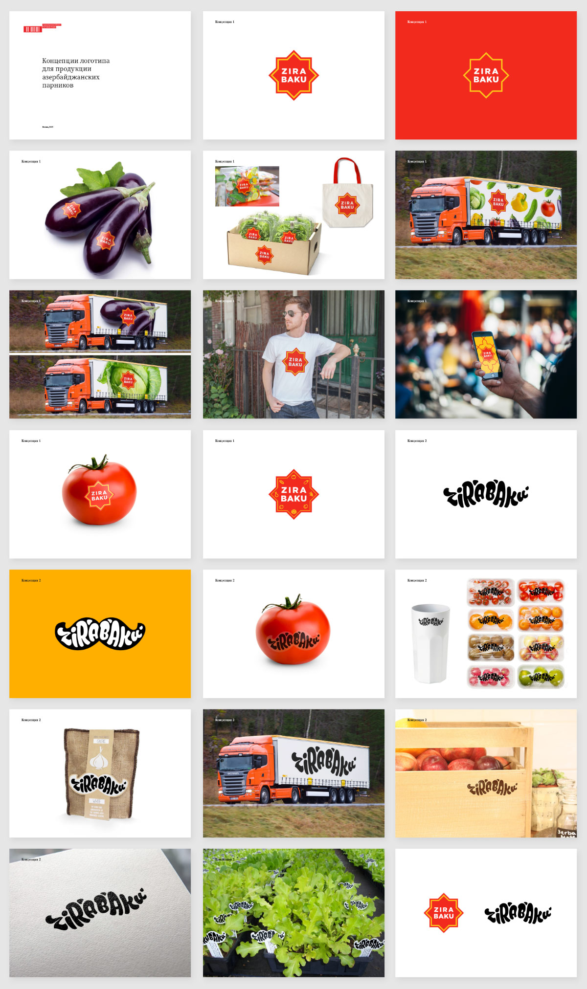
After brief consideration, the client chooses the star, but asks to think some more about the name since the previous one was unavailable for registration.
Making another approach.
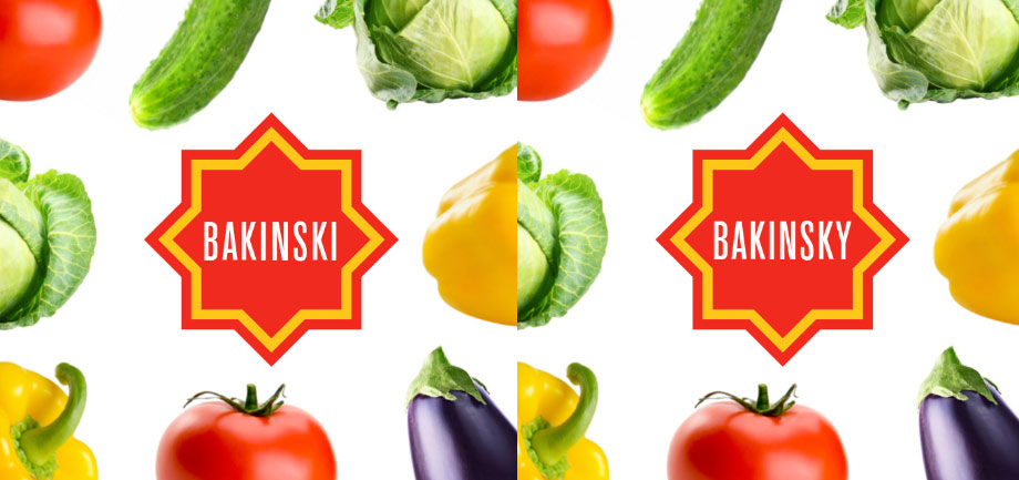
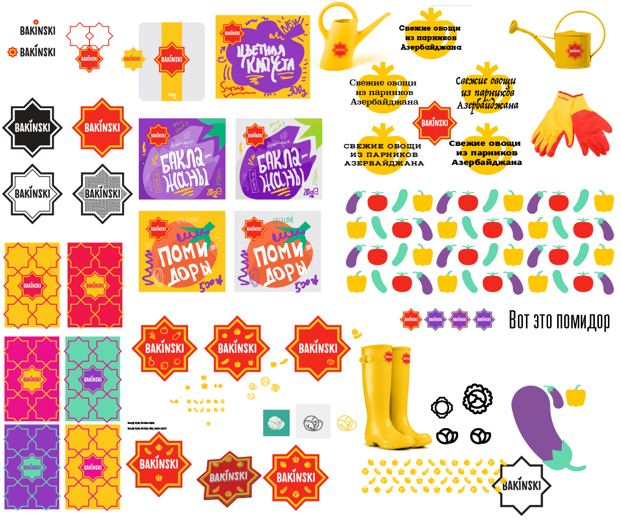
Choosing between two versions: Bakinski and Bakinsky. It would seem, Bakinski would be more correct (similar to e.g. Polański). For the client it makes no difference. Talking to the translator, deciding to go with the -i. Getting the client’s approval.
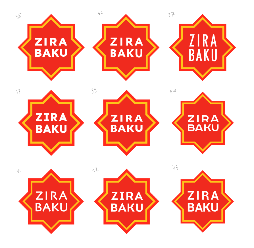
Starting to work on details.
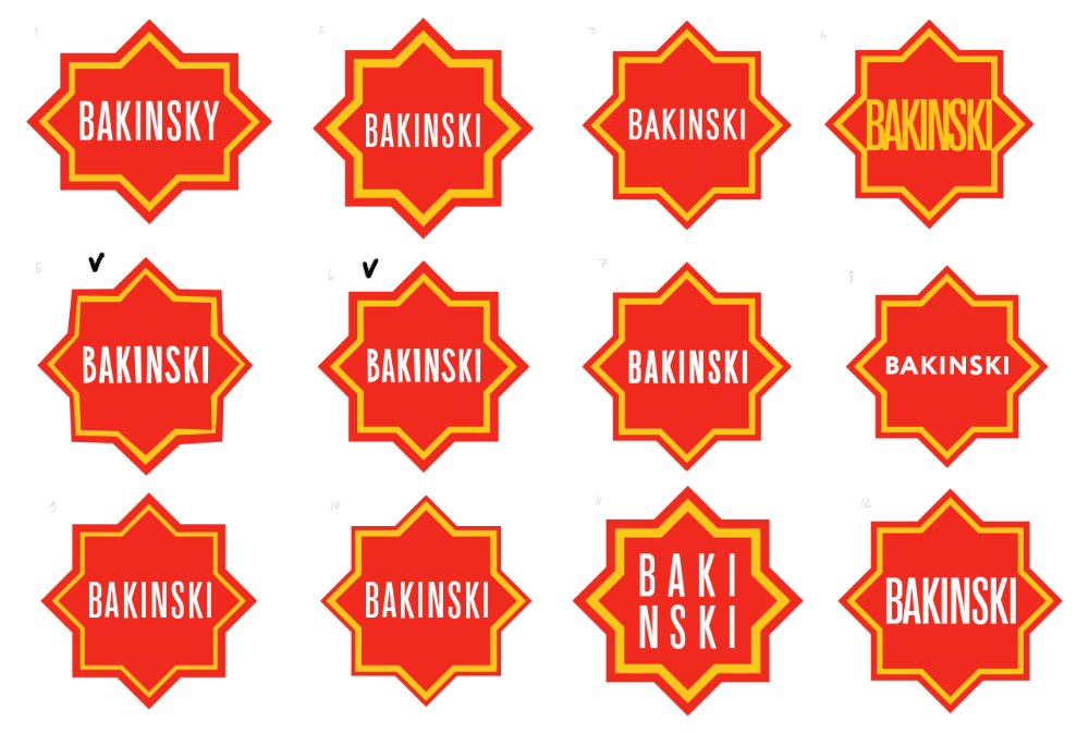
Designer: The top row is geometrically correct, the lower ones are slightly more “handmade.”
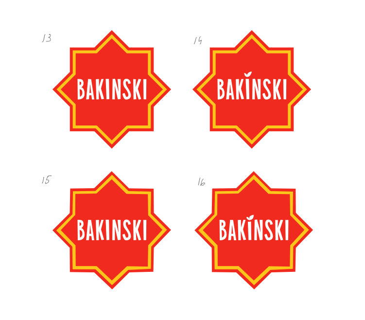
Art director: The text from 14 and the star from 16.
Inviting the type designer to join us.
Designer: How about this?
Art director: Sure. I like Number 2. Just replace the B.
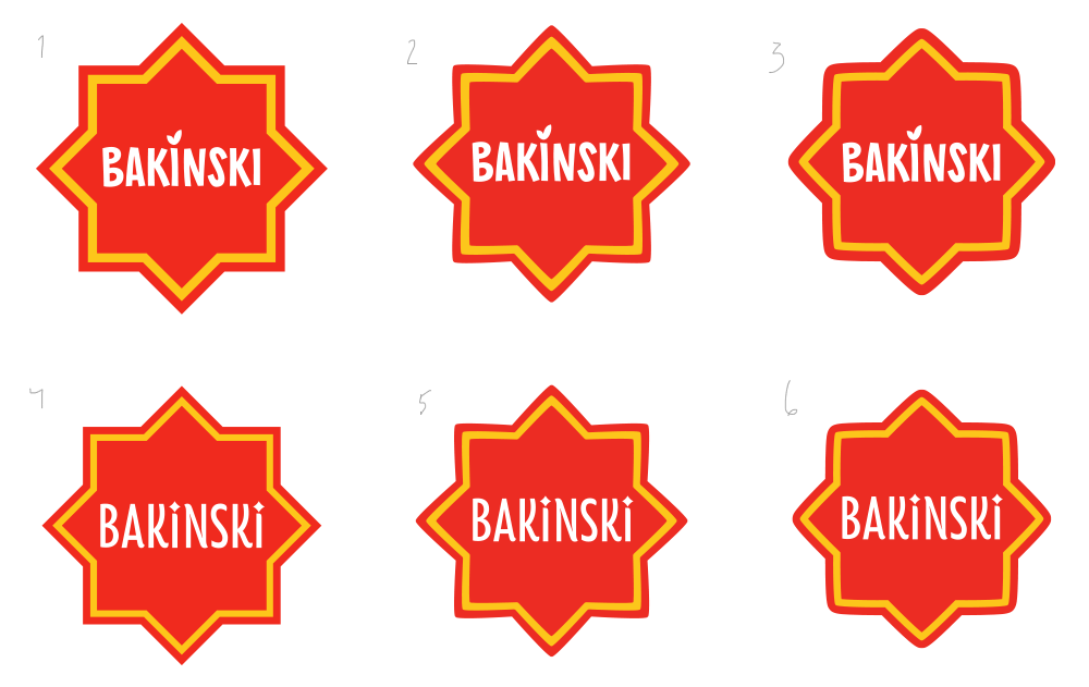
Hesitating slightly between 1 and 2. Deciding to go with 1.

Sending a presentation with the new logo to the client.
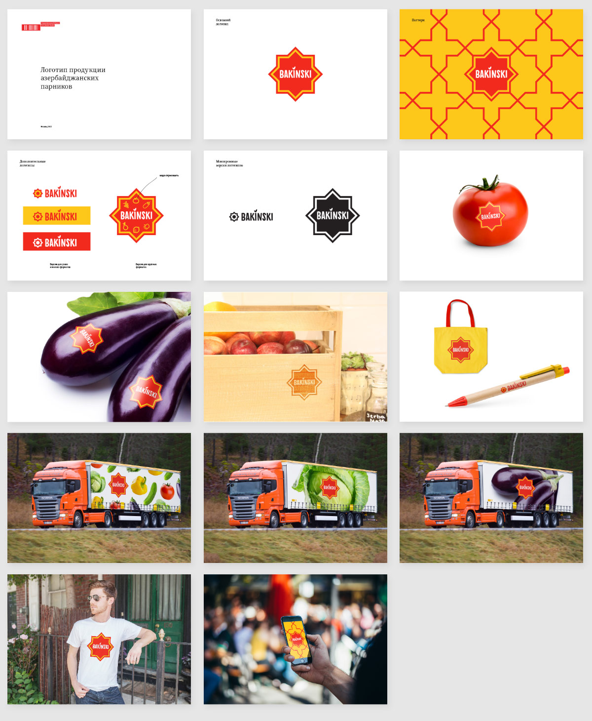
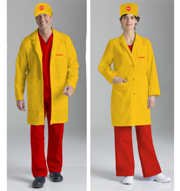
Immediately starting to work on the uniforms.
Choosing typefaces and colors, drawing icons and patterns, assembling style guides.