The making of the Beeline payment cards promo page
Getting the materials from the client: a clickable prototype and the results of its usability testing. The client asks to solve the problems uncovered by the testing and adds: “We need a bright, laconic, dynamic design for this section of the website, since it’s almost like a separate promo page about the cards. It would also be great to use the best practices for presentation of banking products and bonus programs.”
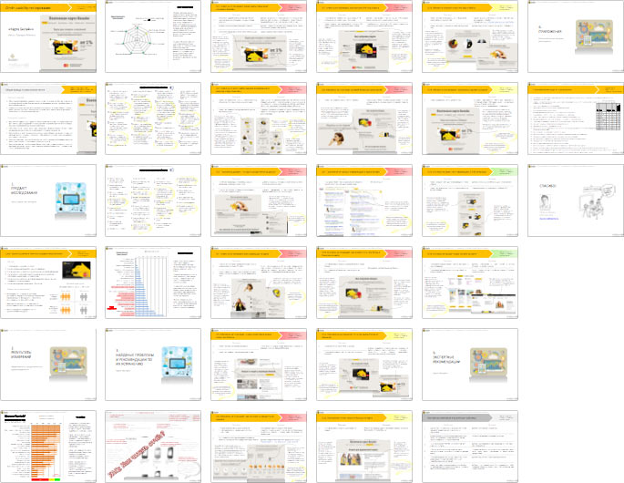
Understanding the task, writing down a list of questions, working on the structure. Simultaneously coming up with a concept for the main page and the way these principles should propagate onto internal sections. Overall, we now have five concepts.
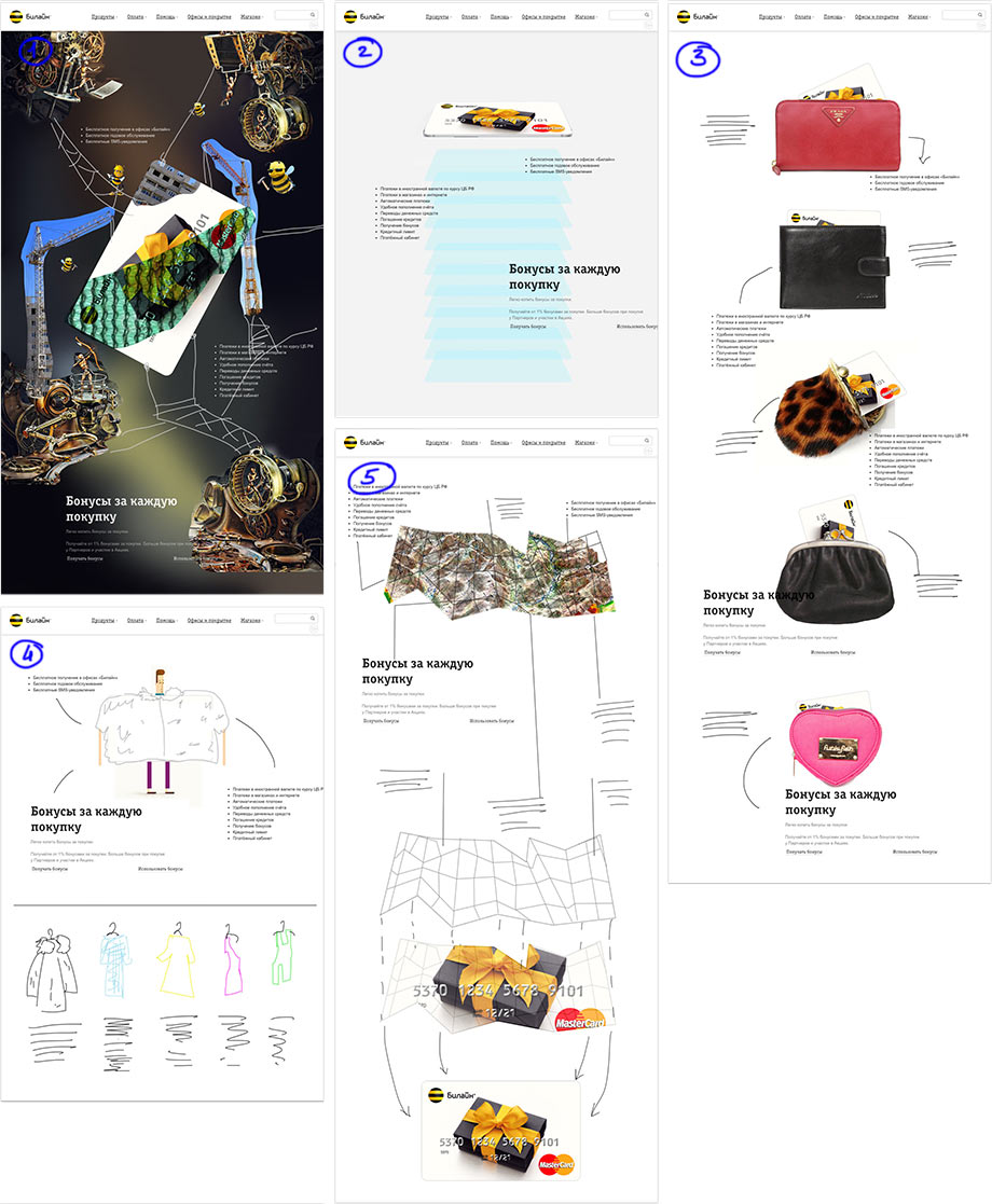
Art director: Let’s not waste any time, just show it to the client like it is.
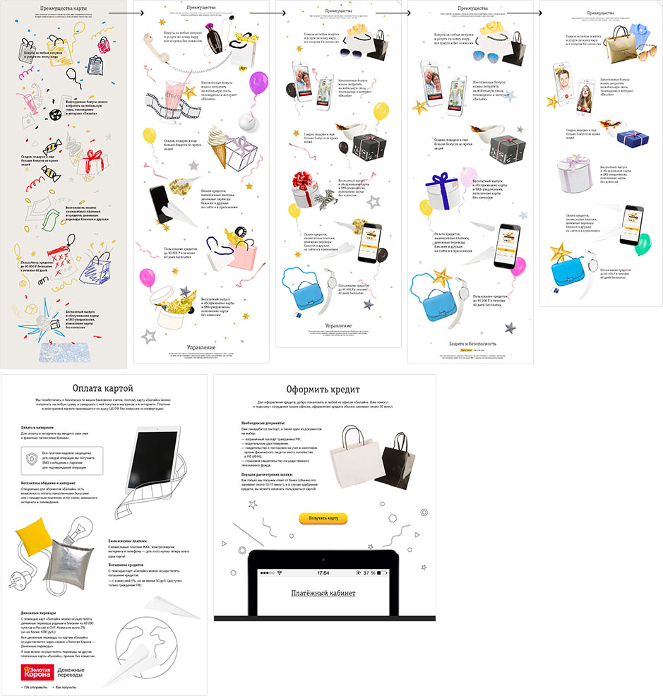
Demonstrating. The client starts giving helpful comments right away. They like variants 1, 2 and 3. We will be working on numbers 2 and 3. It is important to show the difference between the cards, present their features, mention security and explain how to get one. Starting to work on implementation.
Creating a video to make the result more visual (turn up the volume).
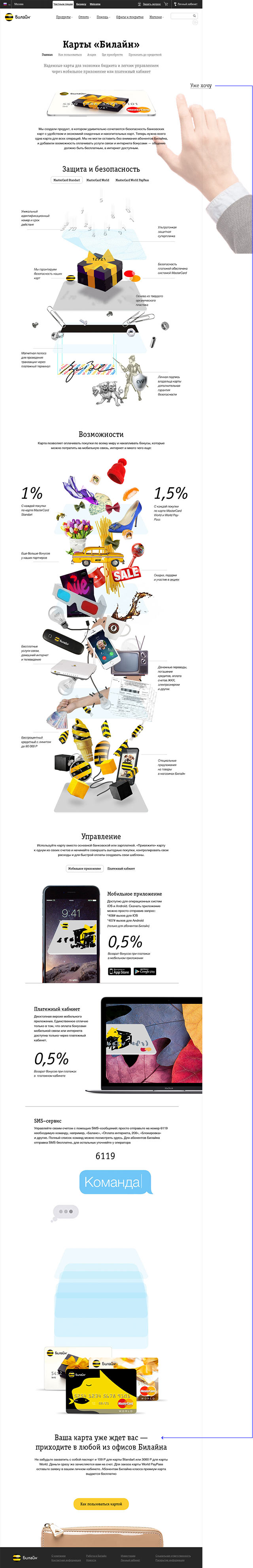
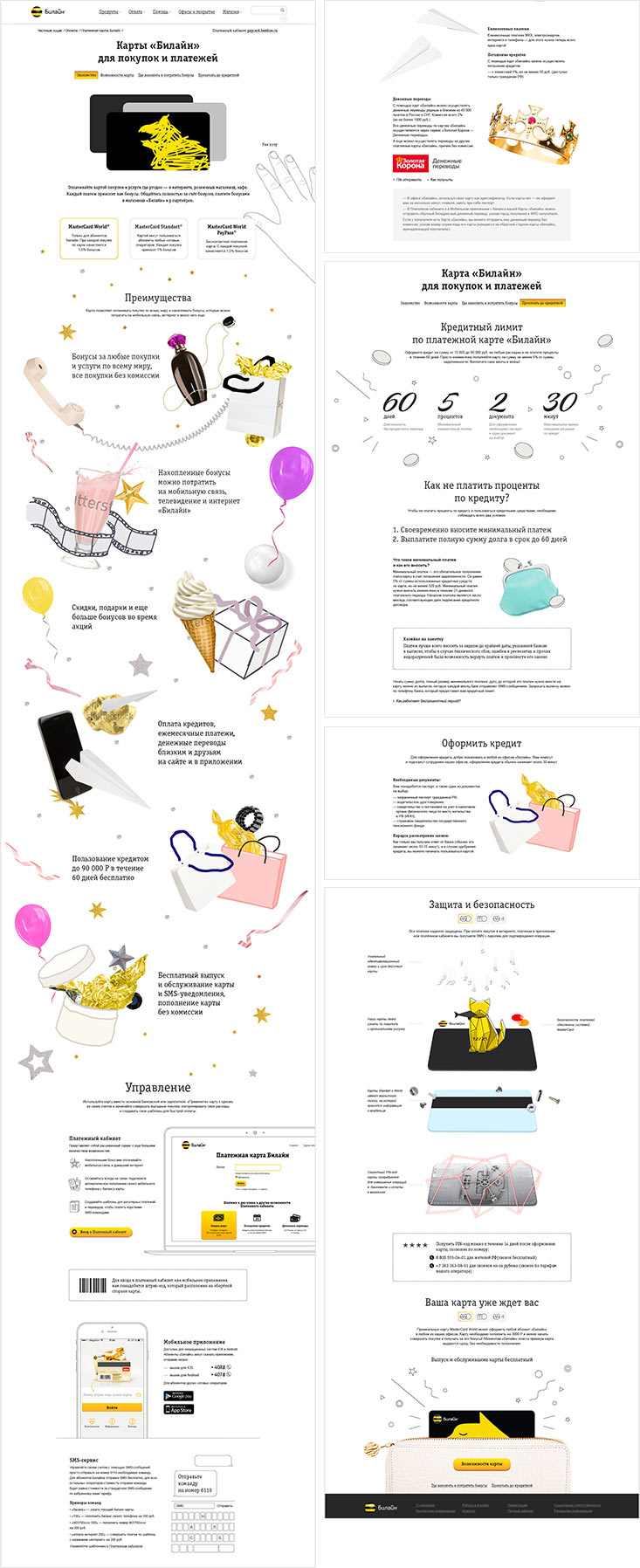
Gradually, the concept becomes filled with the client’s texts. The main changes are introduced to the Features block. It still has to be bright yet conservative. Creating sketches for internal pages and linking the Beeline styles.

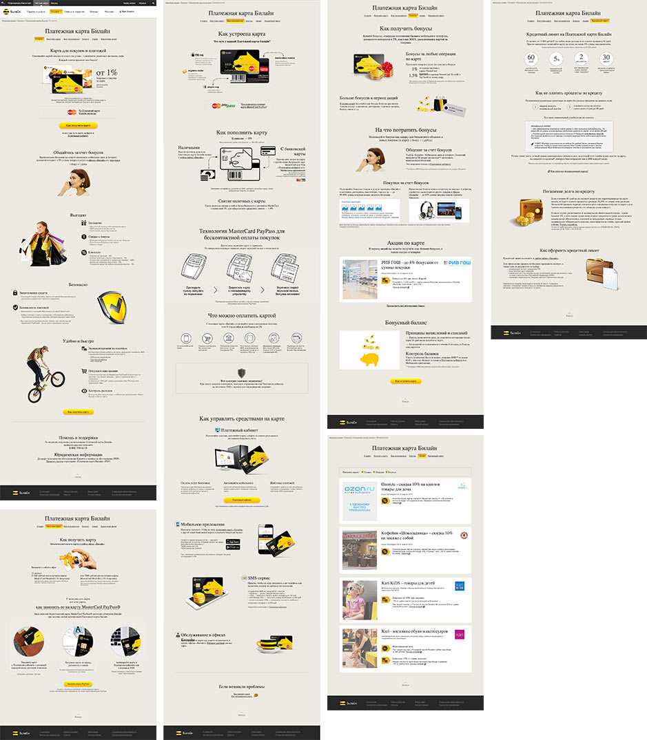
Working With the Card, Card Transactions, Loans, Fees and Interest sections. All of them contain a lot of official information, legal texts we can’t change. Coming up with stories and design for each block.
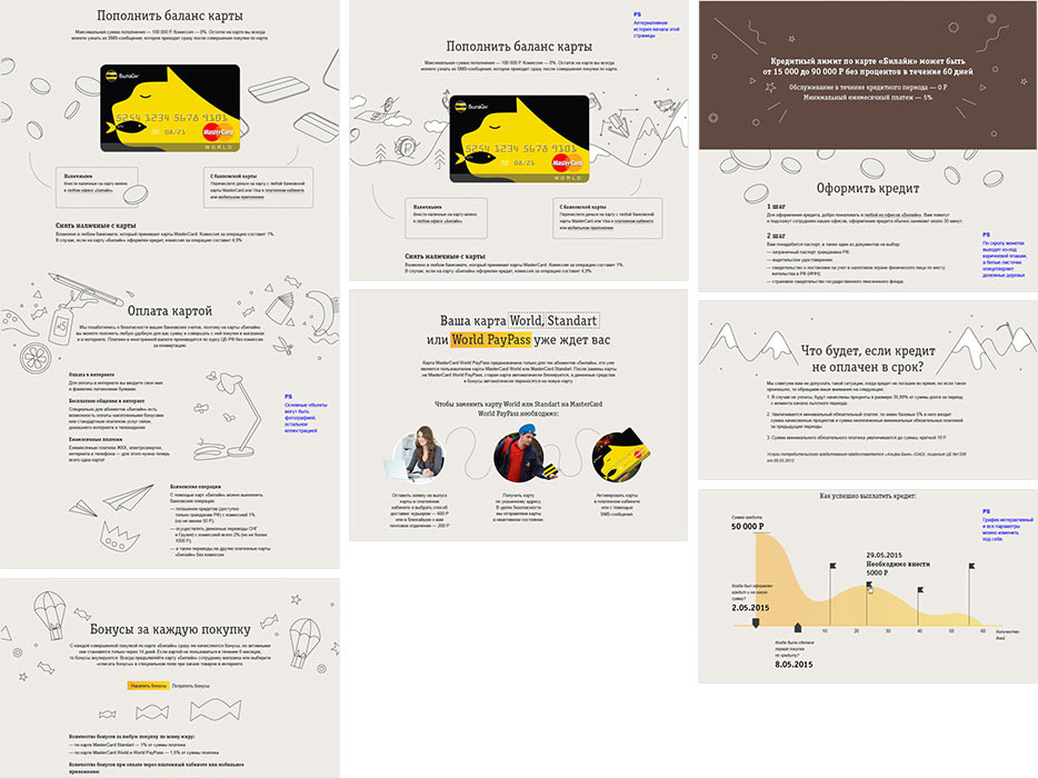
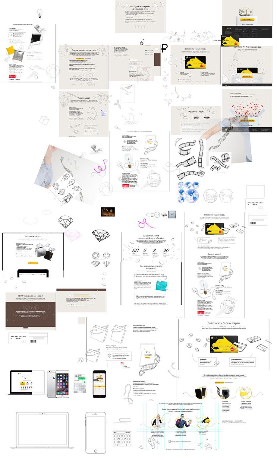
The quantity of information which we have to include grows rapidly. Inventing user-friendly transitions between the sections.
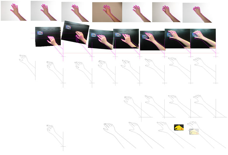
Testing the hand animation, preparing individual frames, drawing.
Getting the client’s approval for the metaphors for the Features block and making an attempt to introduce some radical changes: to get rid of the background color and make some of the traditional Beeline pictures “fly.” It is a promo page after all, so we should be able to deviate from rules somewhat.
As soon as all the metaphors are approved, going to photographers to throw things into the air.

Meanwhile, the technical designer is busy polishing pixels.
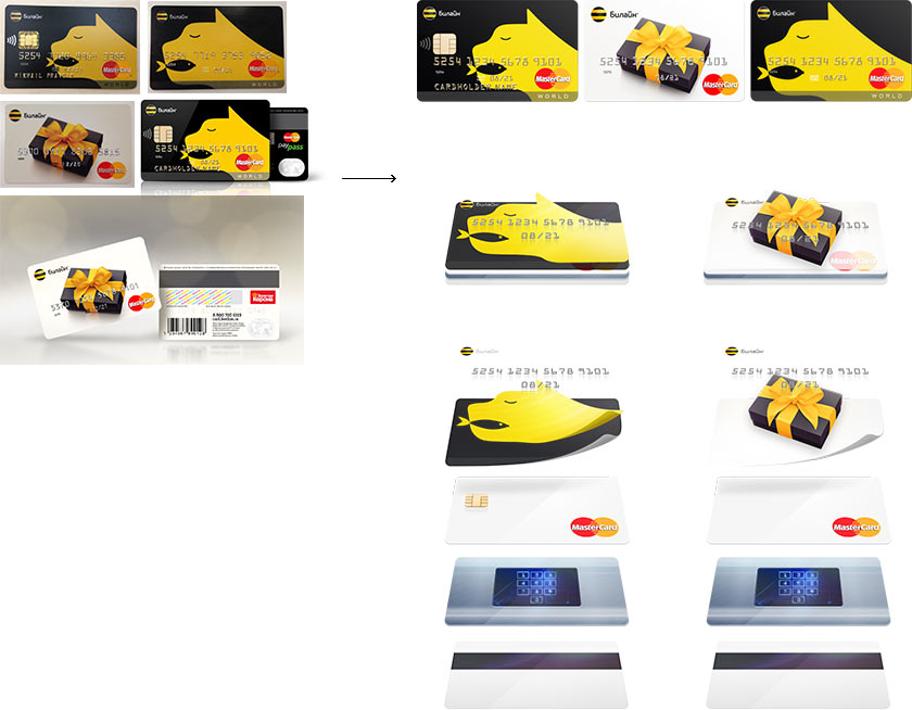
Looks beautiful, but we want more. Adding some folds.
Looking at gigabytes of photos, selecting the best and assembling them into collages.
The first page is sent to the technologist. To make it easier for him to understand what the final result should look like, preparing a video about each block.
The technologist performs a miracle and shows the first result. Everything is beautiful, especially the effect with the hand.
The remaining blocks are also being coded. Spending some more time on the easings, delay timing and a bit of “move this one 10 pixels to the left and that one slightly lower” and it’s done.
Drawing the remaining illustrations.
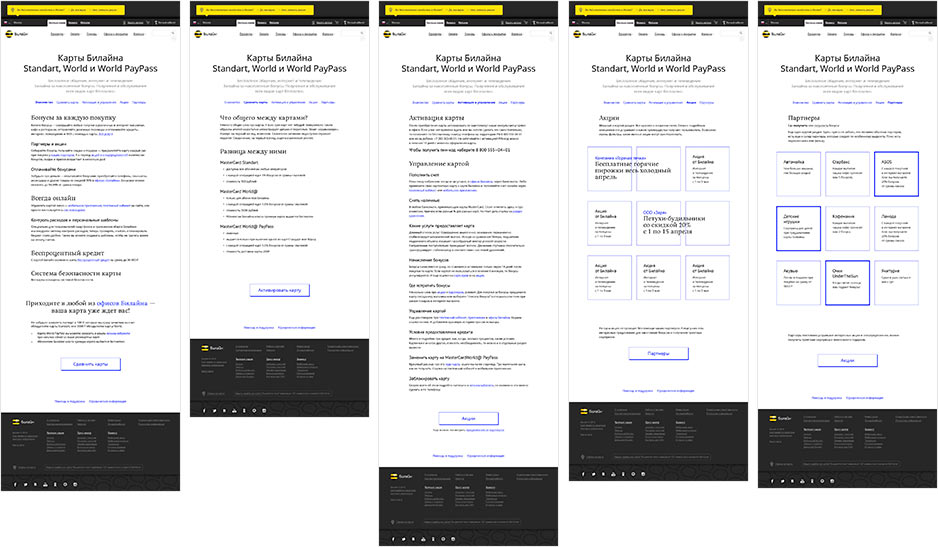
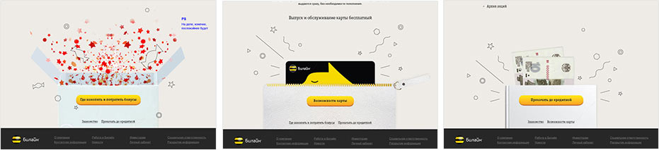
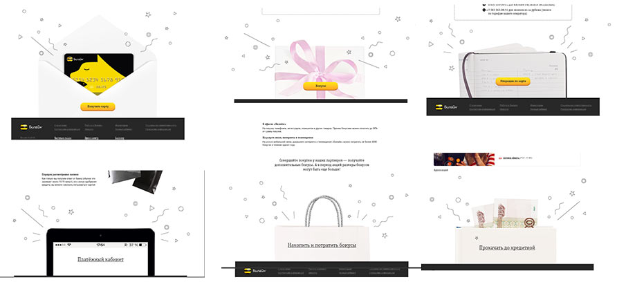
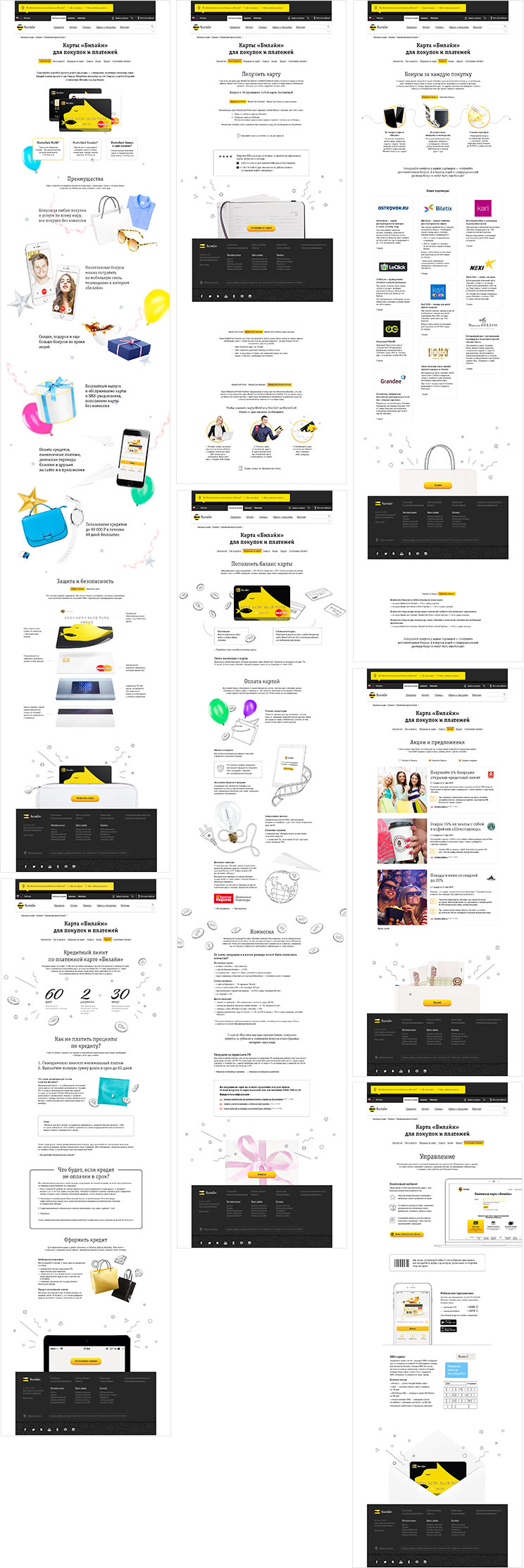
The client holds usability testing of the prototype, based on which they ask us to remove the hand, since too few visitors click on it. And also to change the structure by moving out the blocks Managing the Card and How to Get a Card into separate pages and breaking down Partners and Promotions into two different blocks. Adding some more mandatory texts.
Sending all the mock-ups and the final version of the main page to the client.
After a while, evaluating the result, finding bugs and writing comments.

