Bimcadeng works in an incredibly interesting field, building information modeling, which is a modern way of creating drawings in 3D. The company develops models of airports, factories and universities.
Their products were as important as their logo was horrible. Outdated, with letters of different colors and oddly rhymed rectangles... It was as if it came straight from the 2000s!
A new one was developed at the studio: beautiful, meaningful and laconic.
The client wanted the new logo to reference the theme of 3D, be blue and minimalist.
What can we say? The new logo references the theme of 3D, is blue and minimalist.
The name of the company was broken into parts that come together to form a 3D optical illusion.
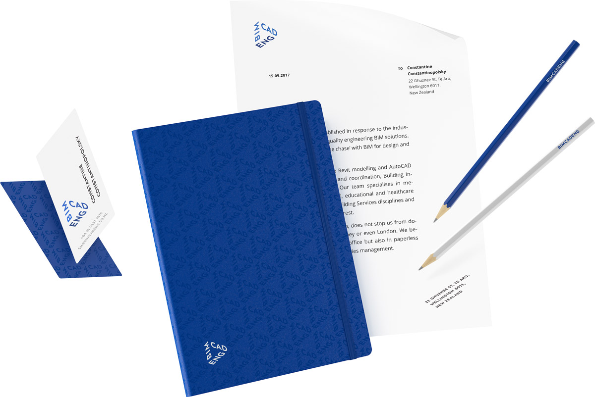
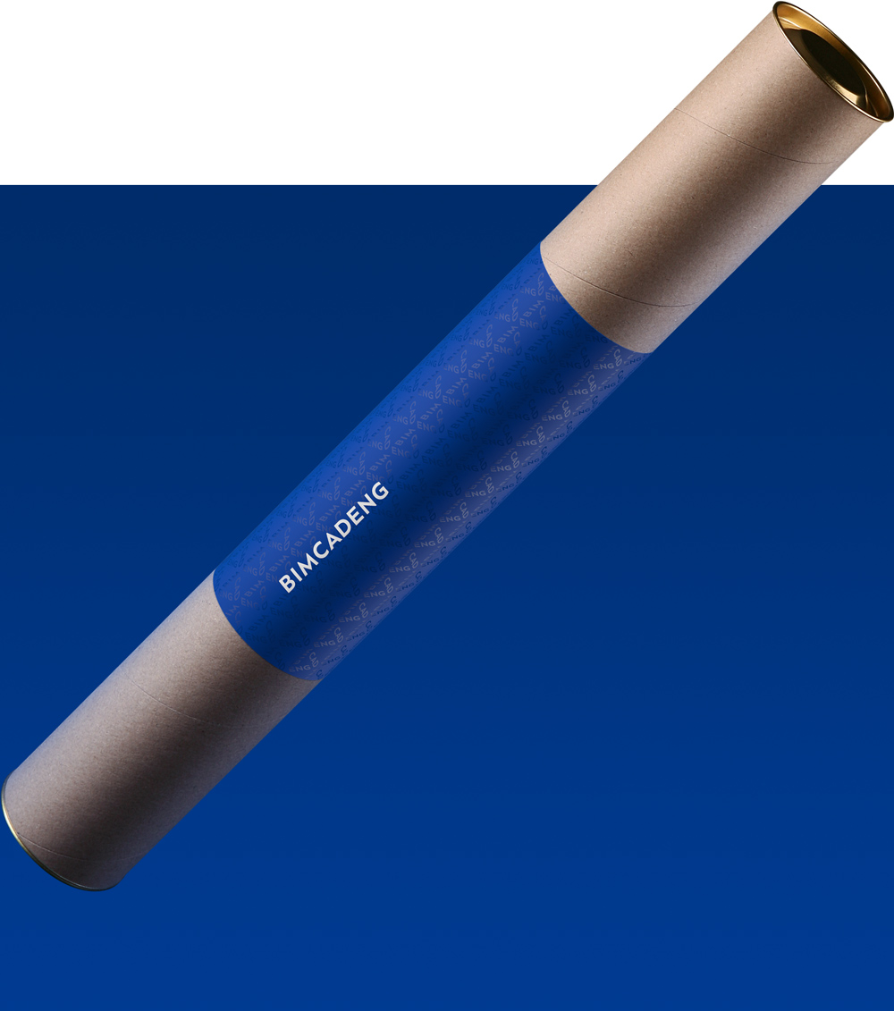
Several logos put side by side create a beautiful and solemn corporate pattern.