Client: Our company specializes in creating 3D models for commercial and industrial buildings (educational and medical facilities, offices, airports, factories). The keyword is BIM, Building Information Modelling. In other words, the modern way of creating drawings. Our key clients are construction companies, subcontractors, project managers. The company operates on the English-language market.
Expectations from the logo and the corporate identity:
1. Reflection of what we’re doing: modern technologies, digital copies of building, management of project drawing documentation processes. We bring certainty to the project.
2. Preferably minimalist style.
3. We would like to keep a shade of blue as the main color.
4. We are planning to use the logo and the company’s name on various media such as emails, drawing frames, business cards, our website, t-shirts, notepads.
5. We would also like to receive a concept of a corporate pattern.
You can see the current logo and learn more about the company at our website bimcadeng.co.nz.
Designer: The first ones!
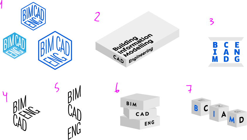
Art director: Why, the navy number 1 is OK.
Designer: The differences are primarily in corner rounding. Number 4 is for smaller formats, derived from number 3.
I also tried to do something with the letters, with little success. I want to take proportions of the Zyalva typeface and combine them with the openness and roundness of Shlange or Proxima. Can I ask type designers to help with these projects or should I just keep trying myself?
How about this pattern? Will it work or do we need something more original?

Art director: Banal crap.
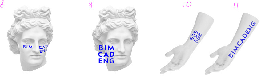
Designer: But you said number 1 was OK :-), should I have kept it as an outline? Or is the direction entirely wrong?
Art director: Number 1 was OK but you turned it into a hipster hexagon.
Designer: Should I develop the one with the fill or the outline?
Art director: See number 1.
Designer: Here are the options. Rounded Zyalva on the left, stretched Din on the right.
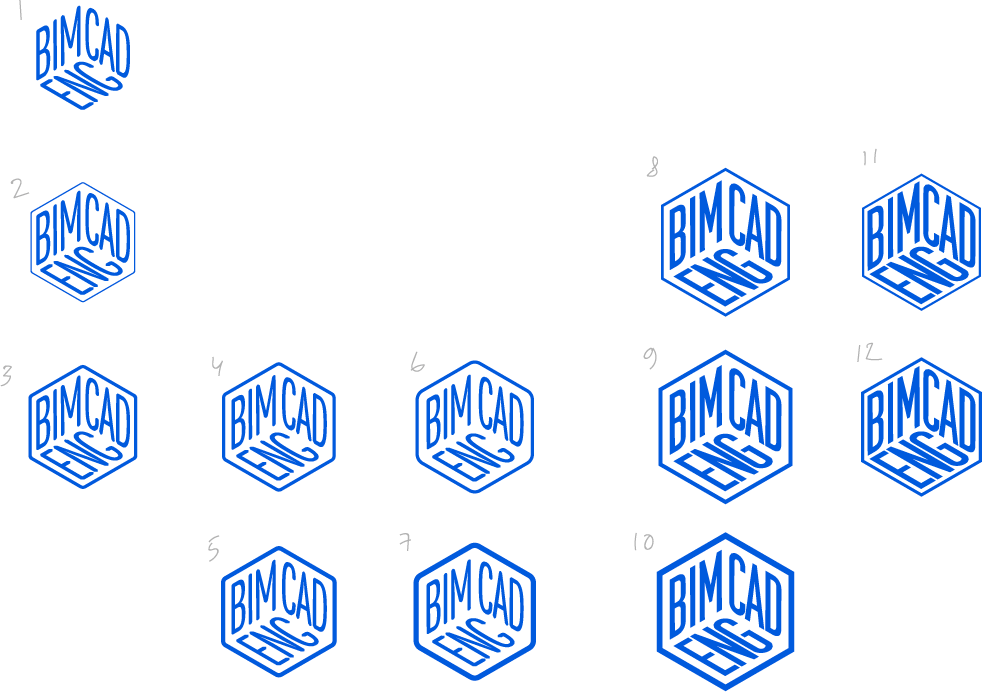
Art director: You can keep number 9 if we don’t have anything better. The rest look like dice.
Designer: More variations.
Art director: Something like 13.
Designer: Why “like 13?” Is it poor overall or in some details?
Art director: Well, I don’t see you getting a Cannes Lions award for this.
Designer: Maybe we can make it stronger by using different angles?
Art director: No, let’s try something else.
Designer: Here are some ideas. I still want to use a 3D coordinate system.
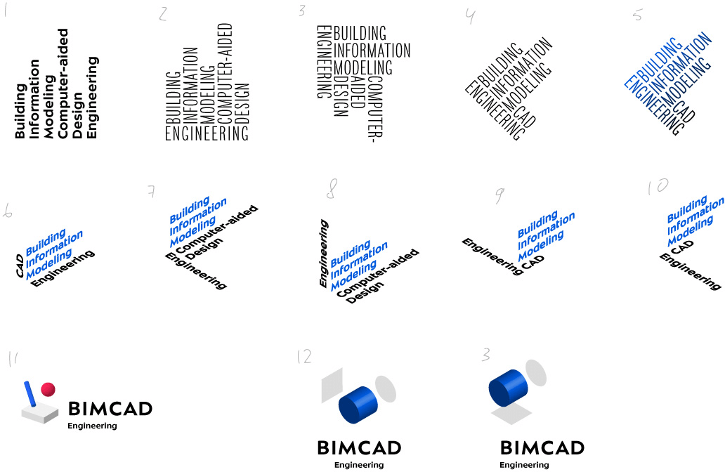
Art director: Let’s keep the company’s name as it is.
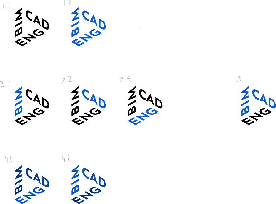
Designer: 1–2 have xyz coordinates, 3 is a Penrose triangle.
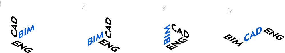
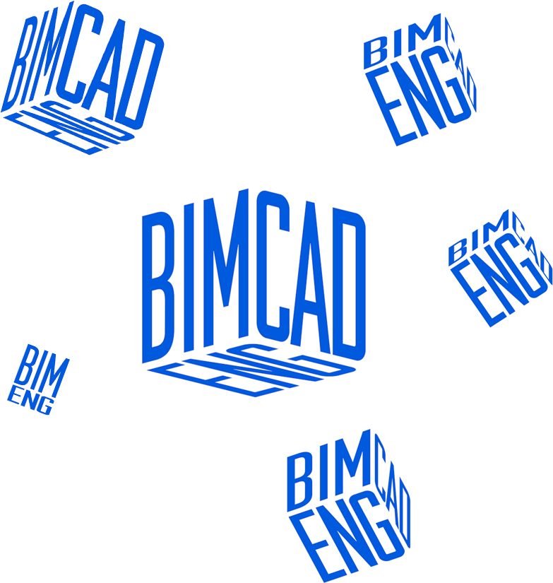
Art director: All right, let’s go with 3.
Designer: Evened the margins, worked on kerning and color.
Art director: 42.
