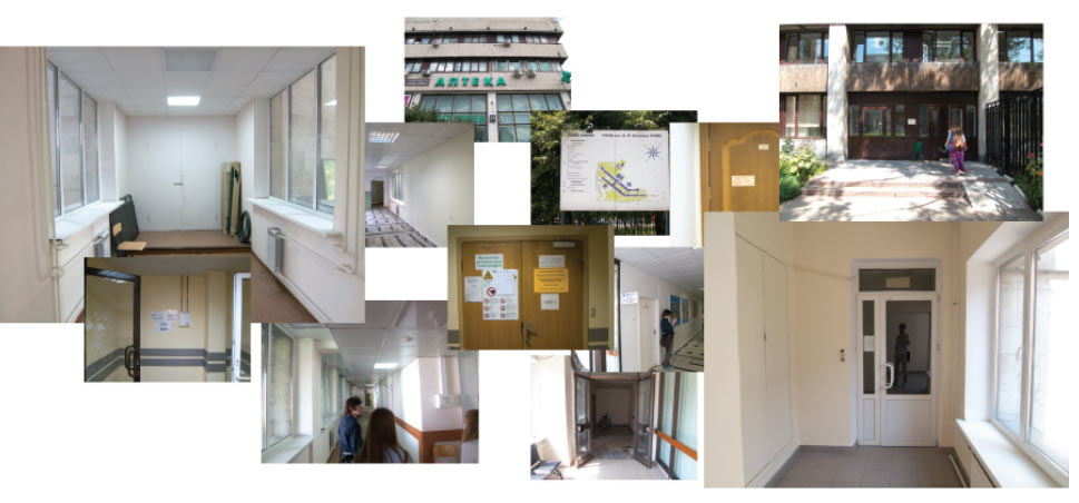
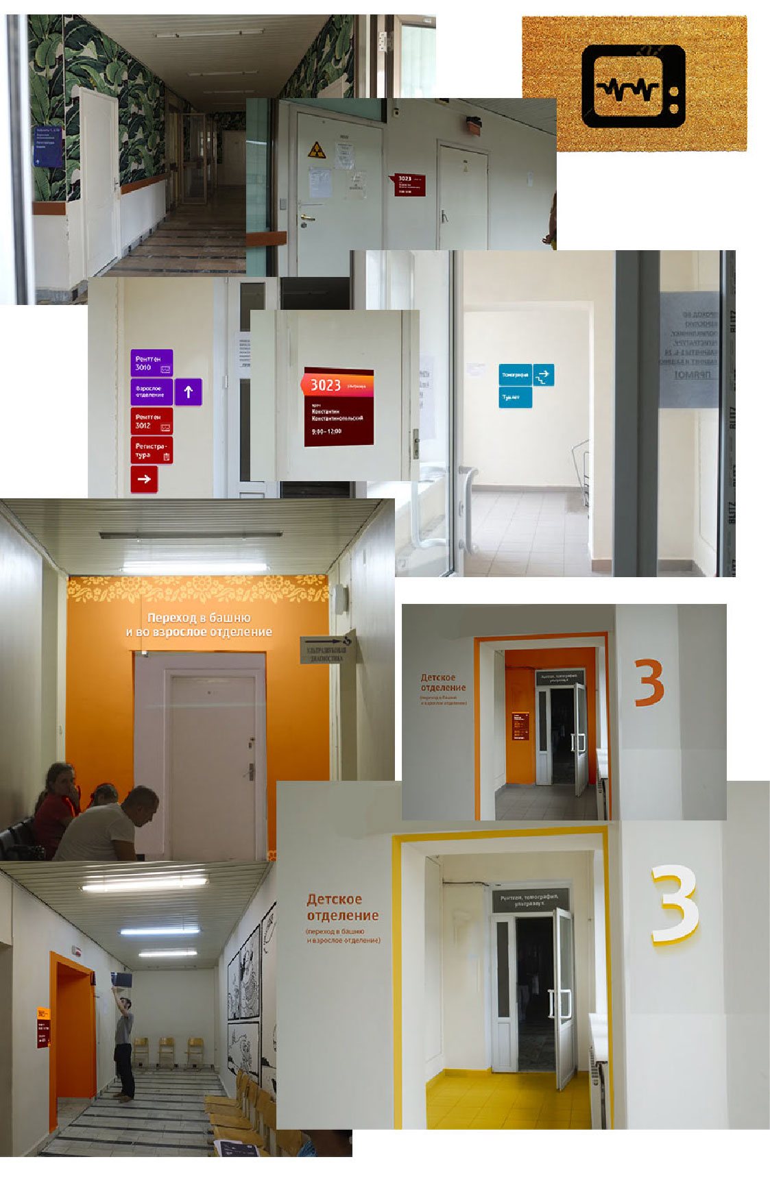
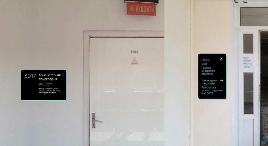
Going to the hospital’s children’s wing to get acquainted with the current situation.
Assembling the first draft.
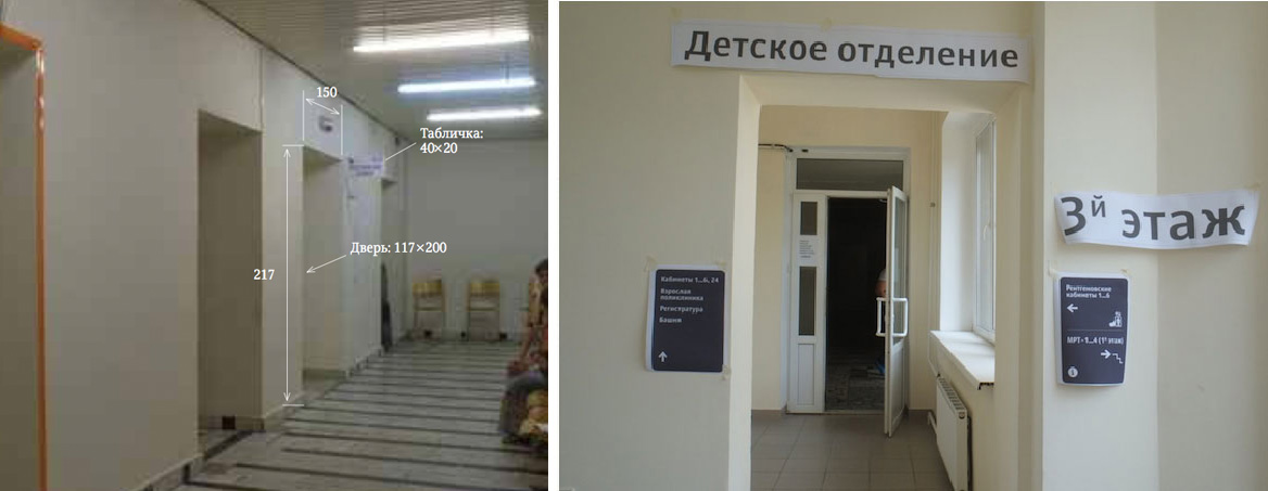
Taking measurements to understand constraints better. Trying out various typeface sizes.
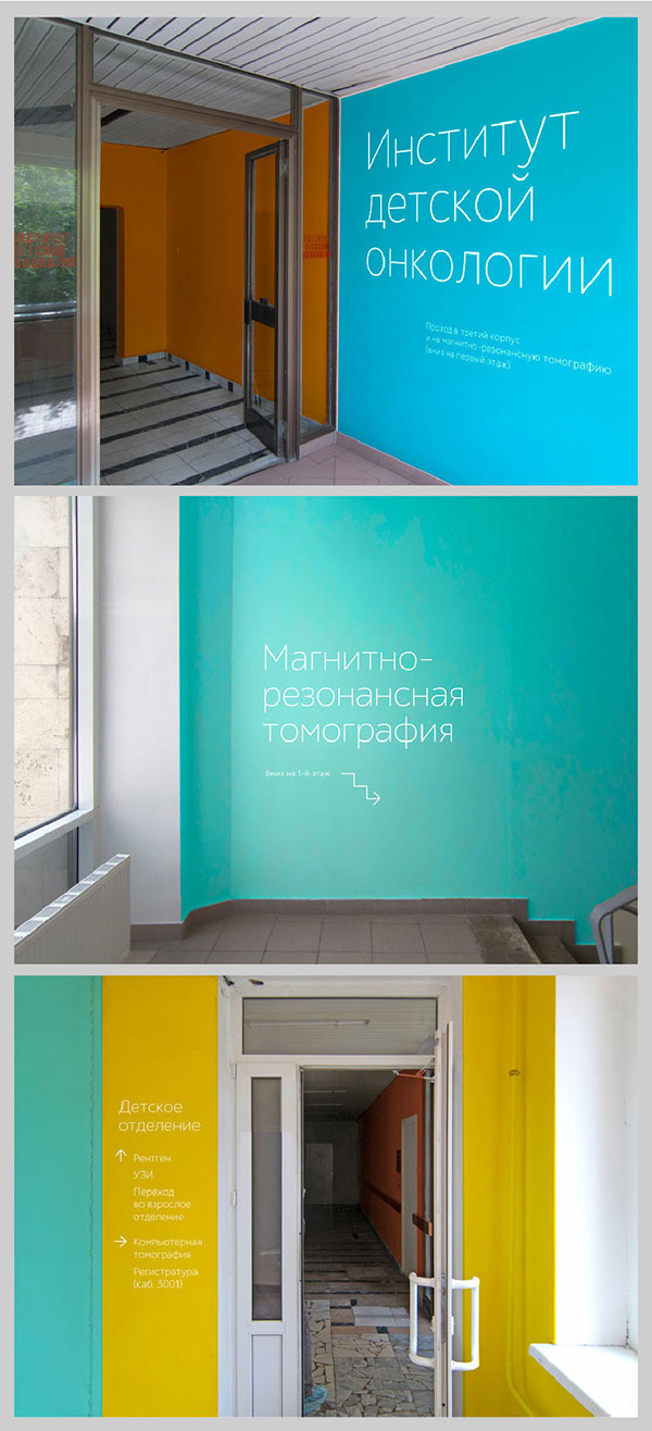
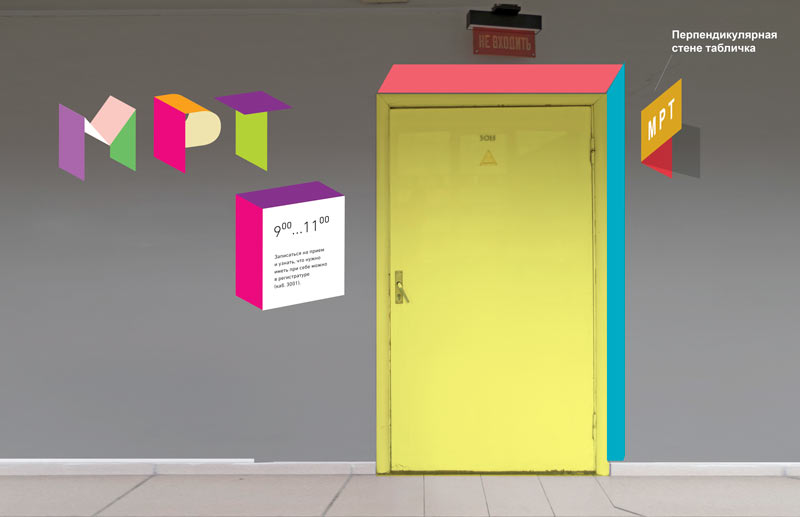
Choosing various formats and colors.
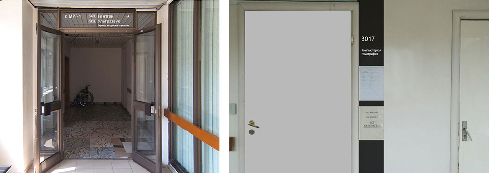
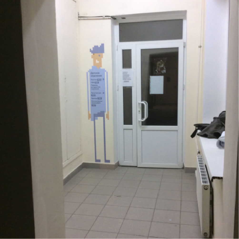
Colored outline around a door signifies entrance into a different wing.
Circles.
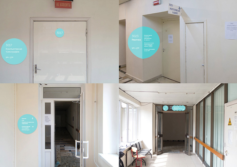
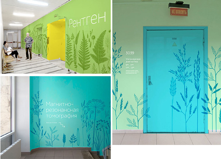
Colors.
Plants.
Regular signs.
Exploring a typography-based idea. Looks too complex for a children’s hospital. Discarding the idea.
Colored signs made of translucent glass. An interesting idea, but a bit too formal. Characters will look better, although it’s important not to make them look too childish.
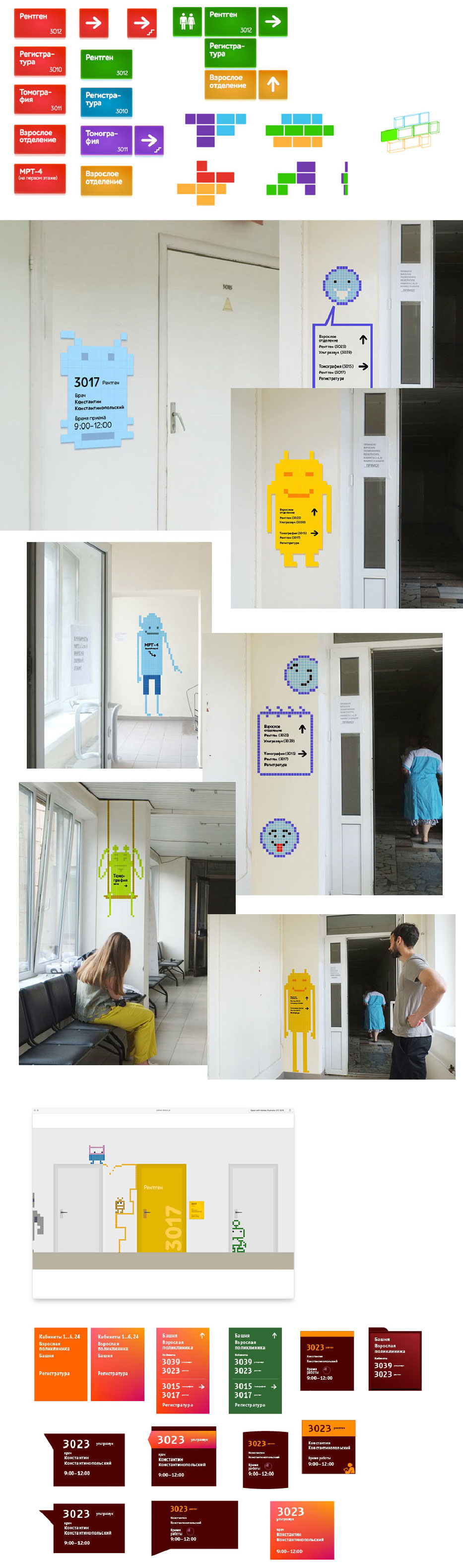
The client chooses pixel characters. Developing the direction and choosing a theme.
Pirates conquer robots.
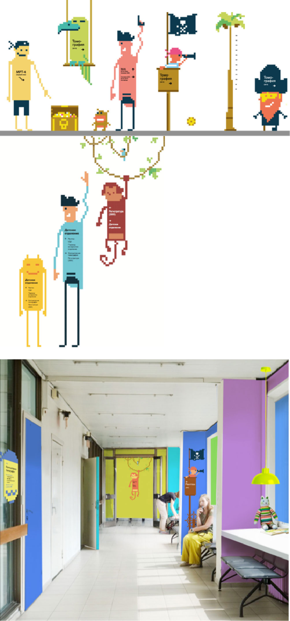
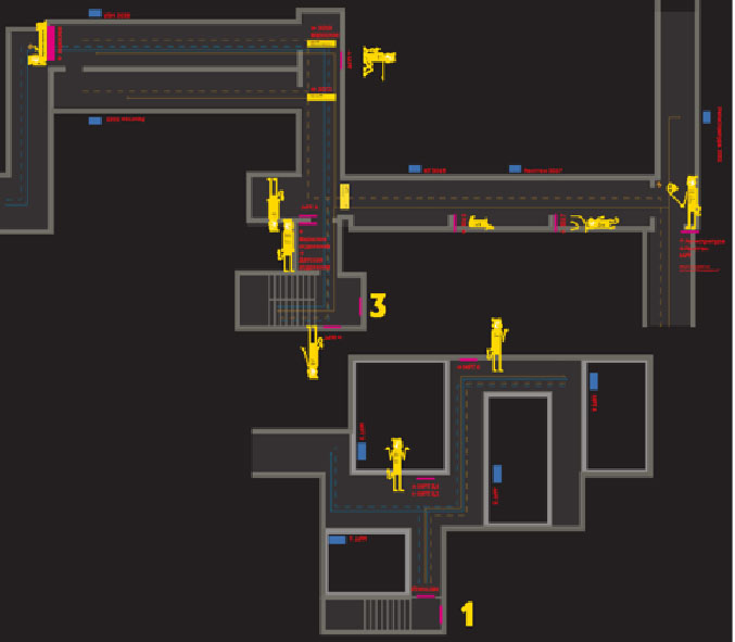
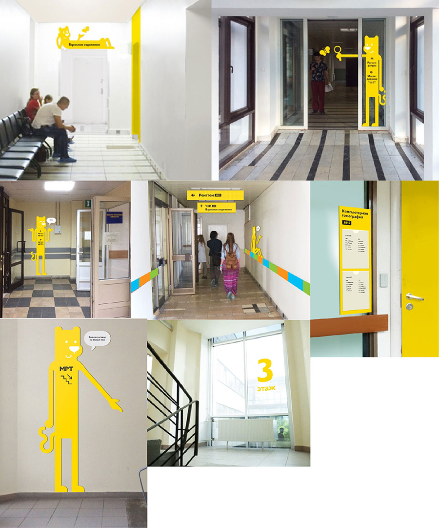
Trying it out and testing how the characters look in the interior. Rooms open for visitors are marked yellow.
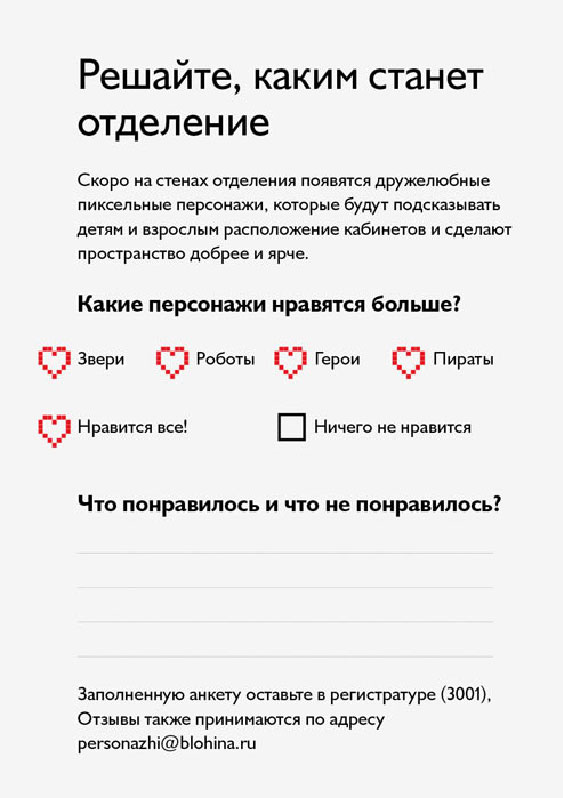
Creating a survey flyer.
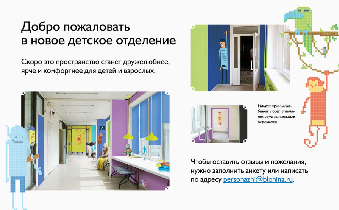
Preparing a poster notifying about impending changes at the hospital.
Trying out floor numbers.
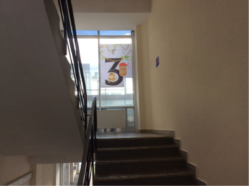
The number looks too big for such a small distance, we can make it smaller.
Studying visitor movement patterns, drawing conclusions.
There is lots of small text which is difficult to read. Visitors see the media not as elements of navigation but rather as illustrations.
Decreasing the amount of information, making the images simpler. Drawing new characters, as monotonous pirates are sometimes difficult to recognize.
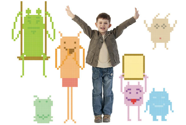
Exploring another idea with animals.
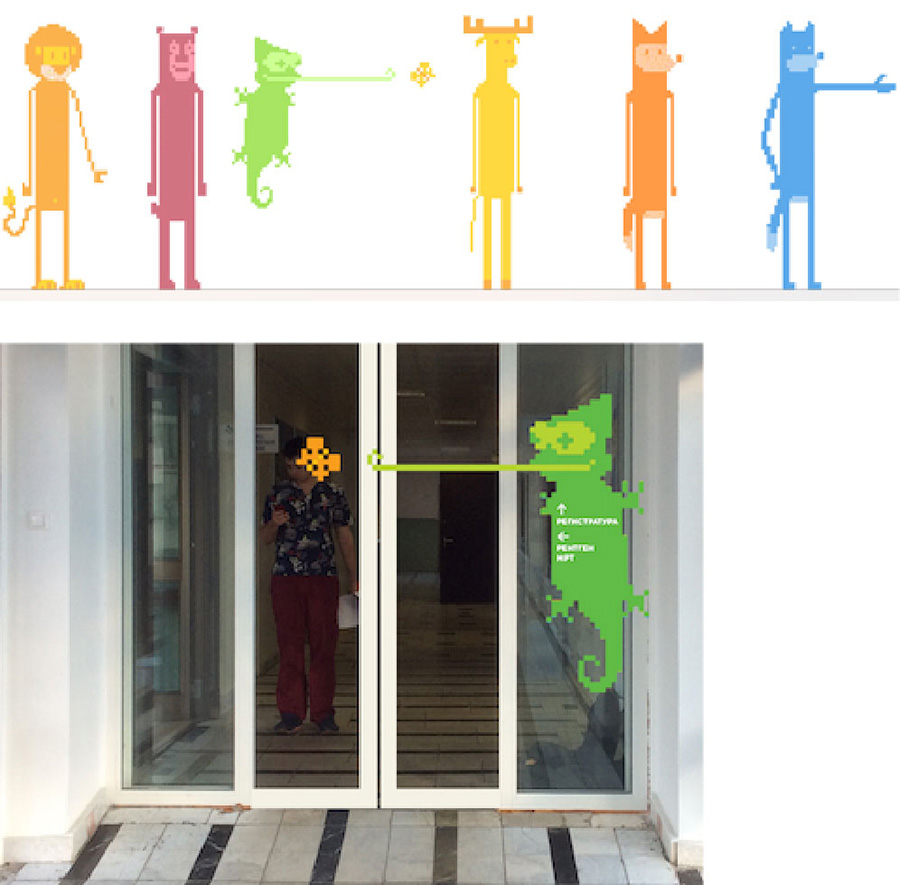
Animal characters are great. We get the feeling that letters may appear as color blobs. Making yellow the primary color of the navigation system, which matches the color of rooms that patients can access. Besides, yellow and black create a nice contrast and better legibility, this will help older people who frequently visit the wing.
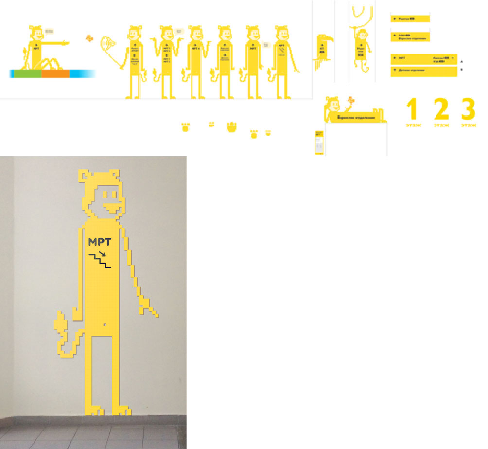
Empty areas look weird, making them white.
Creating a model of a sign.
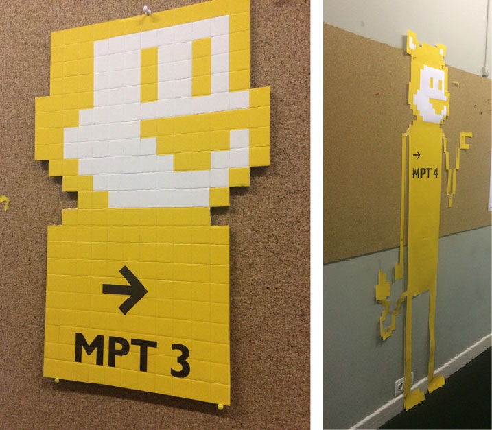
Artistic director: Remove the pixels, they add nothing to the result.
Coming up with designs.
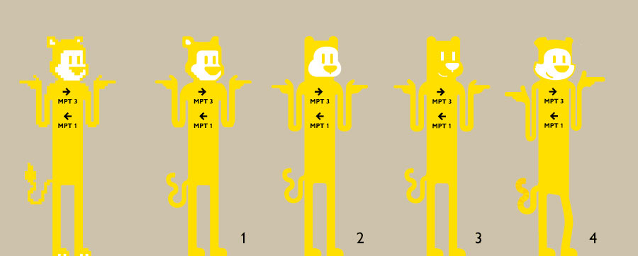
The artistic director chooses number 3.
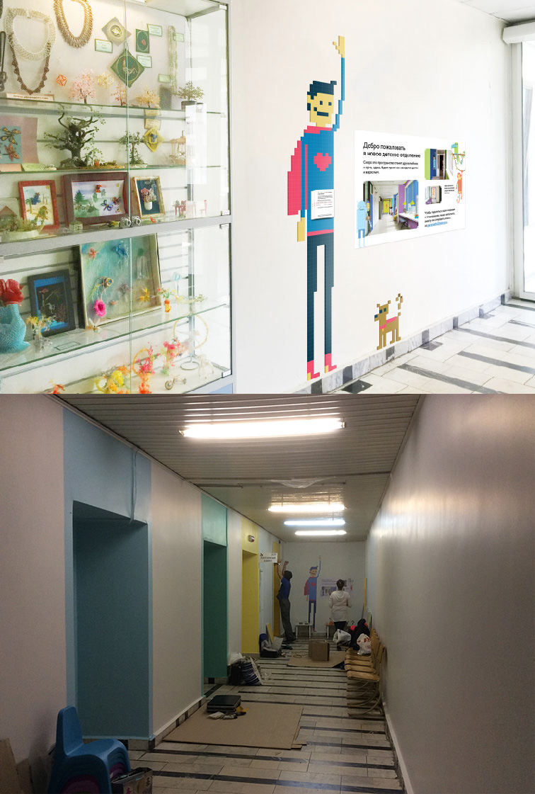
Testing on other media.
Preparing mock-ups and a placement diagram.