Bank Saint Petersburg needed 12 illustrations for their calendar and Facebook posts.
Starting to work on the first drawing.
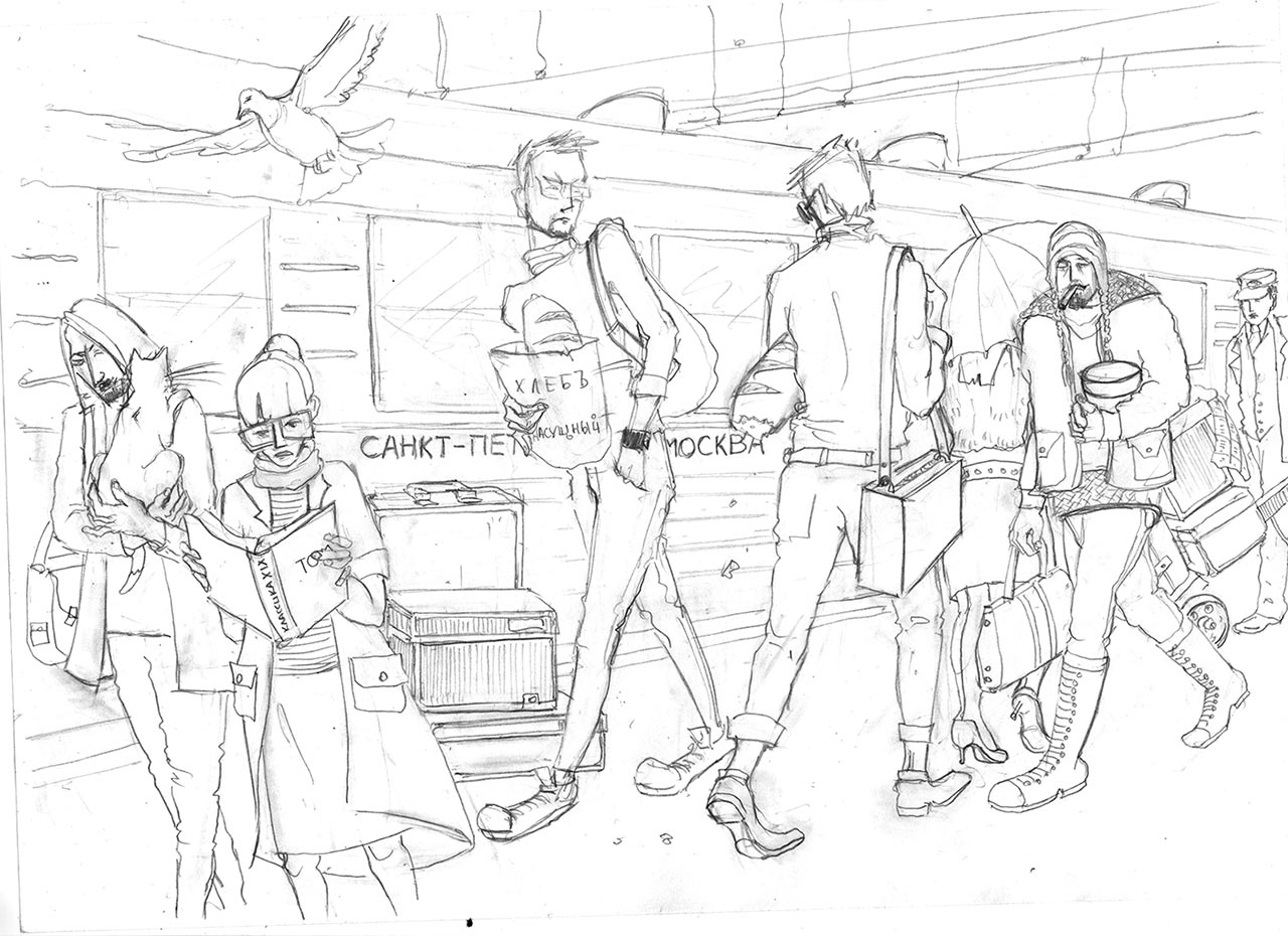
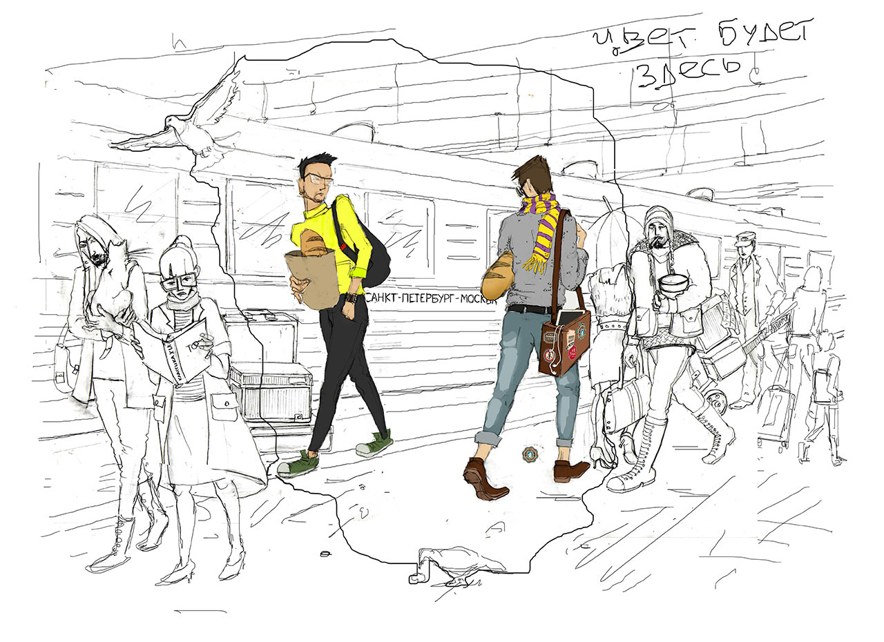
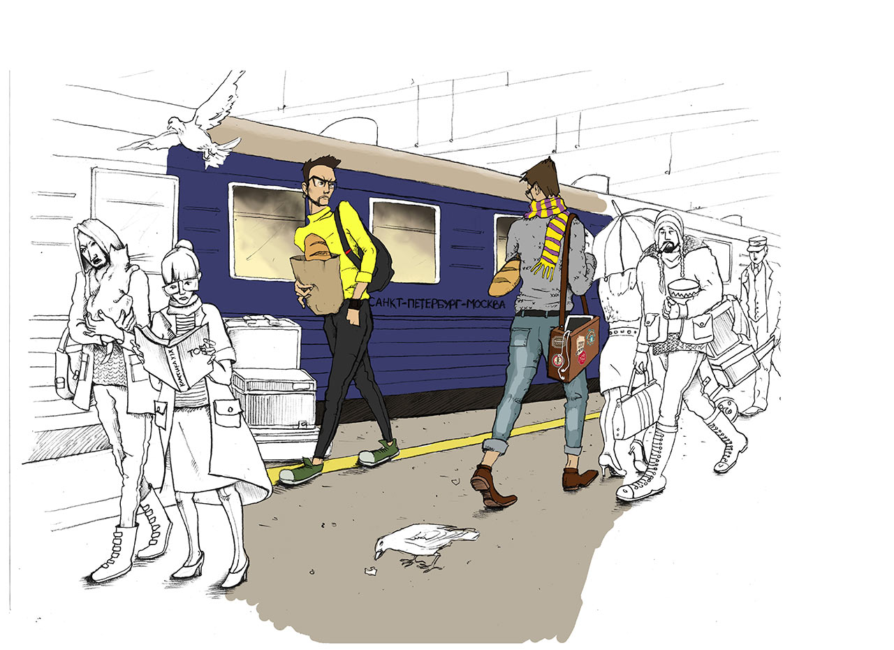
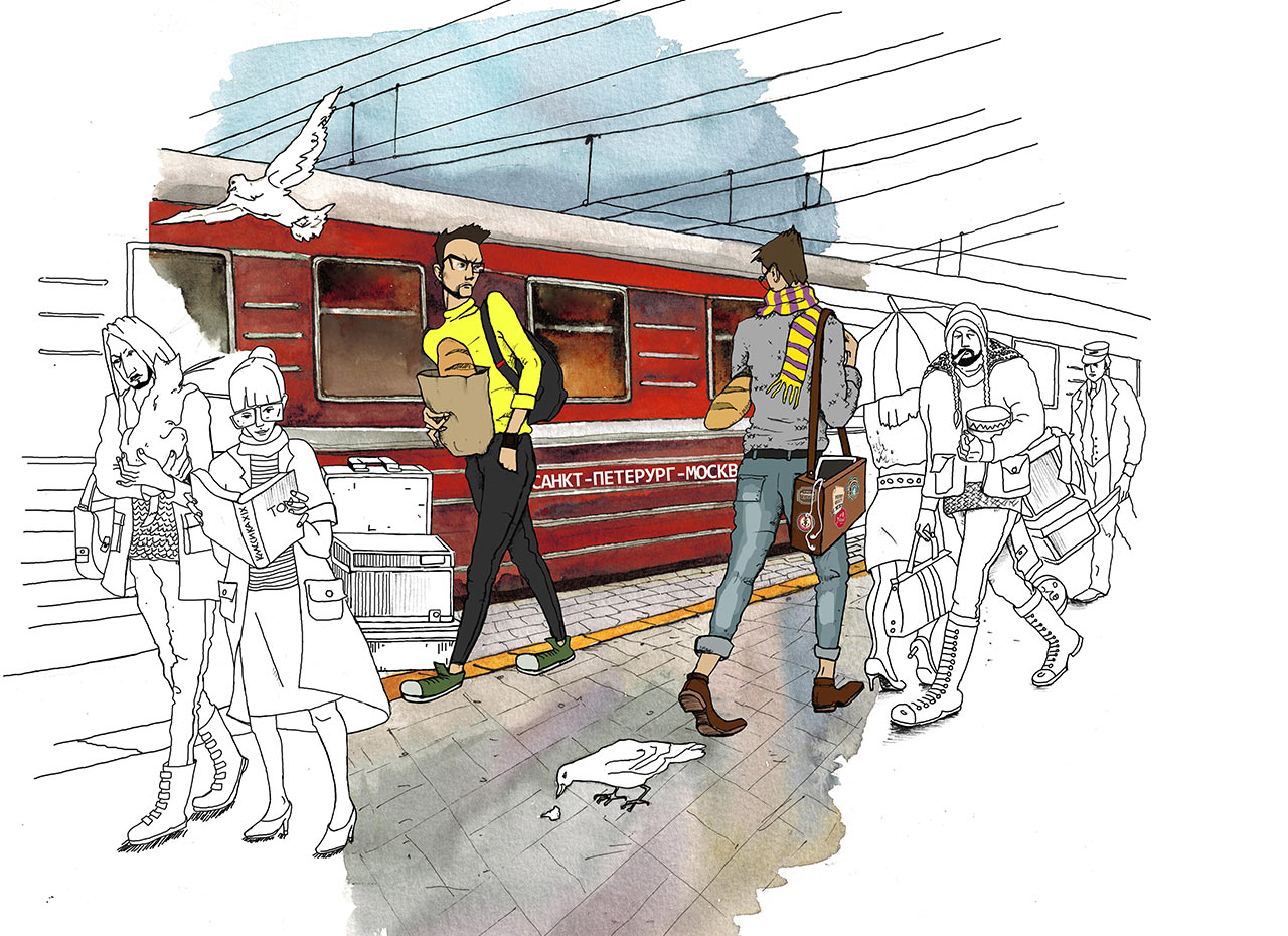
Trying to show the difference between Moscow and Saint Petersburg residents. The Moscovite is to the left, looking nice and sharp, wearing a tight-fitting turtleneck and Converse shoes. Of course, he has a loaf of bread in a bag and a posture to match. The Petersburger on the other hand carries his loaf under his arm, got a scarf and a bag covered with stickers. They meet each other by the Moscow—Saint Petersburg train.
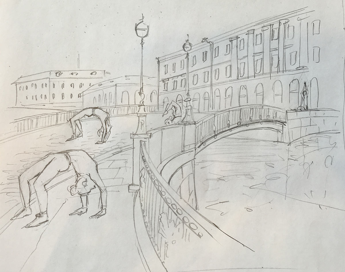
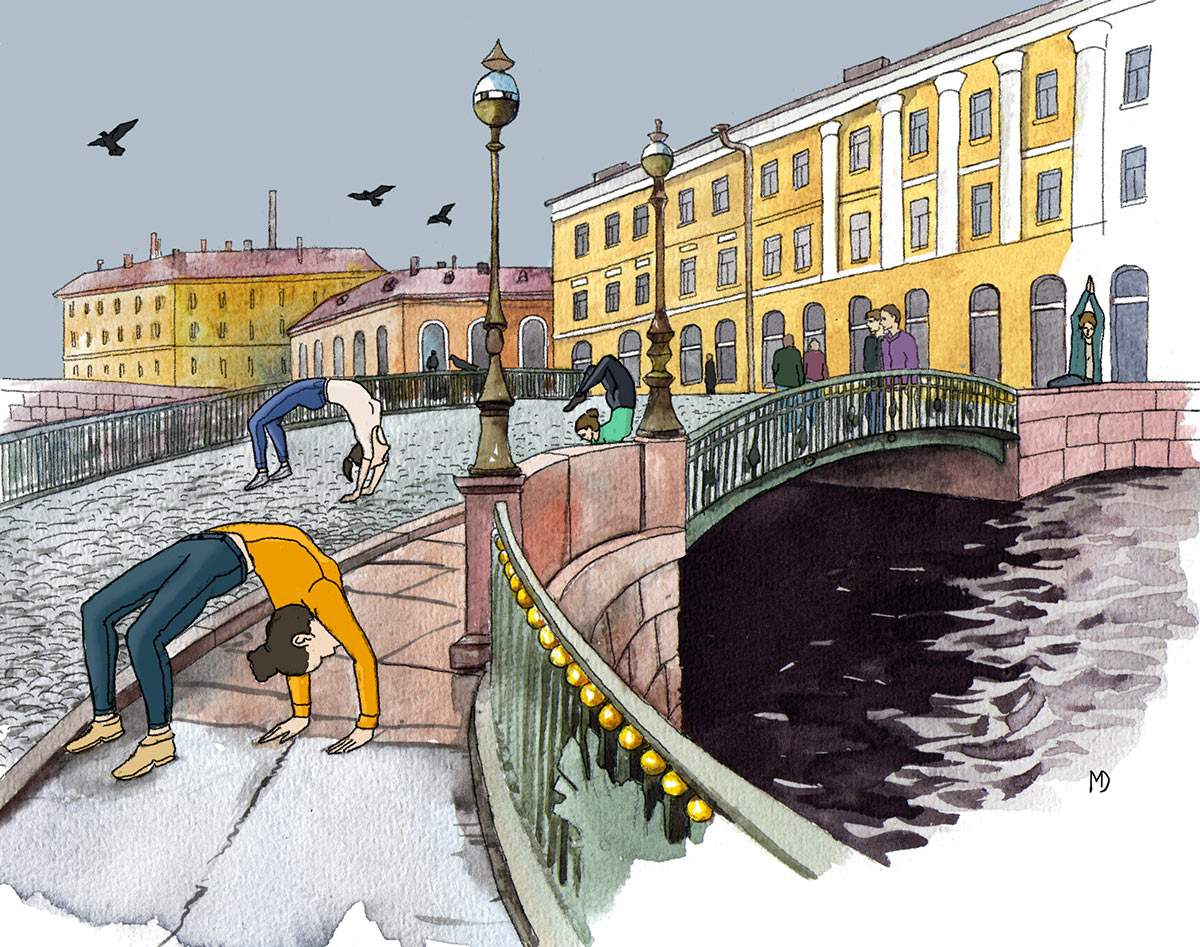
The second illustration is about yoga. People in Saint Petersburg love yoga and practice it everywhere. Changing the picture many times over: the client, the art director and the illustrator keep finding something wrong with it.
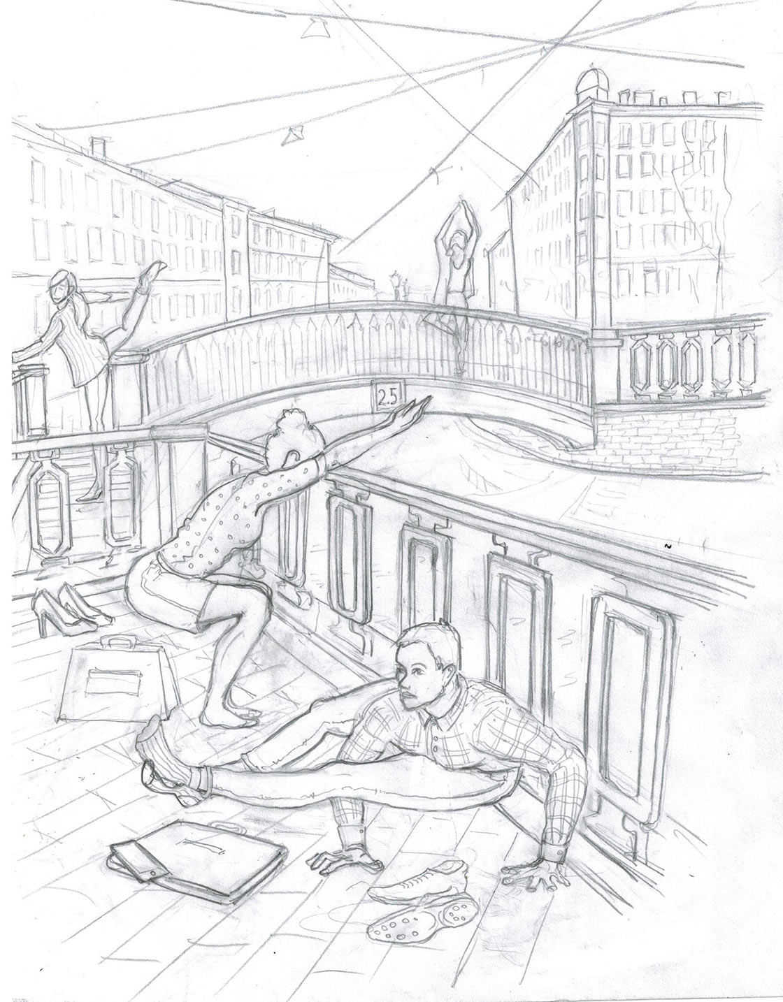
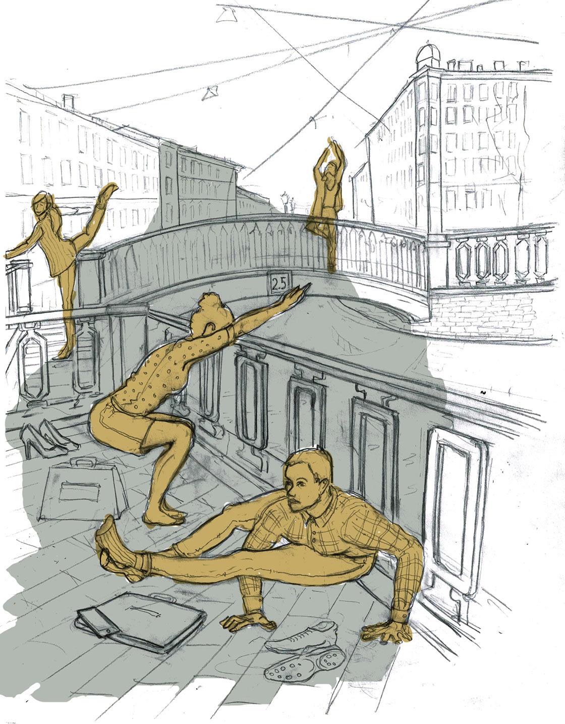
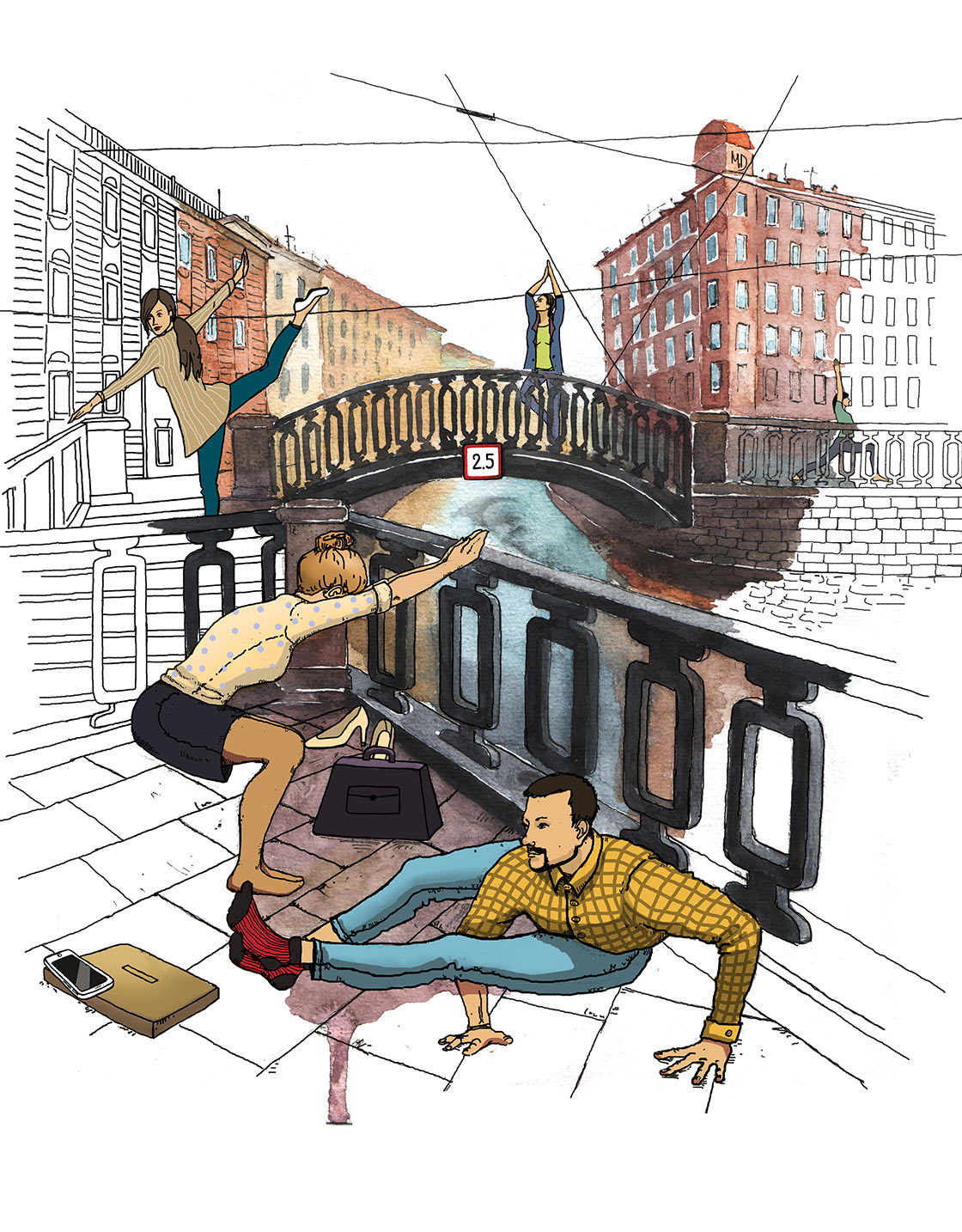
Changing the background, changing the people. But the bridges remain.
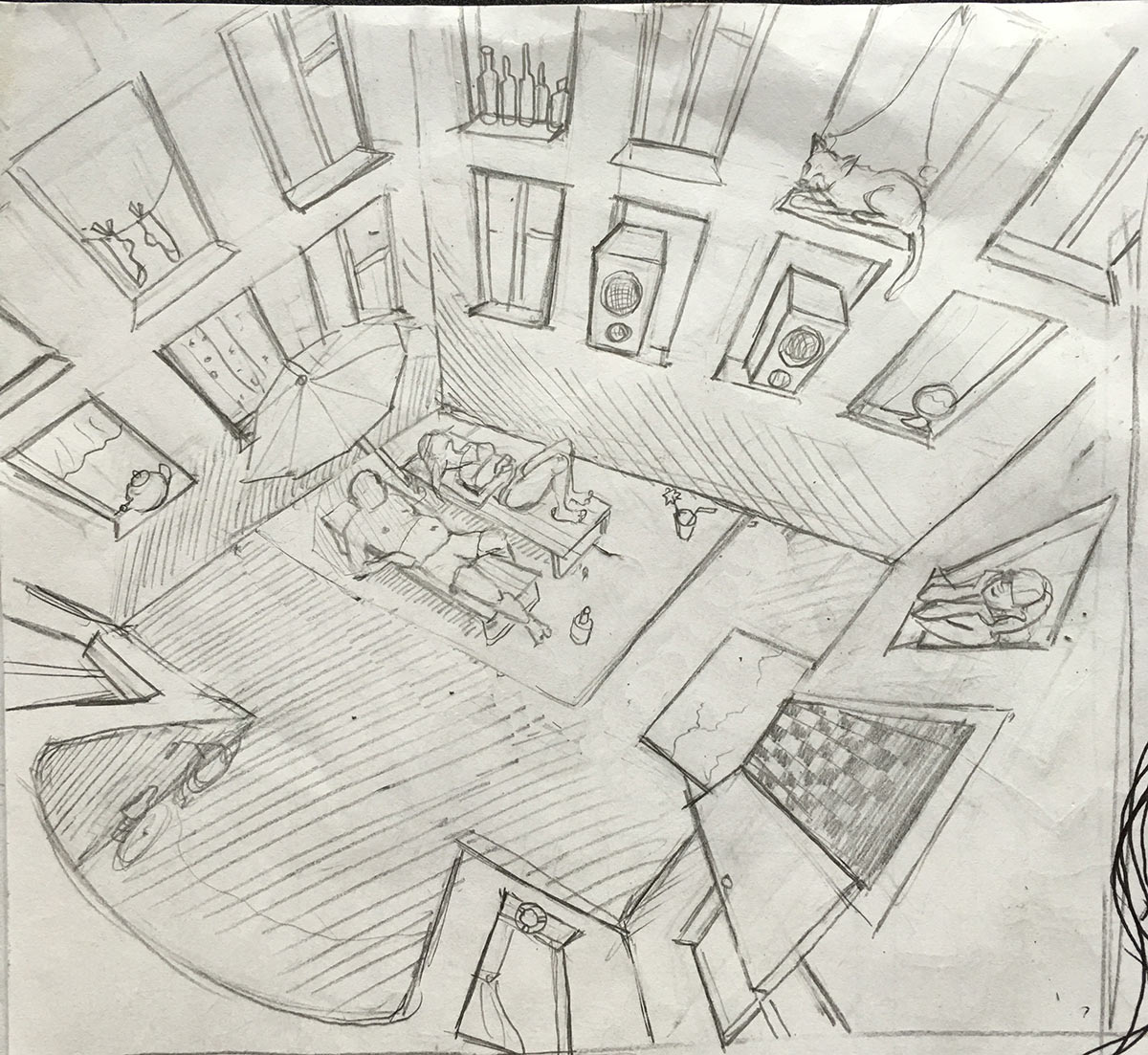
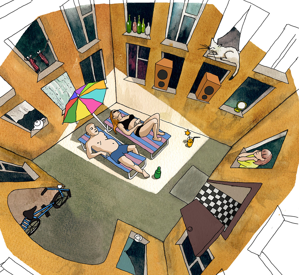
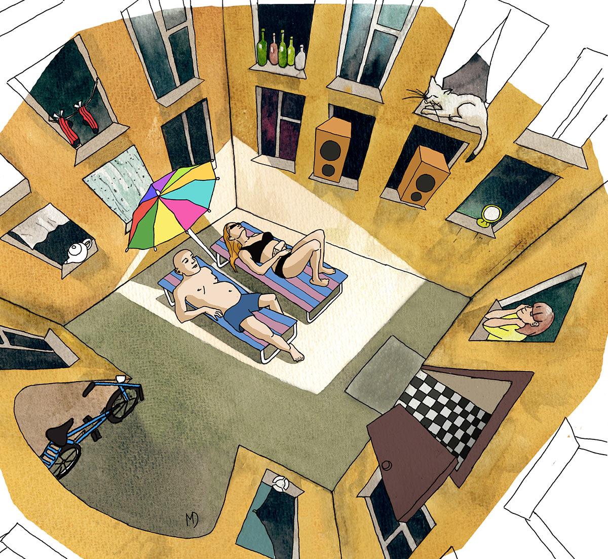
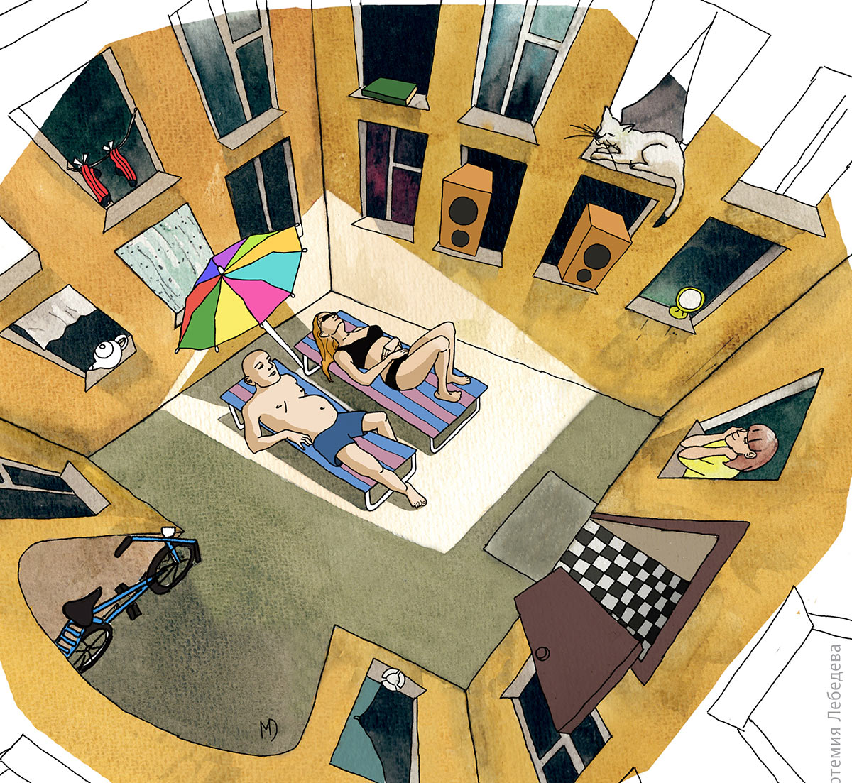
The courtyard illustration is about the fact that there isn’t enough sun in Saint Petersburg and locals have to find ways to manage. For example, like this.
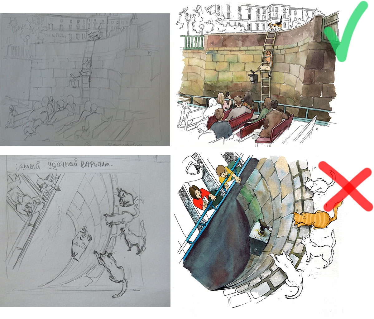
The next one is about the Chizhik statue. Cats try to hunt the bird. Trying several designs and choosing the final one.
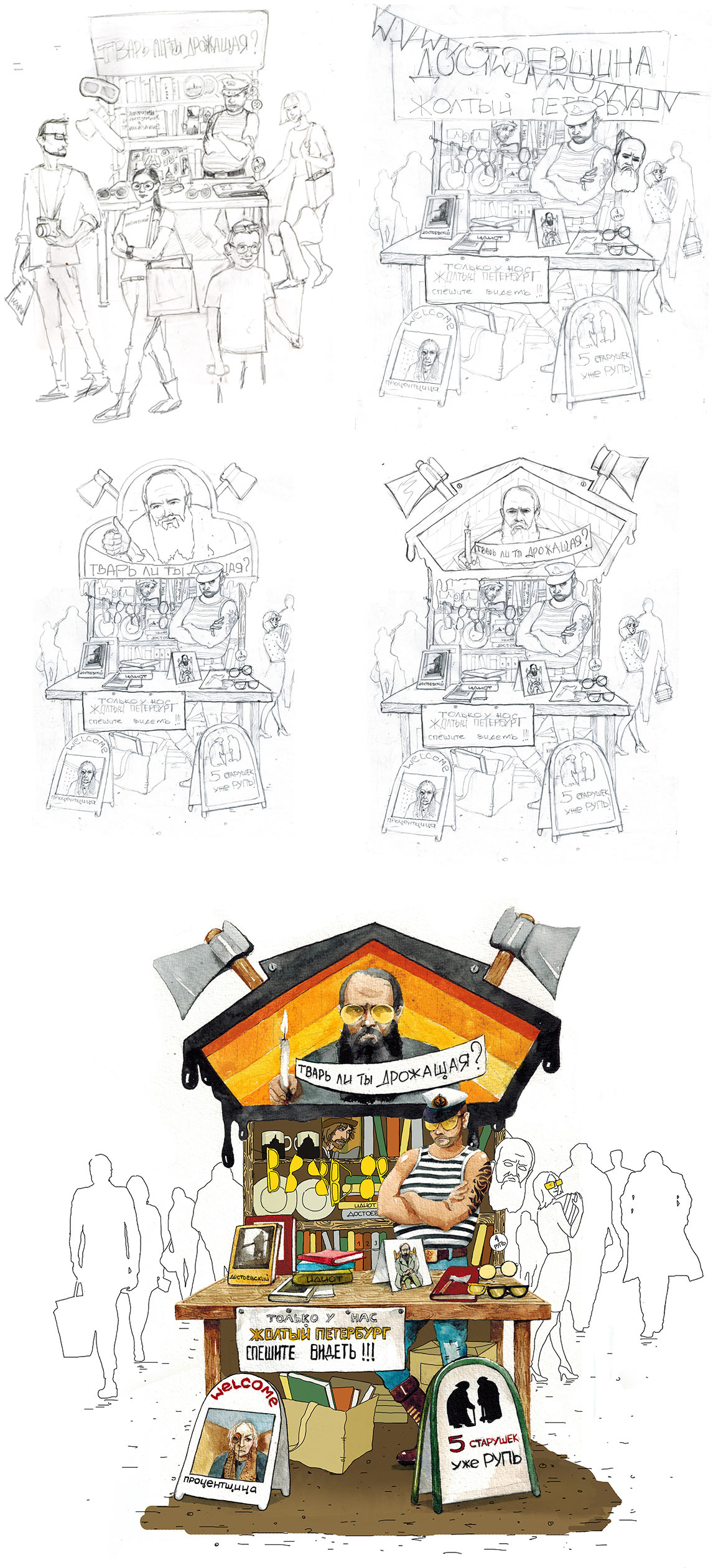
The kiosk illustration is a joke on classics. Taking a specific writer with his interesting color yellow and making a play on it.
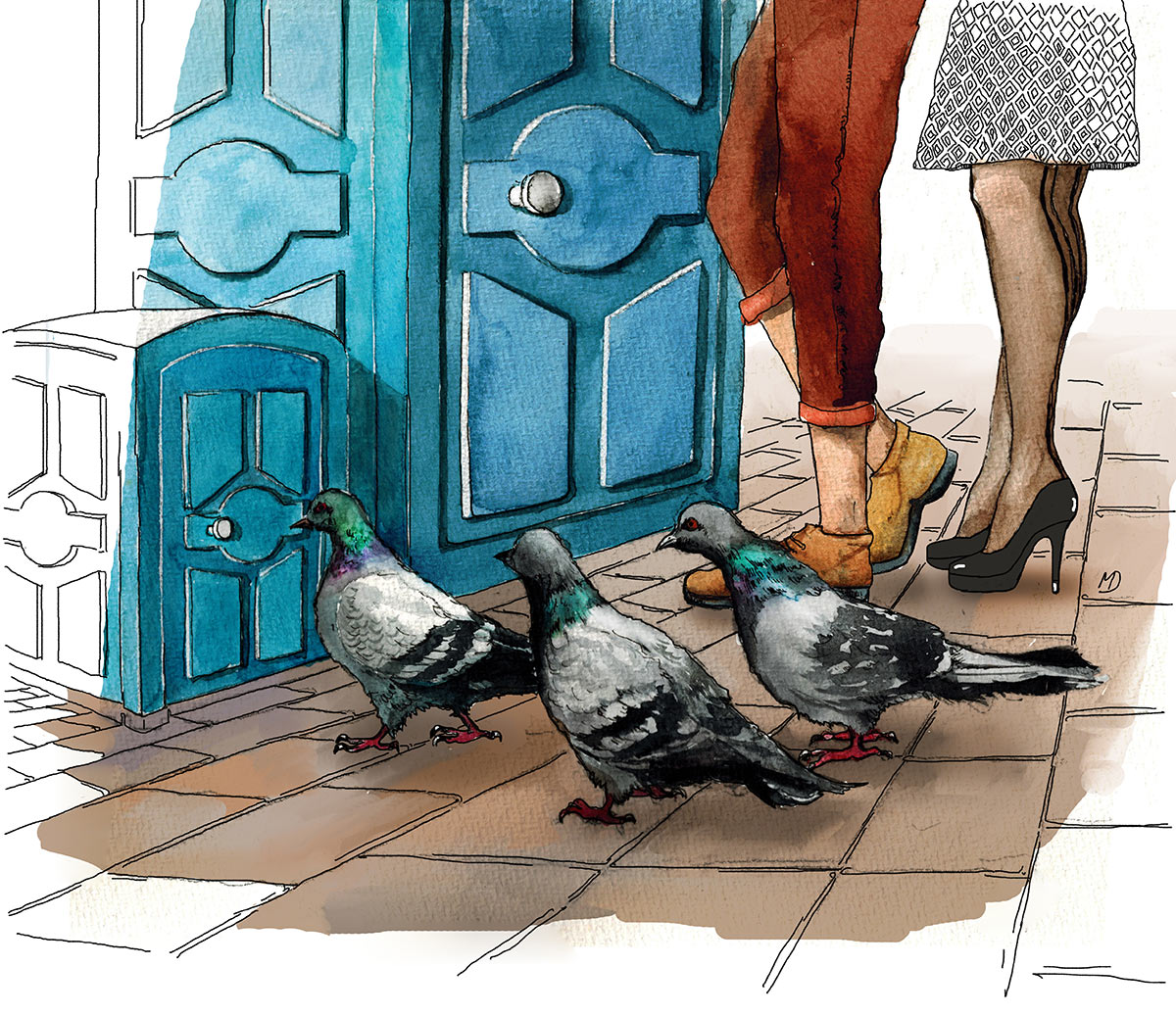
Even pigeons are very cultured in Saint Petersburg. They use their own pigeon toilet, not poop on windshields.
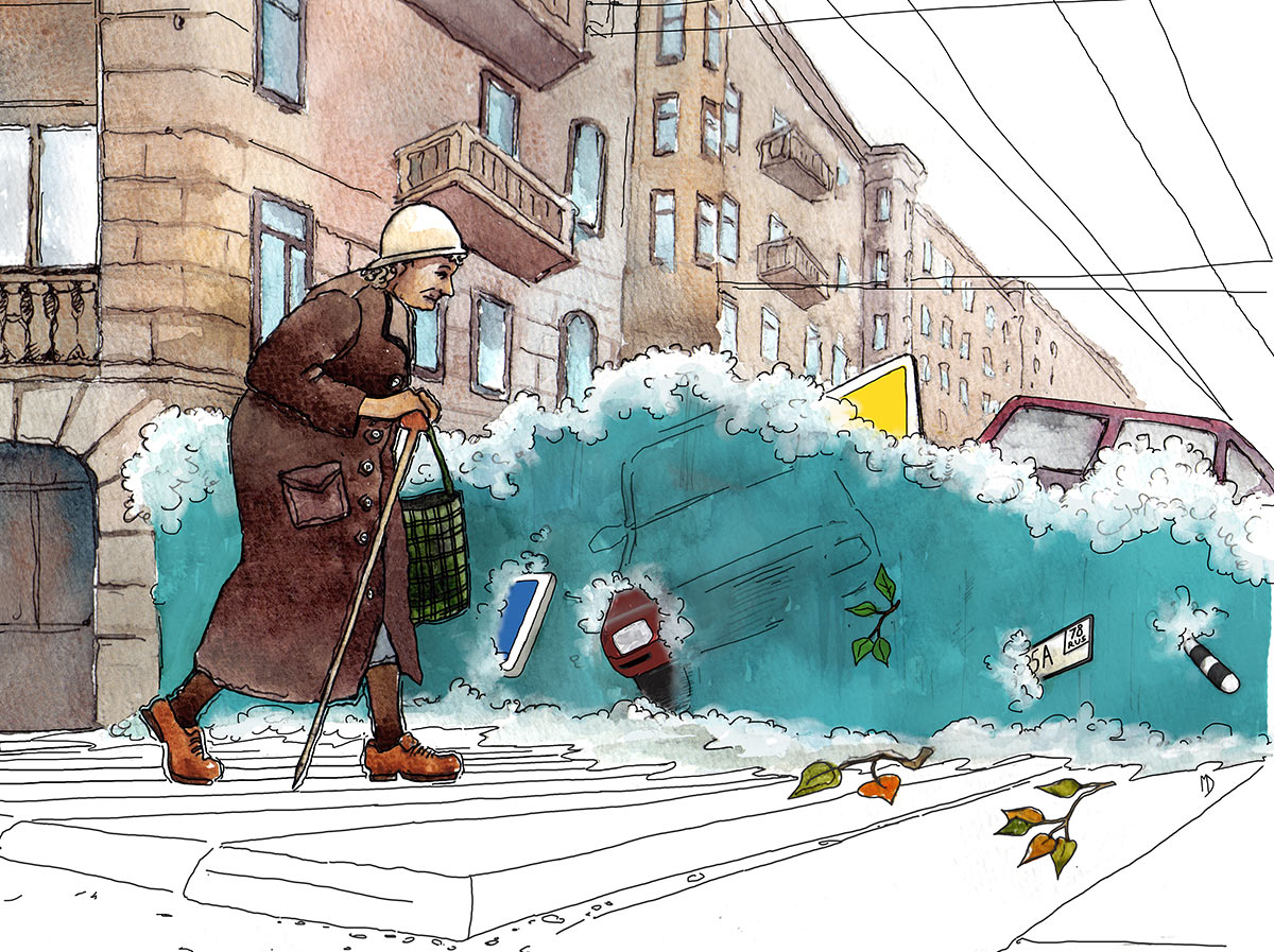
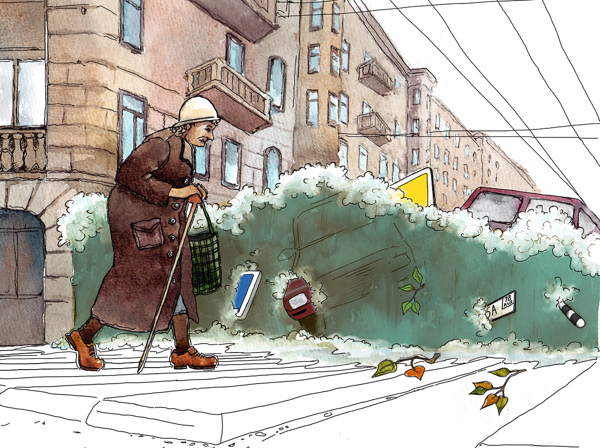
The flood is also polite and tactful. If there’s a grandma crossing the road, of course it will let her pass. We really want to make the water a nice turquoise color but after adjustments and comments that Neva river never had and never will have this color we end up choosing the natural swampy shade.
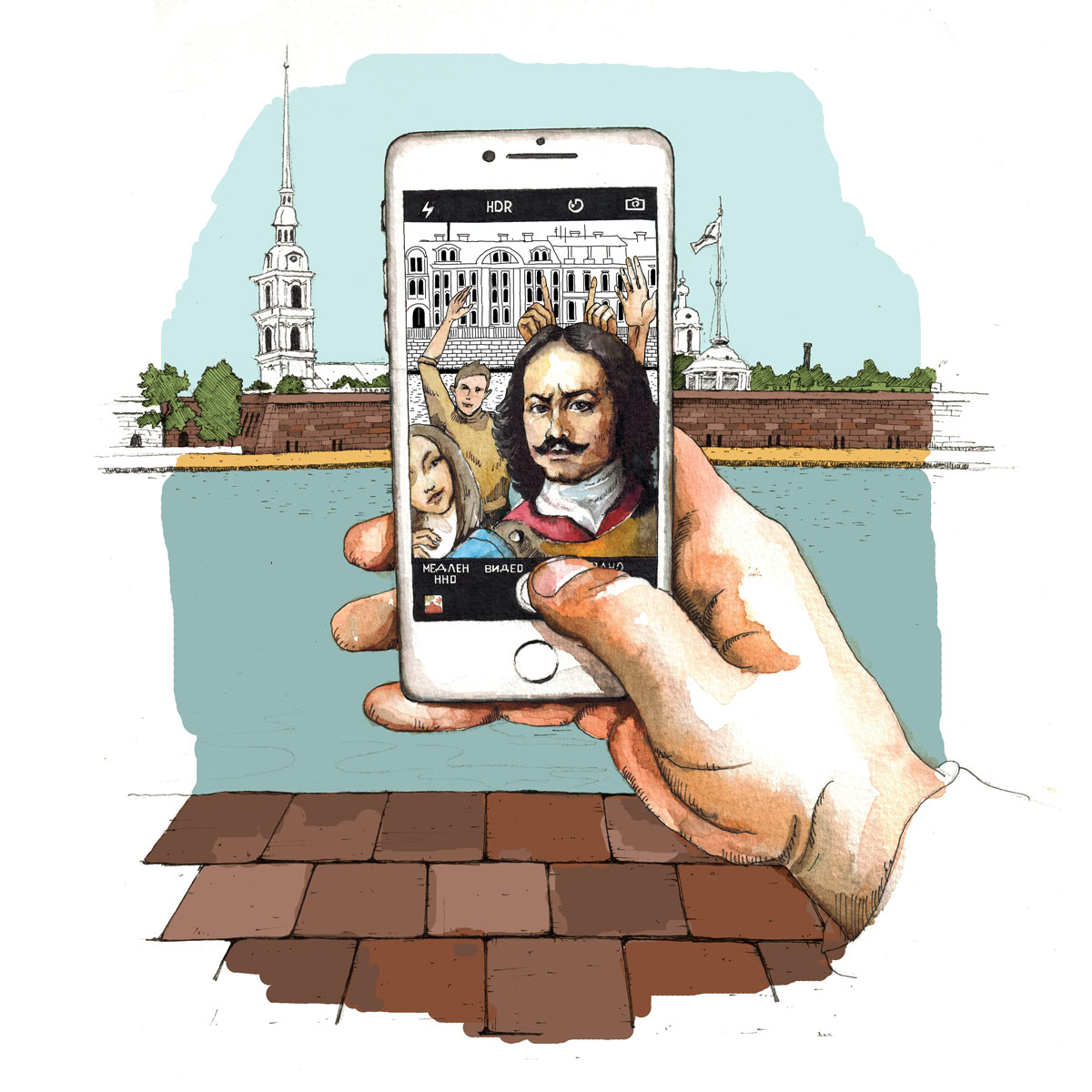
Of course, no way we can do this without Peter the Great. Rotating the iPhone in a bunch of different ways but ultimately deciding to go with the vertical orientation. Peter makes a selfie with the beauty of Saint Petersburg as background.
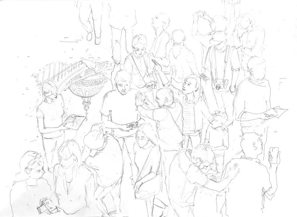
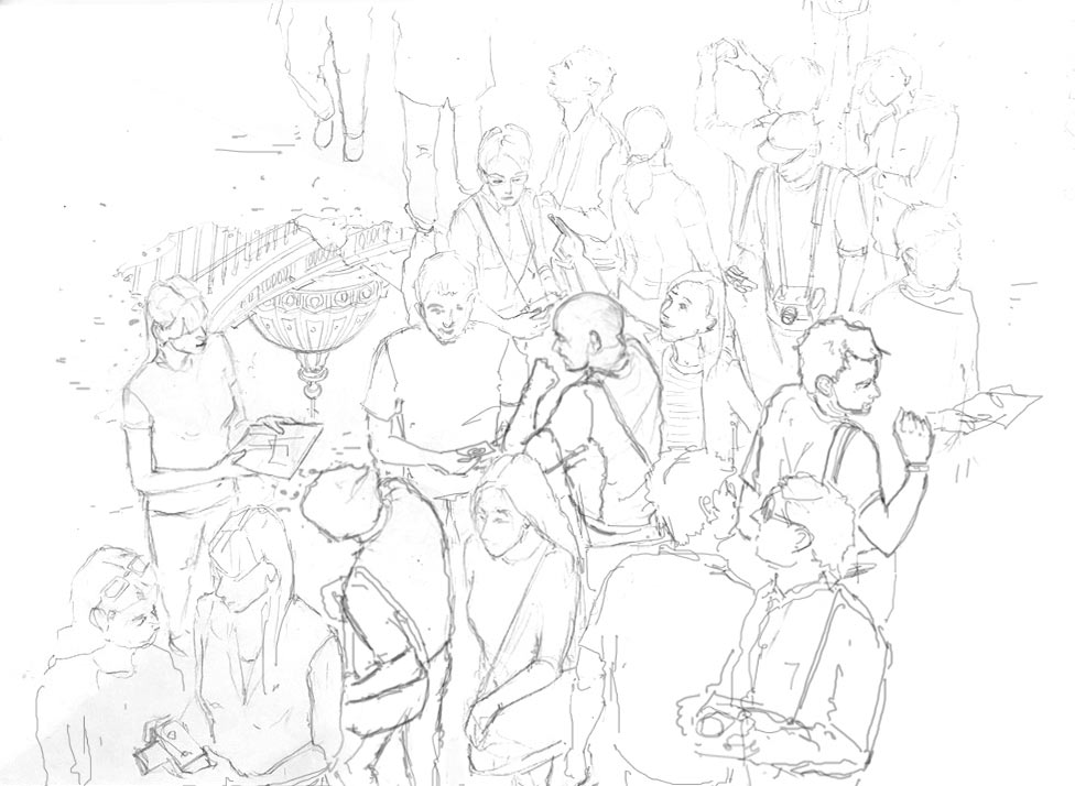
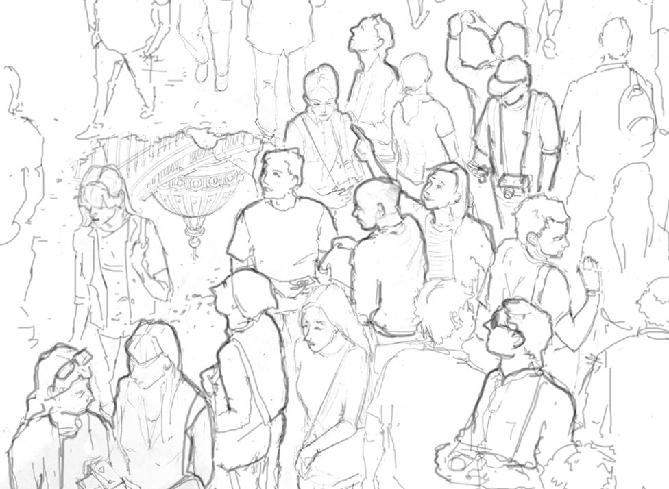
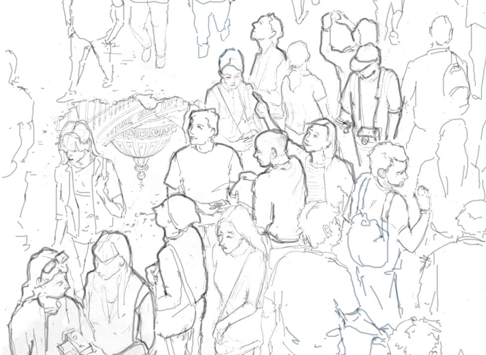
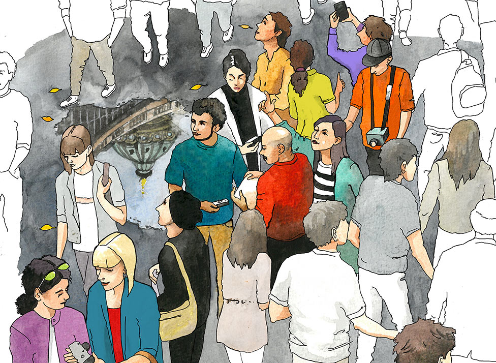
Tourists! Trying a bunch of ideas. The Tourists folder gets two subfolders, each with 10–15 versions and alternatives. The general idea is this: a crowded place, tourists all around, they are happy, smiling, taking photographs and eagerly looking around. And there are locals who try to go through, hurrying on their errands. First, we can’t find a proper location. We try the Palace Square and Kazan Cathedral. Deciding to use the Cathedral but reflected in a puddle of water. The main problem is to decide who to highlight with color and who to keep as a black and white outline. Deciding to draw all tourists in bright colors and keep all the local residents in outline or drawn in bland colors.
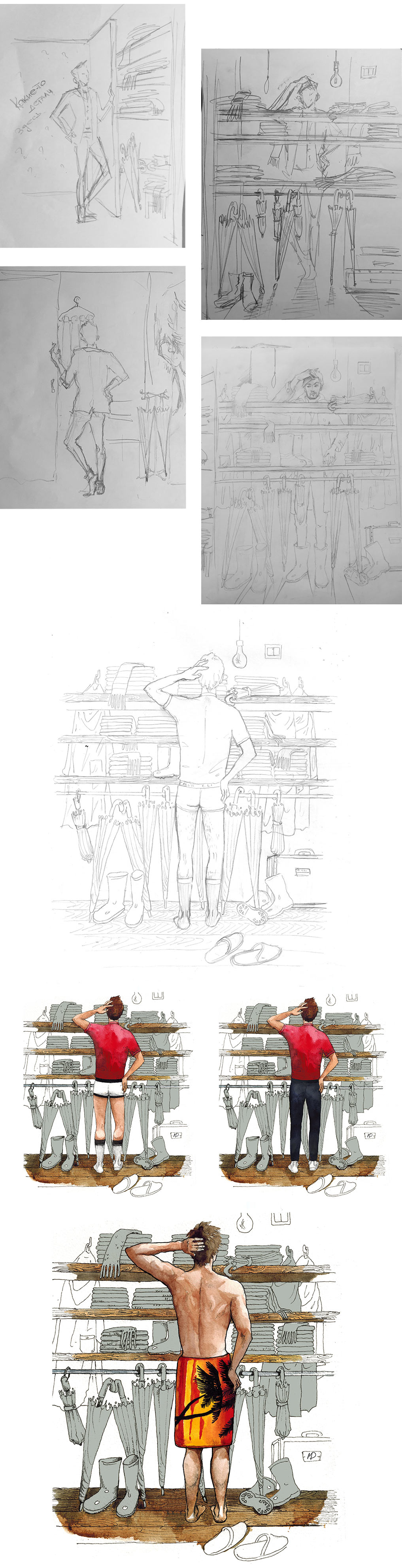
The closet illustration is also about weather, the situation where most of your closet space is taken by umbrellas, scarves and rainboots. Considering the character’s clothes. The client is confused by the underwear, then the towel. Giving the guy pants and socks but at the end deciding to keep the towel with palm trees.
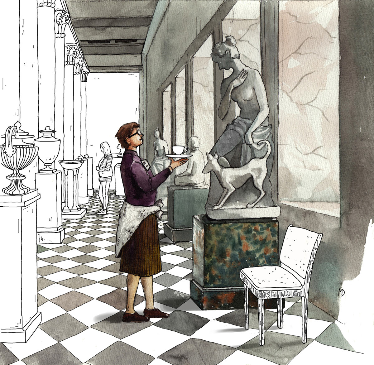
No way around the Hermitage either.
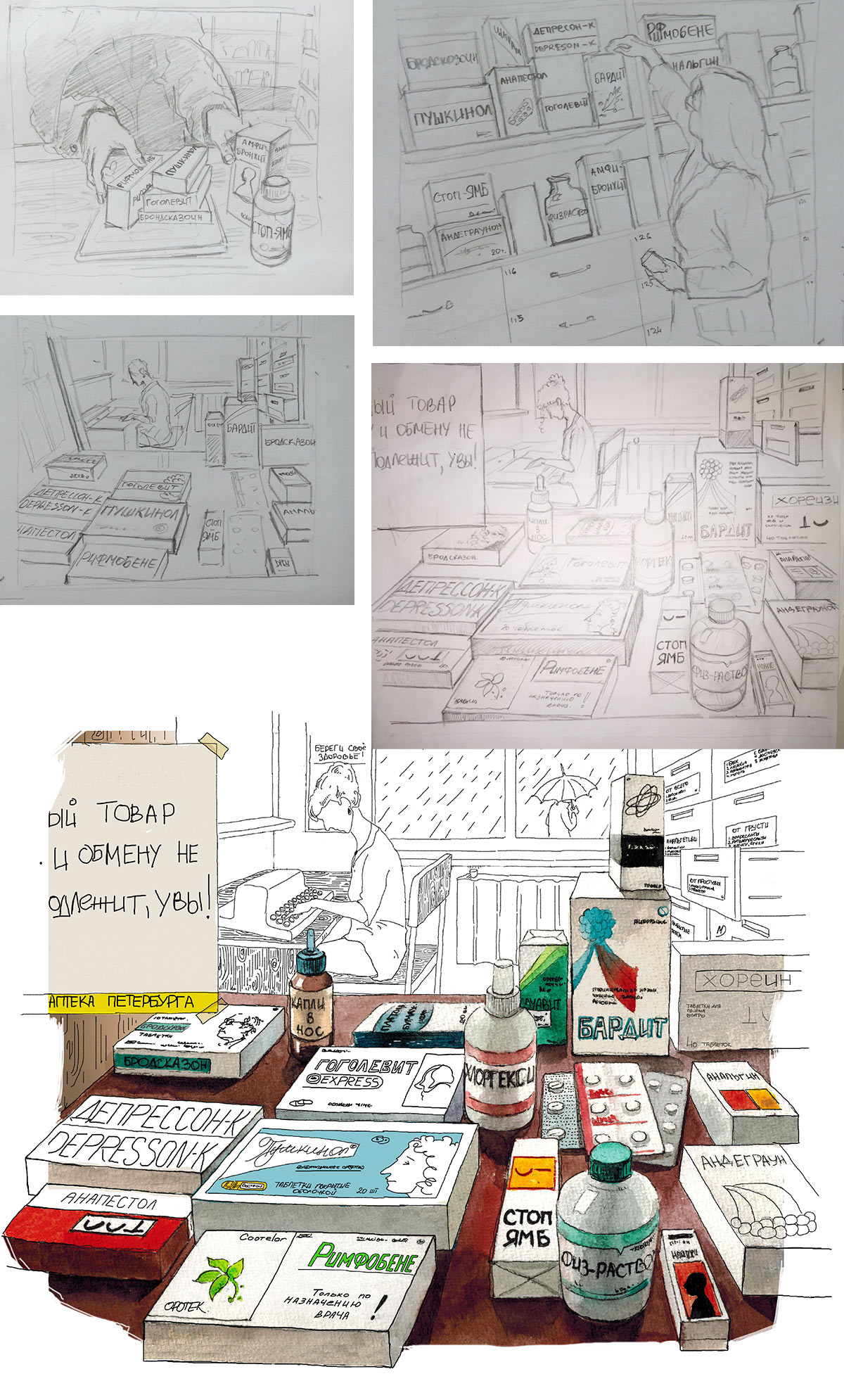
And finally, the pharmacy. Connecting drug names with classic Russian authors: Bardit, Gogolevit, Pushkinol.