Client: BurgerKit is a burger shop. The whale in the name does not have a semantic meaning but rather an emotional one, simply because it’s big and happy. We operate in a market segment called fast casual. Which is to say, our meals are fast, of restaurant-quality, and are reasonably priced. Taste and quality are our main priorities which is why we make almost all ingredients (buns, burgers, sauces, etc.) at our own kitchen using original technologies and fresh products with the shortest shelf life. Another story about us is the atmosphere of “warm minimalism” which is expressed in interior design and low-key service. We don’t have a niche positioning such as “burgers and beer” or anything like that. We are open to everyone, including families with children. Our primary audience is people 15–35 years old. 65% of our followers in social networks are female. We would like to receive a laconic logo with few elements that would be associated not only with whales but also with burgers, as well as our own corporate identity. We ask you to take note of our social presence, primarily on Instagram at @burgerwhale and #бургеркит.
Designer: Draft whale burgers.
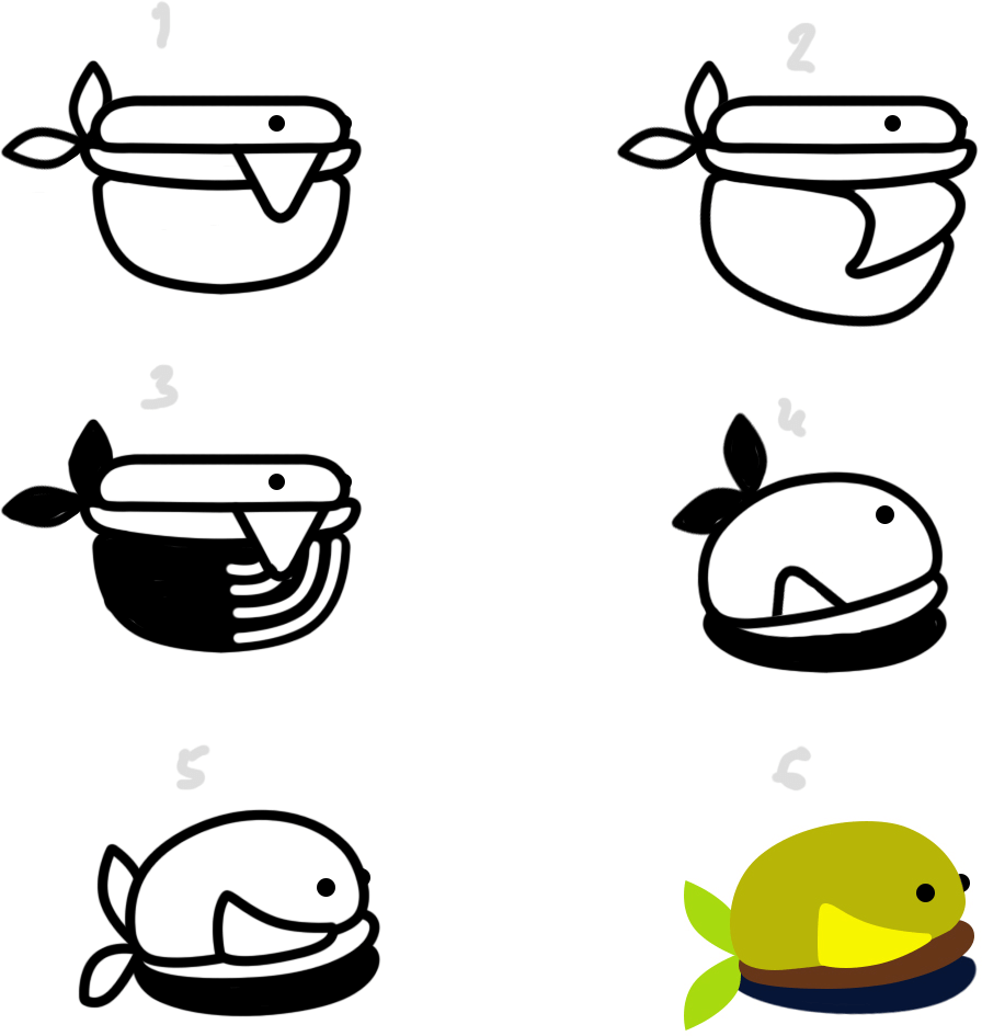
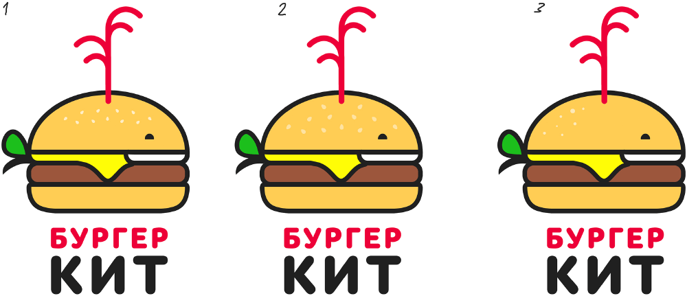
Art director: Obviously, number 6 is the right direction here. Maybe you don’t have to tilt the top bun?
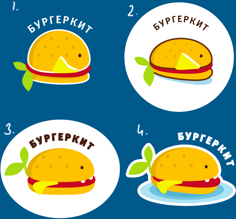
Designer: These guys.
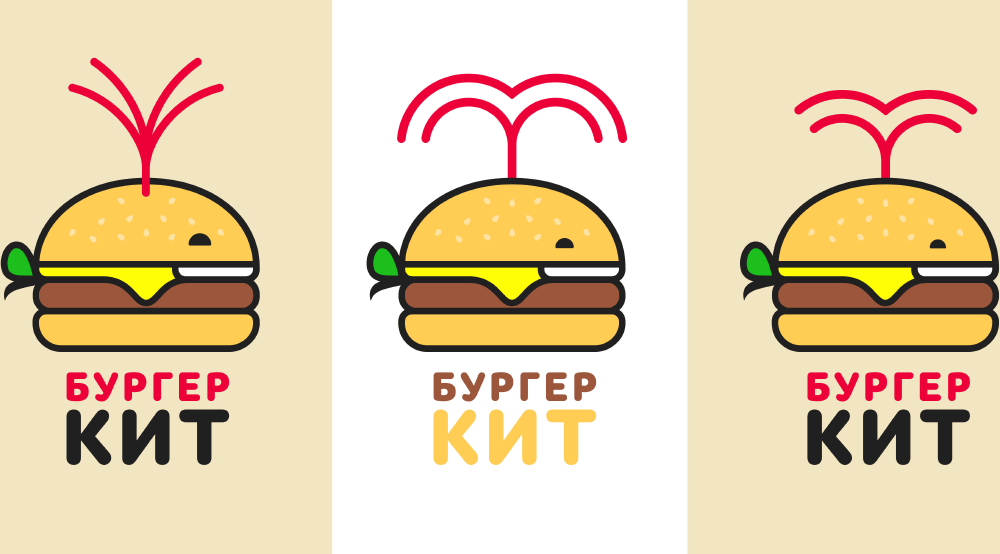
Designer: And some more.
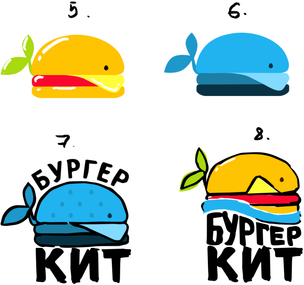
Art director: Well, 8 is logical, just don’t draw water. And the leaves should simply stick out of its ass without a branch. The typography shouldn’t allude to Burger King.
Designer: Two potential directions.
Art director: It’s a cross between a pancake and a sanitary pad.
Designer: OK, forget about it. I went back to the original shape of the burger with the wave and tried to make it more fun because they kept telling me the whale is too sad. Also sketched the letters.
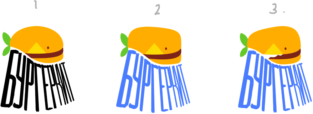
Art director: As a direction this is better, but letters are ENTIRELY unreadable.
Designer: Neither the burger, nor the whale? I mean, should I keep trying to improve it?
Art director: Not when it looks so corny.
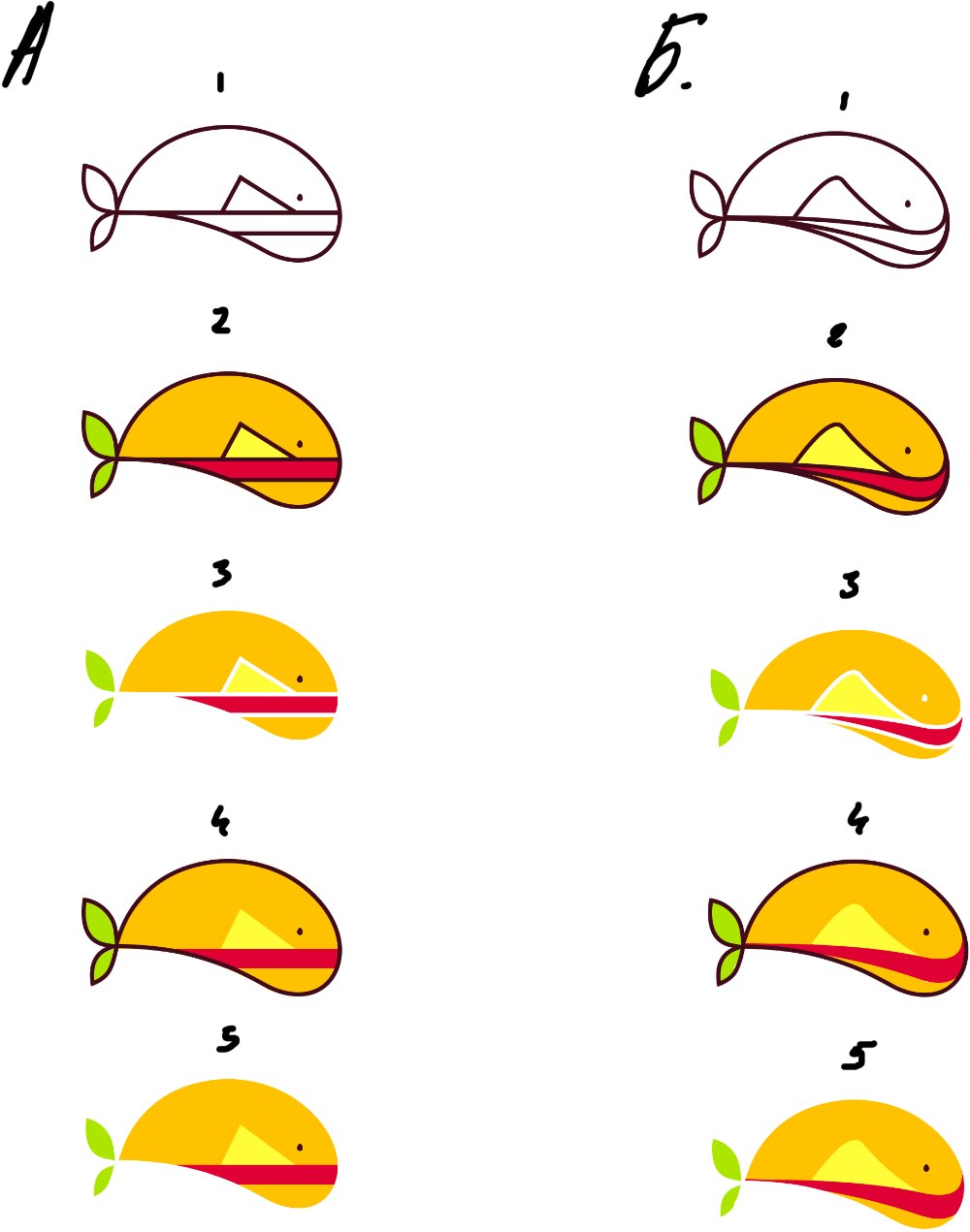
Designer: What if we go with simpler shapes?
Art director: You don’t need to have the bottom shaped as a wave. You need to insert a whale smile, a tail and a fountain of ketchup at the top.
Designer: Made a quick sketch. Looks like the whale was missing the onions. The right one especially seems to have both the whale and the burger... Should I continue or is it a no go?
Art director: Sure, the left one is getting close to what we need.
Designer: Variations of the left one.
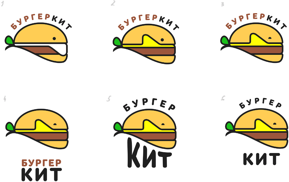
Art director: 1 is very near. You can also sprinkle some sesame seeds on the whale’s back.
Designer: Here it is with sprinkles, I haven’t touched anything else yet.
Art director: 2 is OK, but the fountain isn’t working.
Designer: I think the fountain will look better coming from behind the whale. I tried various shapes. The eyes are also of different sizes.
Art director: The third one is OK. Let’s just find a better placement for the text.
Designer: Here are my ideas so far.
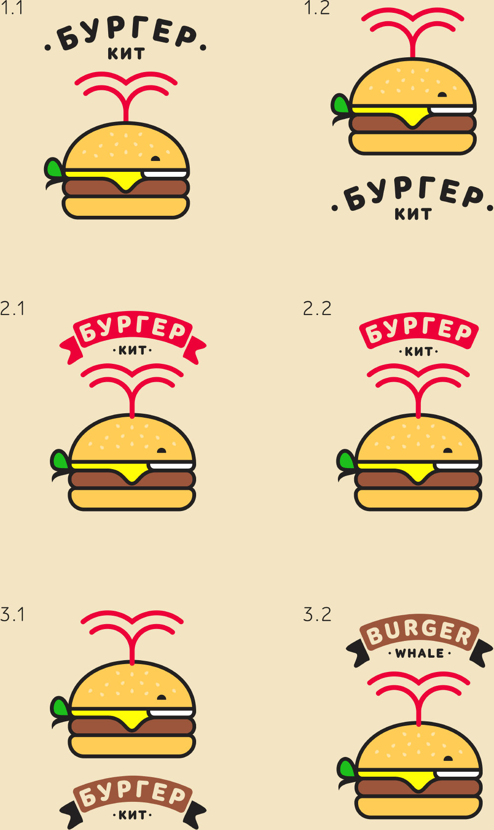
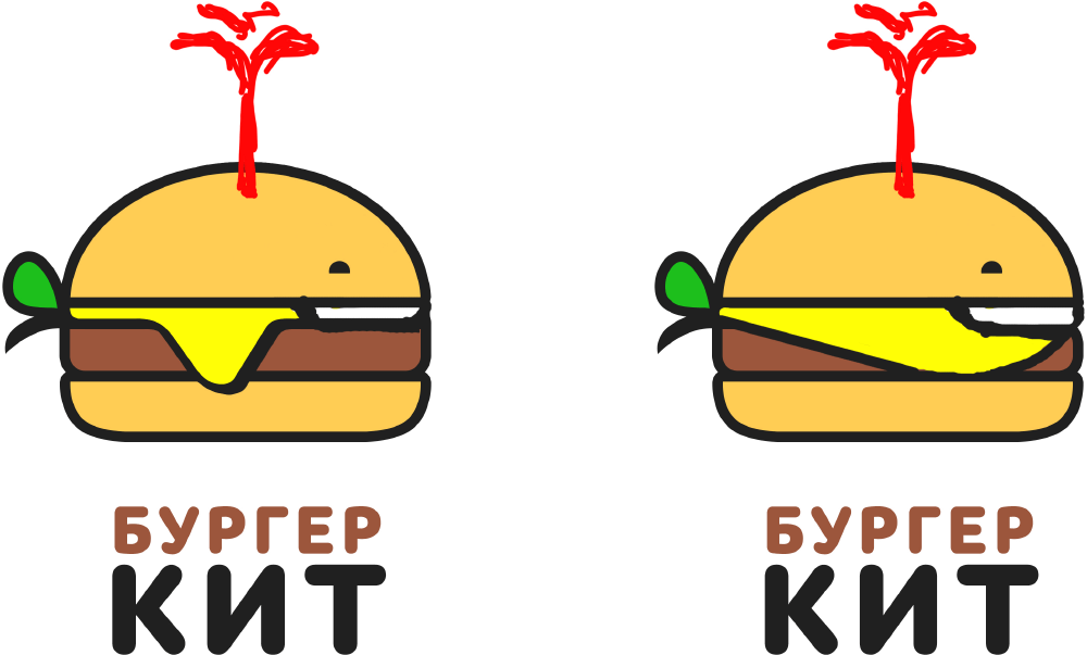
Art director: The word Kit shouldn’t be smaller than Burger. And don’t translate it, it should be in English.
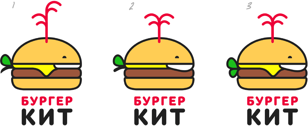
Designer: So here it is. I like the flags...
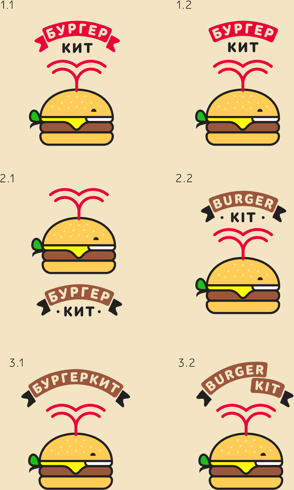
Art director: 2.1 is OK.
