The making of the Ekaterinburg logo
Overview Process
The city was founded during the reign of Catherine I, so we need to get inspired by the monograms of the Empress.
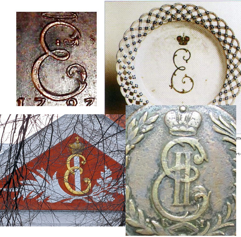
Searching for the shape of the letter E.
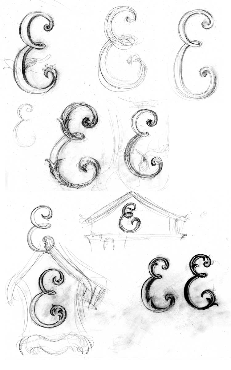
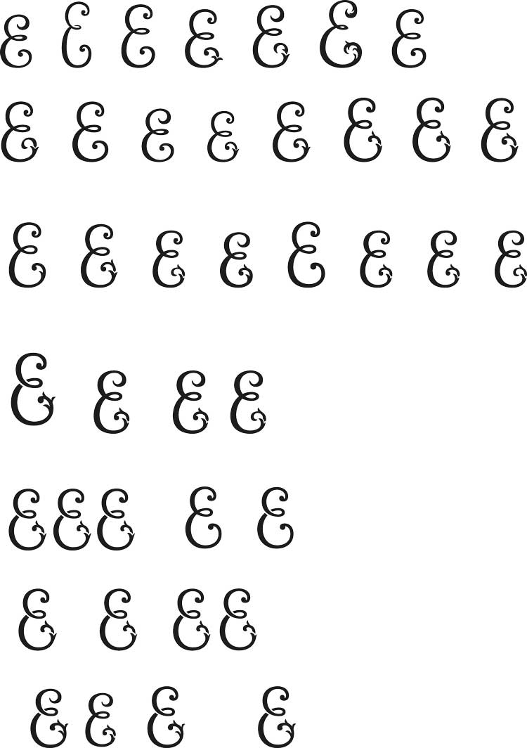
The art director asks to make the loop smaller.

Finding the best typeface.

Art director: The traditional type is too calm and nice, the logo asks for a cool grotesque.
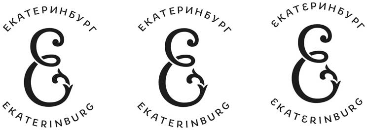
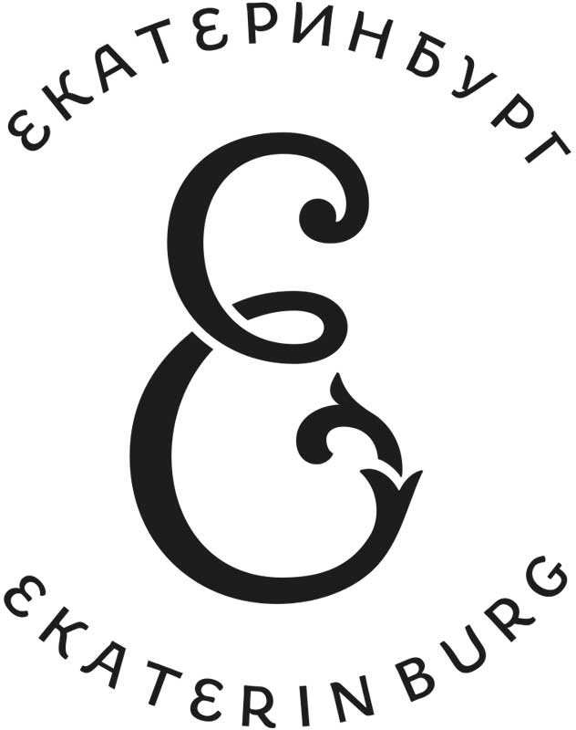
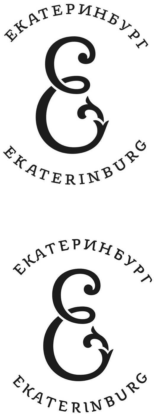
The face is approved. Searching for the best composition of the logo and finalizing the text portion.
The type designer wants to add decorative elements around the emblem.
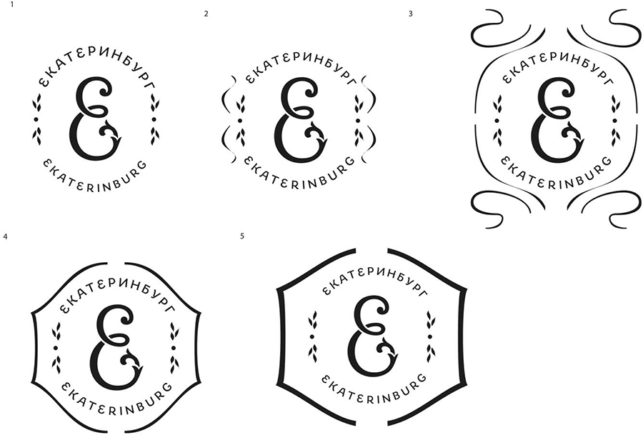
The secret advisor writes a letter to the art director in the hope of making changes to the new sign: “The city was founded by the Romanov dynasty, and it was also the place where it ended. Obviously, there is a certain loop here (Ouroboros). At the same time, the monogram looks like a spiral. There is also a similar staircase in the Constructivist building in the KGB town (a cruel irony, Constructivism is one of the main features of the city). Maybe by reinforcing the spiral motif (for example by adding a curl on top), we can emphasize the theme of development (of the city and maybe of the entire country). After all, this is a place of one of the main industries of Russia, iron mining. By the way, the monogram logo would look especially well in iron casting. We can imagine it as quite intricate, with ornamental branches resembling a lizard or maybe even with the Mistress of Copper Mountain herself :).”
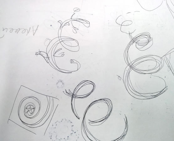
The art director approves adding a curl to the spiral. Suggesting new options.

Art director: The fourth one is OK. What about adding a drop with a third curl?
The designer adds the drop.
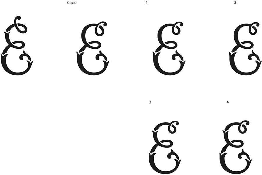

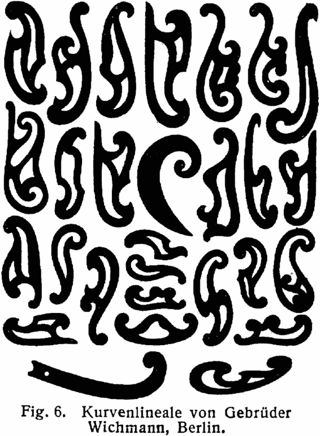
The secret advisor likes the result, but the art director doesn’t. He asks to go back to the original variant but make the drop look like a French curve.

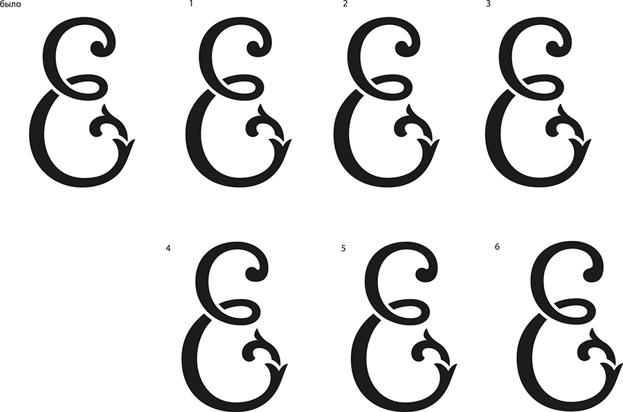
Going back to the first design, discarding the French curve. Giving the logo to the designer to apply to different media.