1.0 2.0
The making of the Elegant online store
Overview Process
Meeting with the client to discuss business ideas for the new online clothing store.
Besides a large catalog of products for the whole family, the new service will provide helpful recommendations. Guest experts will blog about style and fashion, stylists will answer questions submitted by visitors as well as present their recommendations on color, figure types and on combining accessories. Rapid promotions with big discounts will be announced daily. It will all make a separate section of the site that will become the center of action. Clients will create accounts, specify their measurements and color types. The website will automatically add suitable products to the list of suggestions.
Describing all the functionality in the statement of work and starting with the design concept.
We don’t want to clutter the main page with independent blocks for products, promotions and seasonal offers. We want a monolithic page that one could endlessly study and explore instead of wasting time trying to understand what’s what. Deciding to mix it all together in the main storefront.

Searching for the shape. The store logo is a coathanger, maybe make it look like a wardrobe?
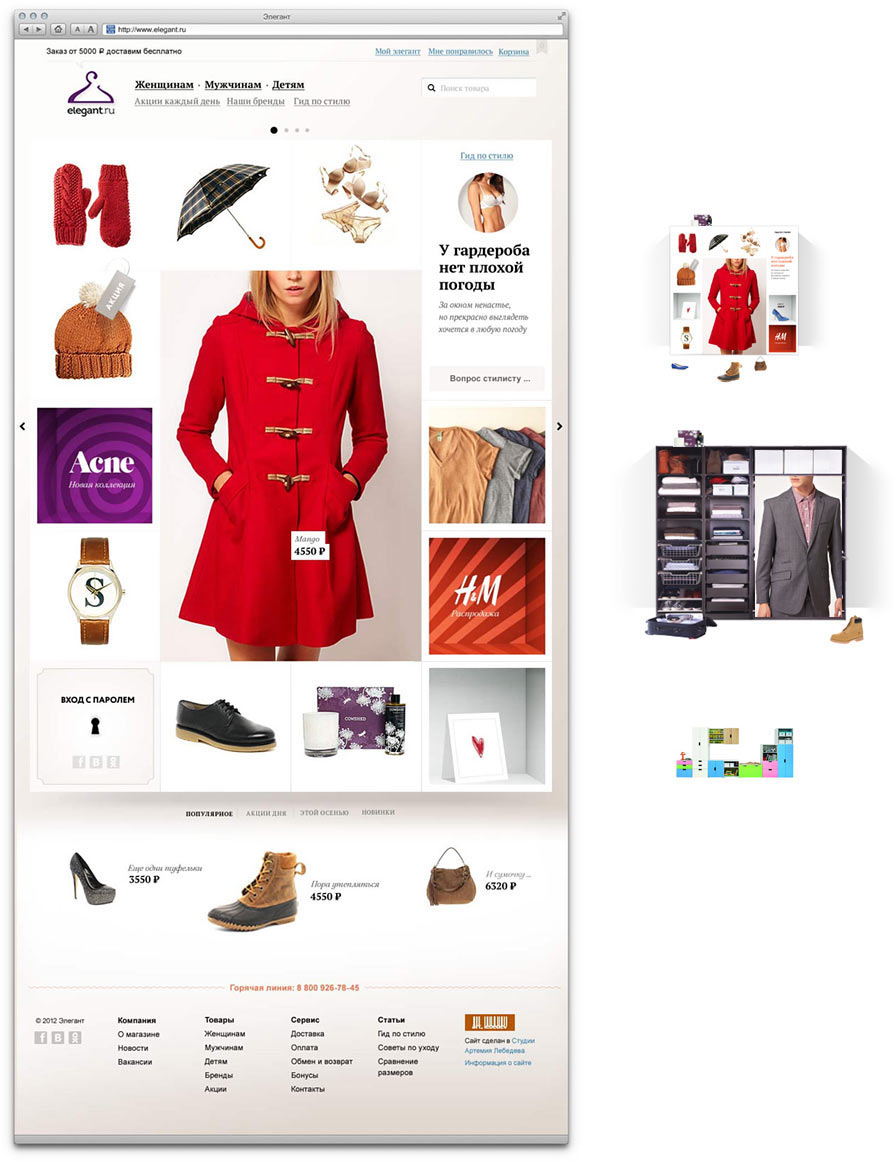
Nope, too heavy and too boring, though color boxes look promising. Trying to give the pictures more space.
That’s better. To make it even nicer, adding a slideshow of additional pictures which shows up when the mouse hovers over an item. After all, what makes a clothing website if not large beautiful pictures?
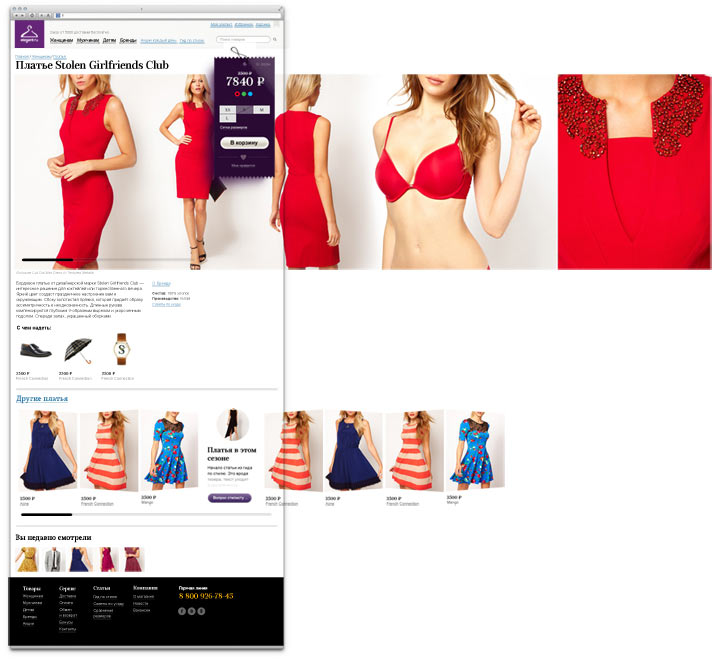
Starting to work on the product pages. We want to bring the viewer as close to the real product as possible. We want to throw away all the standard picture switchers, enlargers and magical zooms—they don’t give the feeling of purchasing clothes in real life. Naturally, you would want to hold a piece of clothing in your hands, examine the details.
We get the idea of a panoramic gallery that viewers will drag with the mouse. Eureka! By all means, a most engaging solution. The model turns around you as if in motion. It’s easy to control both on a desktop and on a mobile device. The pictures don’t have to be limited in width. Finally, it makes exploring shoes a pleasure.
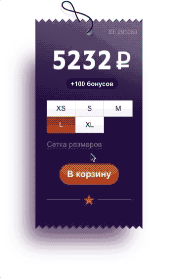
Designing the tag with the price and sizes. Adding a nice effect to reward the customer for adding the product to the cart.
Holding test photo shoots with the girls from the studio, typesetting the layout and testing the mechanics. Adding the Next Product button at the end of the panorama. Surfing the website will feel like flipping through a fashion magazine.
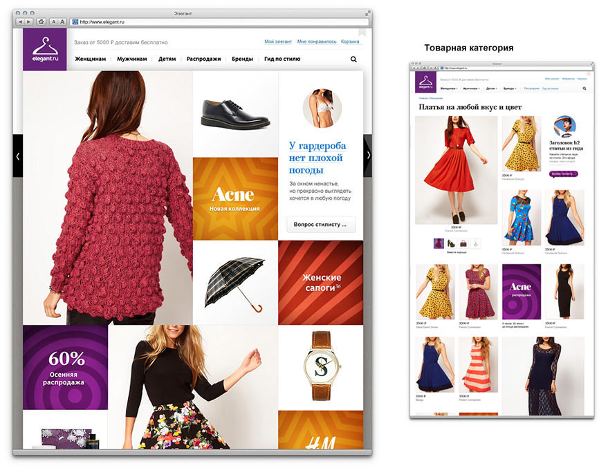
Planning product category navigation. We need to ensure switching between adjacent groups is fast and easy. Abandoning the popup site map idea: having to read all the columns looking for one word is too boring and complicated.
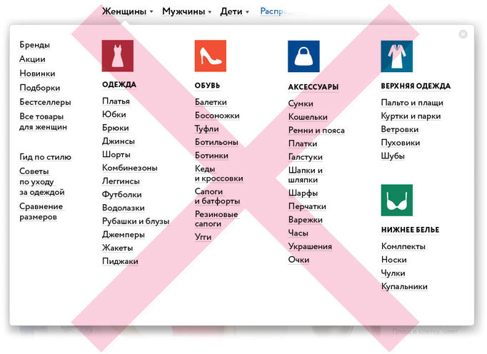
Trying to divide the categories into subcategories and go through the website pages suggesting a new set of links. Clicking accessories, then handbags, then leather bags. The number of choices decreases and the products are visible right away. But there is a problem.
In the Russian language the names for clothing categories are not as consistent as they are in English. English has simple categories such as tops, bottoms, outerwear, underwear. Tops include everything that can be worn on the upper part of the body: shirts, t-shirts, jackets, tank tops; bottoms are jeans, chinos, shorts; outerwear is jackets and coats; underwear is underwear. In Russian, though, you have outer garments, underwear and jeans, trousers, shorts, leggings, sweaters, cardigans, turtlenecks... Even in colloquial speech we don’t have words for “tops” and “bottoms.”
To sum up, there will be a lot of words. We need to use it to our advantage. What if we just dump all the categories in one list on main pages for men’s, women’s and children’s clothes? To make it less boring, we can use scroll effects and illustrate product categories with animation.
Maybe, we can make it into a cartoon with a character illustrating the categories?
Nope, then we’ll have to entirely undress the girl when we get to underwear. And what about children? :)
It’s better to change the background covers and use arbitrary pictures—it will all come together as a nice look book.
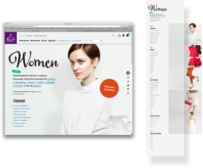
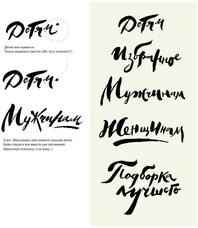
To maintain the feeling of a fashion magazine, asking the type designer to draw calligraphic headings for the website.
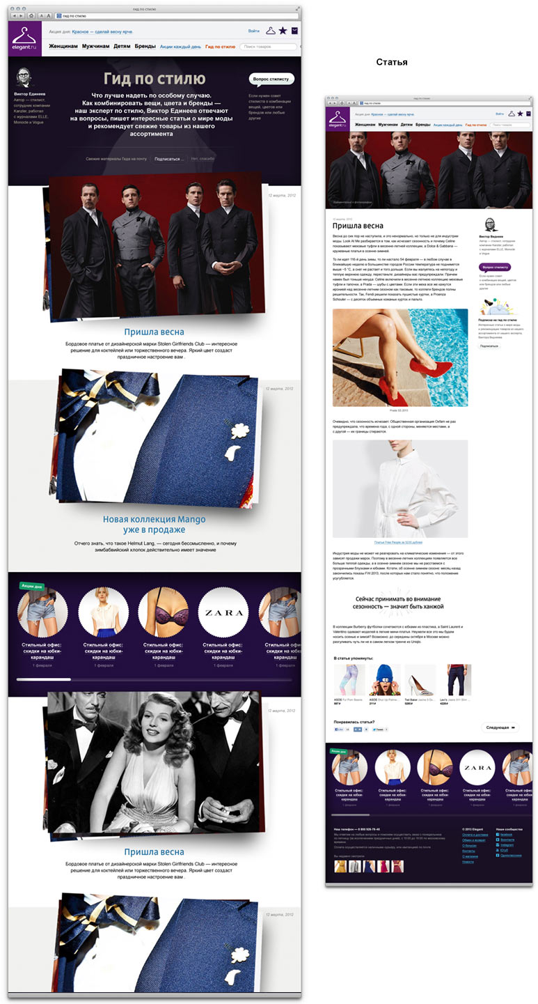
In the stylists’ blog we scatter around article cards tilting them at different angles. Now it looks like a mood board of a fashion collection. The same image will become a large insert in the header of the article page it leads to.
Typesetting and programming ready pages using progressive JPEG, adding new functionality, testing out solutions and solving technical questions.
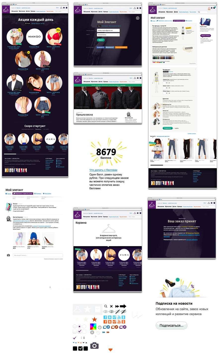
Adding functionality to the size chart. Getting rid of the hateful legend where you need to open up the chart, compare the sizes, get back to the order form and only then choose your size. Making sure the size can be chosen right in the chart.
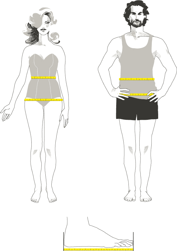
Asking Yana to draw a beautiful couple for the How to Make Measurements page.
Using Firebug to make on-the-fly corrections to the typeset pages and test animations.
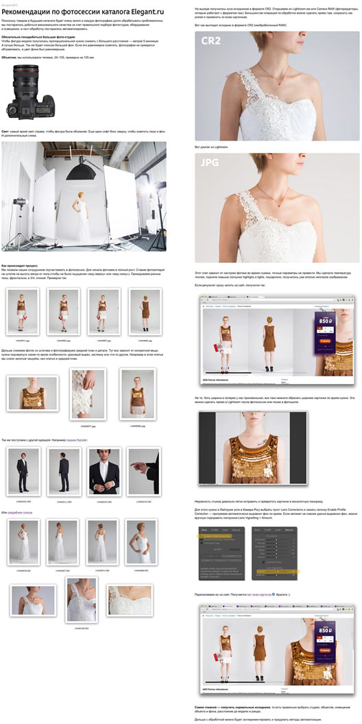
Writing photo session guides for the client and providing supervision.
Uploading the catalog and testing. Fixing bugs, making adjustments and launching the website.
