Client: Ergotronica is Russia’s first ergonomic products store. We launched in 2010 and never had a proper logo even though we have a nice website. We are really client-oriented: we offer 14-day moneyback guarantee, test drives of all chairs and discounts for socially disadvantaged families.
Ergotronica.ru helps work more productively. We are not a furniture store, our range isn’t limited only to ergonomic chairs and includes products from vastly different categories united by a single idea: increasing productivity while maintaining health. Our clients are freelancers, gamers, office workers as well as young parents who care about their children’s health (we offer products for children, too). We’ve been on the market for 7 years and have always had problems with a logo. Which is why for the past 2 years its role has been taken by a simple text reading Ergotronica. Our name includes words “ergonomics” and “electronics” since we offer not only furniture but also high-tech solutions. Which is the main reason we would like to avoid any obvious answers, which is to say we don’t want to see a chair in our logo. Thank you.
First designer: Letter Э.
Art director: Is that a 1930s alarm clock?
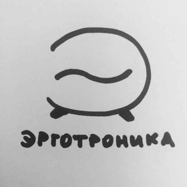
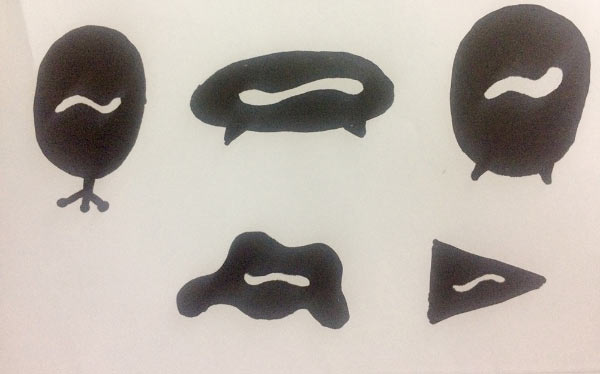
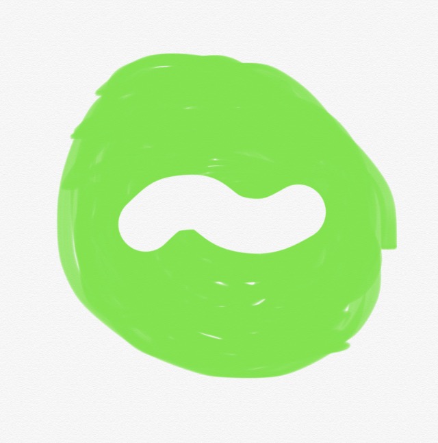
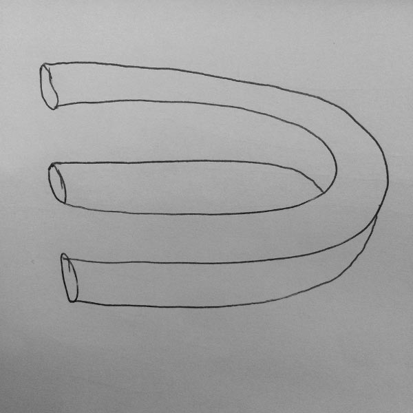
First designer: A nice and ergonomic alarm clock. With a wave in the center. See the attached picture, there’s less of the alarm clock there. For each product category I want to draw a silhouette with a wave in the center. The wave will first appear in the letter Э and will be used everywhere. The canonical logo will be a simple circle with the wave.
Second designer: 1.1–1.6: minimalist interior silhouettes and built-in ergonomic cats as a symbol of comfort.
2.1–2.3: a construction kit, arrow, letter Э, adjustment. The blocks can be moved, we can make a pattern or use them as frames for photos.

Art director: Nope, this direction is completely wrong.
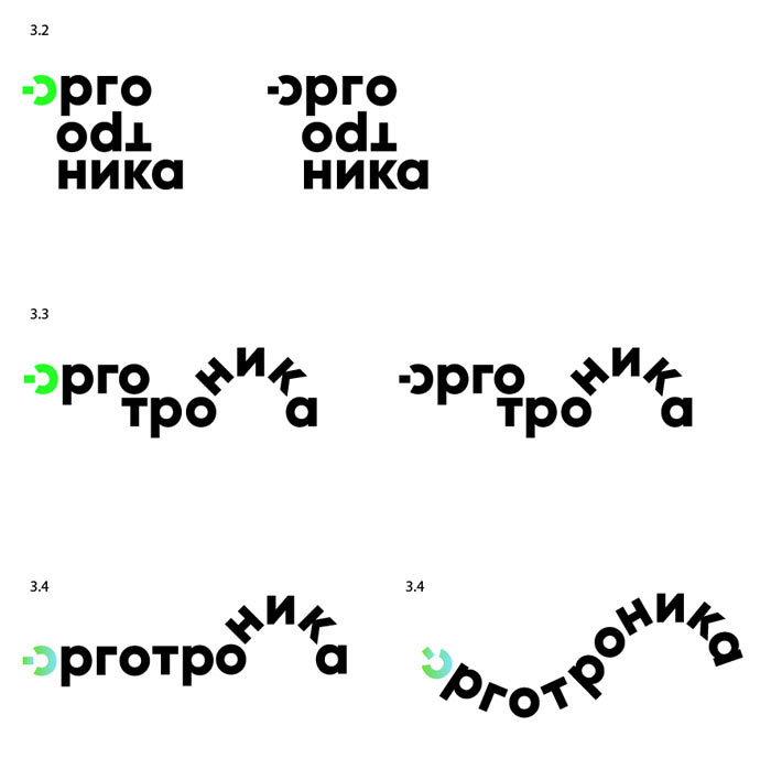
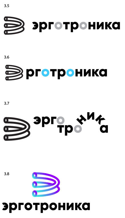
Second designer: 3: the text portion is dynamic, the letters О act as hinges or adjustment knobs to find comfortable position.
4: ergonomics means not only beautiful comfortable things, it also means multi-layered research (see picture) + the letter Э.
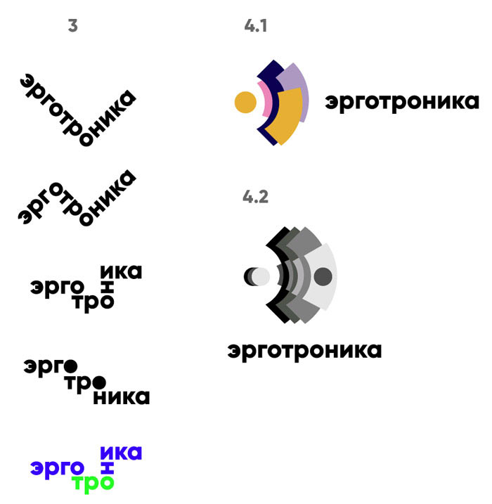
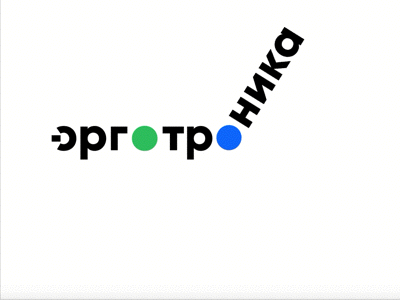
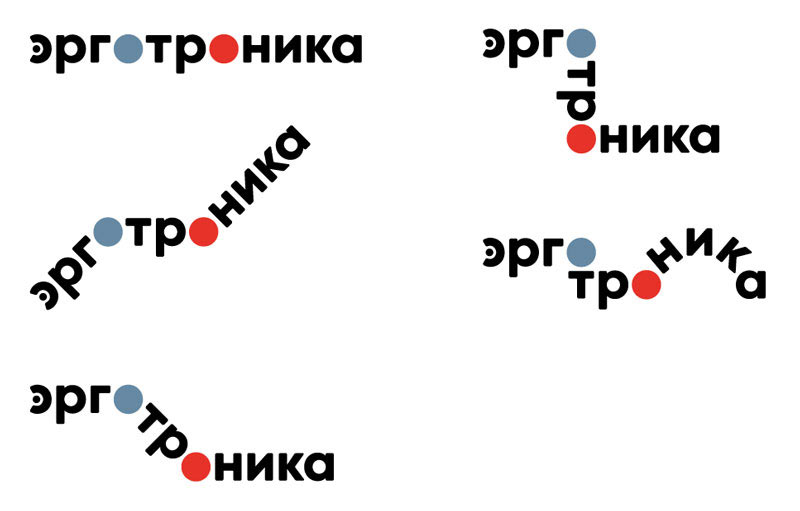
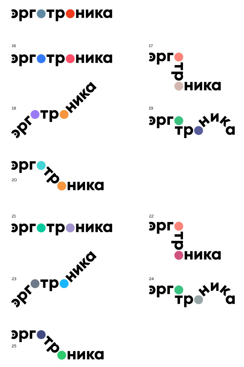
Art director: Let’s go with the middle one in 3, just make the letters ника follow an arch. We can create a series of logos (or an animation) where letters will go in an arch, in steps, vertically or horizontally around the О hinges.
First designer: I can’t make the wave beautiful. Ergotronica deals in things that look odd, so an odd logo would be fitting.
Art director: Sure, we can use this letter with the logo that is our primary candidate right now.
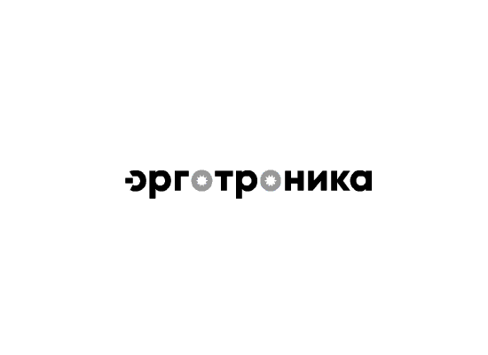
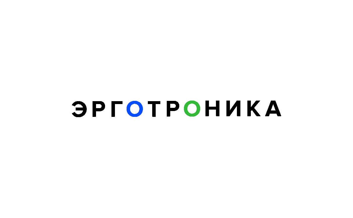
Second designer: I added a dot and color to the letter Э so it looks like an on-off button.
Art director: Use this impossible Э. You need to highlight letters О with color and everything should rotate around them.
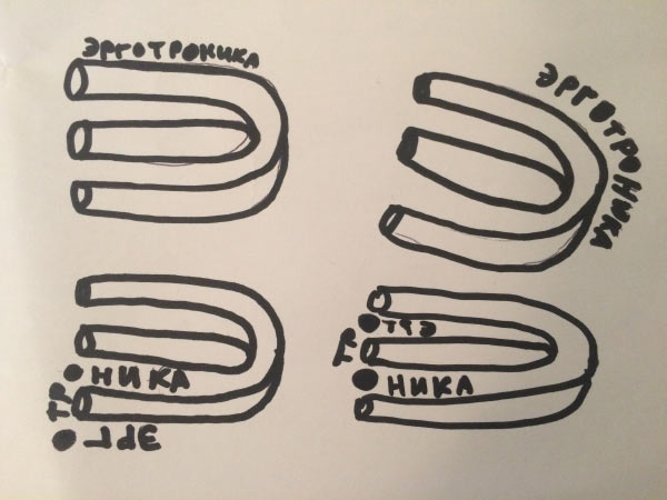
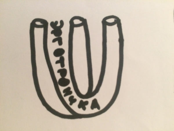
First designer: I think it would be cool to make a poster with stretched letters, see attachment. We can animate them and the impossible Э will get deformed but remain recognizable. The idea is, the format changes and everything adjusts accordingly, or the letters become more narrow or wide.
Art director: It’s crap.
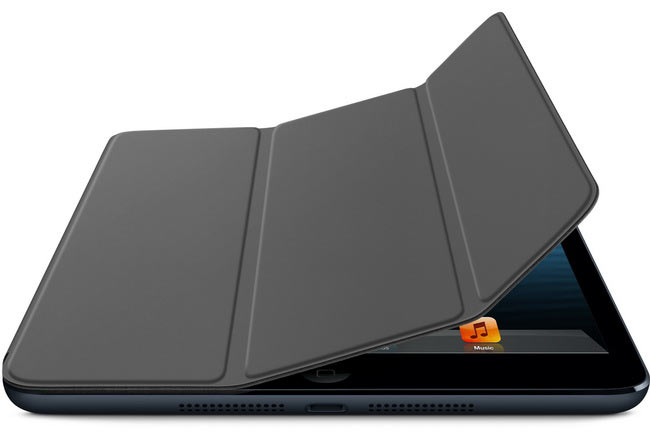
First designer: Hinges became magnet surfaces like on an iPad case. They travel around the impossible Э and bend at the letters О.
Art director: No, we’re only taking the shape of the letter, nothing else.
Second designer: This letter is just too odd. Don’t you think it would be too excessive to have both the animated text and the letter?
Art director: Get rid of the letter then.
Second designer: Working on the animation.

First designer: No time to explain, see attachment.

Art director: We already have a design, don’t waste your time.
Second designer: Searching for the color and shape of the letter Э.
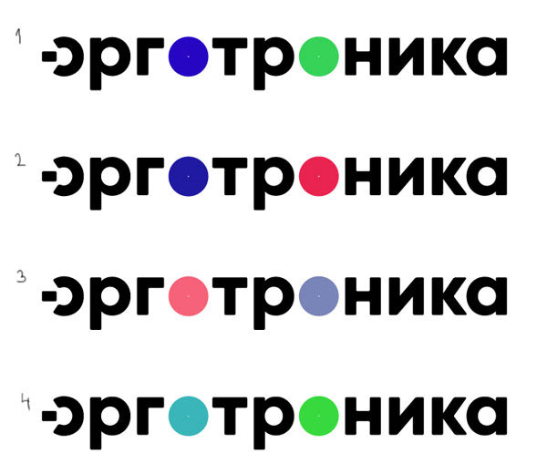
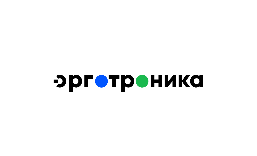
Art director: Everything looks good except for the colors. It’s 2017, the 1980s are long gone.
Second designer:
Art director: Colors should be bright and juicy.
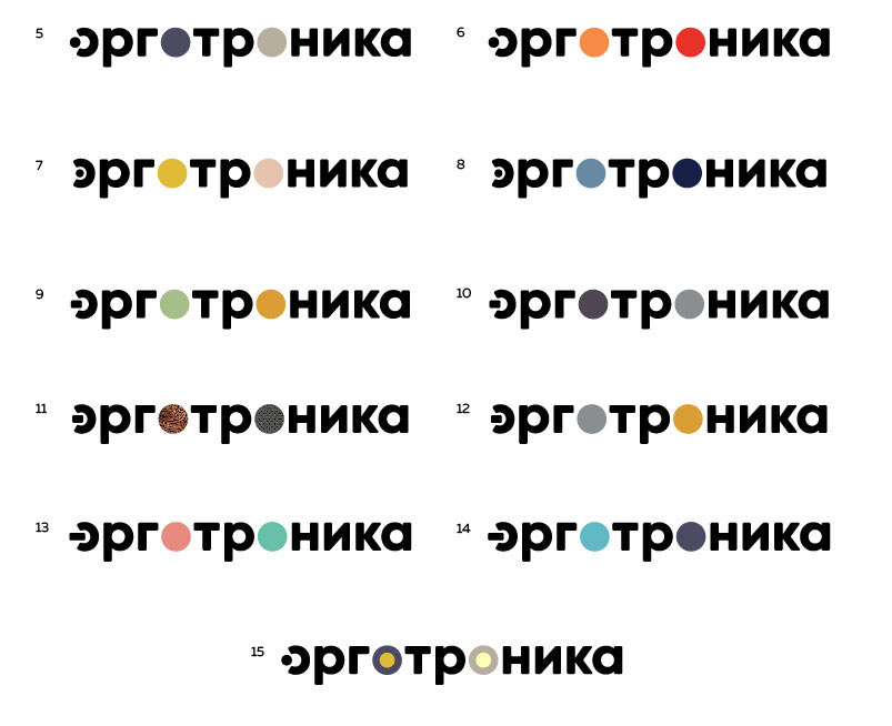
Second designer: Adjusted saturation.
Art director: Yep, each one in the first row is a go.
Second designer: 31–33 have gradients.
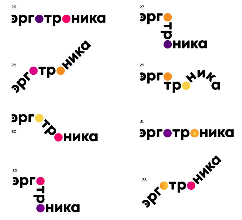
Art director: 33.
Preparing files for printing.
