The making of the corporate identity and packaging for Exotic People products
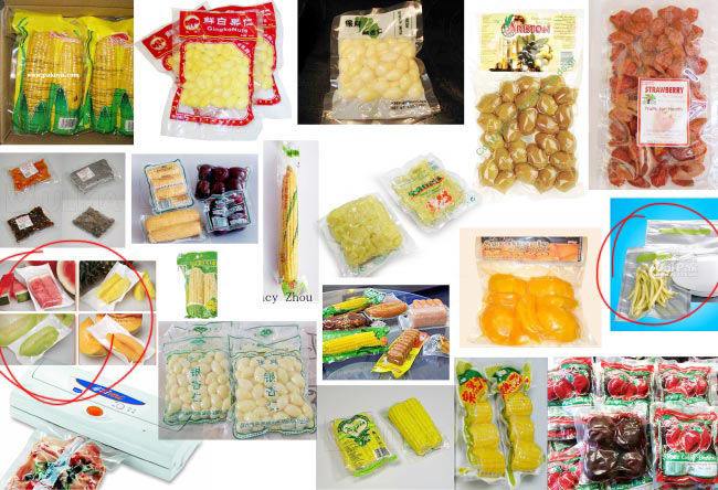
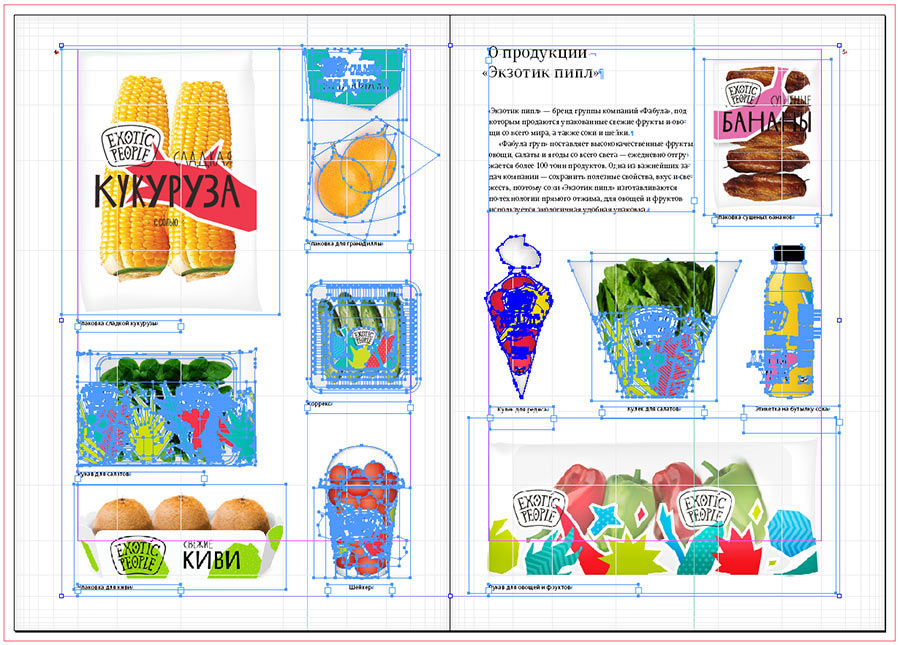
Getting acquainted with the client’s range of packaging: individual packaging for various fruits and vegetables, plastic sleeves for fruit in trays, salad bags, stickers for transparent trays, boxes, bottles, shakers...
Studying the international experience. Vacuum...
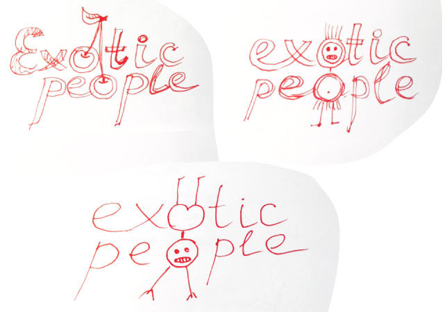
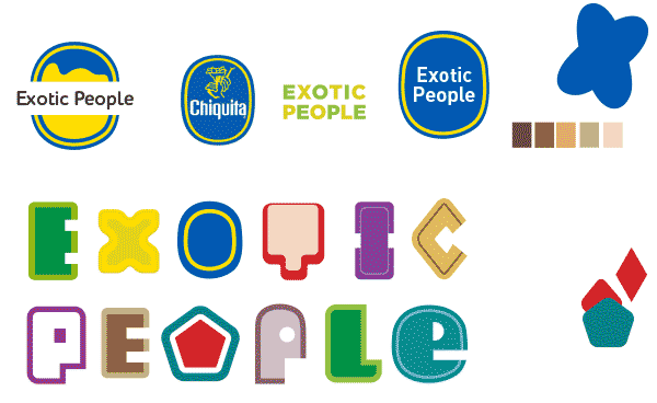
The first attempt. We start by looking for ideas for the future logo.
Trying to approach from another angle: feeling out the overall concept of the packaging.
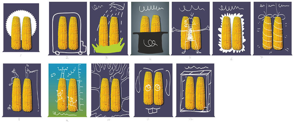
Oh, that’s an interesting idea: a ribbon that shows the product through a house-shaped cut-out.
The tree looks more promising.
More contrast.
We need something else. Leaving this idea for now, looking further.
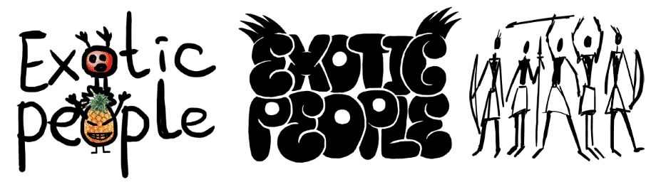
Typography?
Lingerie?
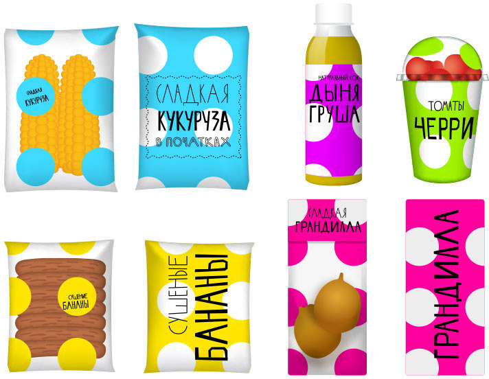
Polka dots?
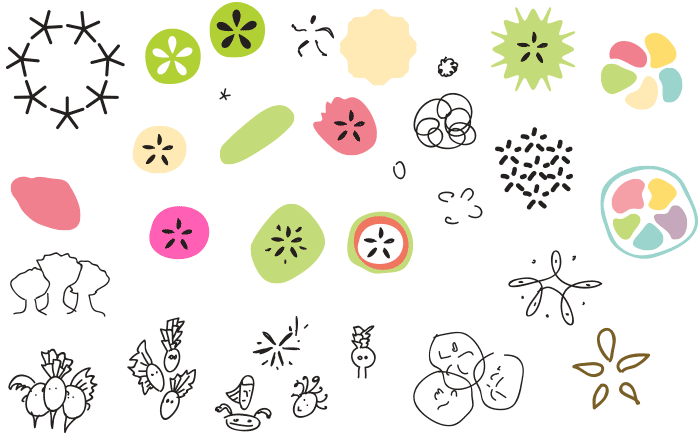
Abstract move with broken shapes.
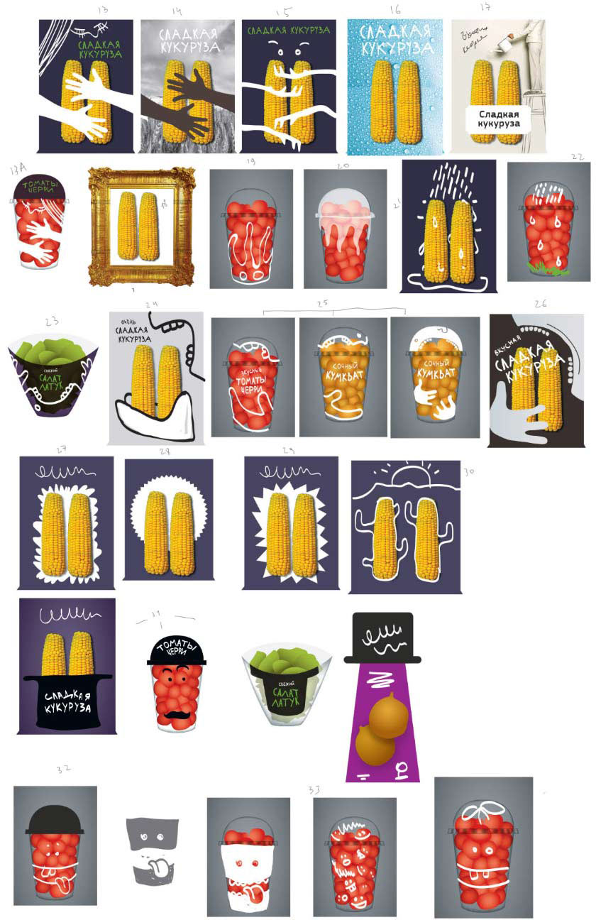
Just what we need! This style will survive anything, even the most wrinkled packaging.
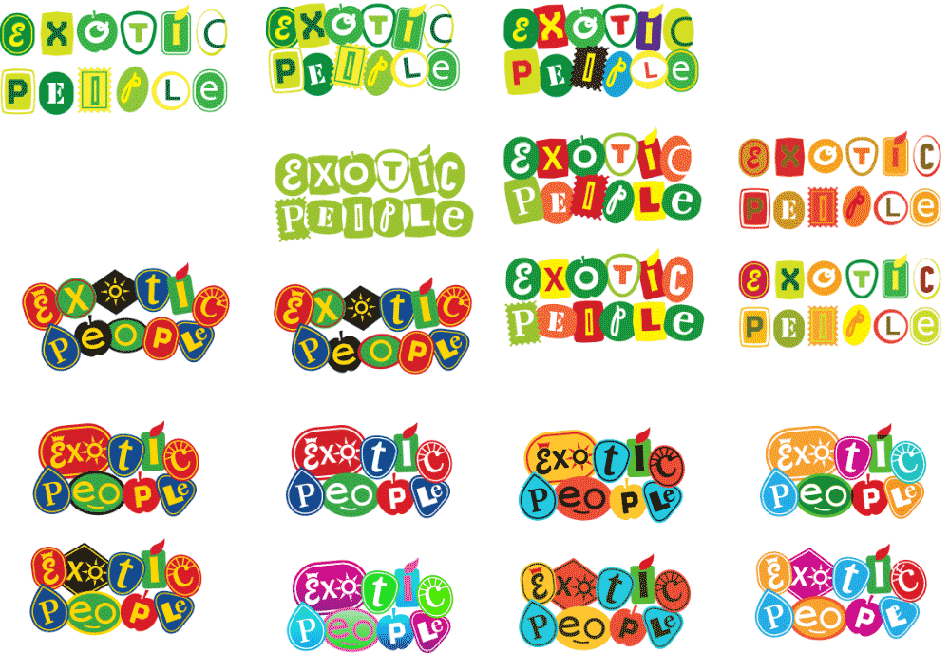
Developing it further. Drawing a chopped logo based on this design. Trying it on the packaging.
Art director: Too hairy and the letters are very harsh, you need to calm them down.
Adding edges to the fruit, making the type more gentle.
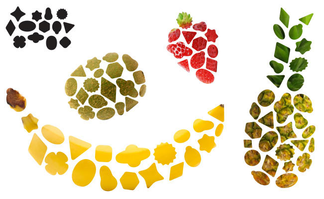
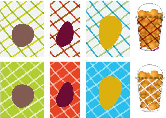
Art director: The shapes are too complex. Show every fruit with just one color.
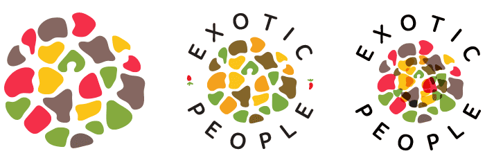
Doing that and looking at how the shapes form a pattern.
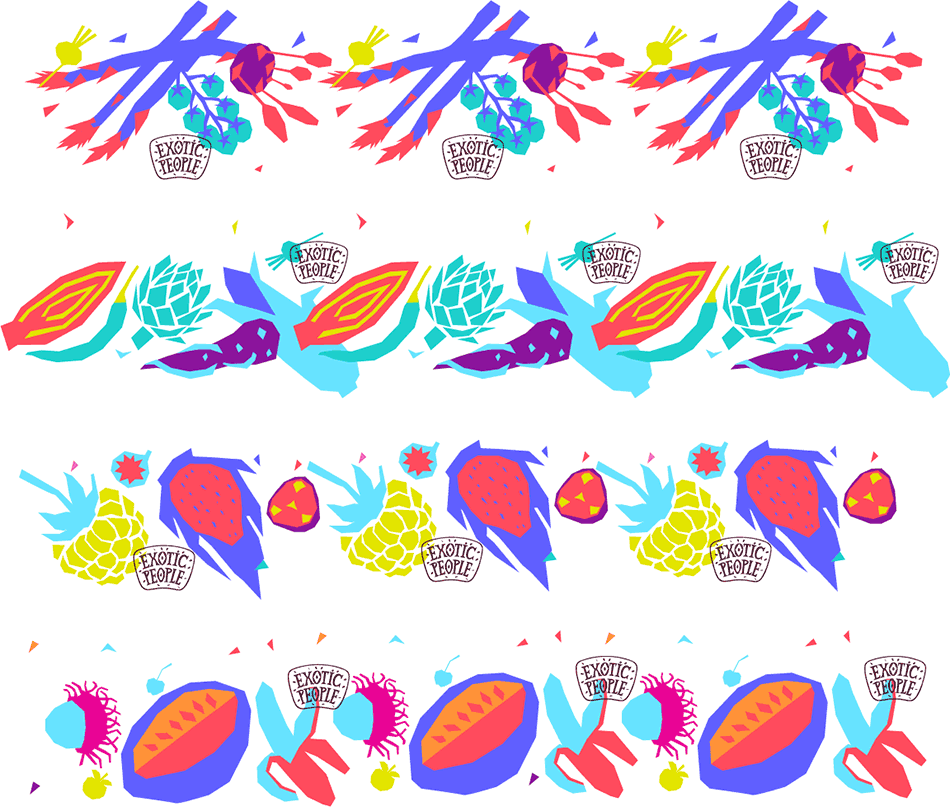
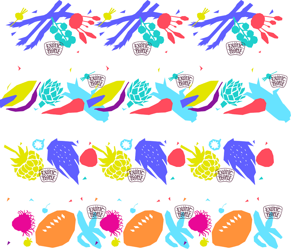
Thinking how the corporate pattern would look with a logo. The colors are too natural. Going in the reverse direction: coloring fruit and vegetables in unnatural bright colors.
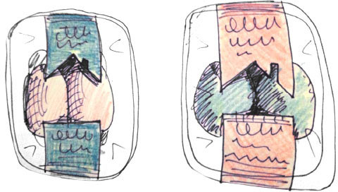
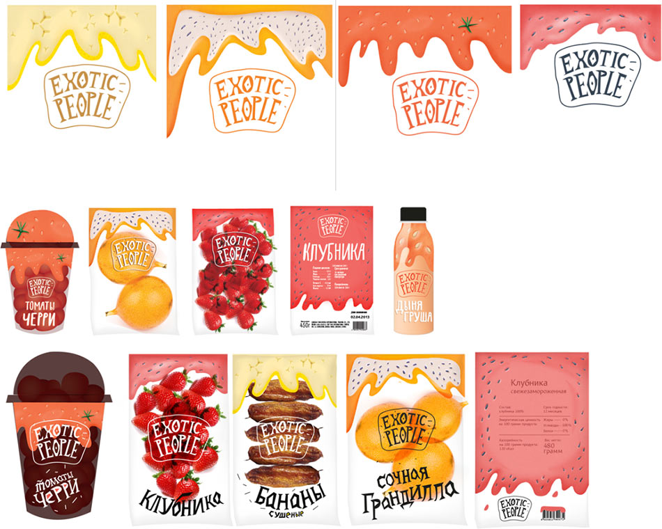
Simultaneously suggesting another idea with fruit and vegetable purée and fruit juice running down on the packaging.
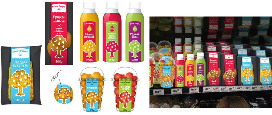
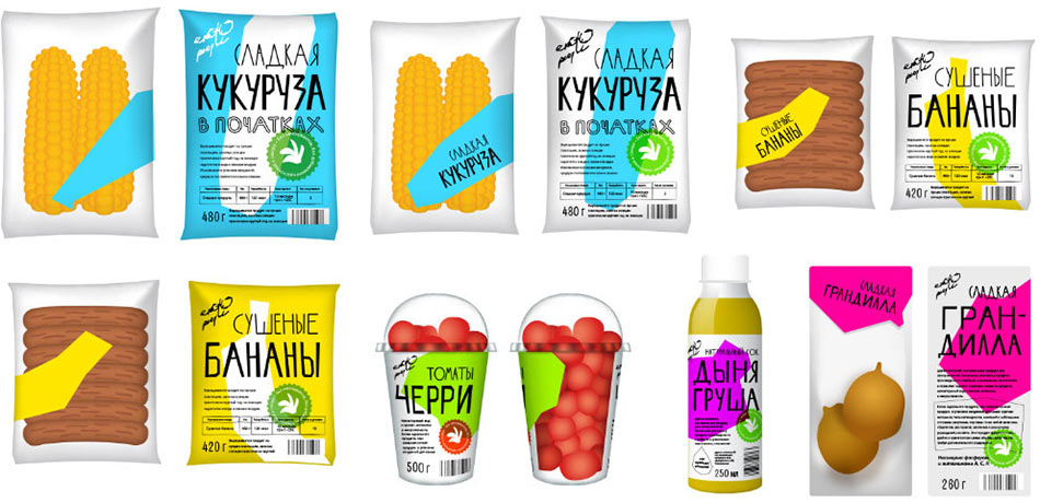
Choosing the best ideas and presenting to the client.
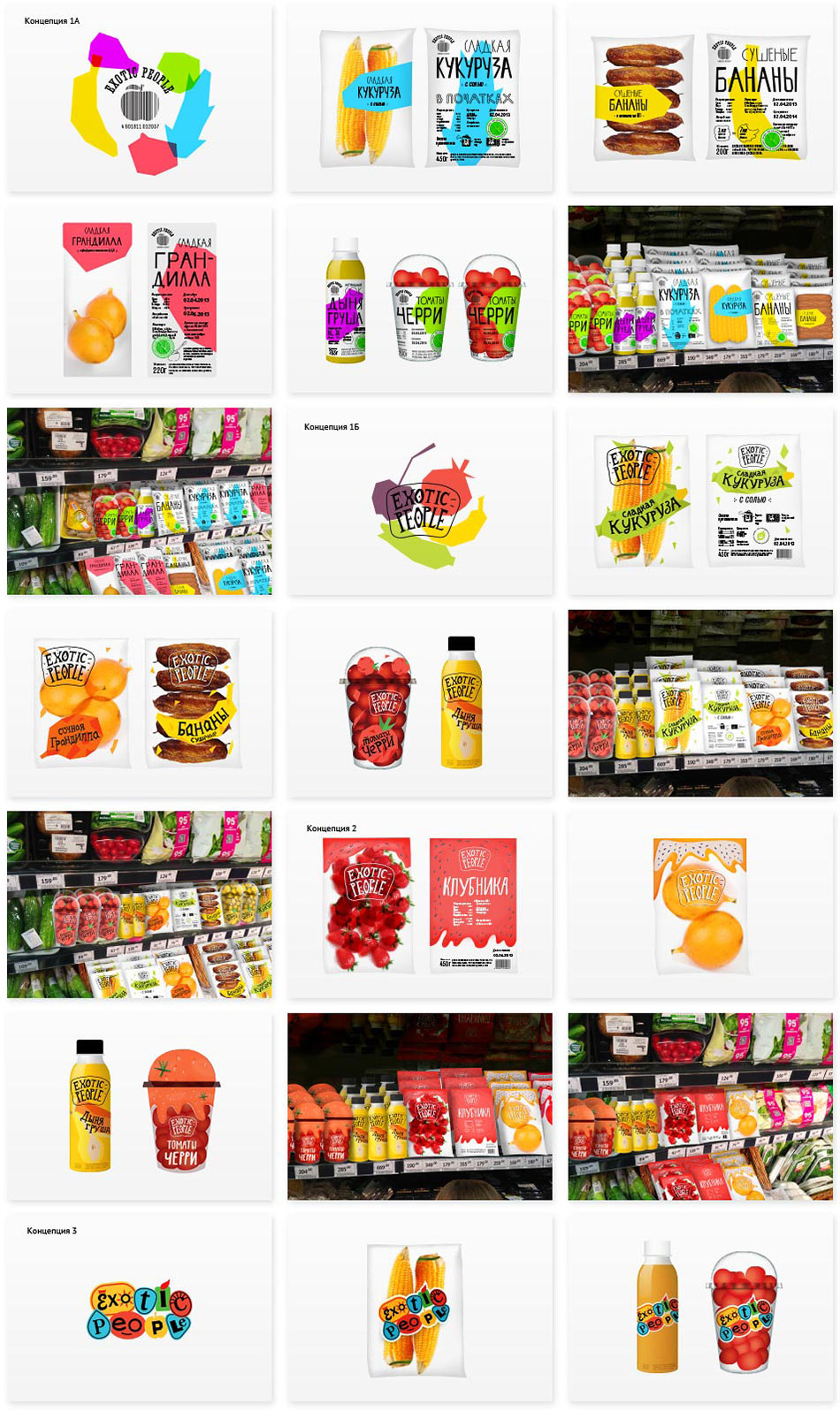
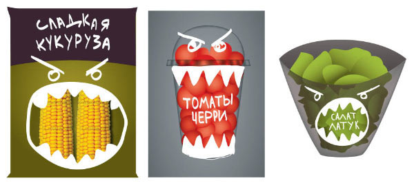
Client: We like the simple chopped graphics with no noise and the logo with seeds.
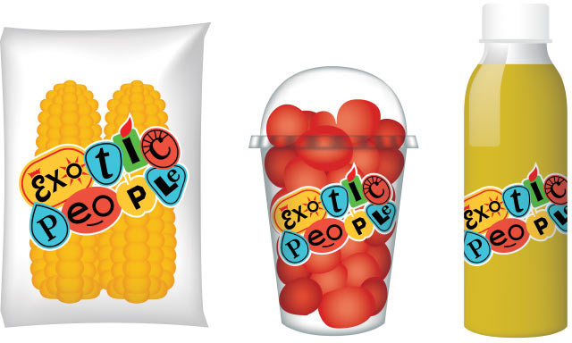
Combining them into a single solution.
Client: We like it. It’s bright and conspicuous. Let’s do it.
The next stage.
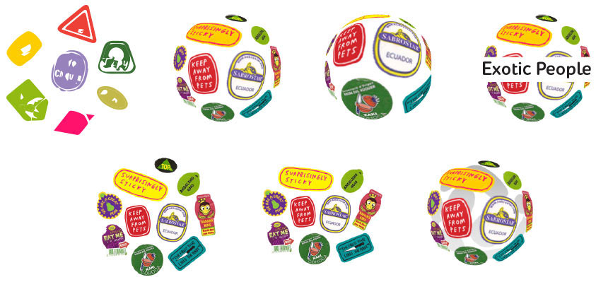
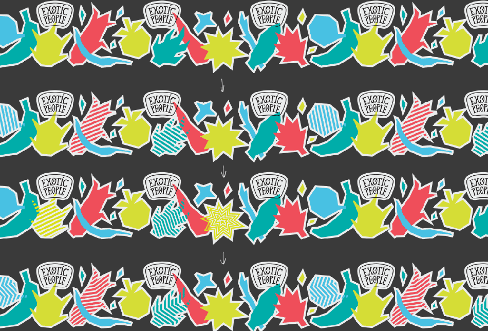
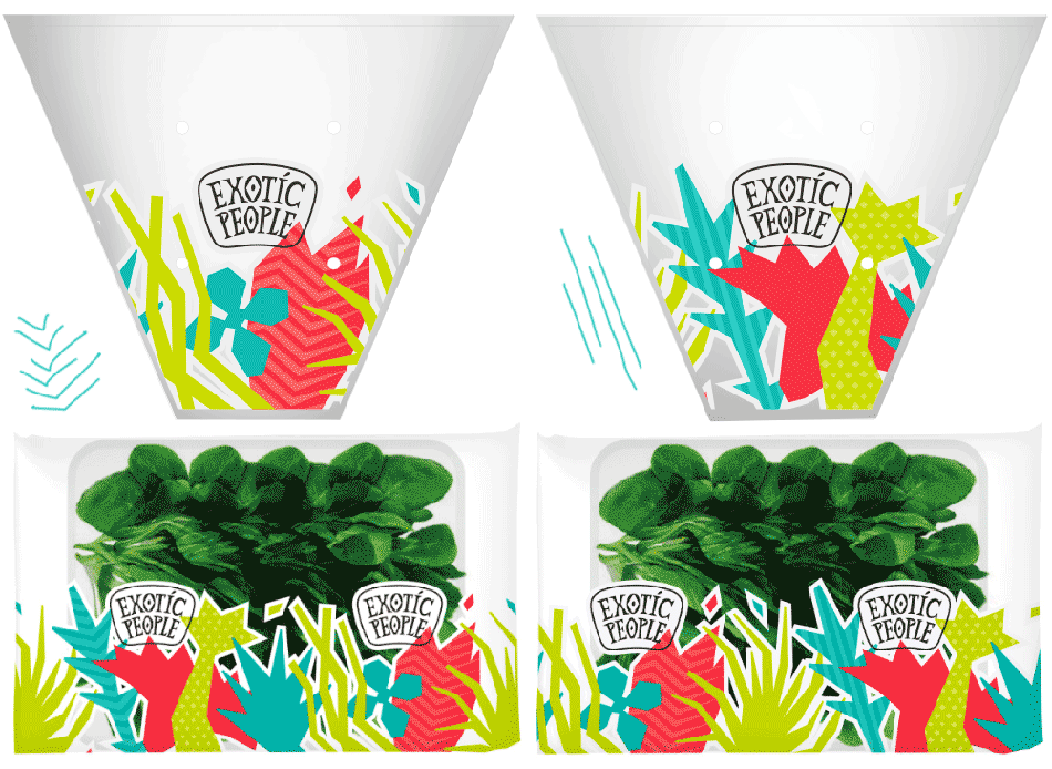
Separate shapes work well on individual packaging. But what about transparent film? We need a common pattern. And just one is not enough: we need one for fruits and vegetables and one for salads. Trying different alternatives.
Art director: Too minute, too many details.

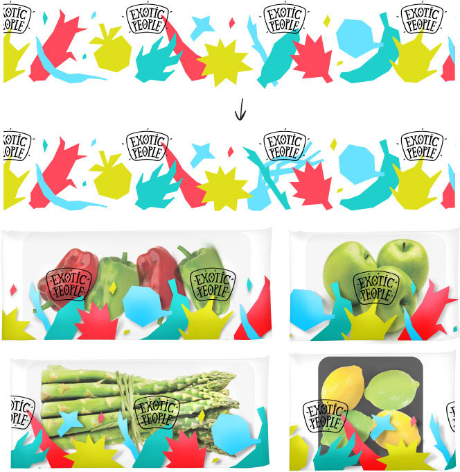
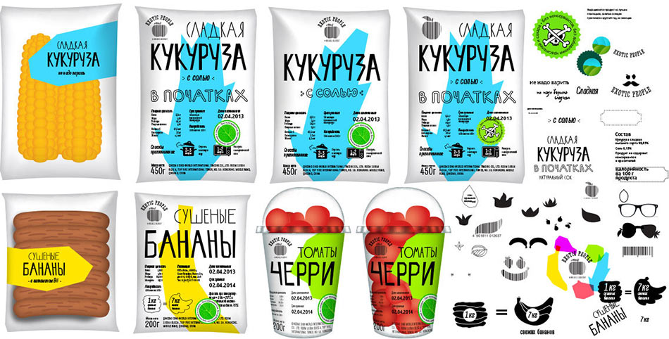
Ultimately we settle on a contrast solution with white outline and a background.
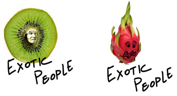
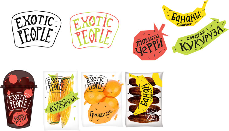
Finalizing the logo. We need to keep the fun spirit, but at the same time increase the legibility and achieve better regularity. First we draw the letters, then the base with seeds.

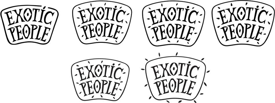
Client: We don’t like it with seeds inside, it looks like a bristled chin.
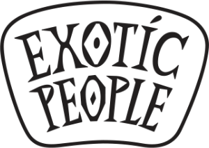
All right, deciding to remove the seeds altogether.
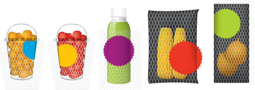
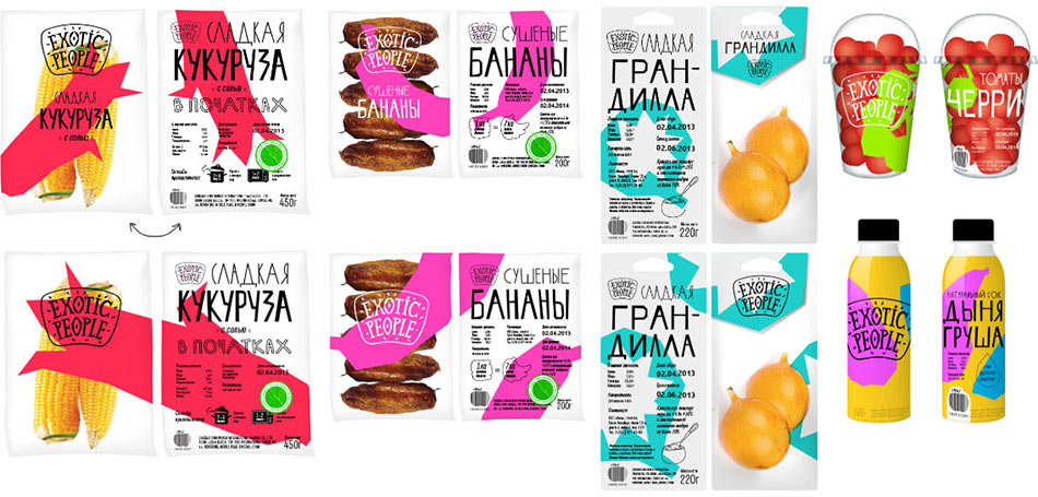
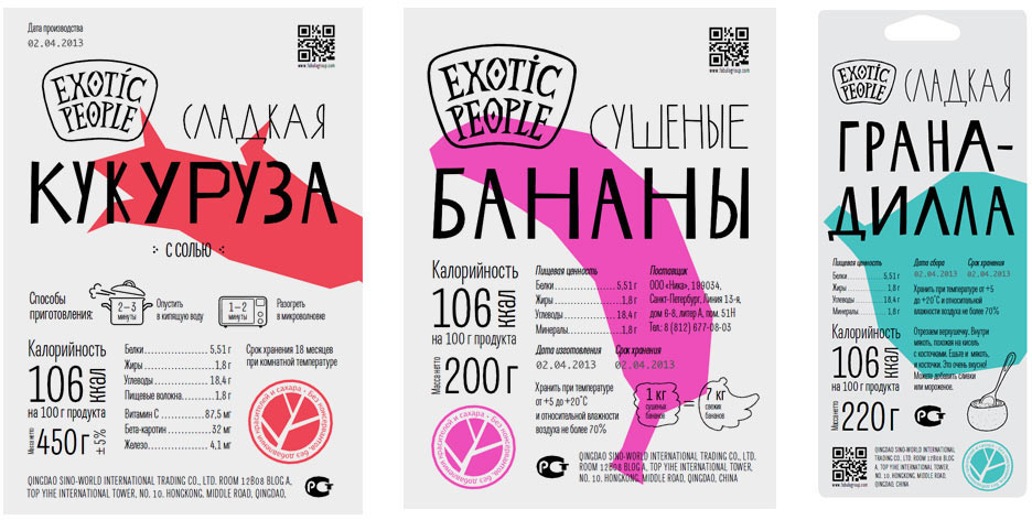
All packaging will have stickers. We offer two alternatives: a classic square one and a boldly unusual one which supports the graphics on the packaging.
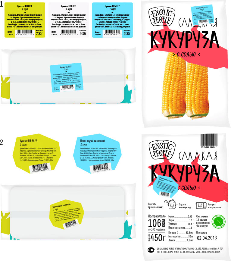
Client: The bold one is ok.
Bolder yet:
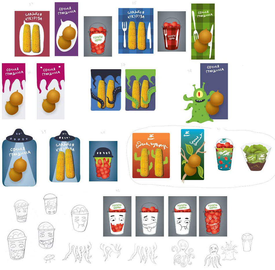
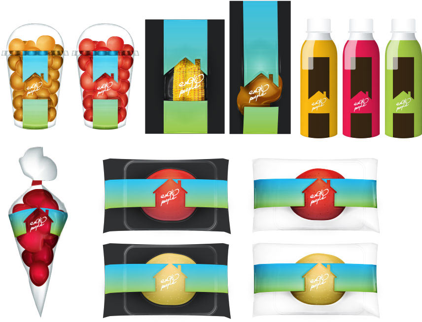
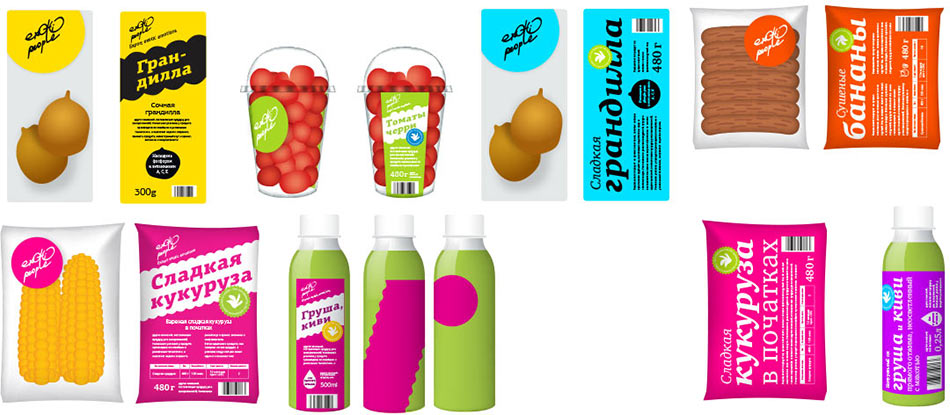
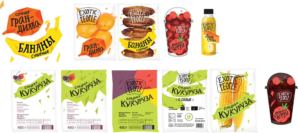
Moving on. Now we need to adapt the graphics for all types of packaging.
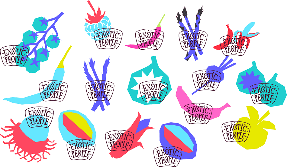
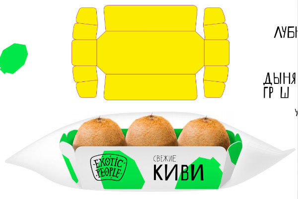
Kiwi.
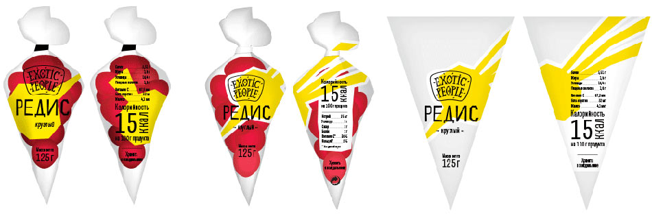
Radish.
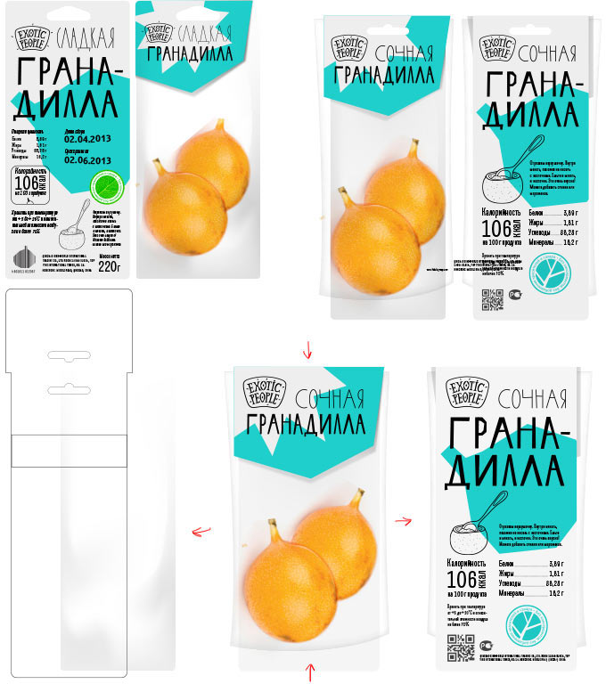
Granadilla.
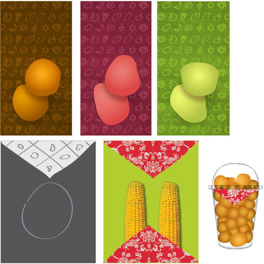
The shaker needs a pattern.
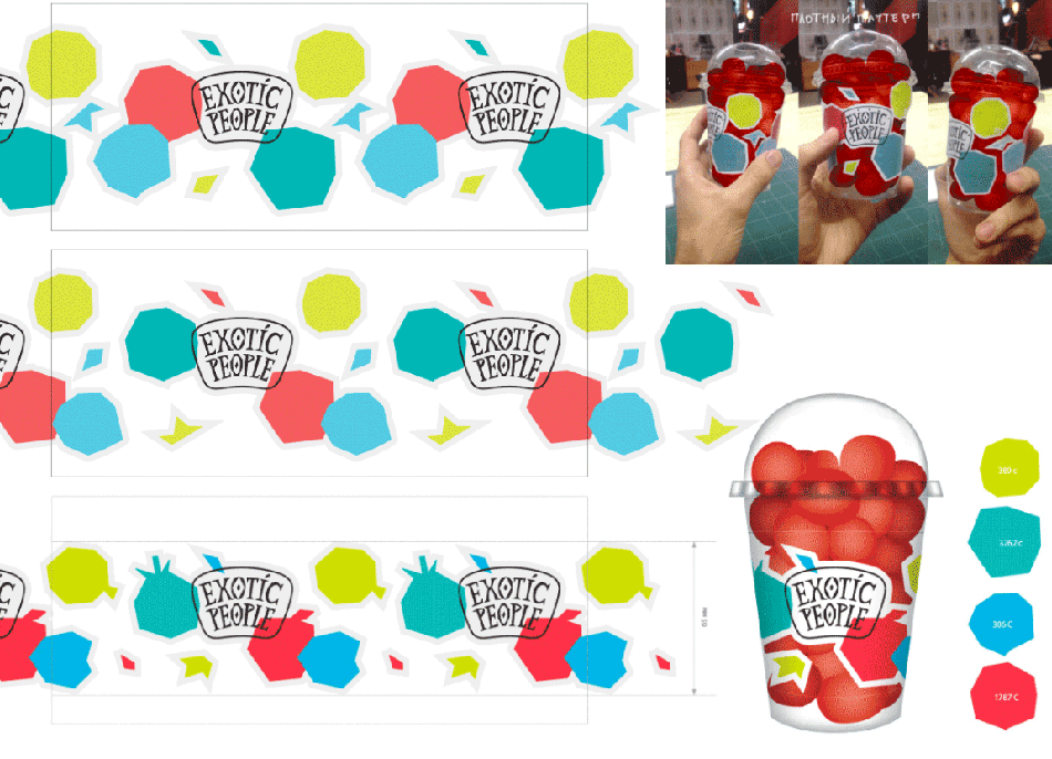
And the pattern needs more work.
Just what we need.
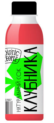
Juice bottle.
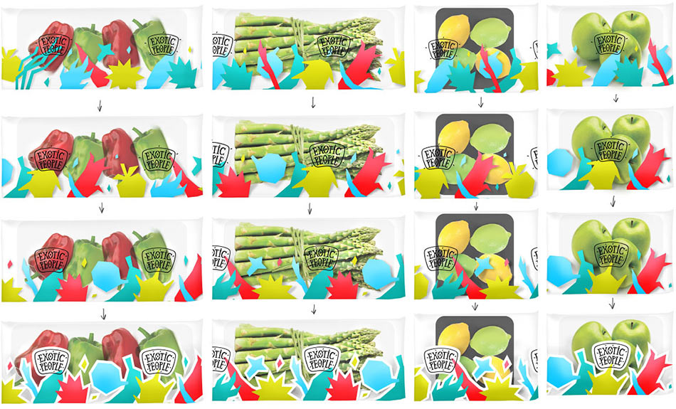
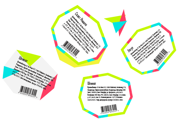
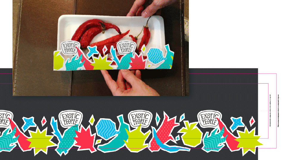
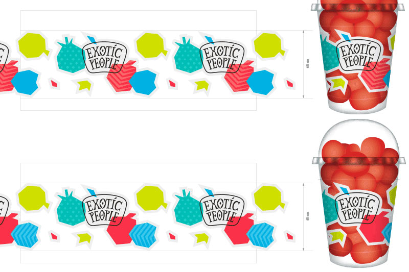
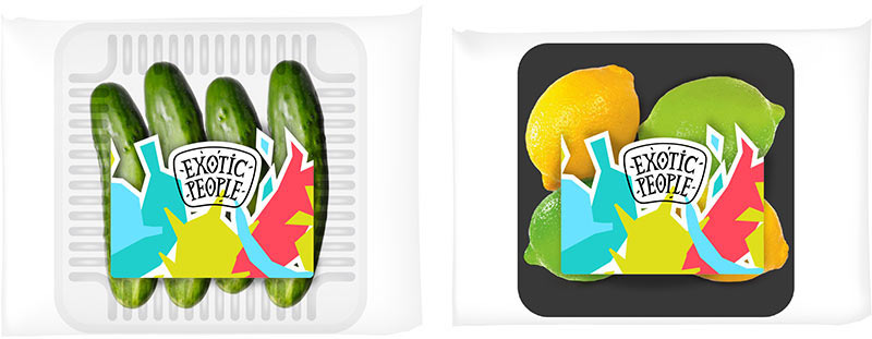
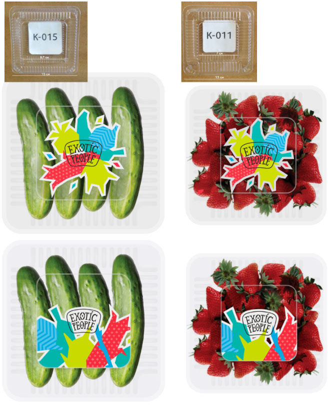
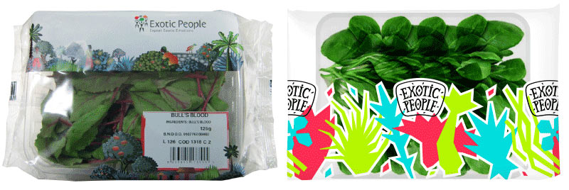
Trays require special stickers.
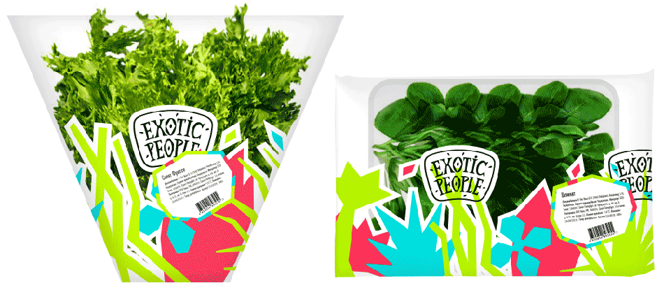
Salads have their own pattern.
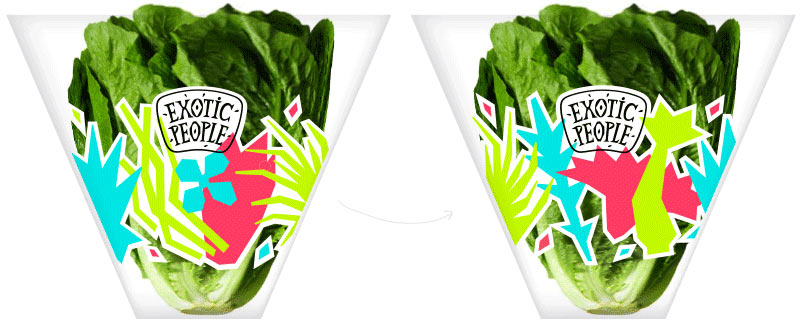
Looks OK with a sticker.
Making the illustration more complex.
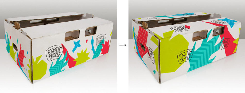
Citrus fruit box.
Breaking news: salad wrapping must have information not only about suppliers, but also about health benefits of the salads. One large sticker won’t work, and two on one salad would be too much. We suggest a wobbler on a stick. Wobblers are two-sided so that it wouldn’t be possible to insert them the wrong way.
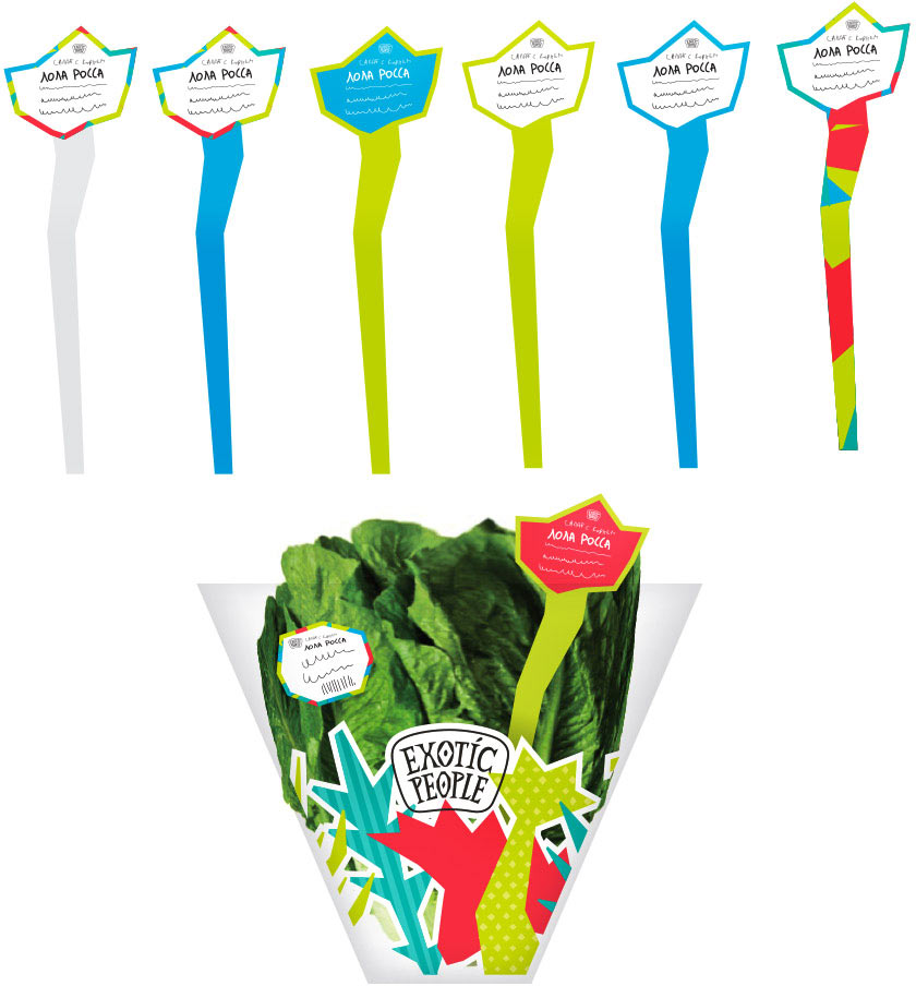
Client: The wobblers are great, we’ll take them!
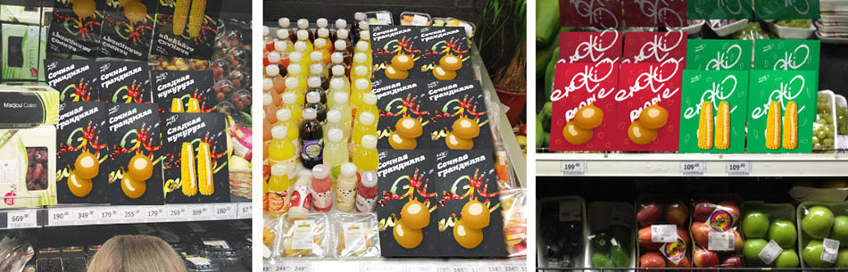
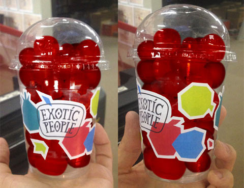
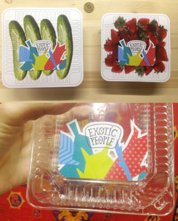
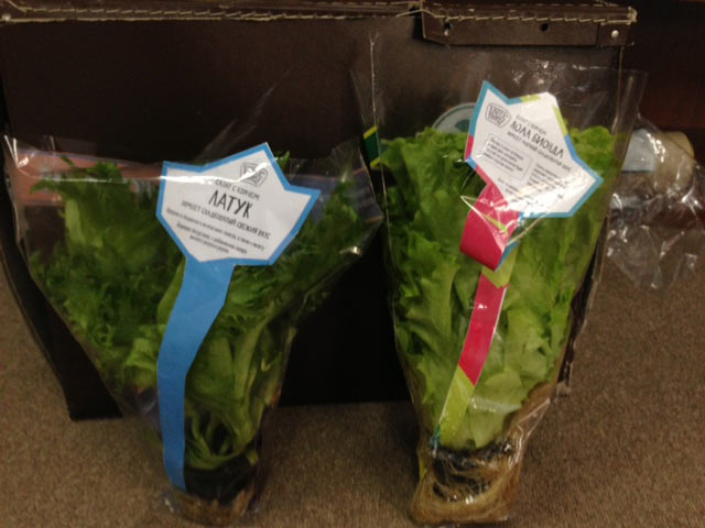
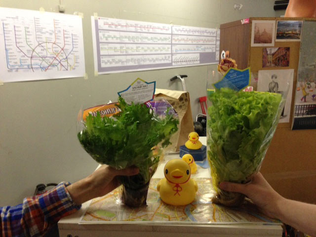
Real life testing.
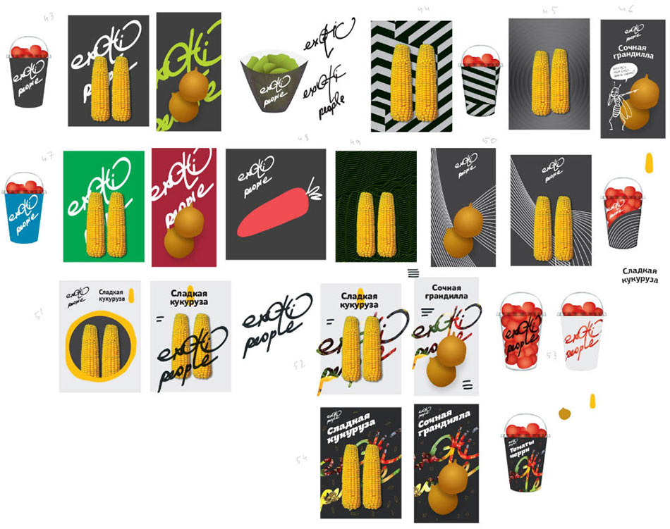
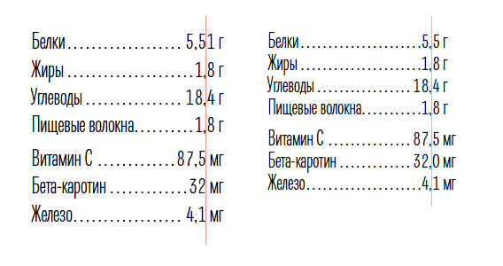
Starting to typeset all of the packaging. First we brush up all the mock-ups.
Polishing the details.
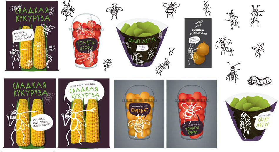
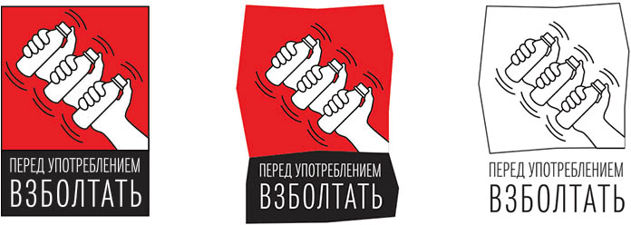
Art director: We’d better draw a nice picture for “Shake before use.” We have one for the microwave oven, for the pot, but nada here.
Making a couple of alternatives.
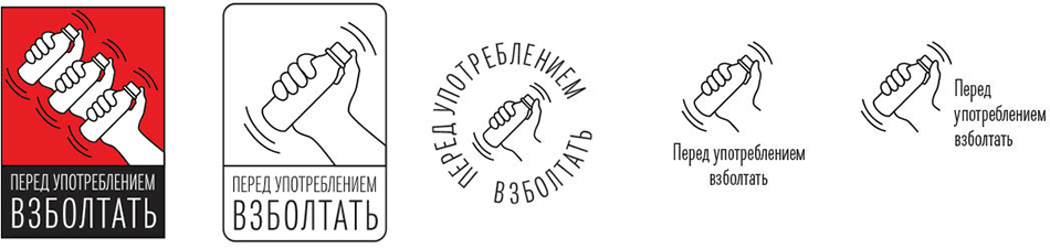
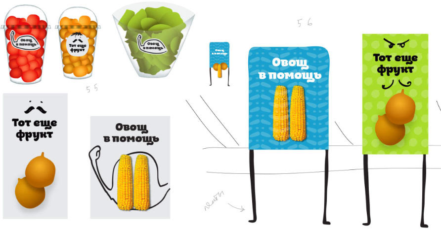
Art director: The third one, with the circle. Though the first one is more crazy, which is what I like. I just don’t like the frame.
Saying nothing about the fact that the first one was a joke and quietly remaking the frame.
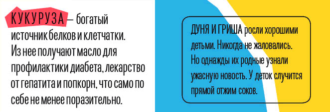
Art director: We need a small text about the product for the packaging, one that would be nice to read.
The typesetter tries to come up with a kind text that would be nice to read.
Typesetting the brand book.
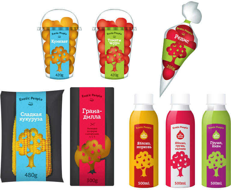
Rechecking all the mock-ups and sending to print.
