Visual Identity Advertising
The making of the logo and visual identity for Modny Sezon shopping arcade
Drawing out first sketches.
Doesn’t feel right. Deciding the best for the task would be an image that expresses the ideas of fashion, style, seasons and trends. We want to play up the name and create the style that would be “on trend.” Art director suggests seeking inspiration in the works of Juan Miró.
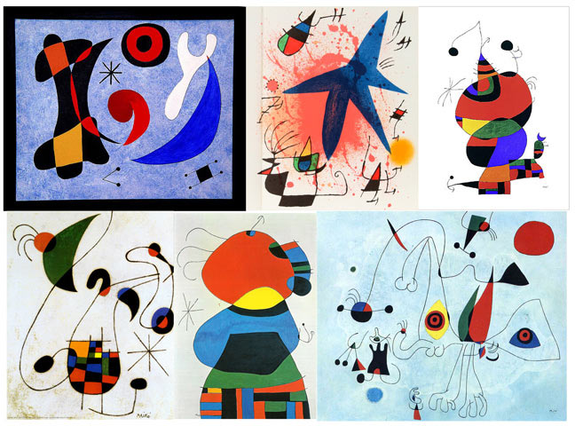
Studying the artist’s works. They really are exceptionally beautiful, but also trendy. Trying this approach. Suddenly coming up with something original but also in the manner of Miró! We were so in love with that concept that decided not to reveal it here. We’ll leave it for the future.
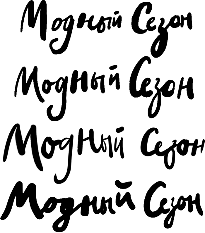
Ok. Little pot, cook. Looking for something new. Why not turning to another approach—a more classical one? For instance, let’s try calligraphy.
Not bad. Can live with it. Let’s go on.
Got it! The last one is nice. At the same time thinking on the logo to complete the overall style. It has to be something delicate to go well with the flowers. Maybe something like this?
The first one. Trying it out and at the same time working on the presentation.
Putting together presentations for the other versions as well.
Presenting. The client takes a long pause to think. Later on it turns out that the client sees the overall style differently. It needs more gloss, chic, luxury, splendor and other signature attributes of Moscow city center. We could incorporate them into the flowery concept, but only if we change the logo to something more respectable.
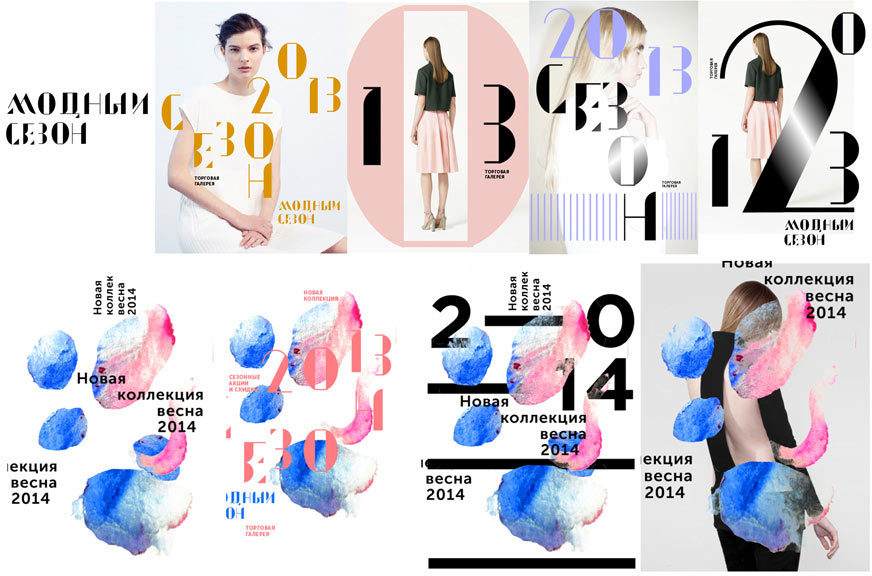
Cmnd+N, starting over again. Drawing sketches inspired by glossy magazines, runway shows and current trends.
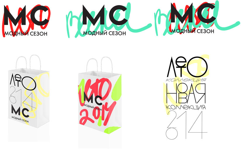
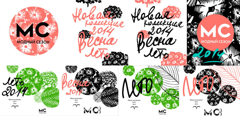
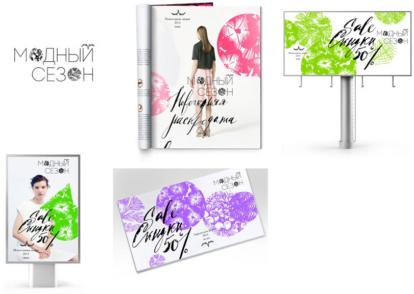
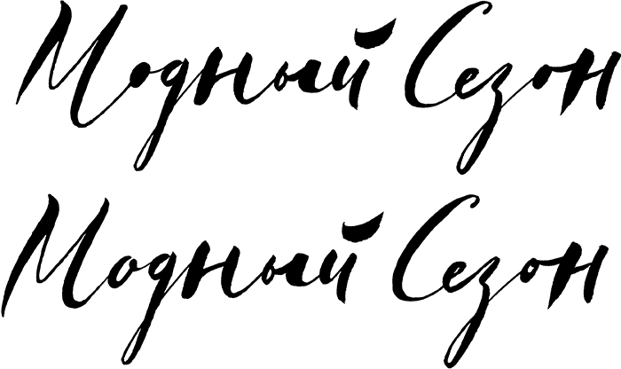
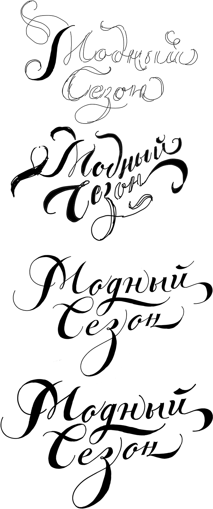
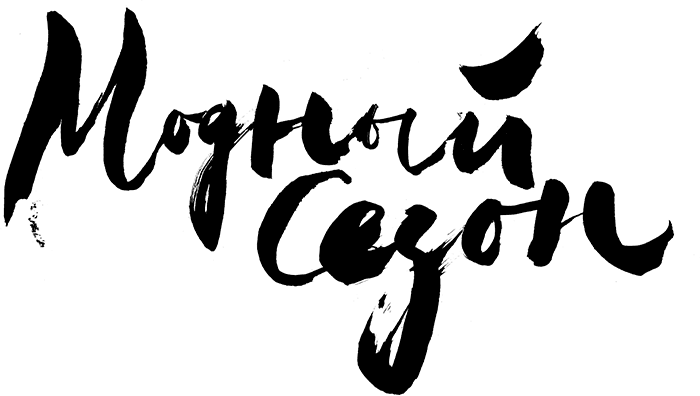
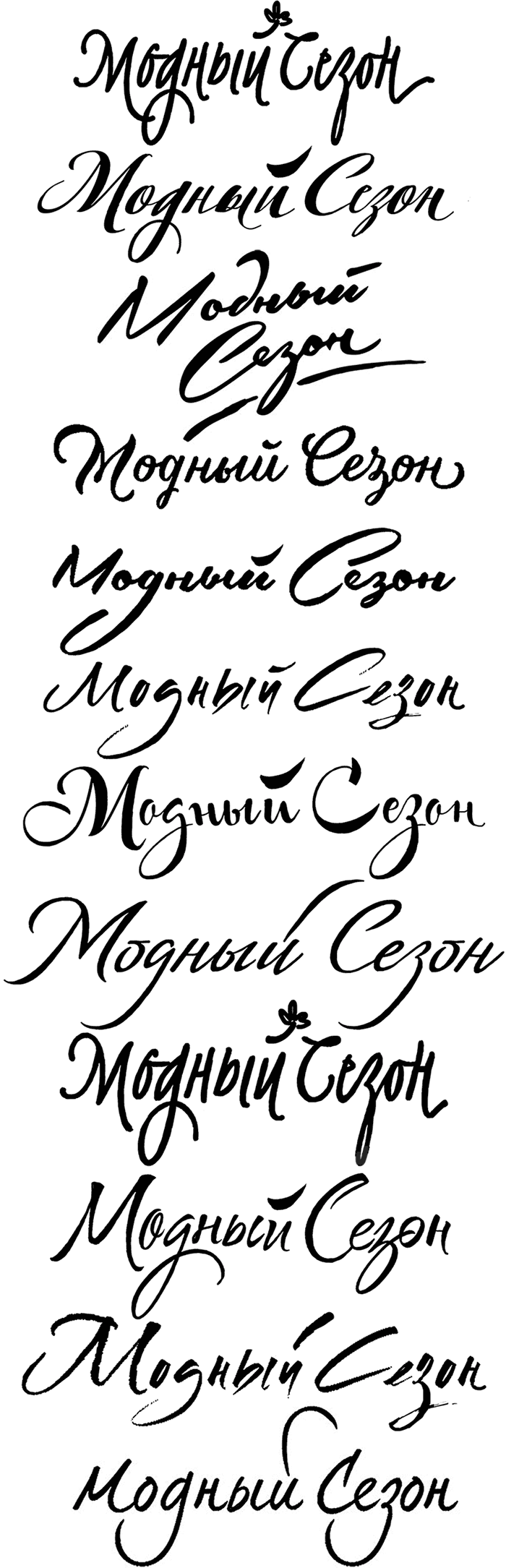
They all look good, but we decide to continue with flower collages and colorful splashes. At the same time we turn to the type designer to develop a calligraphic logo. She comes up with a fresh and vibrant calligraphy. The client wants the logo to be calligraphic and “vivid.”
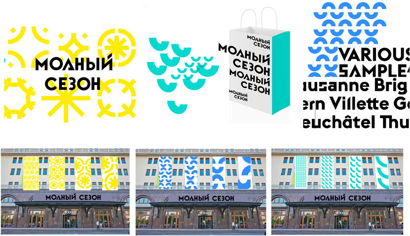
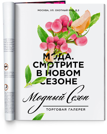
Putting it into the flower collage template.
Drawing a logo for the “engraved” flowers version.
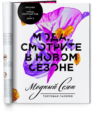
Although it looks good with splashes as well.
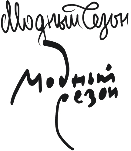
This is something to think about. Maybe we should make another calligraphy? Coming up with an elegant and sharp design.
Presenting all variants to the client.
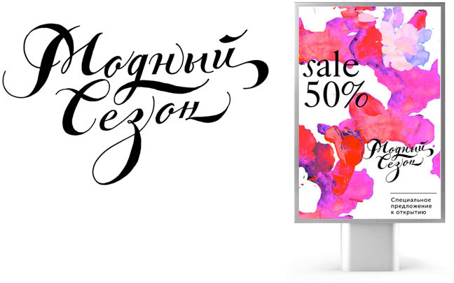
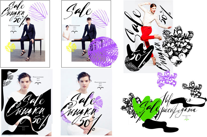
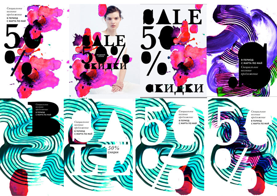
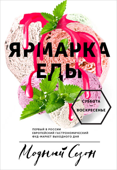
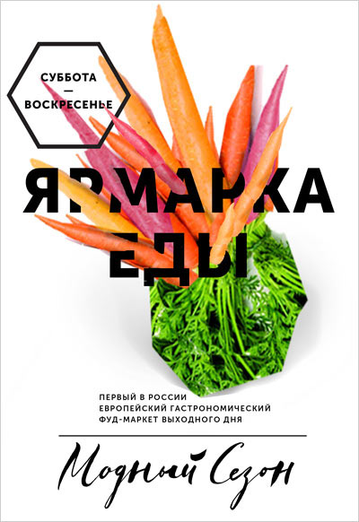
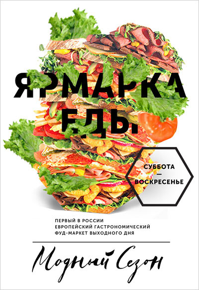
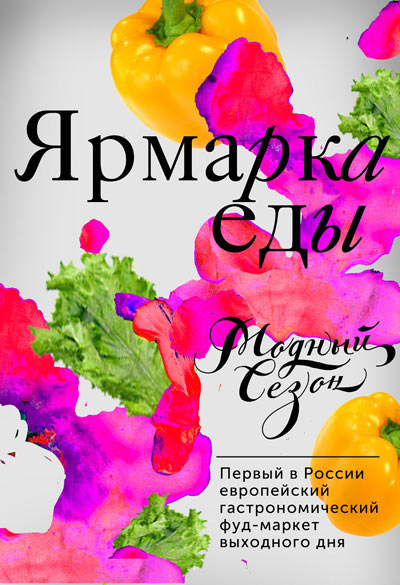
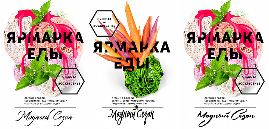
All designs are flatly rejected except for the calligraphic one. But the second version also doesn’t feel right. Eventually the client decides on the collage concept. But we need to work on the calligraphy. And the overall style needs testing on an ad template—for example, an ad for the food festival that’s going to take place in the arcade. And it also would be good to test the splashes concept. We need to compare and think.
The flexibility of the styles impresses the client, but he decides to opt for the collage concept. Working on the calligraphy. Trying different variants. For instance, a more expressive paintbrush one.
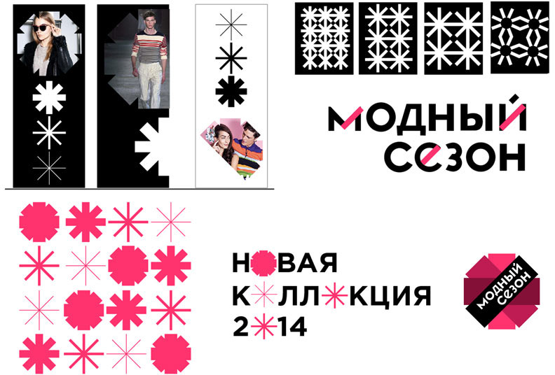
Nope. We have to continue the search.
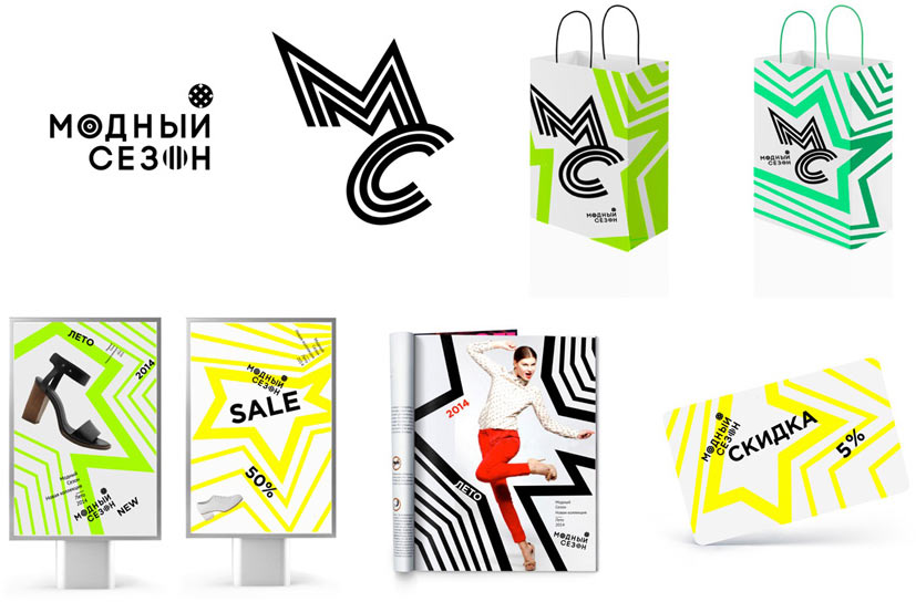
Definitely not it. Art director sends us his sketches.
We decide to choose the bottom one and work it out, but the search isn’t over. Let’s roll.
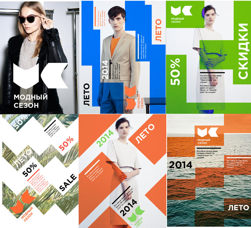
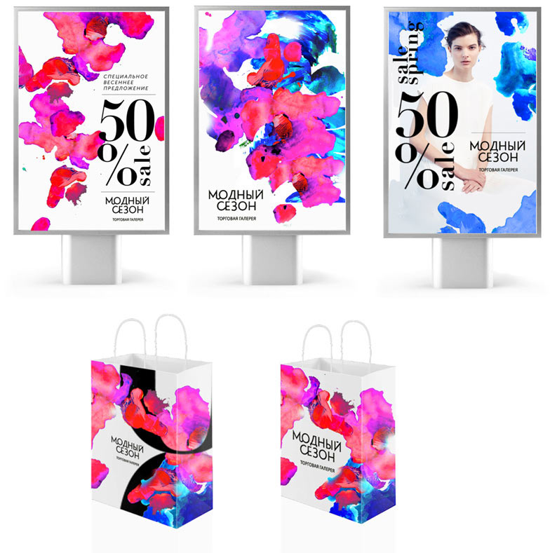
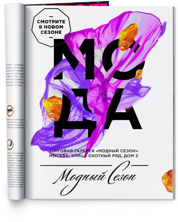
Art director chooses three variants. Trying them on a sample ad layout. The client chooses the third one.
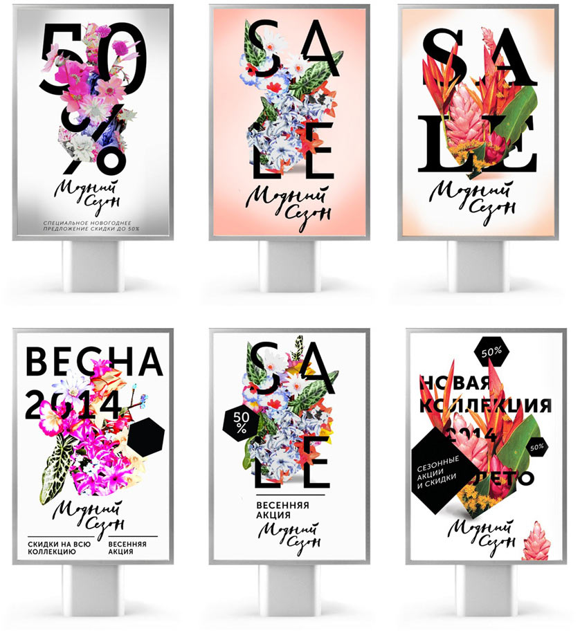
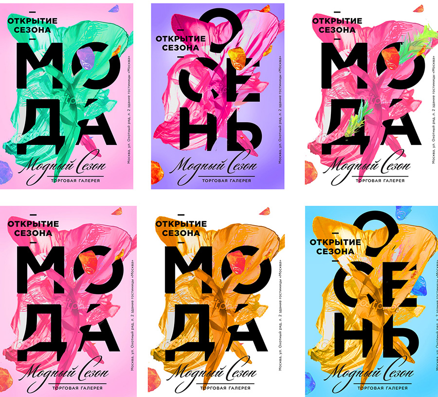
Drawing, modifying. Now we need another ad layout—for the grand opening. We decide to continue with the flower theme and play with different meanings. Drawing a parallel with blooming flowers.
Nope. The client thinks it looks like a flower shop. Ok, then we’ll replace flowers with clothes—fabric, jewelry...
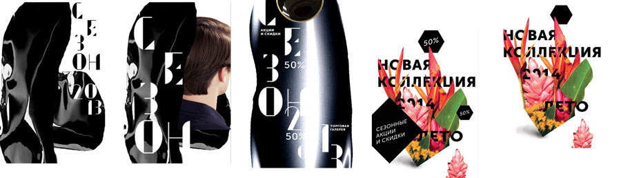
The inscription seems too small and illegible.
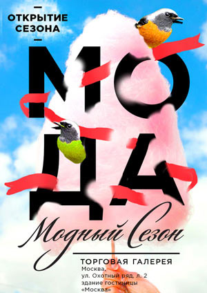
Finally, everything clicks. The word “мода” (fashion) is unveiled—ta-da!—a triumphant, long-awaited opening of the new fashion season arrives. Meanwhile, designing another layout.
Art director: Cool, but for the next time.
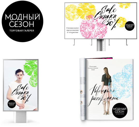
Going back to the first variant. The client wants the print ad to have a background. Making sketches.
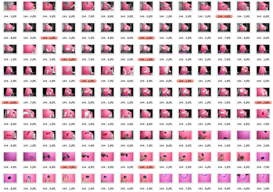
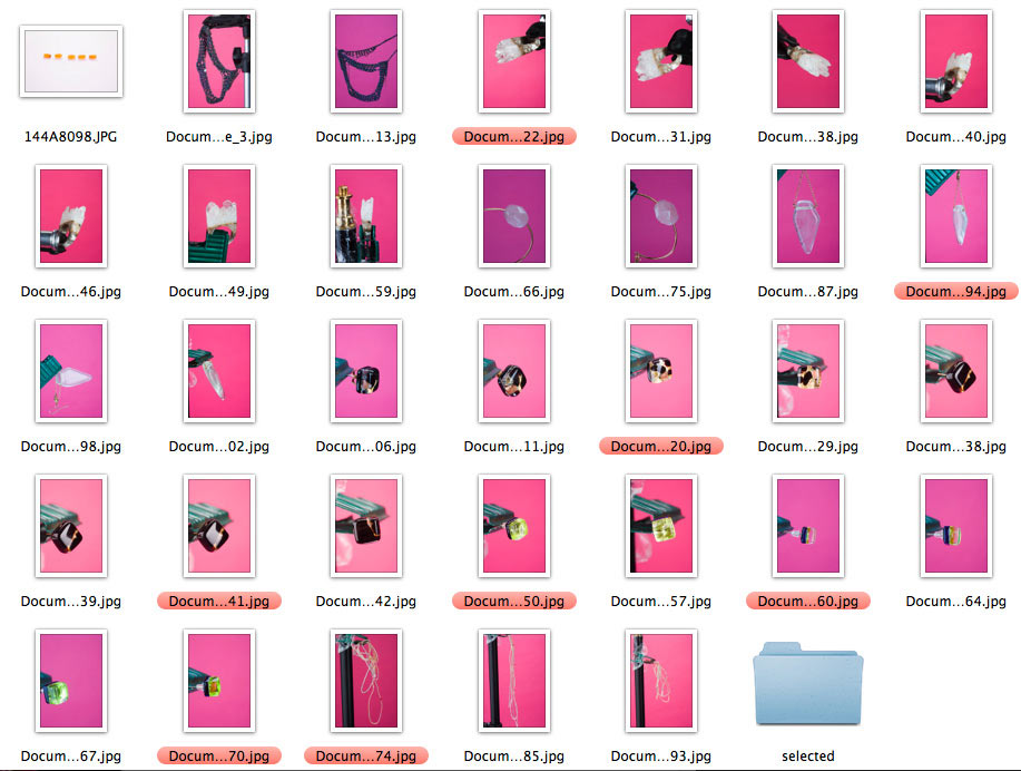
Suddenly, we’re made aware that the magazine issue with the ad goes to print midday tomorrow. Urgently doing the photo shoot.
Finishing the midnight layout.
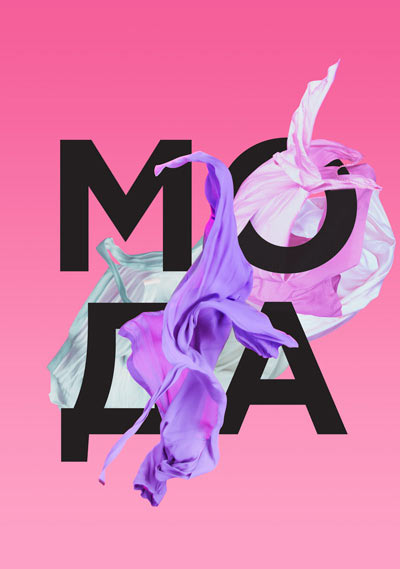
Greeting the new season.
