We need to create a logo that isn’t too traditional and at the same time is not ultramodern.
Going through references, drawing inspiration from wine.
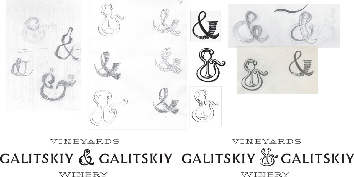
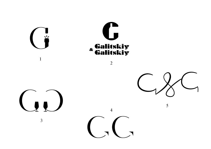
Generating ideas.
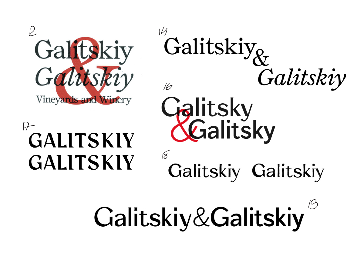
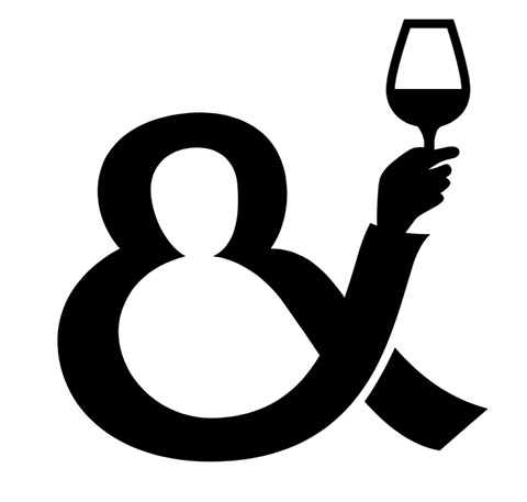
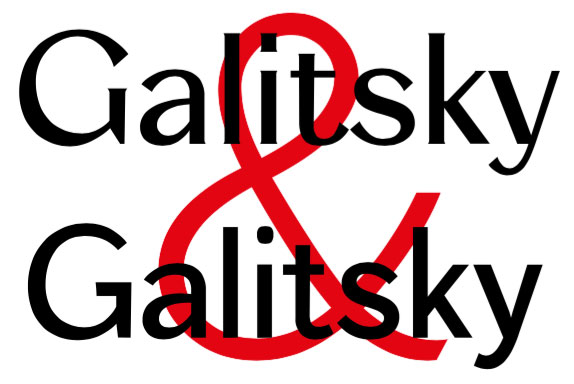
The art director suggests to inscribe a bottle into the ampersand.
Putting everything together and showing to the client.
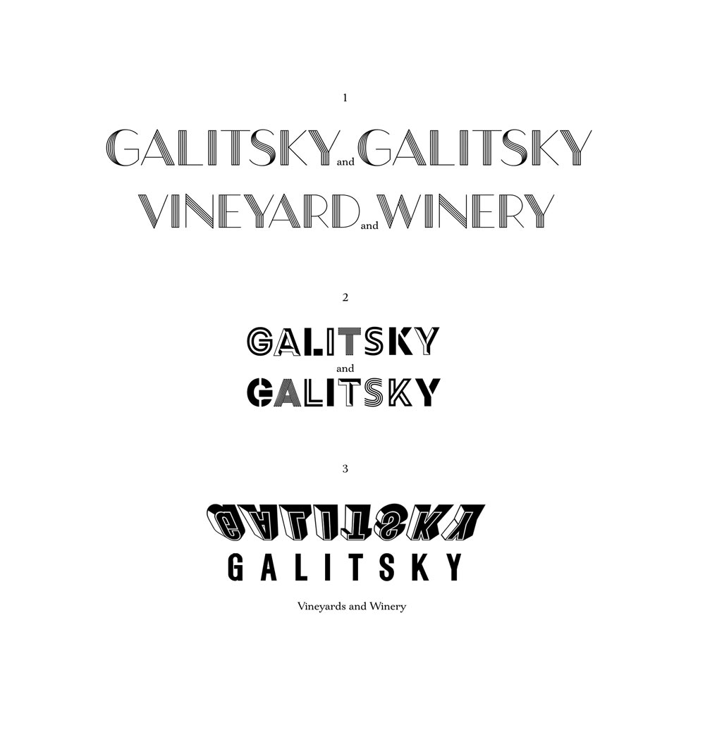
No. There should be no play in the logo or any differentiation of one Galitskiy from the other.
We need equality.
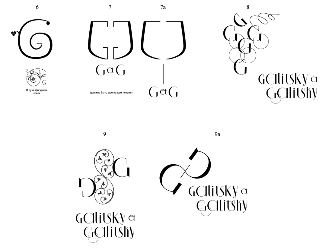
Creating more quick sketches to try to get a feel for a direction.
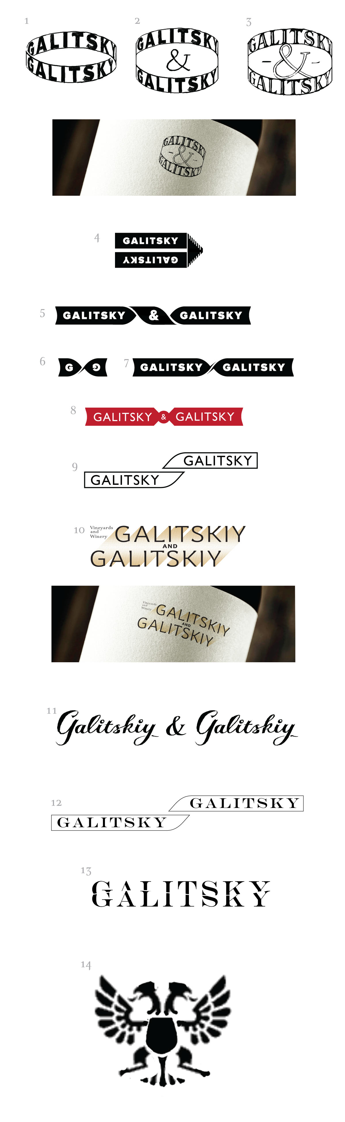
Numbers 10 and 11 are slightly less wrong than others but are still wrong.
Number 14 has interesting heraldry, although the way it’s rendered right now makes it feel out of place.
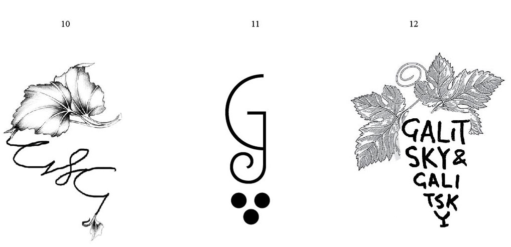
Getting new references from the client. These are the styles they like.
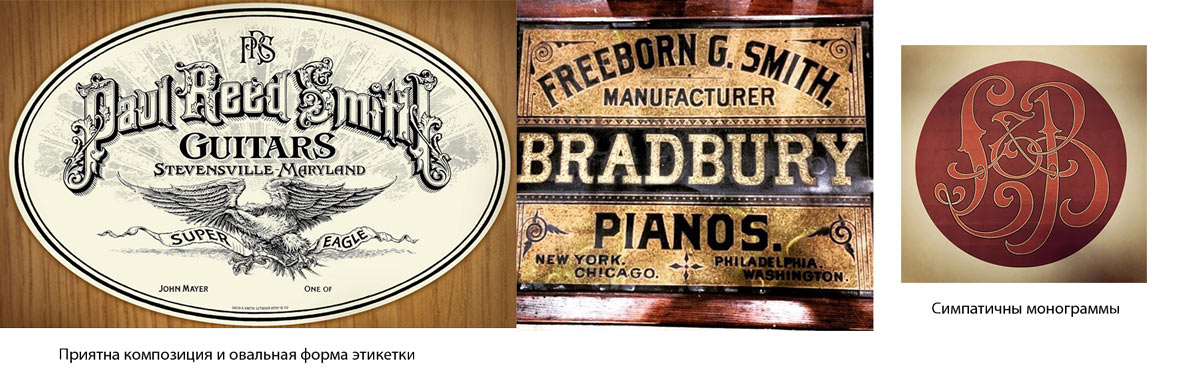
The new references have more to do with labels rather than logos. Keeping in mind that the client likes the engraved style of a dollar bill and high level of detail, yet there should not be anything playful about the logo.
Making another approach.

Discussing.
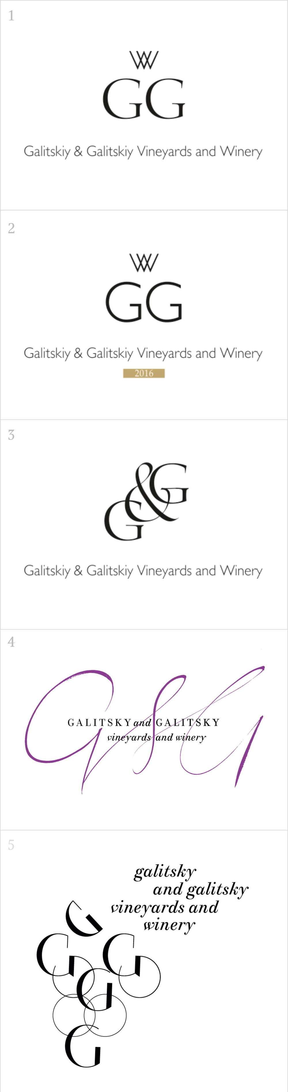
Client: Each of these designs has something interesting about it, but not enough to catch our attention.
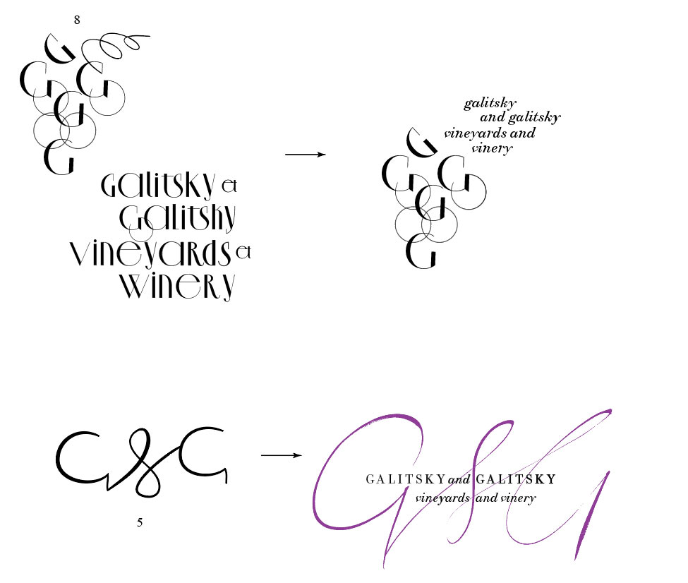
We liked the grapes in number 5.
Maybe that’s something we can later use in the corporate identity.
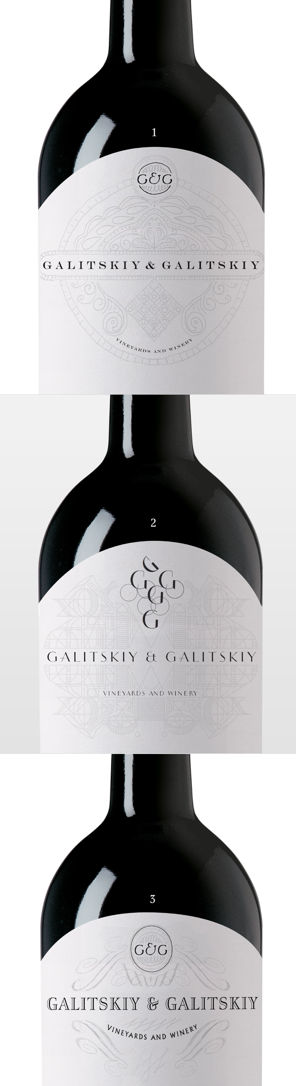
Inviting two more designers to the project. Making the graphics more intricate.
Demonstrating.
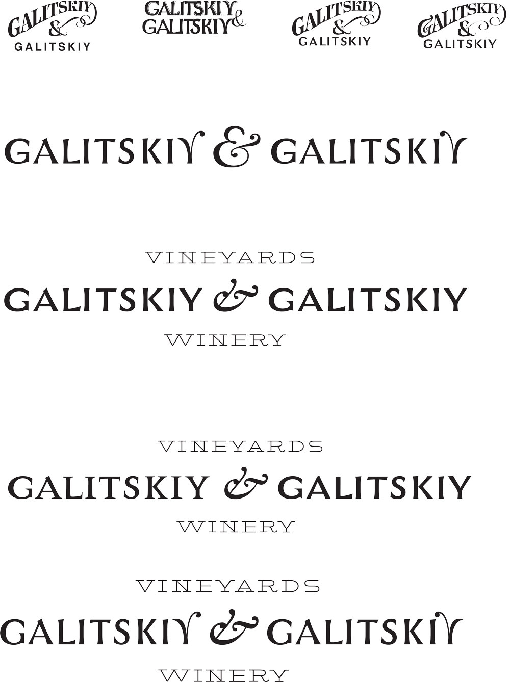
In 1–3 too much meaning is given to patterns.
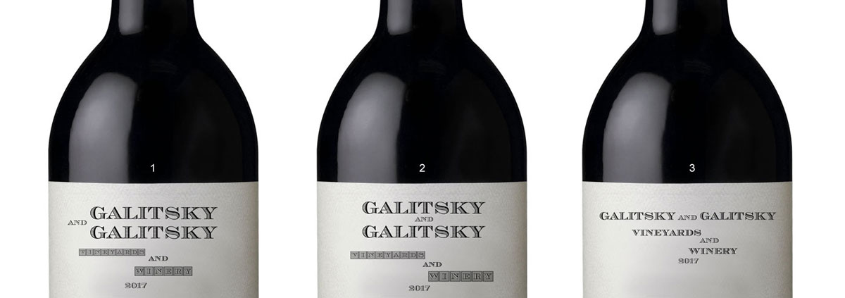
In number 3 we don’t like the monograms and the circular arrangement of “Vineyards and Winery.”
The number 4 is nice, but right now the Galitskiys are not equal, one dominates over the other.
The number 5 is the closest to our vision out of them all, but is a bit too simple now. It lacks a monogram. And again, one Galitskiy is located above the other.
The number 6 is too lush, reminds of a Champagne house logo.
Deciding to work some more on numbers 4 and 5.
Another attempt.
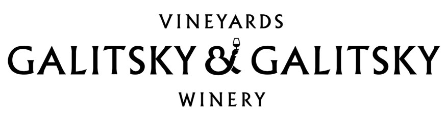
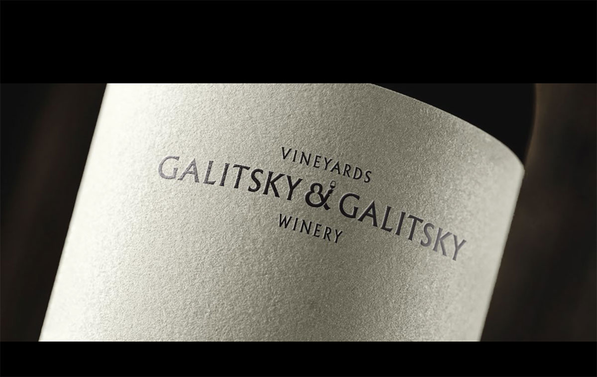
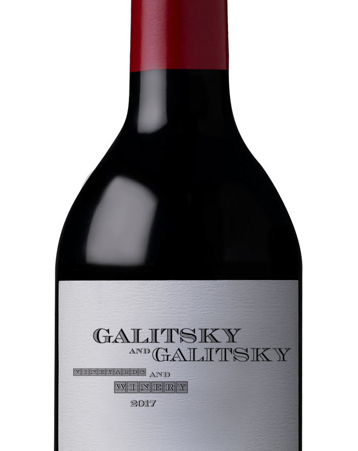
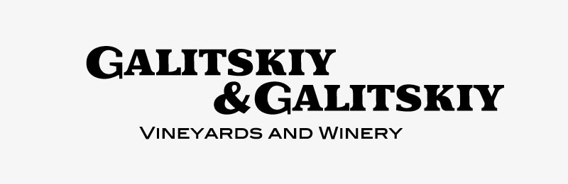
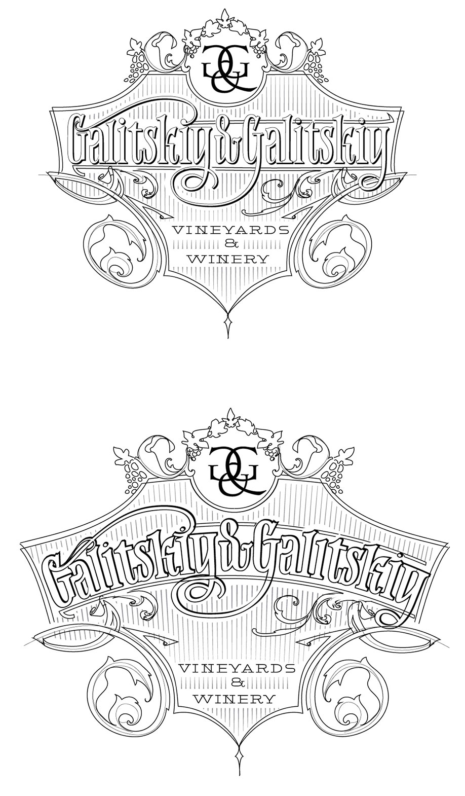
We got it. The client likes the first design with the monogram. Starting to draw the final version.
Trying different monogram designs.

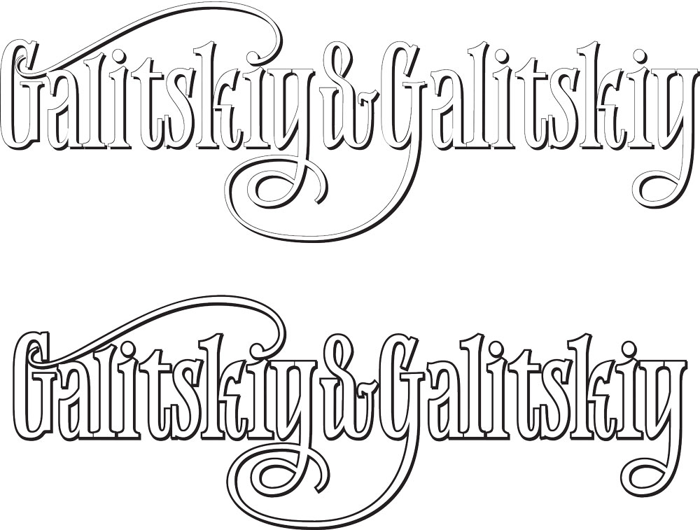
We like the result, but letter thickness is distracting. Generating lighter versions.
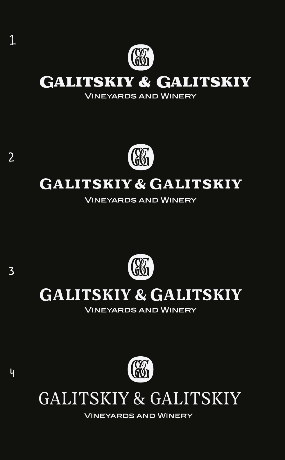
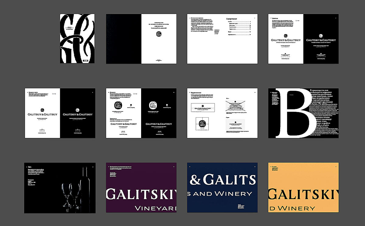
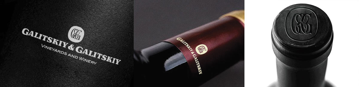
Choosing colors and typesetting the guide.