Client: Helicopter Technologies helps to buy or sell a helicopter in Russia or abroad. We connect the supply with the demand based on specific criteria (make, model, flying hours, price, etc.) providing assistance with the transaction from start to finish. We also sell spare parts, insure helicopters and perform aerial work.
Our clients choose us for the qualification of our personnel, to save time and ensure confidentiality.
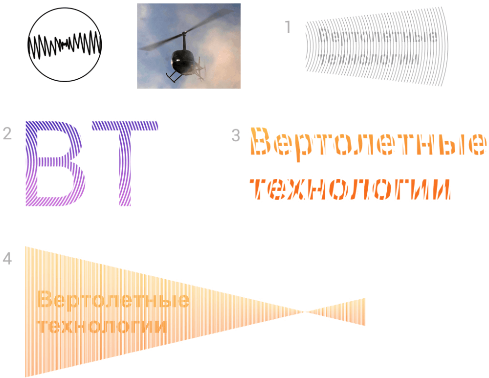
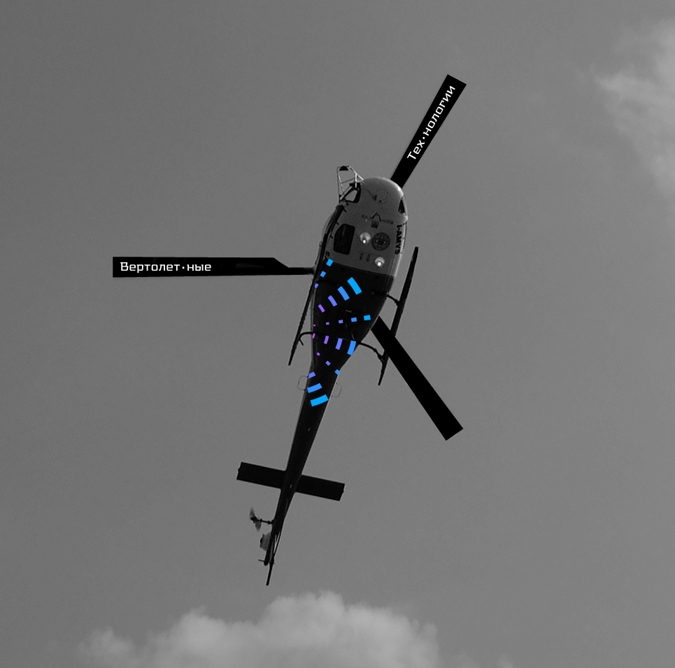
The logo should be simple and clear. The main identity element we use is a letterhead. Decision makers go through several shortlisted offers that include photographs and a brief description.
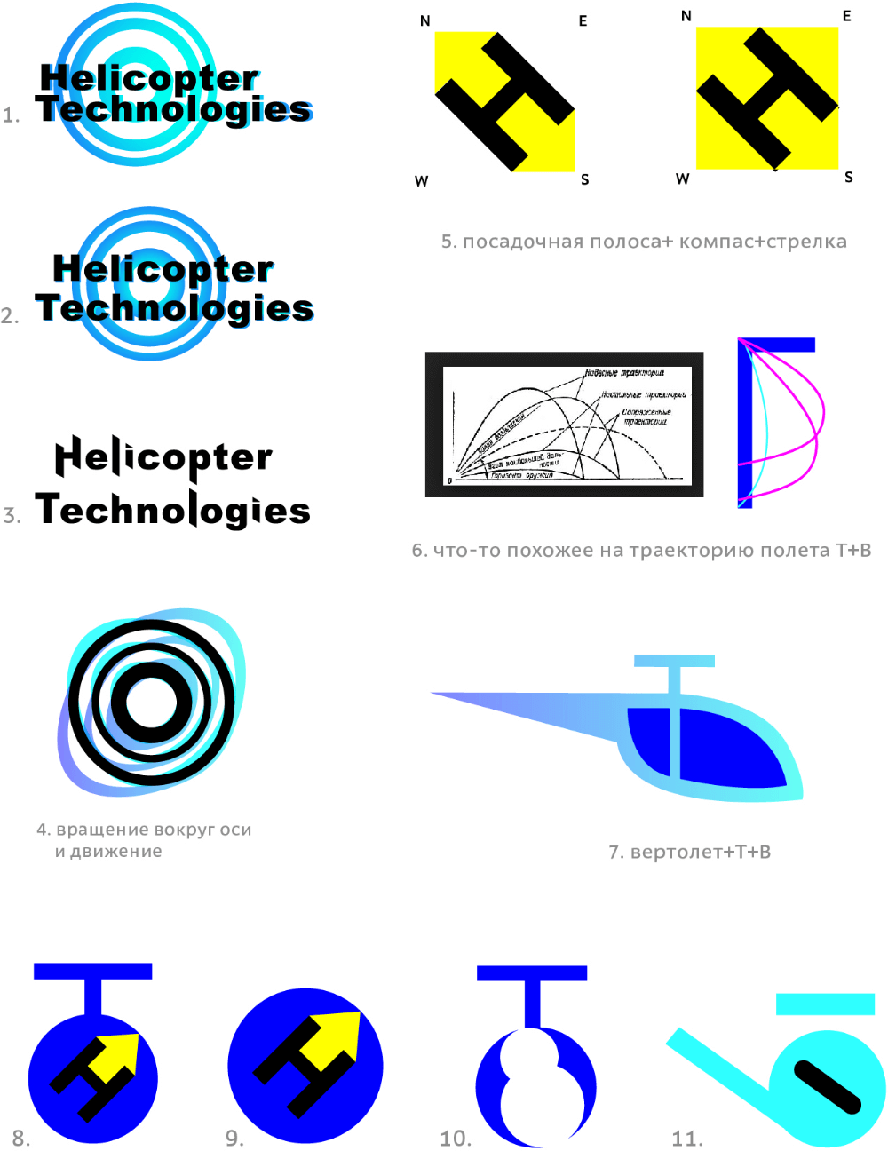
First designer:
Art director: No.
Second designer:
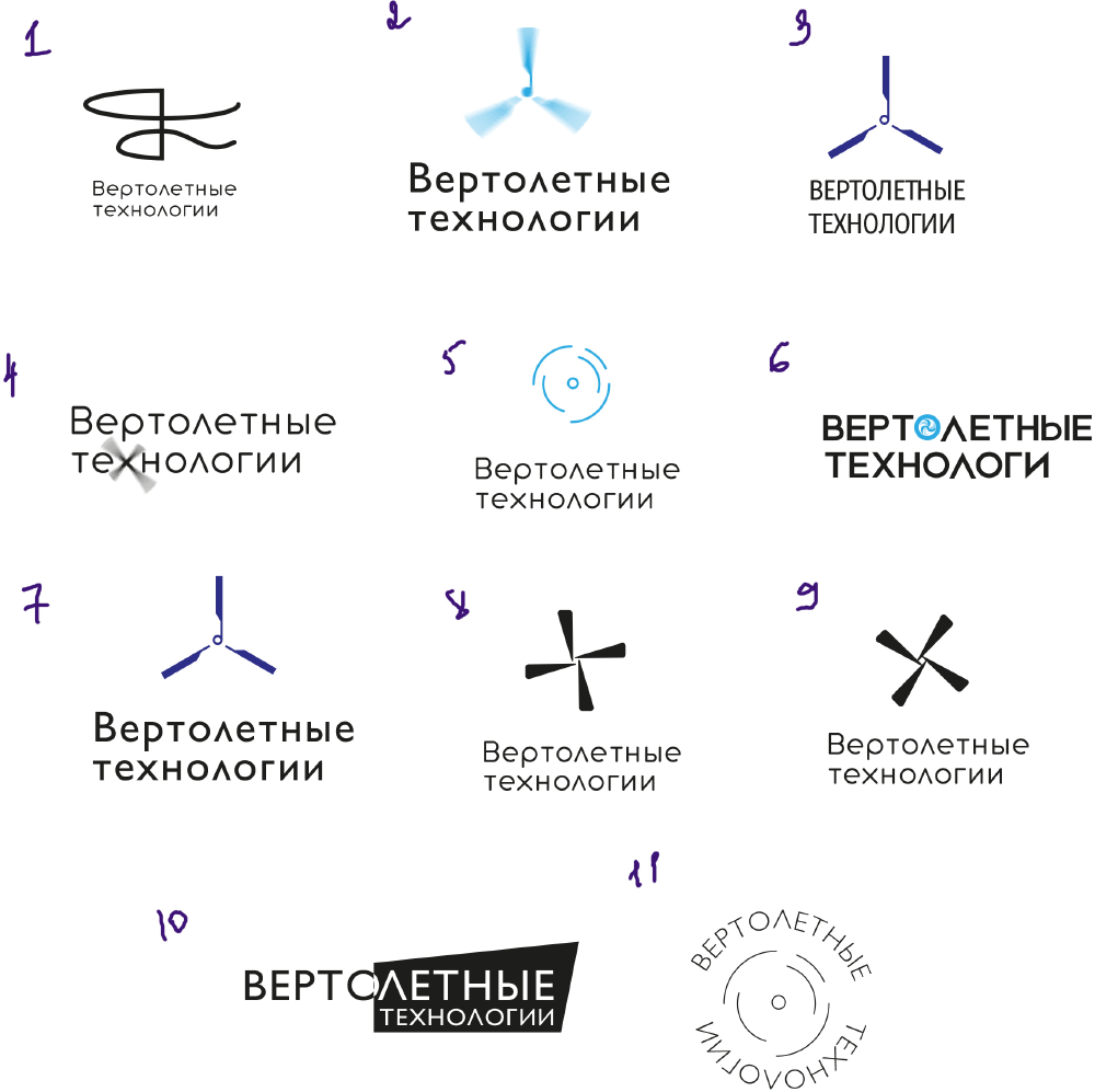
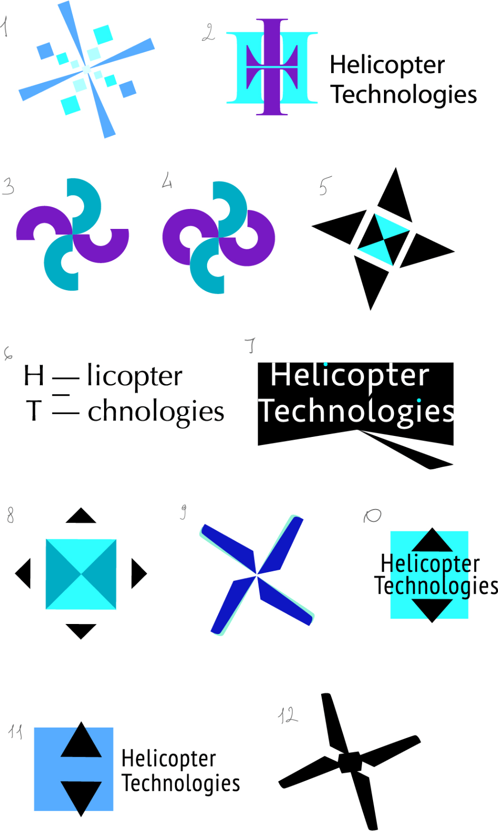
Art director: You can use number 5 as a starting point. Let’s go with the fact that helicopters are all about rotation. The number of blades is irrelevant.
Second designer: Some ideas about the movement of air through helicopter blades.
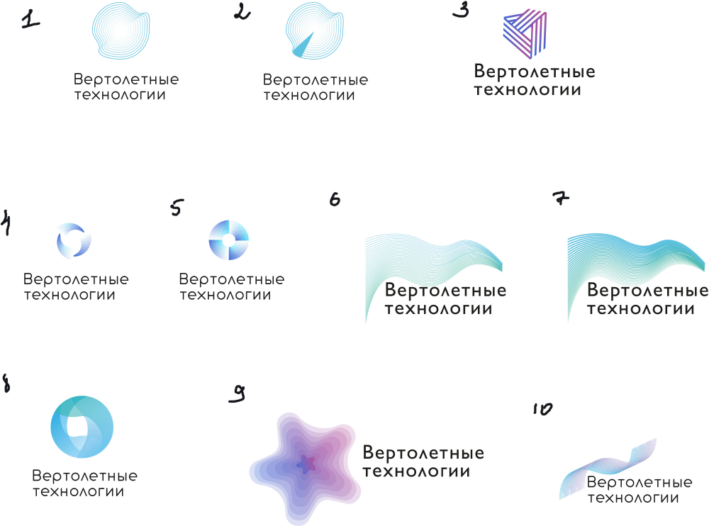
Art director: Turn it into something like a halo.
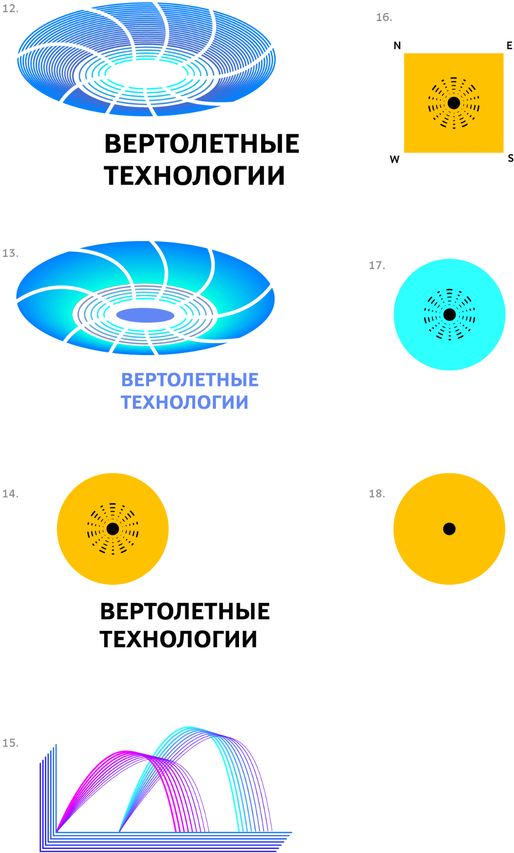
Art director: They all look like tin cans. Number 5 is better though.
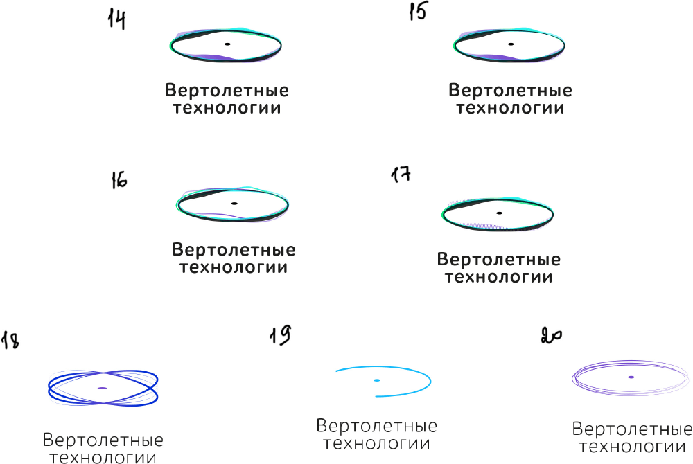
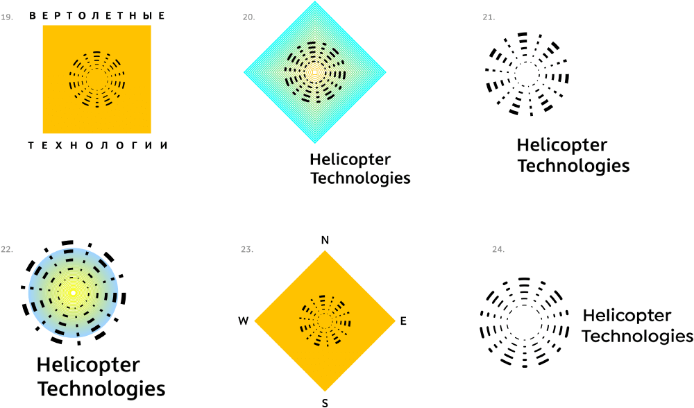
Art director: Why the distortions? Let’s go with 19 but close the shape.
Second designer: I just want to make it a bit more dynamic...
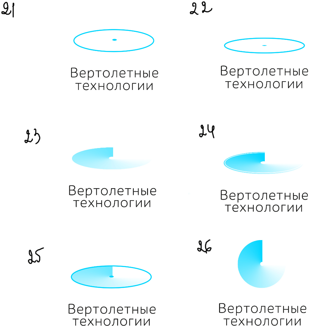
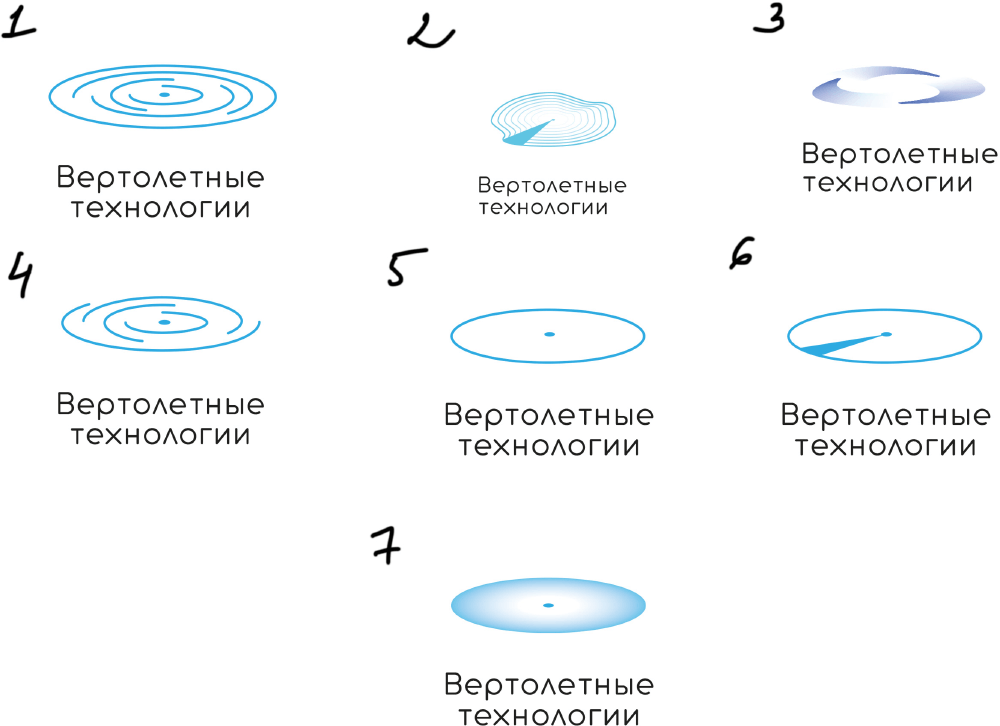
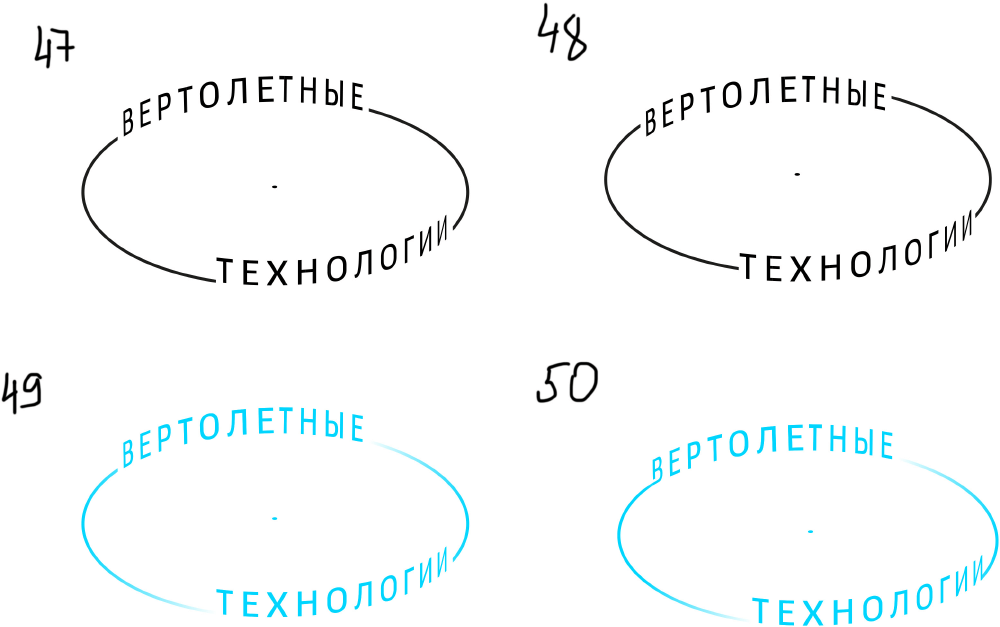
Art director: 21, but make the dot thinner and use a more interesting typeface.
Art director: I like the ОЛОЛО in the text. Let’s try to put the text in the circle.
Second designer: We’ll lose the ОЛОЛО then)
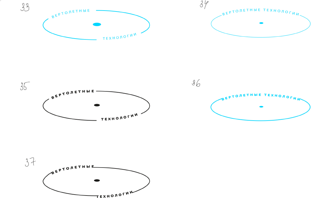
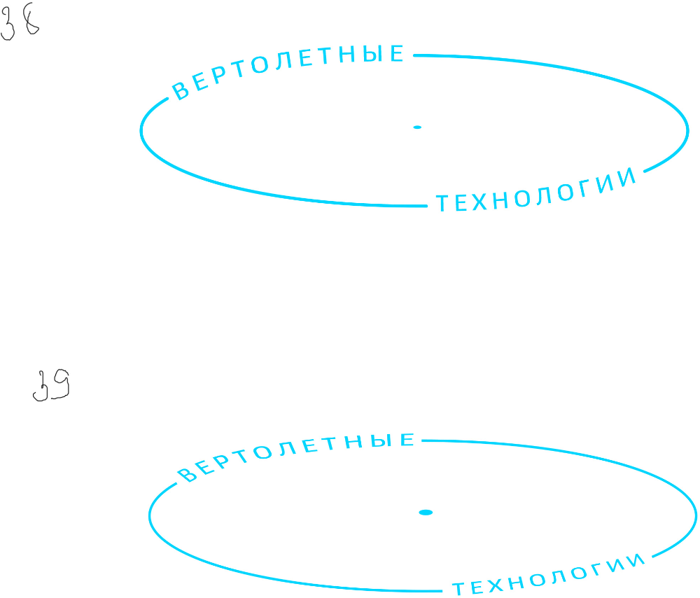
Art director: In 33 make the dot look like a dot. And write the text in better so that the letters are placed nicely.
Art director: The text is positioned horribly.
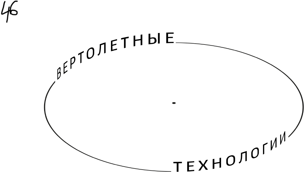
Art director: Arrange the letters as if they are on the side of a transparent glass. And make the dot a dot, not a birthmark.
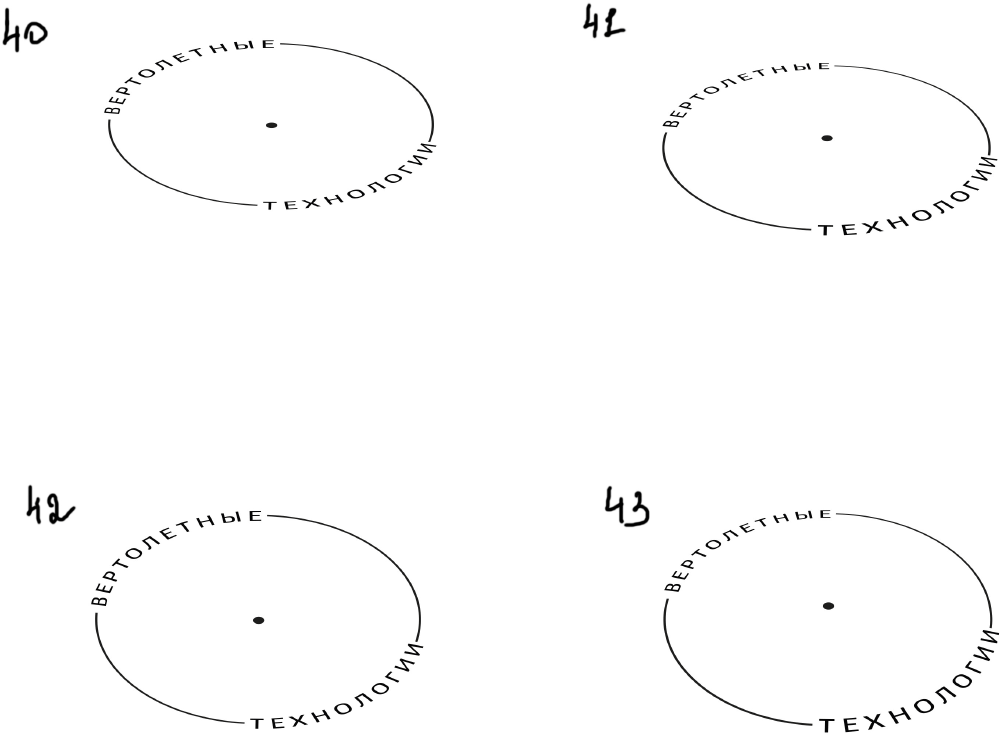
Art director: The typeface is not inscribed into the ellipsis.
Art director: Make the words larger.
Art director: No, let’s wrap this up.
Art director: These look like a labyrinth and a swastika.
Third designer:
Art director: Wow, wow, we don’t need a swastika here.
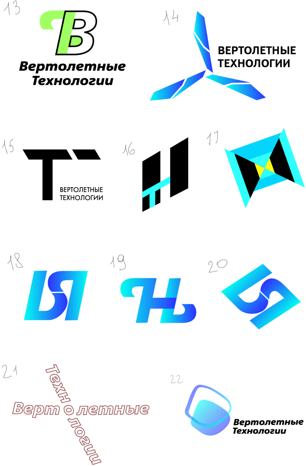
Art director: Looks weak.
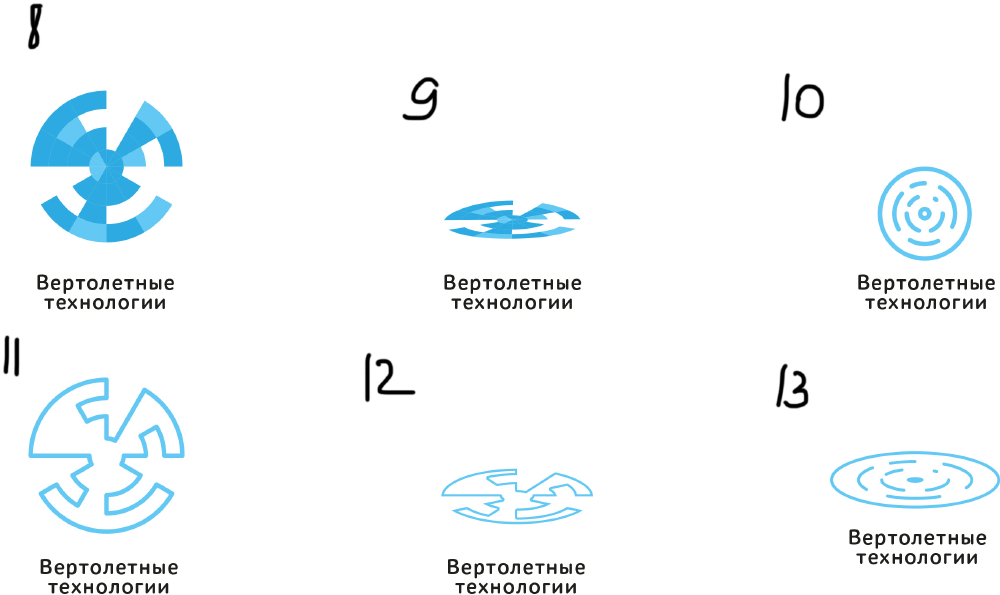
Art director: Try a simple circle with a dot in the center.
Art director: Let’s use just the round part from number 16. Get rid of the dot too.
Art director: Something like 24, but put the center-aligned text at the bottom.
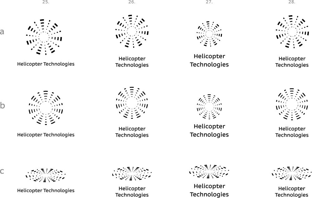
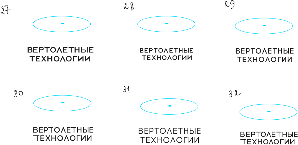
Third designer: More color variations.
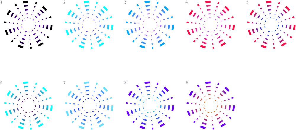
Art director: The symbol looks OK but the text is positioned poorly in all of them. I want something more fresh.
Third designer: What if we put it like that?
Art director: 5 is OK.
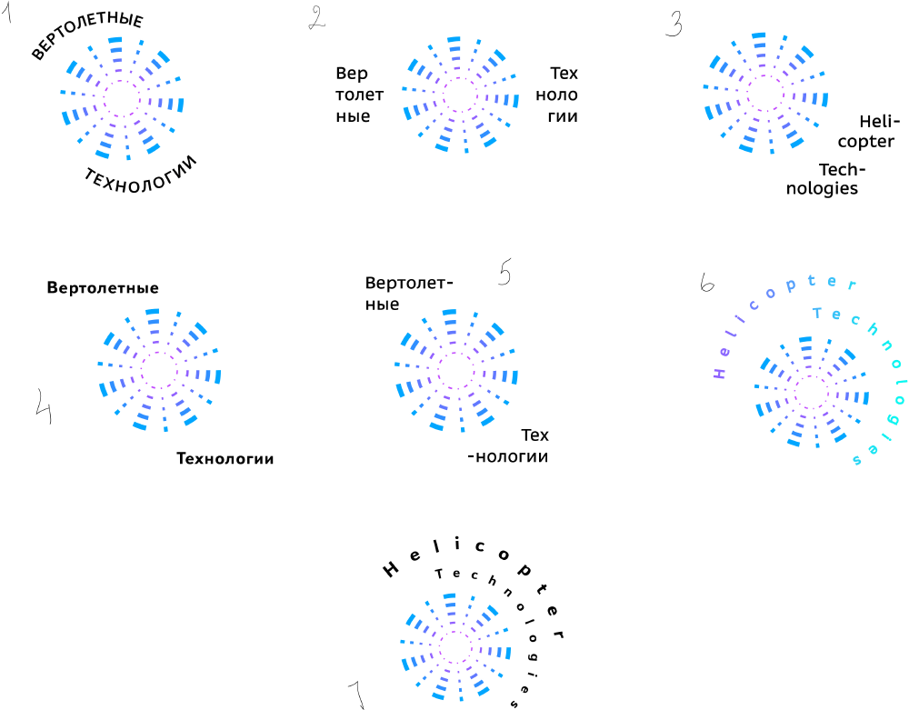
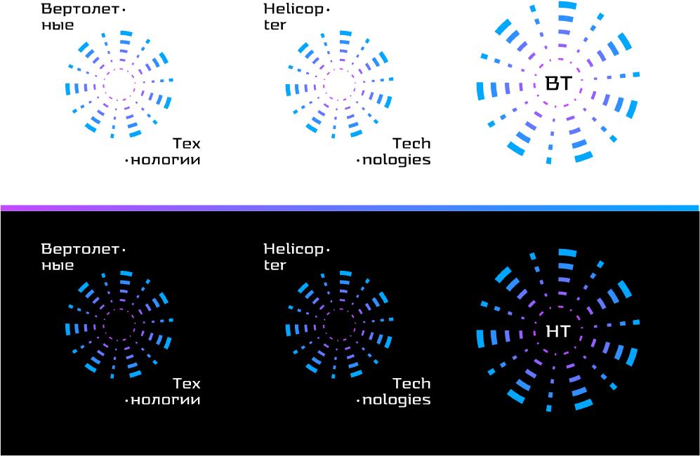
Third designer: I changed the typeface to ALS Tongyin Regular. And the circles are now slightly different.
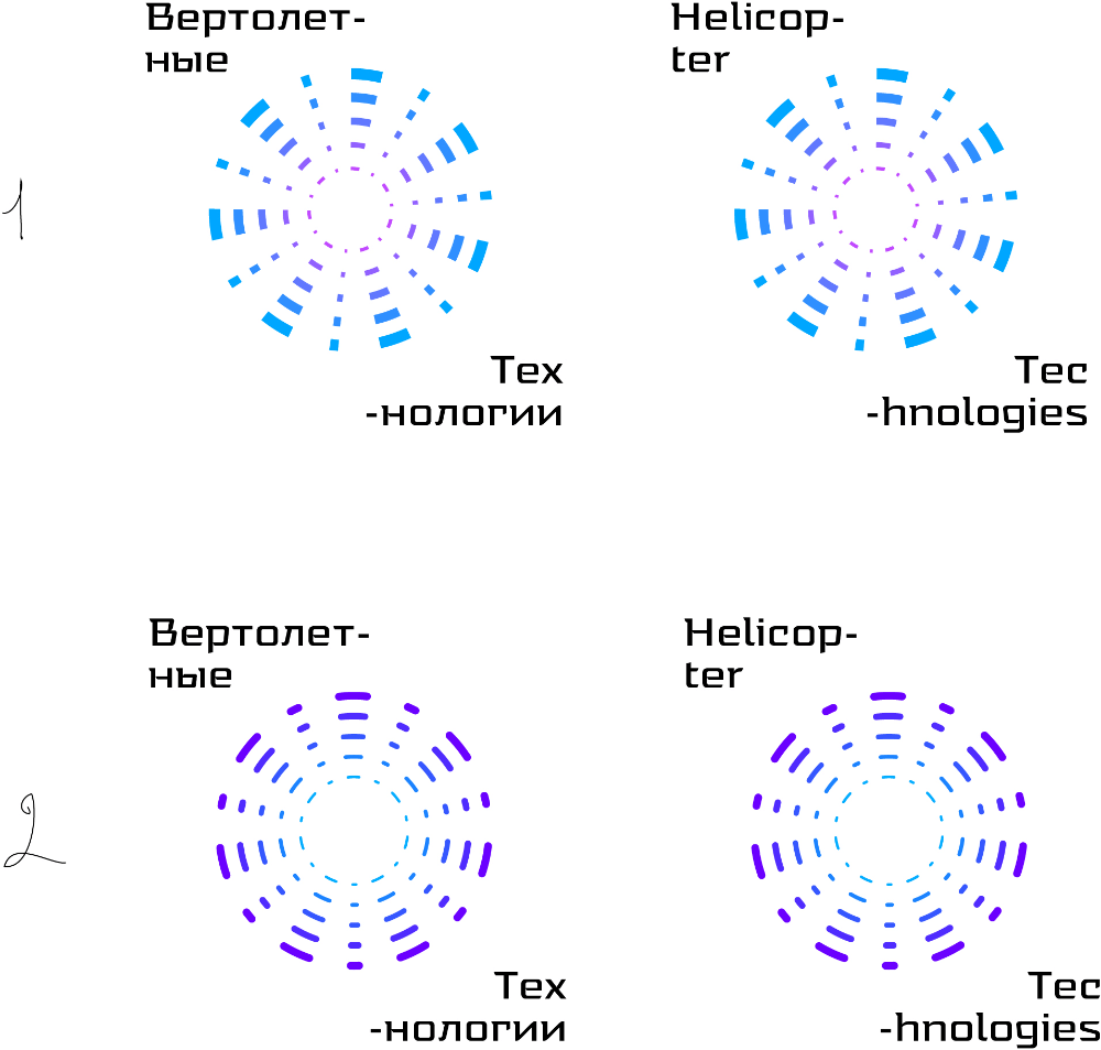
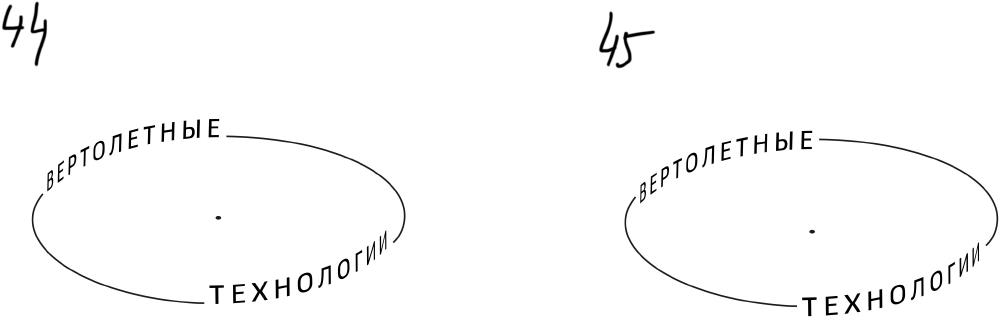
Art director: You can’t hyphenate at “tec,” it has to be “tech.”
Third designer: Which circle will look better? Should I show development?
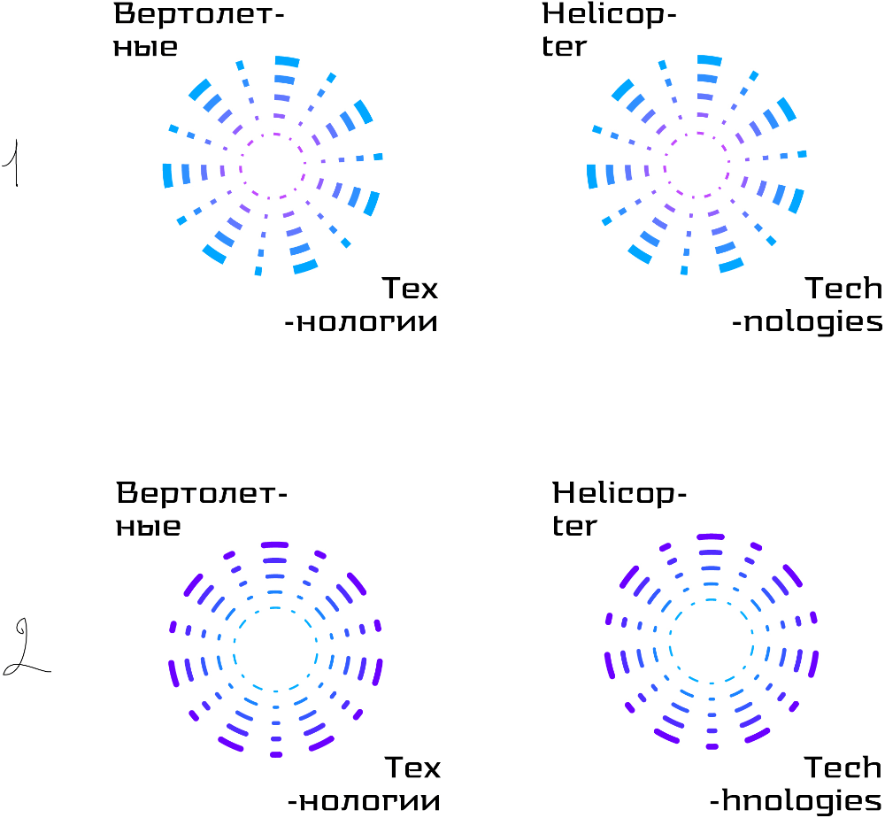
Art director: 1. And replace the hyphens with small round dots.
Third designer: Dots instead of hyphens, a simpler versions and more colors. I’ll also create a letterhead.
Art director: OK.
