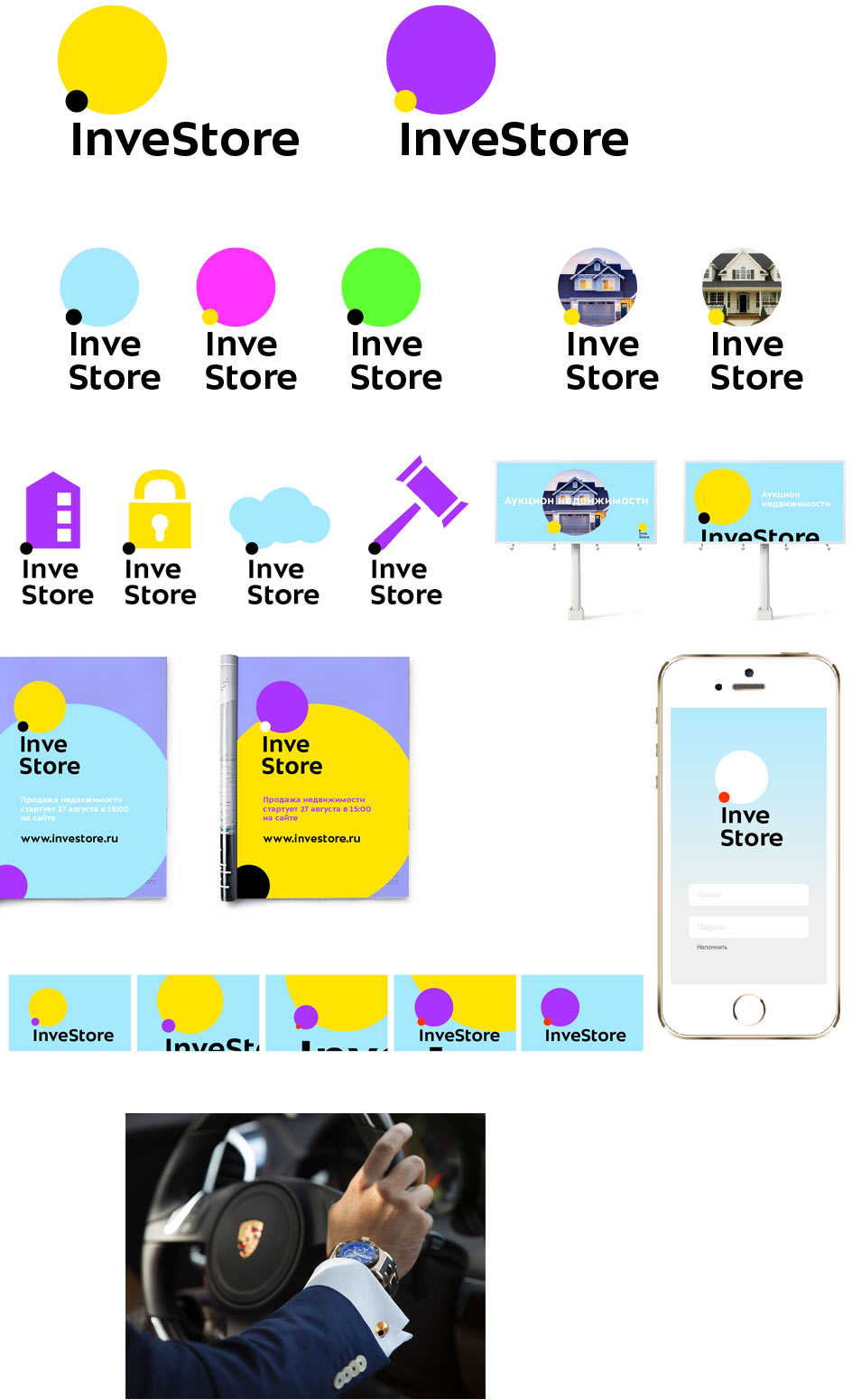
Making first sketches.
Slightly elaborating the design with arrows and trying it on media.

Presenting to the client.
The client likes it in general but has some doubts. They would like to explore other directions.
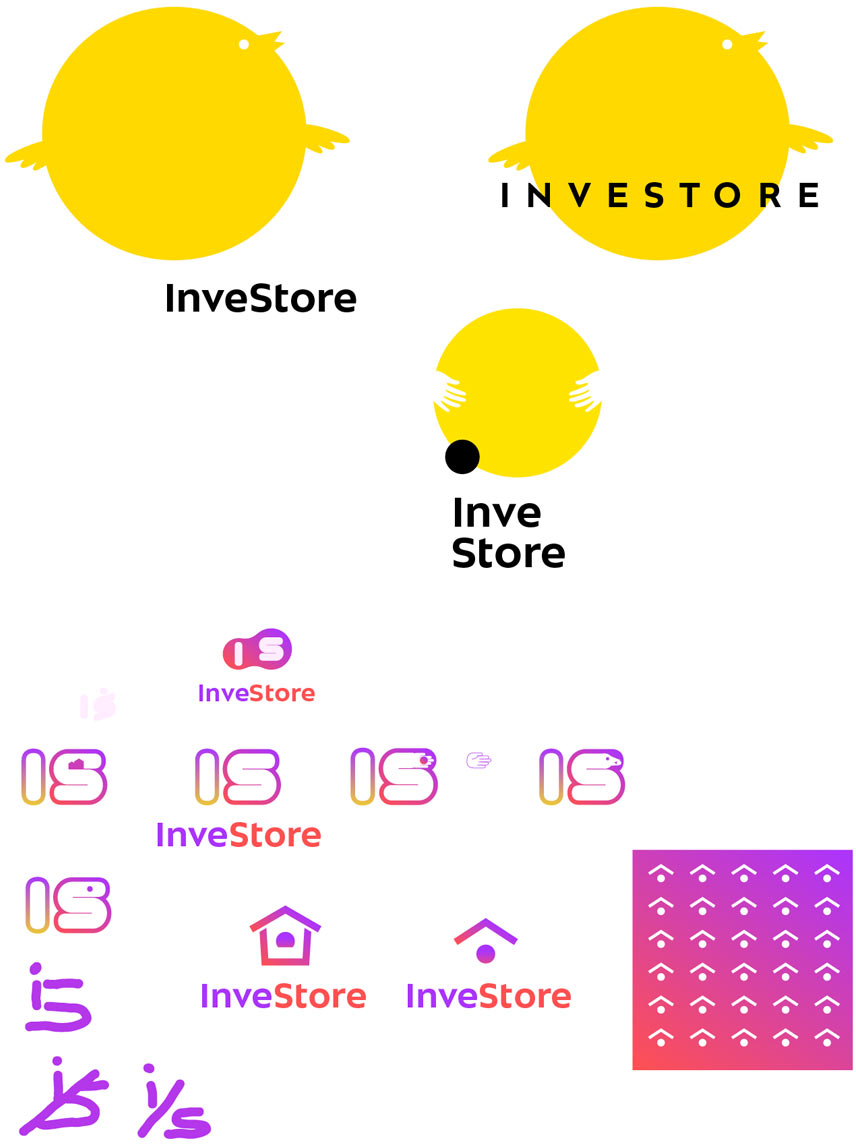
Changing the designer on the project and generating more ideas: coins, banknotes, currency, ligature, business sharks, instant profit, deposit.
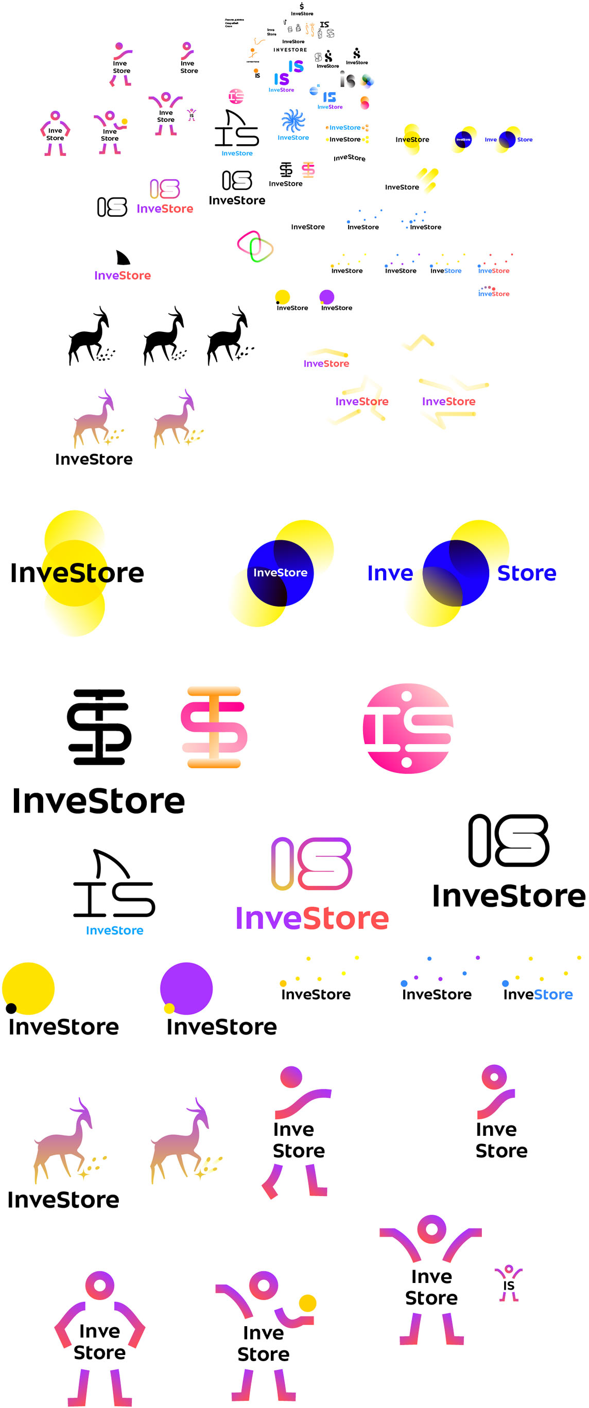
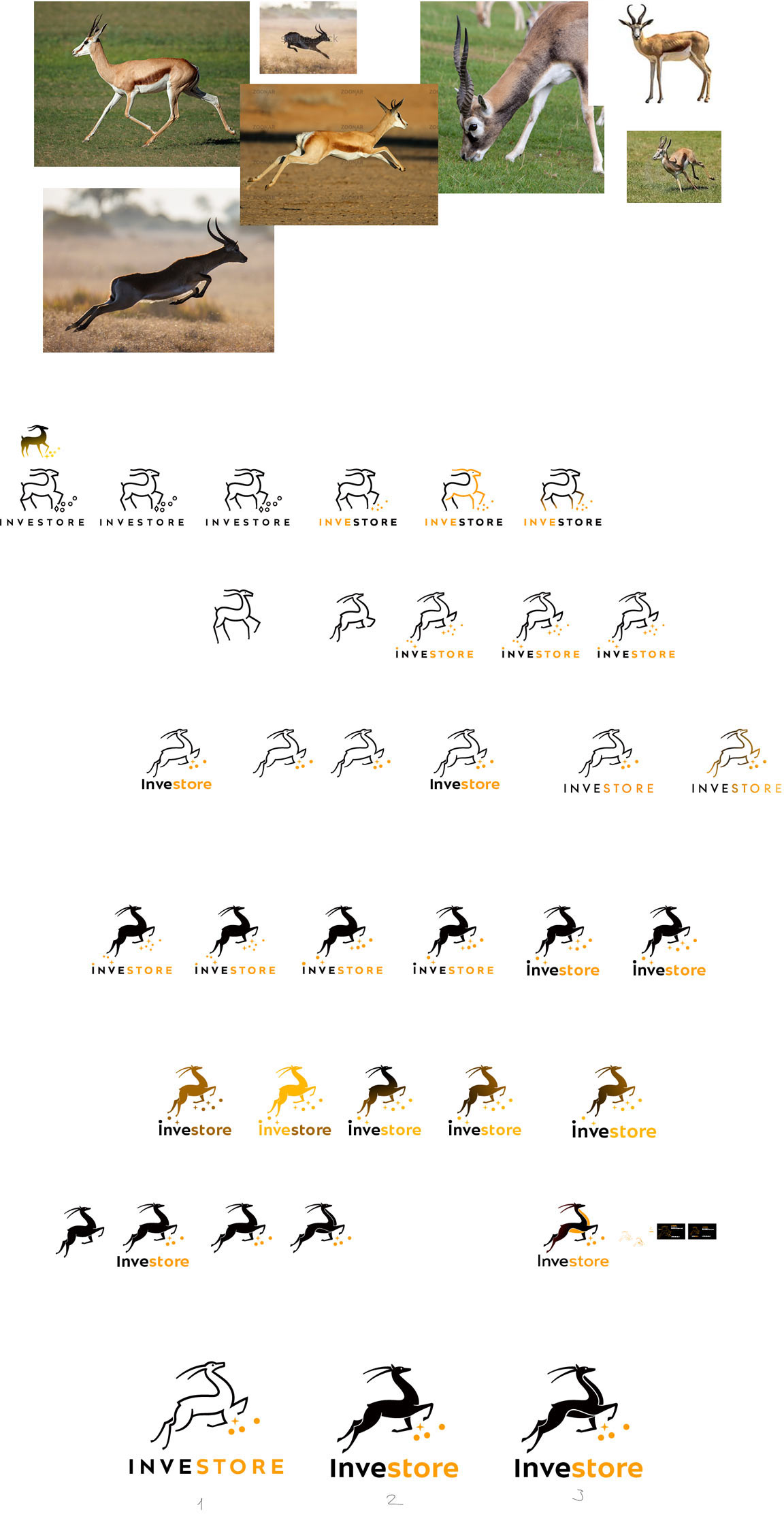
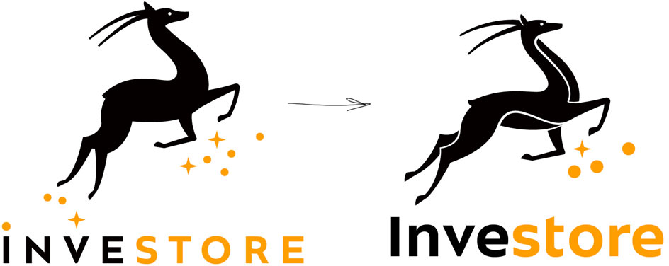
The antelope seems interesting. It’s about generating money, looks memorable and has nice dynamics.
We want to show that a person invests a little and gets back a lot. For example, by using the contrast of size and color of two figures.
Comets are good because they are never static and always moving: coin comets, speed of generating a profit, a multitude of offers, etc.
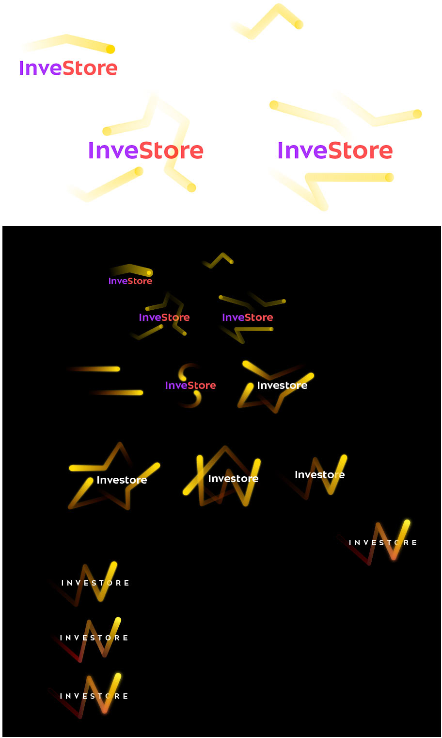
Some stranger thoughts also appear.
Choosing the most promising ideas and presenting to the client. The client chooses the antelope.
OK, Google! Moving on from rock art to realism. Looking at the characteristic nuances of the animal’s body, movement and dynamics.
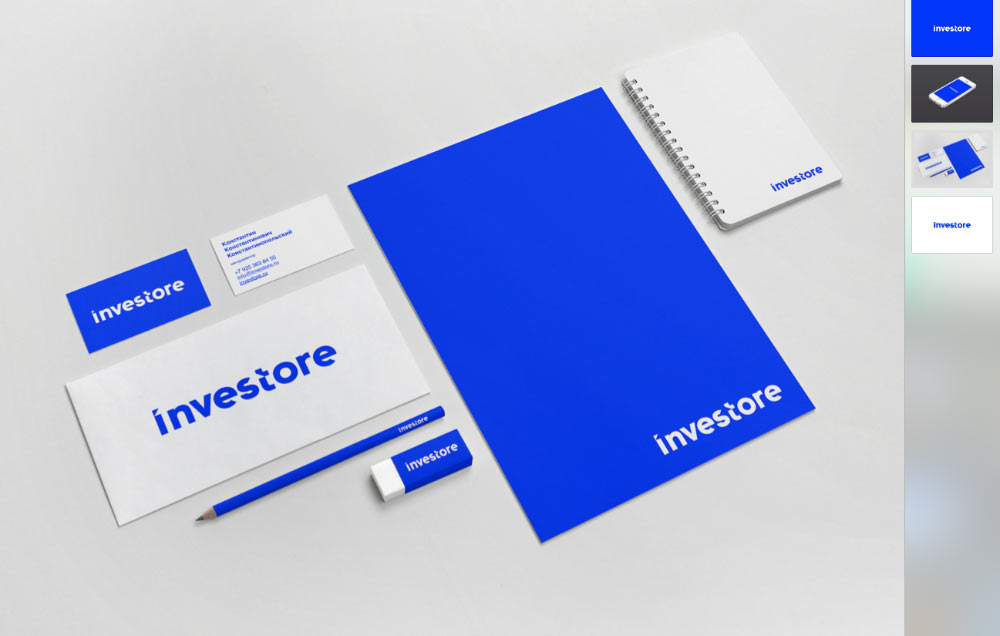
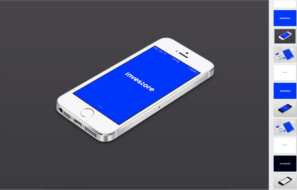
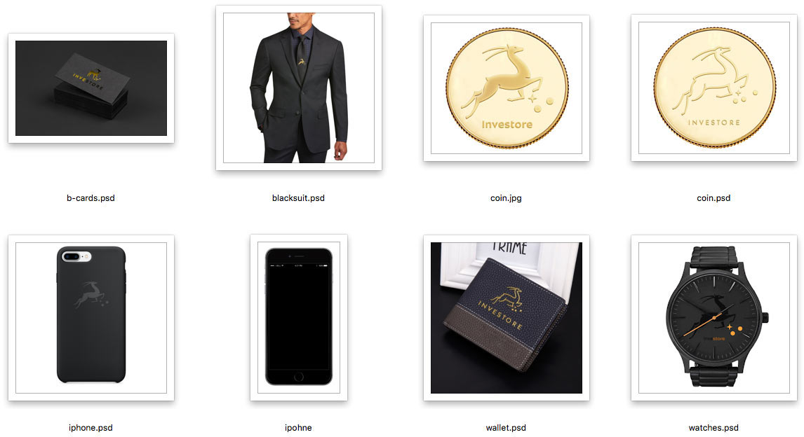
Quickly sketching the logo on various items and executed in several technological processes.
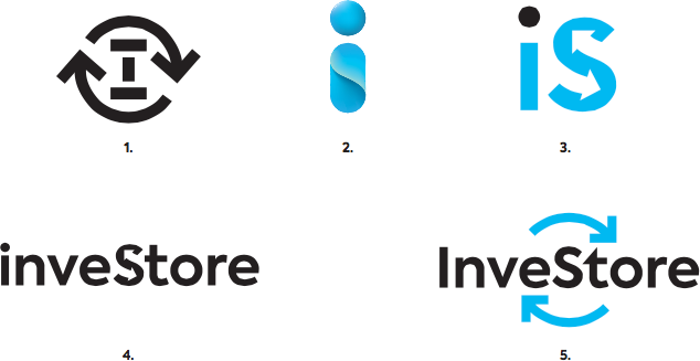
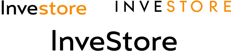
Making the first attempt at the typeface.
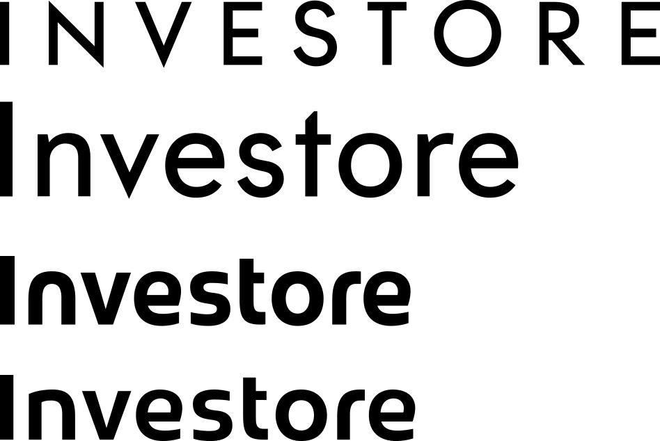
The art director doesn’t like any of the alternatives. Trying again.
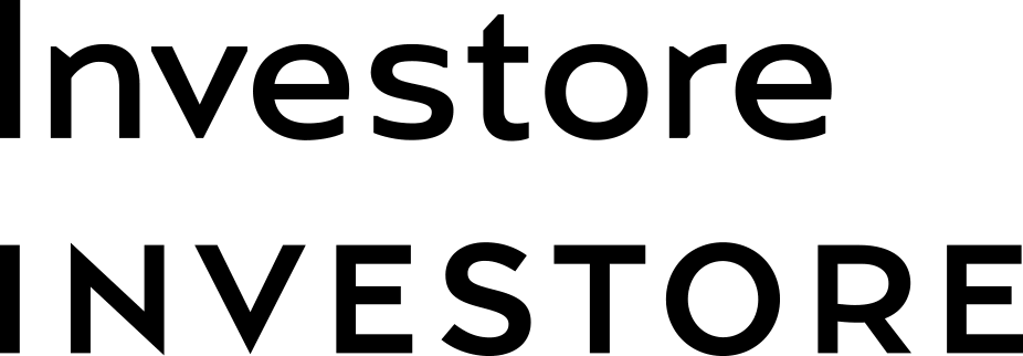
The one with lowercase letters will work. Preparing additional versions. Making the S capital in one of them to emphasize the company’s focus area.
Now we just need to find a nice shade of gold, come up with the pattern and the set is ready.
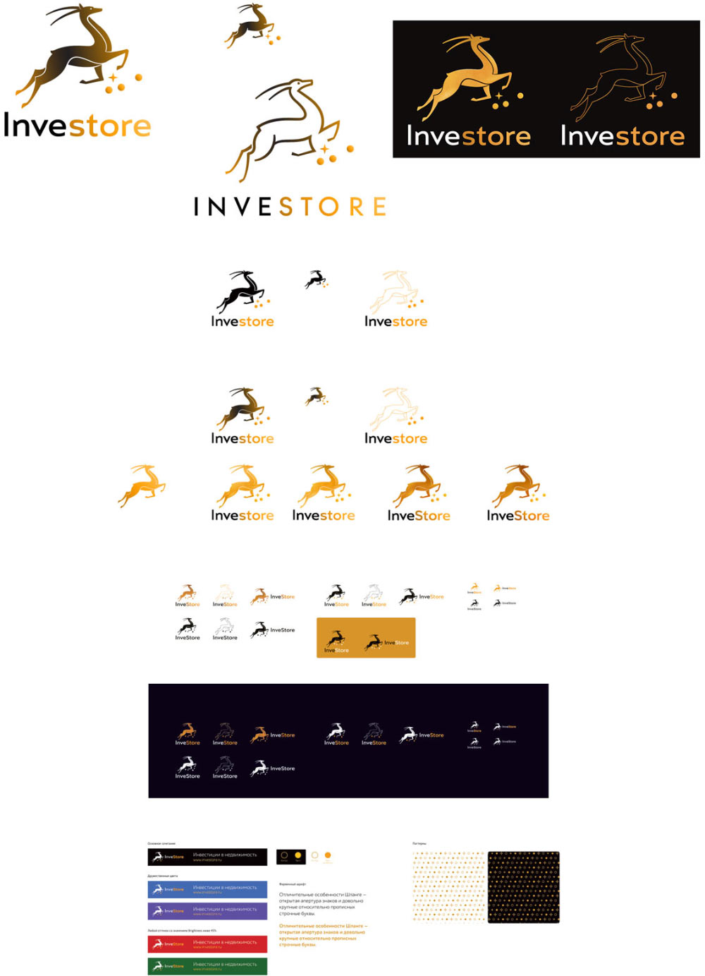
Typesetting the guide and preparing the announcement.
