The making of The New Typography by Jan Tschichold
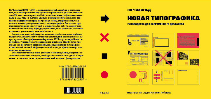
The book is translated and edited. Starting on the layout. The classic approach comes first.
Looking for a fresh way of doing it. Setting the text flush left and tightening the linespace.
When the book was finished except for the illustrations and final proofreading, the art director decided to redo the whole thing from scratch. Adding that you can not typeset the typography bible in serif, only in sans serif, with titles and page numbers in heavy weights. The resulting edition has almost the same number of pages and amount of lines per page as the original. Even some chapters start from the same page in both editions.

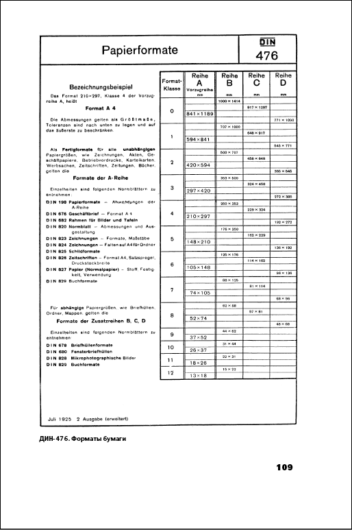
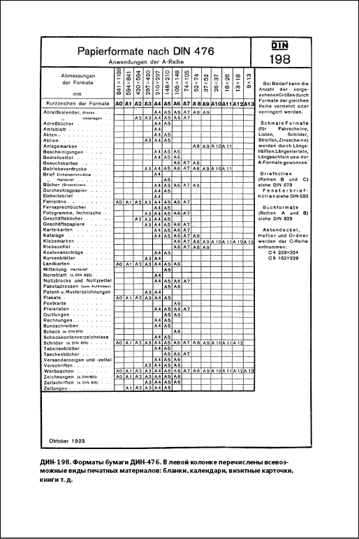
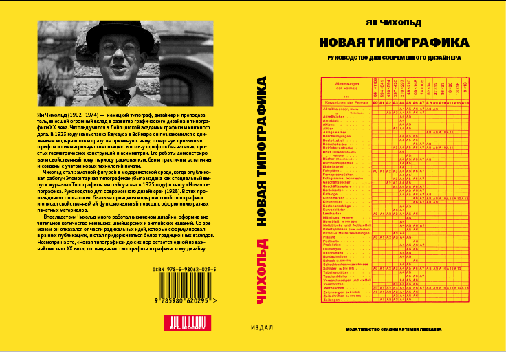
Pages with DIN standards were first destined for translation and reformatting.
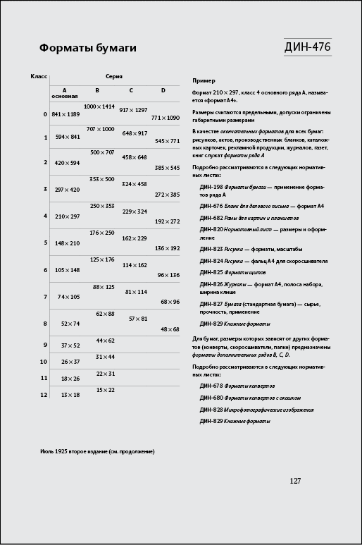
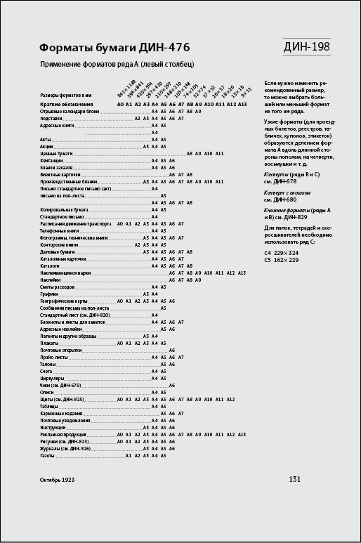
Later we decided to leave them as is: with bold frames and in German. They got outdated by now, we have ISO instead of DIN.
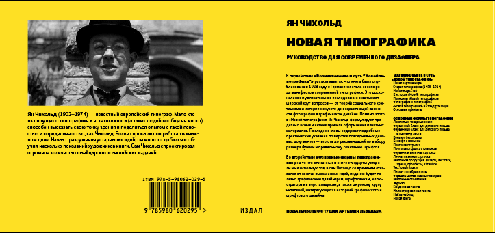
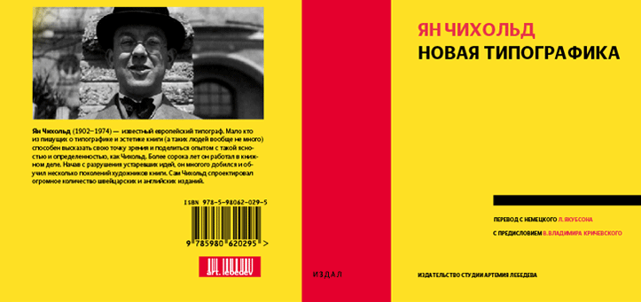
Approaching the dust jacket. Trying on a standard size DJ.

Testing the cropped version.
Designer: You have the layout on your desk. Good to go?
Art director: Yep.
