The making of the Treasury of Alphabets and Lettering by Yan Tschichold
Thinking on the page layout. To start with, adopting the grid from Calligraphy for Everyone.
Switching to a more classic setting of generous margins and justified copy.
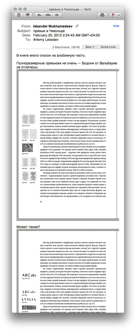
The artwork part of the book features illustrations in original sizes. Adding flaps to accommodate images in album format.
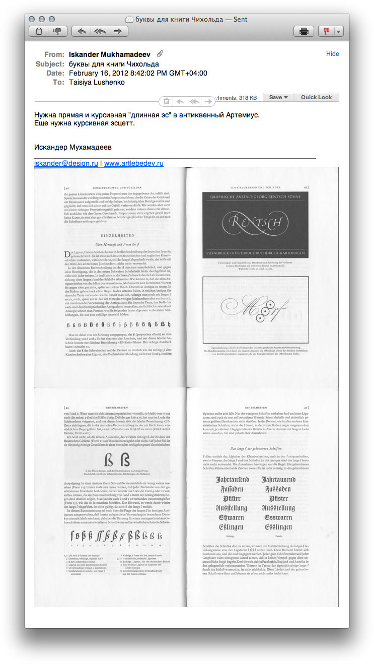
Meanwhile, asking for some characters added to the typeface from a type designer.
Thinking on how to organize visual reference on margins.
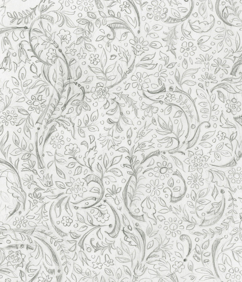
First draft for the endpapers.

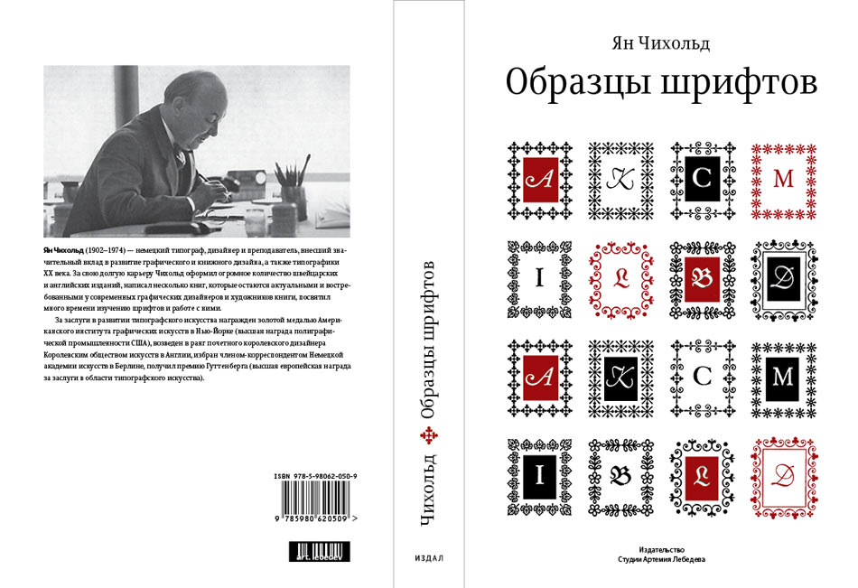
Art director: It can use less flourishness.
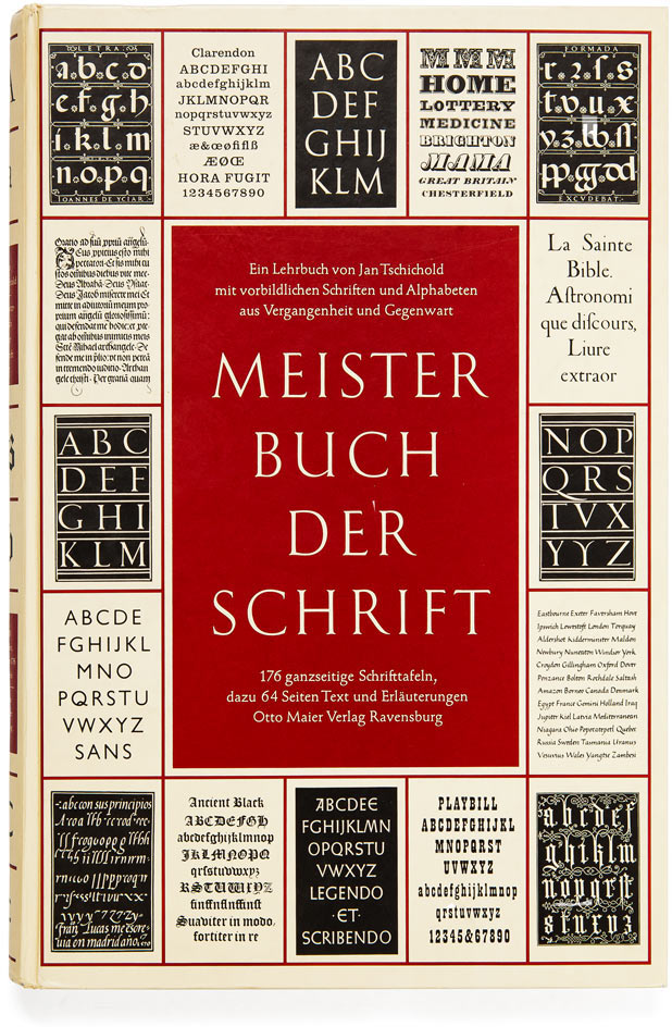
Focusing on the dust jacket. Studying the original.
Bringing the project to our shop.
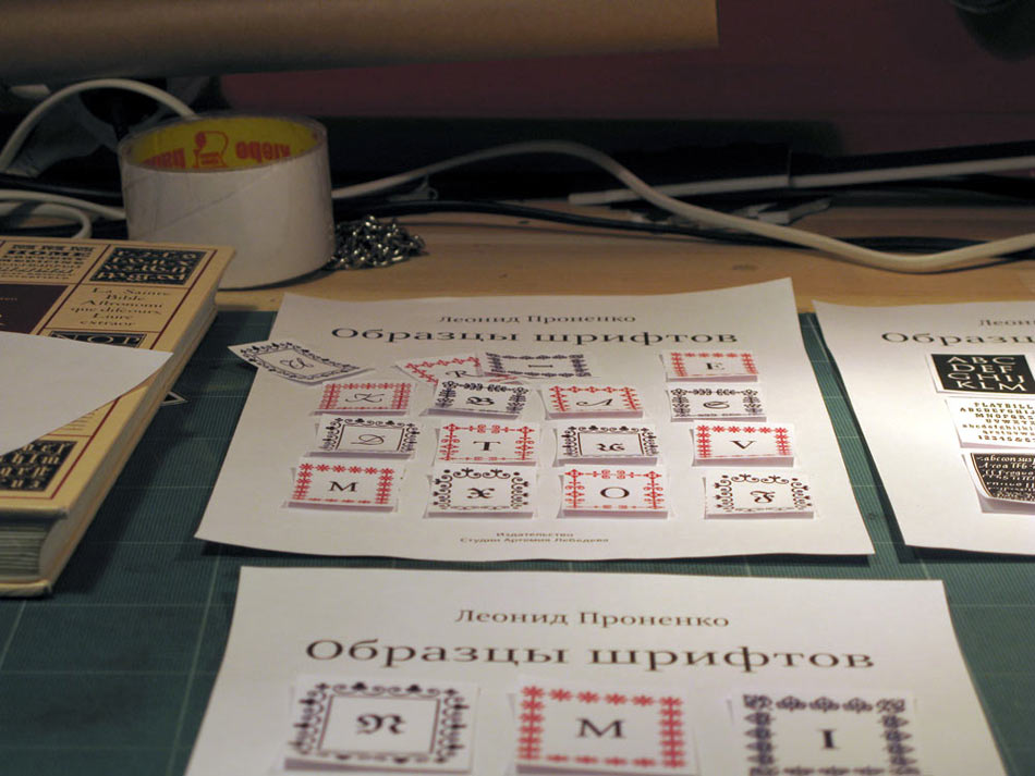
Back to our computers. Trying to run ornate frames around the letters.
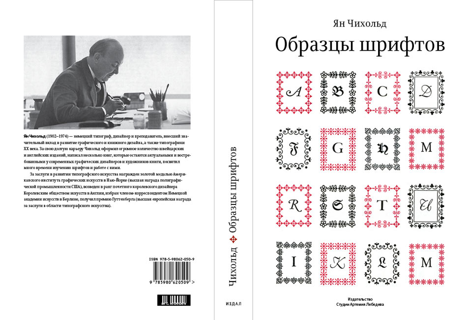
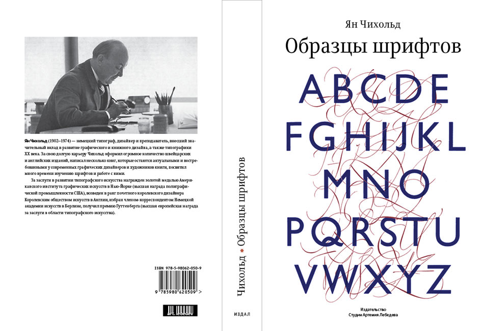
Playing up the contrast created by calligraphy next to sans-serifs.
Fashioning a narrow black dust jacket with the book’s red cover picking from underneath.
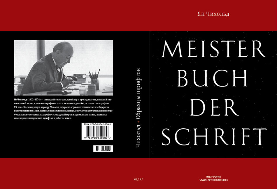
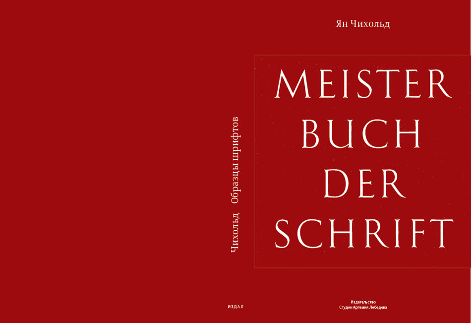
The original-based cover is the final winner.
