Client: The burger shop is located in Gomel, Belarus. Unique features: great quality and taste of burgers (100% marble beef hamburgers, own buns, craft sauces, etc.), nice-looking, positive, young and smart staff, a loft-styled interior, photographs of charismatic bearded men on the walls two of whom the guys jokingly called John and Fedor. Thus the name which put us at the junction of American cuisine and Slavic soul. Ultimately we want to build a large chain.
Logo: we would really like to see a bright and memorable, yet laconic logo without excessive minimalism. The name JohnFedor reflects the combination of Western cuisine and Eastern/Slavic/Belarus culture in preparing burgers: maybe it would be worthwhile to play with this contrast (but please, no country flags, although I have nothing against national symbols :).
Of all the logos created at the studio as part of the Express Design program we liked the following ones most: Pavel Ryabinin, Level One, Menu of the Week, Recsquare Music. We did not like (speaking of the aforementioned minimalism): Dental Center, Delta, Vash Partner.
Of all the logos created at the studio outside of the Express Design program we liked the following ones most: Bakinski (we’d like something similar in style!), Demilie, Yakitoriya, Remit, Khibiny.
I lean towards the following colors (ordered by significance from the most significant): red, white, black, green.
Corporate identity: matching the logo, combining both strict and careless/bright elements. We would like to get a pattern and a design of a coffee cup.
PS. The result of this is very important to us; we are only starting out and a great push provided by your studio would be of great help!
PPS. Let’s make it look expensive!
PPPS. When evaluating the result, we would ask you to remember Lebedev’s subtle remark made in the process of creating the Level One logo: “Numbers 10 and 12 are OK but not cool enough to make it in the list of the best logos of 2017.” Let’s make one that’s cool enough :)
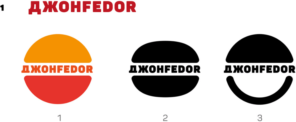
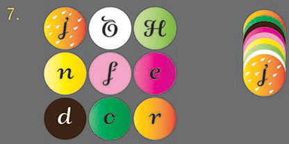
First designer: Trying to bring together John and Fedor.
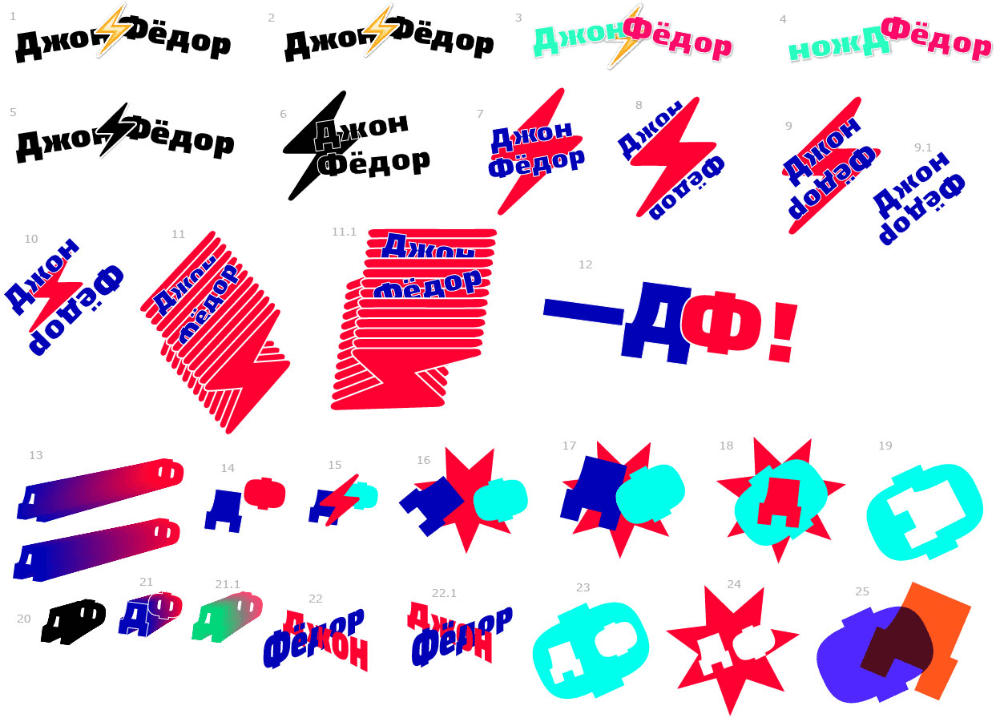
Art director: 22.1 What if we combine them using the letter O?
Art director: The text in 33 is OK.
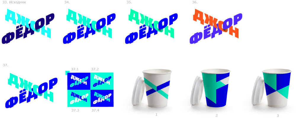
More colors.
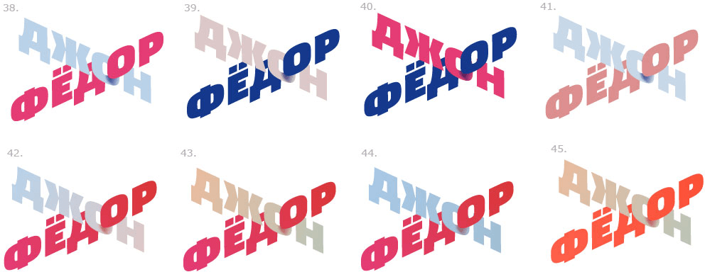
Art director: 45.
Second designer: Джон and Fedor.
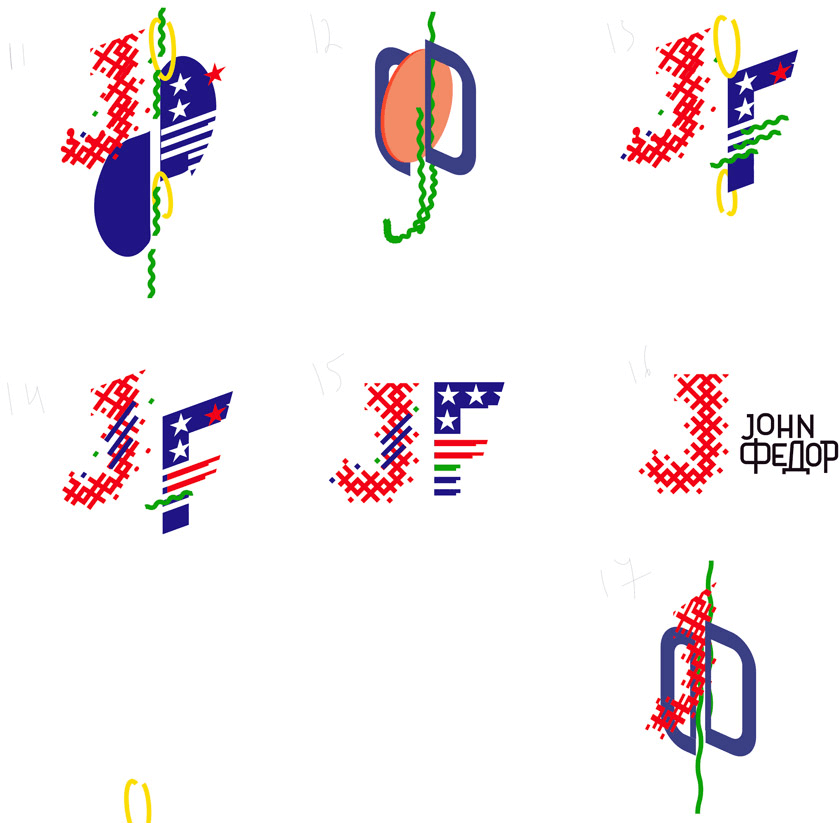
Art director: How about you turn number 3 upside down? And insert an ё.
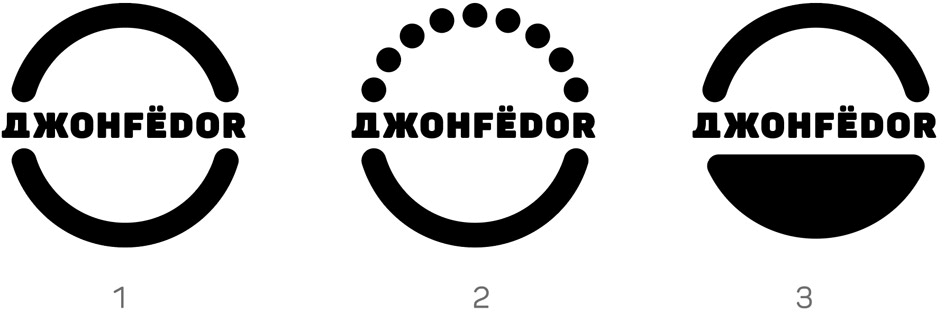
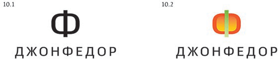
Art director: Also, I suggest you consider this: an Ф is made of two Ds. And all of this together looks like a burger.
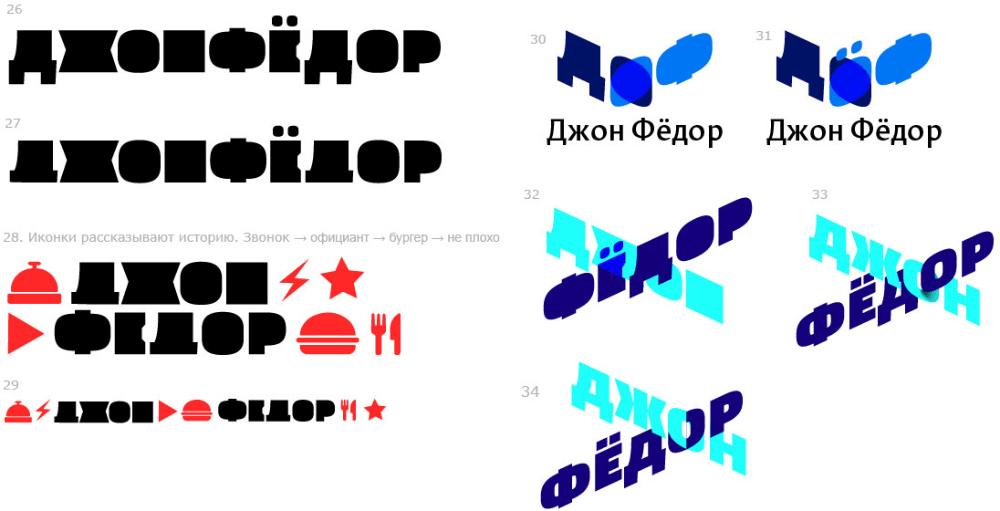
Third designer:
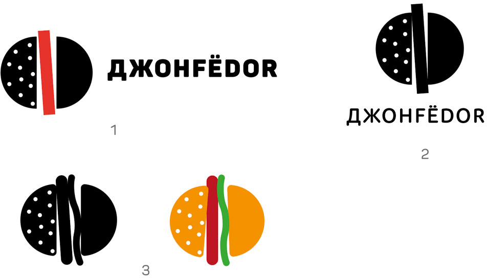
Art director: 2 and 7 are fresh. But it’s spelled “John”, not “Gohn.”
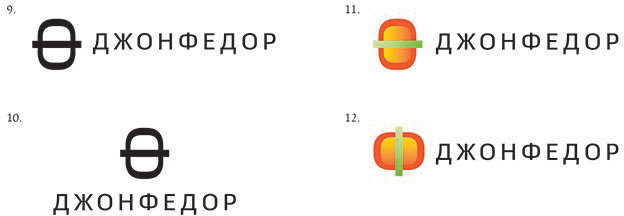
Art director: What if you rotate the top bun in 10 to make it read as a D.
Fourth designer:
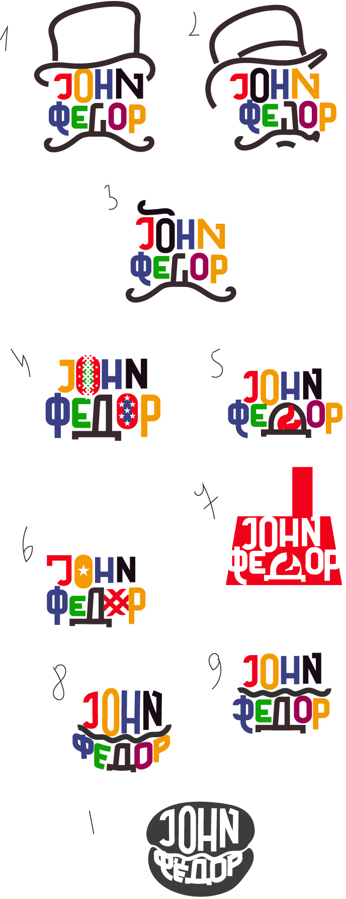
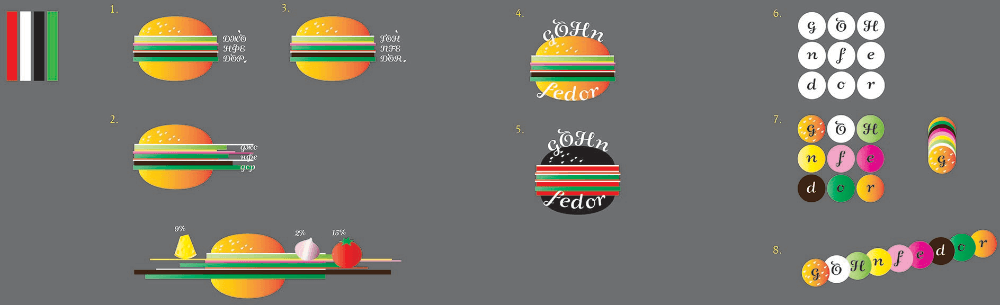
Art director: 4 is OK.
Art director: Albina, we need to combine your number 2 with Anton’s 45.
First designer: Should I help combine them or develop my own?
Art director: Let’s wait for Albina to come up with something. Your text will remain for sure.
Third designer:
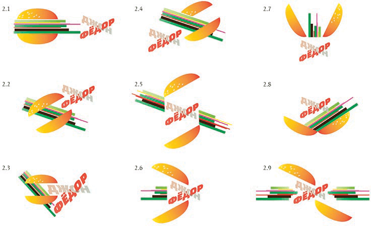
Art director: 2.5 but work some more on the toppings, they look like pencils right now.
Fourth designer:
Art director: Not bad and some are even fresh but we already have a winner.
Fourth designer: OK, I’ll be around if you need me.
Third designer: Here, I played with it. If we don’t move away too much from the idea of stripes but make them thicker, the problem won’t get solved. If we move them further, they start looking like pencils again. I tried leveling them. What do you think?
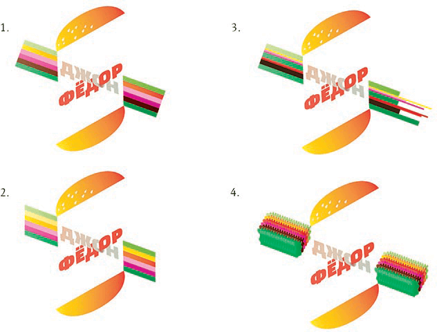
Art director: 2 looks like a gay flag and 4 is like a bunch of brushes. You need to search for something in between these two, both in colors and in shape.
First designer: What about this?
Art director: Looks too much like a Star Trek poster. Albina’s design is almost ready anyway.
Third designer:
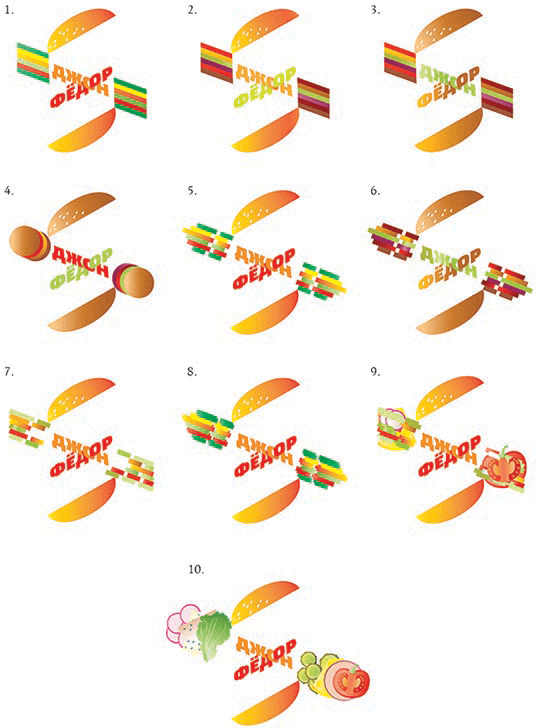
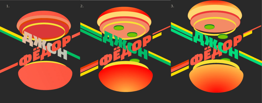
Art director: I like number 3 but with the colors of number 8.
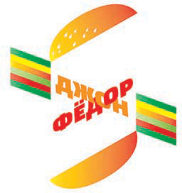
Art director: OK.
