The crown combines several expressive symbols: there are two anchors in the counterform, a tree can be seen in the center, while the side elements resemble sturgeon tails. The images underline the close ties with the sea and the natural wealth of the region.
The contrast of thick and thin strokes in the crown and letters reflects the characteristic local geography: there are two long sand spits in the region separating bays from the Baltic Sea. The logo includes hidden allusions to the most famous sights of the Curonian Spit: loops of calligraphic elements resemble curved pines of the Dancing Forest and the arched strokes in the letter O remind of sand dunes.
The Kaliningrad Oblast acronym (KÖ) supplemented in the logo by the umlaut, refers to the Prussian name of the city, Königsberg. The letters are designed in the Gothic style and feature calligraphic elements. Amber appears in the logo in the form of rhombus-shaped dots.
The chosen texture underlines the inseparable link of the region to amber extraction.
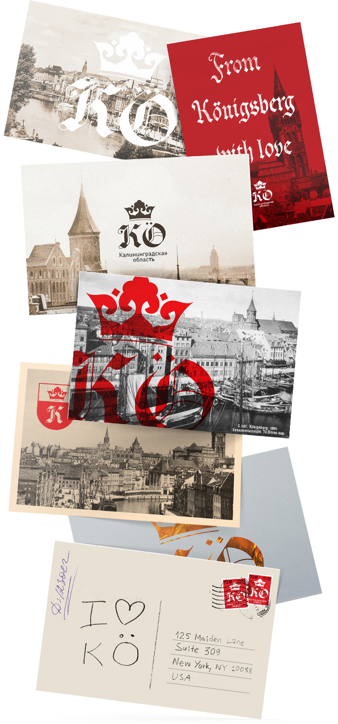
Amber-colored illustration can fill the logo or serve as a background
If necessary, the logo can be painted in any color or filled with a variety of textures.
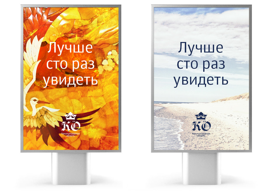
The attractiveness of the Kaliningrad Oblast for tourists is reflected in the slogan “Better many times to see” created in the studio.
Unforgettable sights
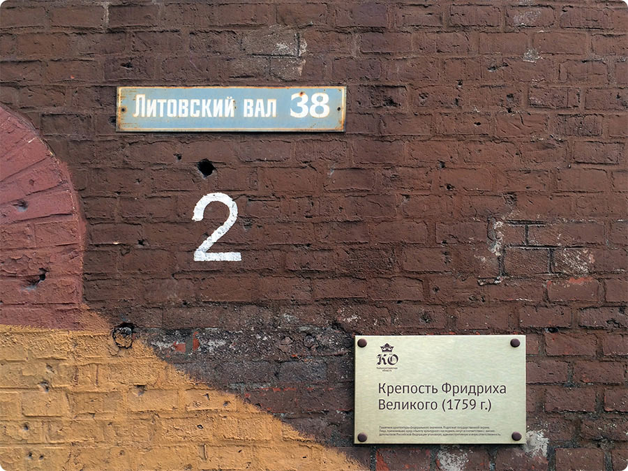
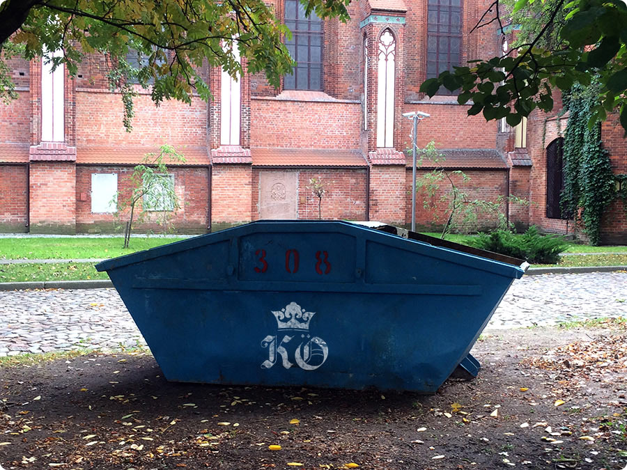
The logo looks great on any media, from business documents to public transport.
Rich history
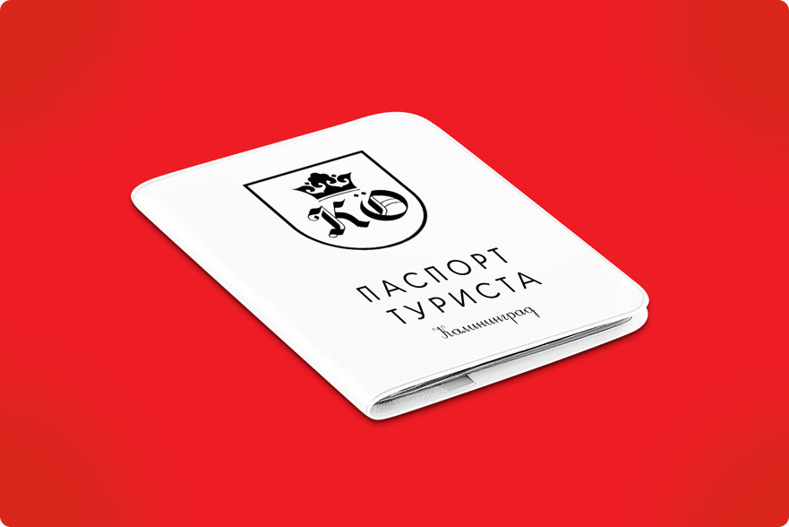
Traveler’s document

The insignia

The most important things
Architectural monuments
City services

Holiday events