The making of the Kaliningrad Oblast tourist logo
Overview Process
Previously, the Kaliningrad Oblast was a part of Germany, its main city was called Königsberg and the region became a part of the USSR only after World War II.
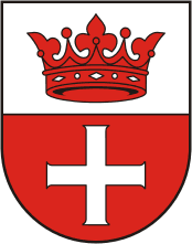
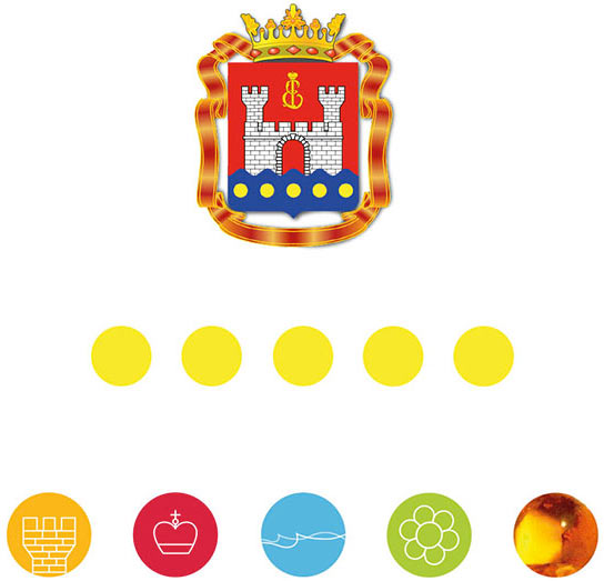
Historical background: in 1255 the Königsberg castle was built. Later, Altstadt settlement was founded by its walls. Altstadt had its own coat of arms:
Later, other settlements, Kneiphof and Löbenicht, appeared around the castle. Until 1724 only the castle itself was called Königsberg, while Altstadt, Kneiphof and Löbenicht were regarded as separate towns. Only in 1724 they were merged into a single city with a common coat of arms. Until the mid-20th century the coat of arms had been transformed many times, yet the composition remained unchanged with Altstadt’s coat of arms in the middle, surrounded by the emblems of Kneiphof and Löbenicht.
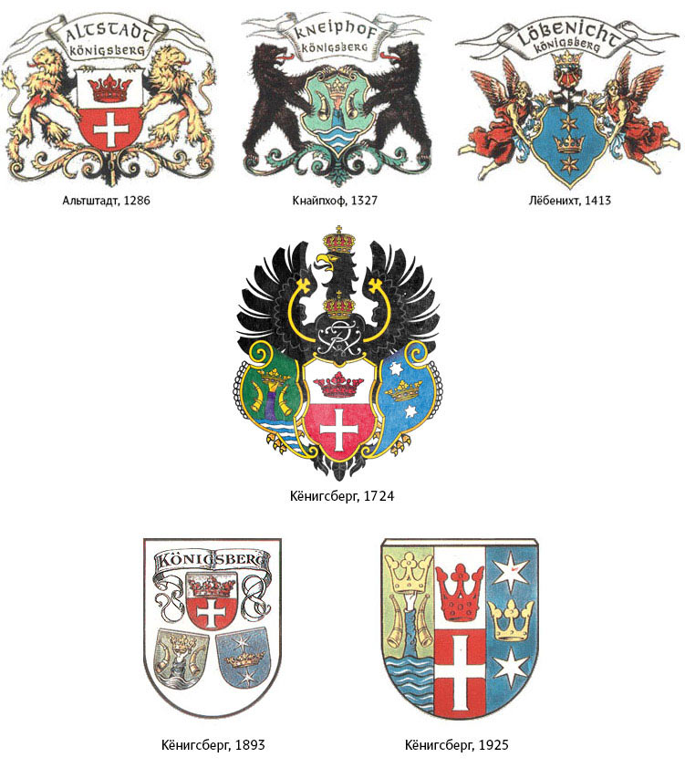
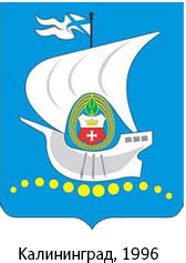
After the city became a part of the Soviet Union, it was renamed Kaliningrad. The coat of arms was changed, which was just as well since only a couple of decades later Königsberg ceased to exist: badly damaged during the war, the Royal Castle was finally blown up and dismantled for bricks. In 1996, after the fall of the Soviet Union, a new coat of arms was created for the city, featuring the Altstadt coat of arms on its traditional place in the center.
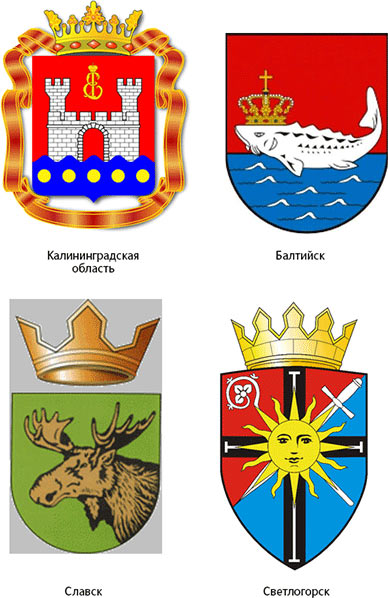
The austere and elegant coat of arms of Altstadt is a great logo in itself. However, it’s too strict for a tourist logo, and the Kaliningrad Oblast is made up not only of Kaliningrad. Not to mention the cross in the center, a symbol some may see as too ambiguous. However, the red crown can become a great logo, especially since many of the Oblast’s cities returned to their old symbols (though not names) in the 1990s. For example, the royal sturgeon from the coat of arms of Pillau returned to the emblem of Baltiysk. Meaning that the crown could again be seen on symbols of cities and districts of the region. It is a powerful symbol reminding of royal traditions, all we have to do is turn it into a logo.
The Kaliningrad Oblast: the Baltic Sea, fishing and military ports, dunes, the Dancing Forest, German churches and of course amber. Immediately noting the peculiar detail: the abbreviation of the name of the Oblast matches the first two letters of the historical name of the city, Königsberg.
Trying to draw a crown, coming up with two variants. The first one with various symbols and sights of the region forming a silhouette of a crown. The second, simpler, one has anchors in counterform.
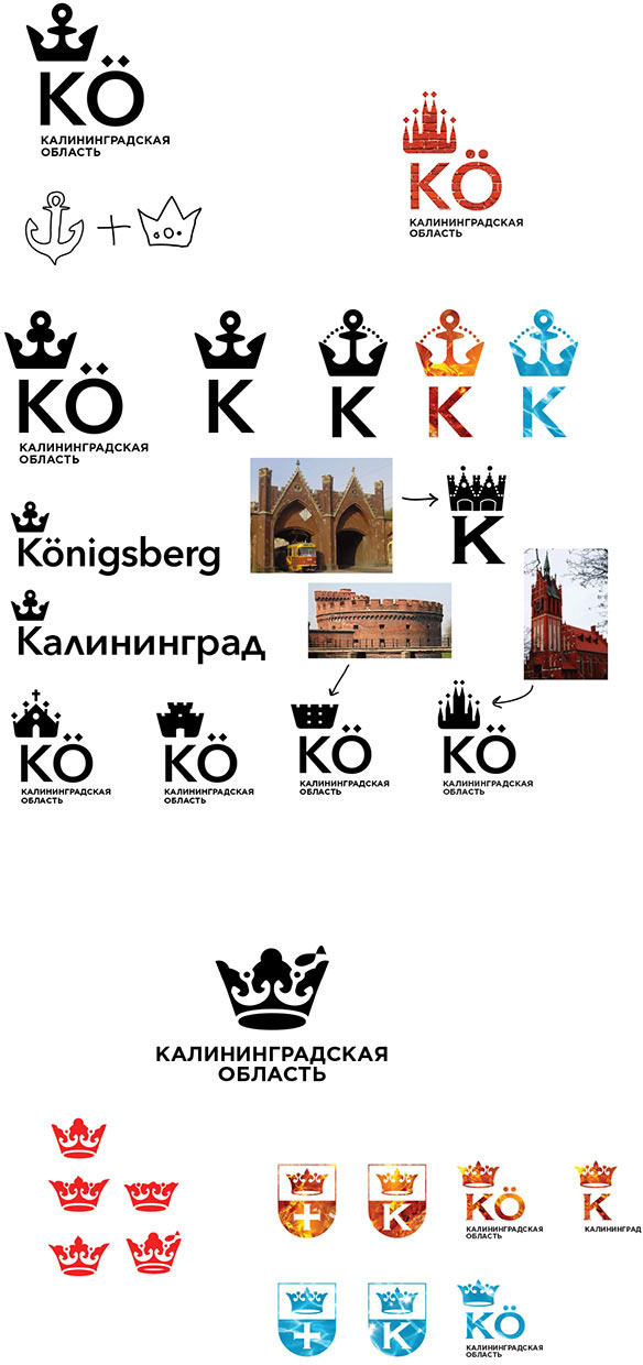
The art director chooses the second design.
Drawing.
Meanwhile, three more designers are working on their visions of the logo.
The first variant. There is lots of German architecture in the city, trying to work with this fact. We need to find an interesting feature.
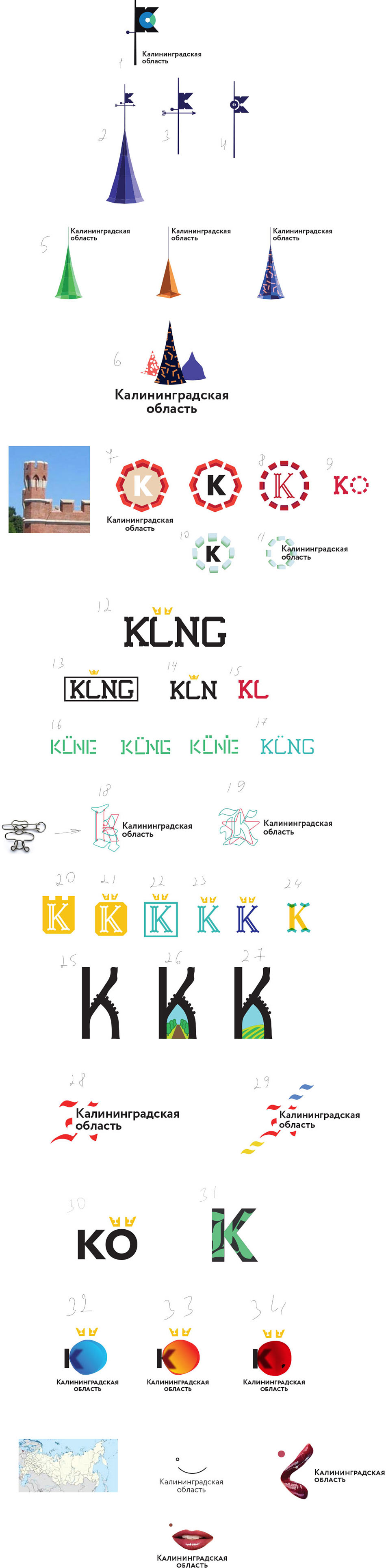
The most promising version is the one with a weather vane and a roof. The art director approves the direction.
Searching for the shape of the vane and trying to light the sun in the middle.
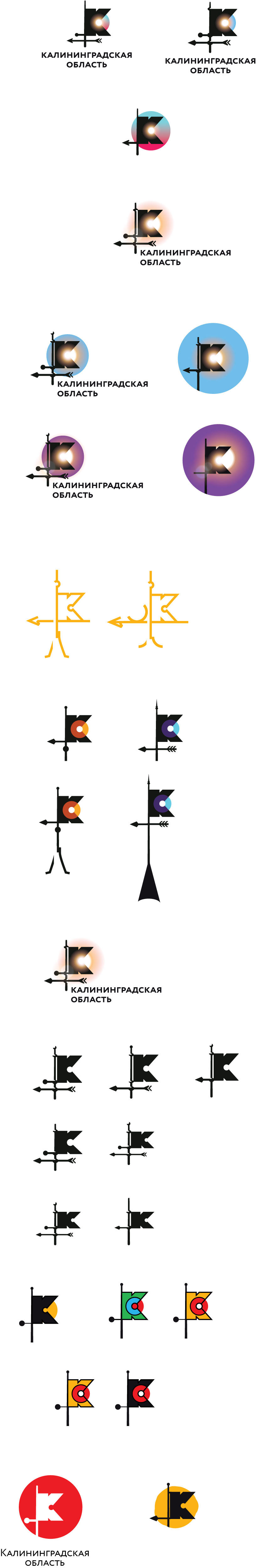
Deciding that the roof silhouette and the illuminated center will be featured on the extended version, while the main one will be a dark-colored sign with a colored circle.
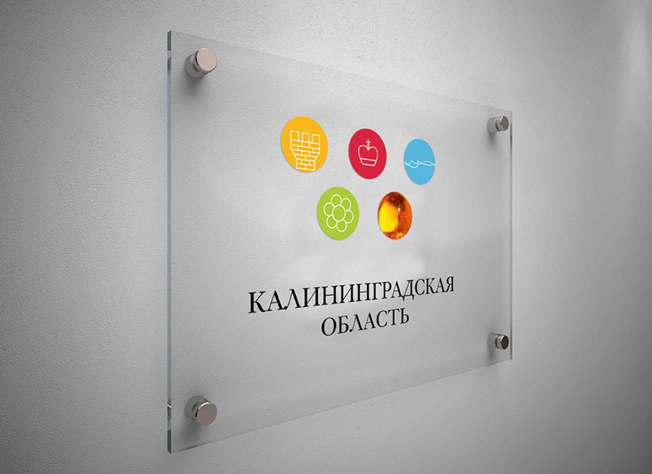
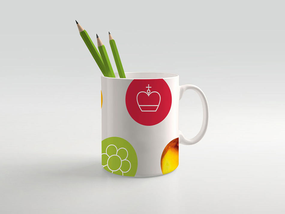
The second variant. We take the coat of arms of the city, take the five circles from it and fill them with meanings of protection, Russia’s continuity, access to the sea, amber and nature.
The elements can be used to create any pattern when aligned on a grid.
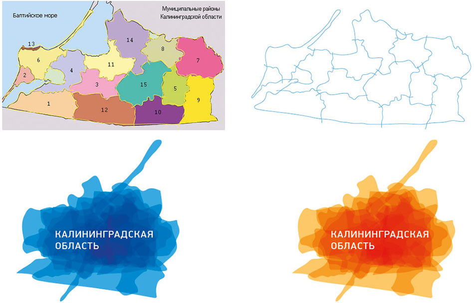
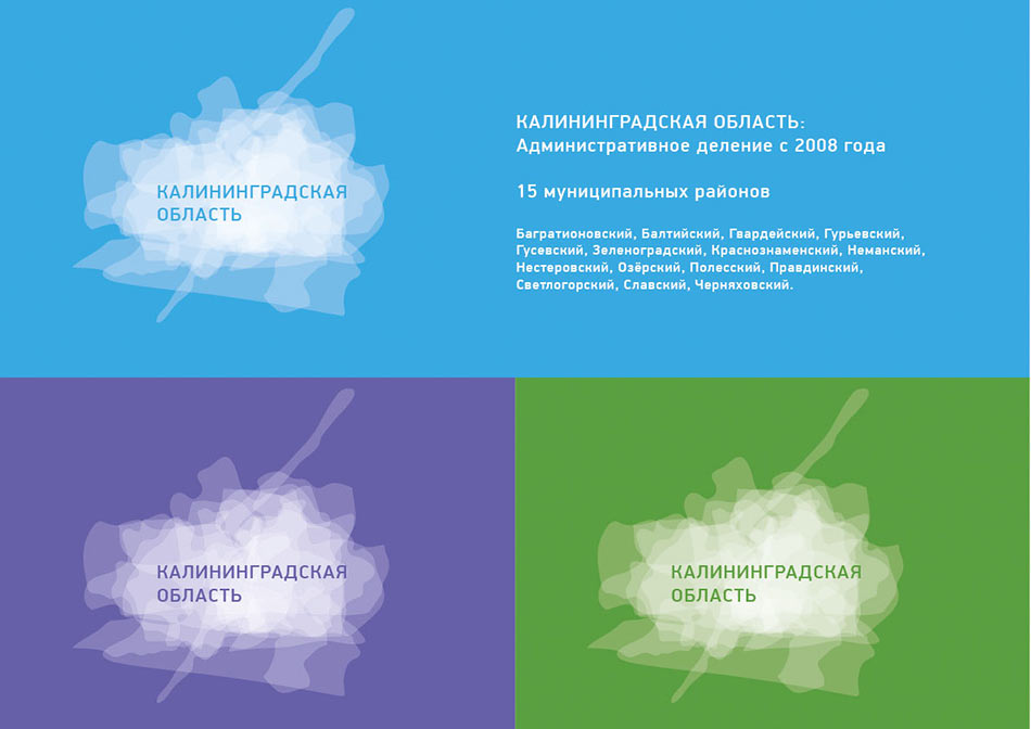
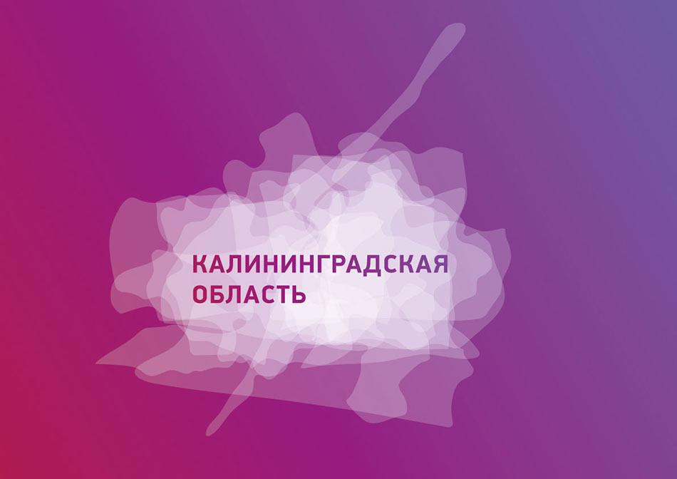
Or, as an alternative, we can take all the districts of the Oblast from the map and place them on top of each other.
Art director: The first one is OK.
The third variant. Inspired by German churches and famous bridges of the old Königsberg, the designer draws a sketch.
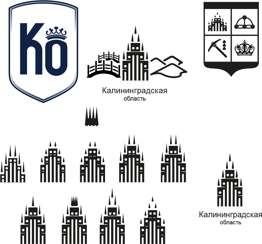
The art director approves the direction. Preparing pictures for the presentation.
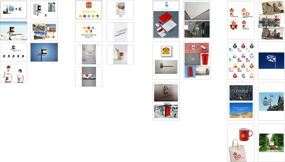
Everything’s ready. Showing all four wonderful alternatives.
The crown wins.
Right now the composition is unstable and the choice of typeface is unclear. Right at the meeting the art director decides to reassemble the composition slightly and maybe use a Gothic face to write the full name of the region, replacing the abbreviation. The task is sent to the type designer.
Trying to place the Gothic typeface next to the crown. The type designer writes the text.
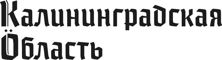
Cyrillic letters look awkward in Gothic script. Especially the letter л. Redrawing it.

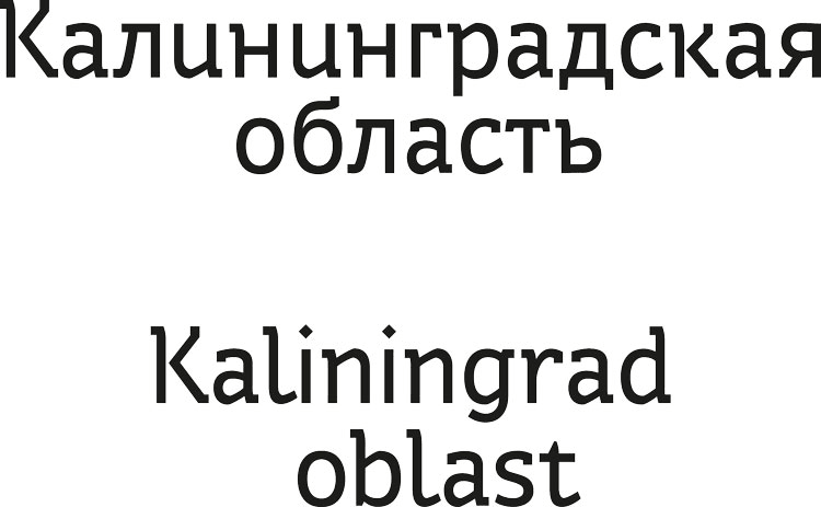
“Kaliningrad Oblast” looks cumbersome, trying to typeset it in three lines.
In order to fill the empty space in the second line of the English version, we extend the stroke coming from the letter g. It would be great to do the same in the Russian version, so we add a curl to the letter б.
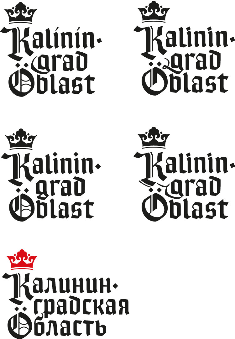
The type designer expresses her doubts about the typographic composition. The designer expresses his doubts about the typographic composition. The art director expresses his doubts about the typographic composition.
Starting to work on the logo from scratch. The type designer tries to simplify the Gothic script. Then the type designer thinks that probably something compact, a narrow Gothic-inspired face would work better. Also, she gets an idea of a waving flag with the text.
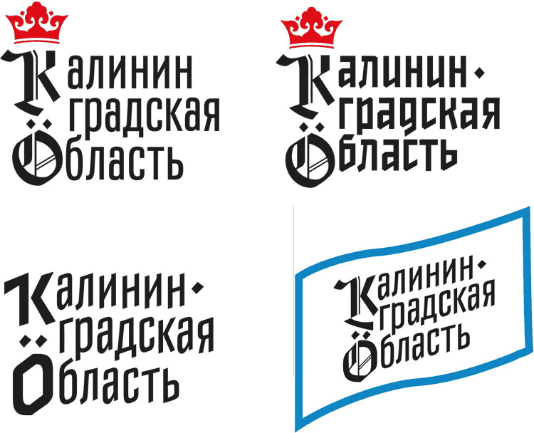
Simultaneously, the designer is trying to introduce Gothic serifs to a simple chopped face.
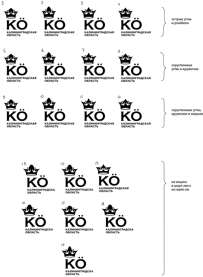
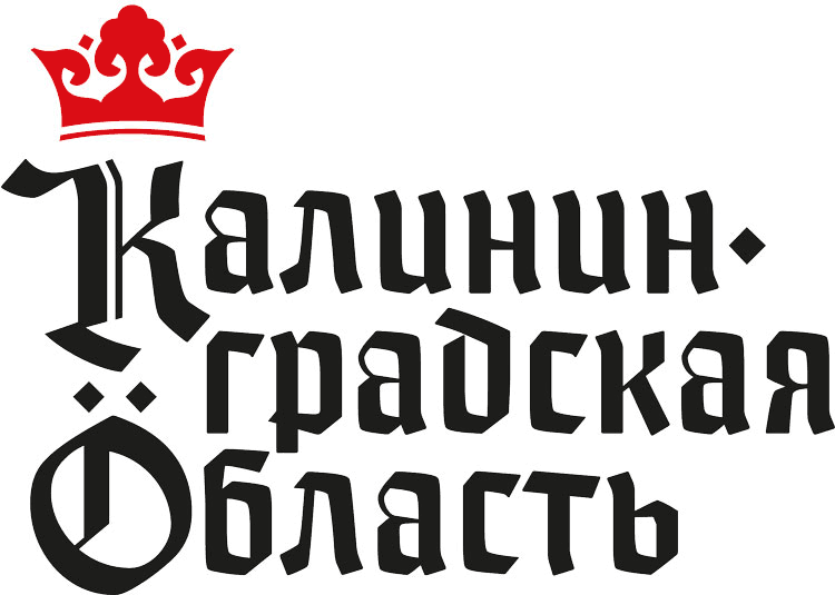
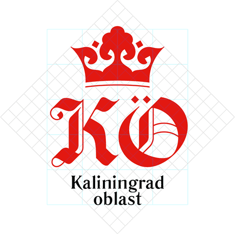
It feels like there is something here, but the general problems of the logo don’t seem to go away. First of all, of course, it’s “Kalinin.” Residents of the Kaliningrad Oblast like to say that Mikhail Kalinin has never even visited the region, so underlining his last name in the name of the region is hardly a good idea. Secondly, the umlauts make the name read “Yoblast,” which sounds borderline profane in Russian. For the first couple of times it’s funny, but after a while it starts getting old. And finally, the overall composition. The crown is sticking out somewhere on the side, and the logo would look better without it. The logo is bulky and smaller versions would have to use the abbreviation KO, as in the very first design. Maybe, that’s what we should go back to?
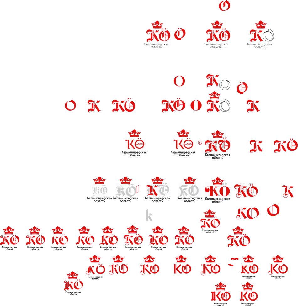
Returning to the Gothic shapes and tasking the type designer with drawing triumphant and elegant letters K and O.
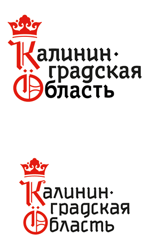
Choosing one of the variants and finalizing the logo and the abbreviation.
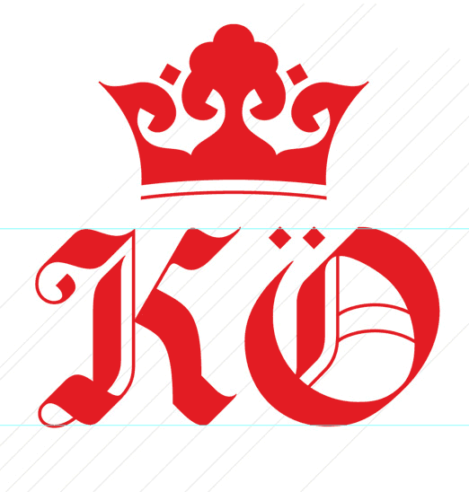
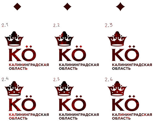
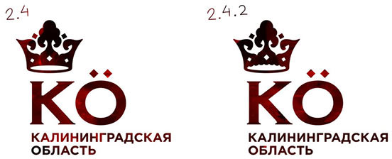
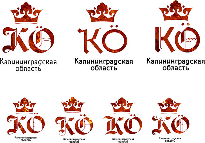
Now we have a new composition reminiscent of Gothic script with rhombus-shaped serifs. The type designer works with these letters, but still has her doubts. On the one hand, the composition is sufficiently compact and well-proportioned. On the other hand, the type designer is confused by the fact that the logo features two versions of Gothic typefaces, even though you can’t call this text Gothic in the true sense. But this Gothic styling looks distasteful next to the real Gothics.
The designer agrees to use a more neutral version. The type designer creates a version of the text based on the proportions submitted by the designer.
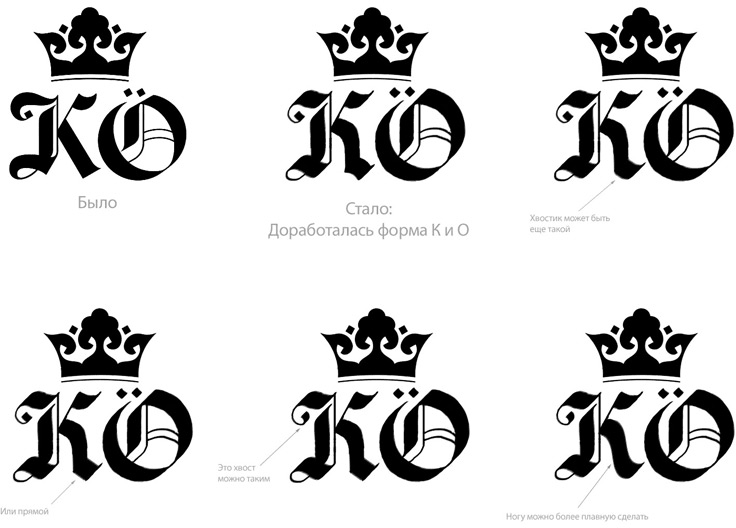
Drawing a traditionally-shaped д for the straight version and an English version.
Using a macro lens to photograph the texture for the logo.
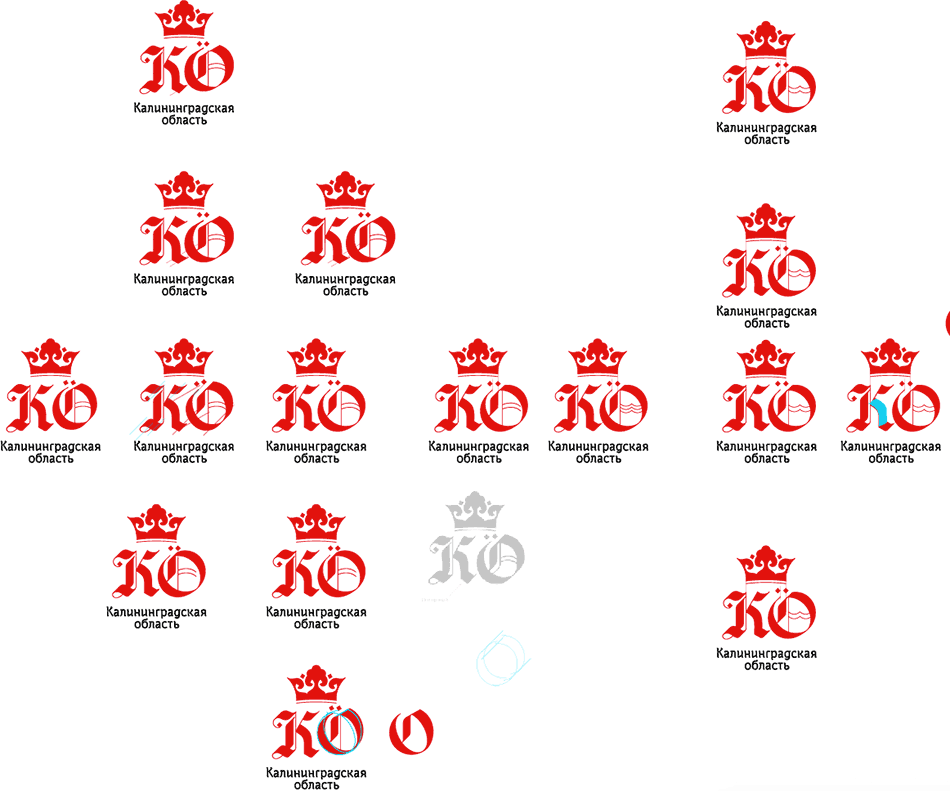
Looking for nicks in vector drawings and fixing them. Clearing up the contour.
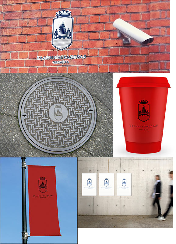
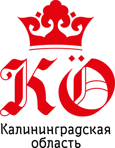
Preparing the final presentation. The client likes the result. Done.
