Kaluga region visual identity
Overview Process
The Kaluga region was formed in 1944 and is a part of Russia’s Central Federal district with a population exceeding one million people. In 2010 the World Organization of Creditors proclaimed it Russia’s most appealing region for investors. The region decided to get a visual identity to support the successful image for investors and citizens. The main version of the logo
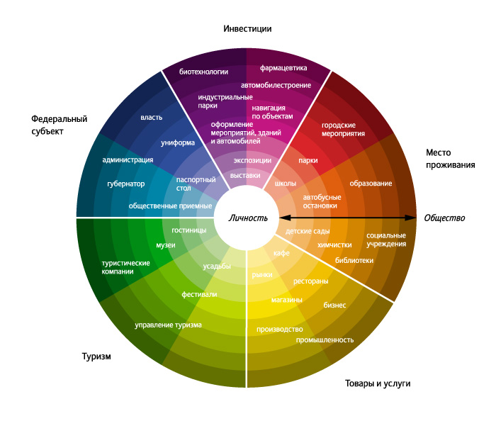
The logo plays up Kaluga region’s initials in Russian (KO) and a welcoming business climate (OK), while being visually pleasant, modern, and unique at the same time. Missions got color-coded

OK
The visual identity manual provides guidelines on using the logo and choosing colors for different missions. |
Cast: art director
designer
Evgeny Zorin
type designers
Taisiya Lushenko
Elena Novoselova typesetter
Anna Golovina
editors
Katerina Andreeva
Anna Martinevskaya secret advisor
Tatyana Devaeva
project manager
Anastasia Olkhovskaya
|
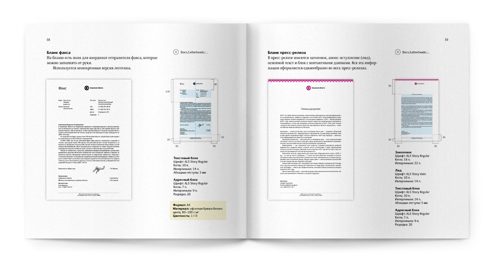
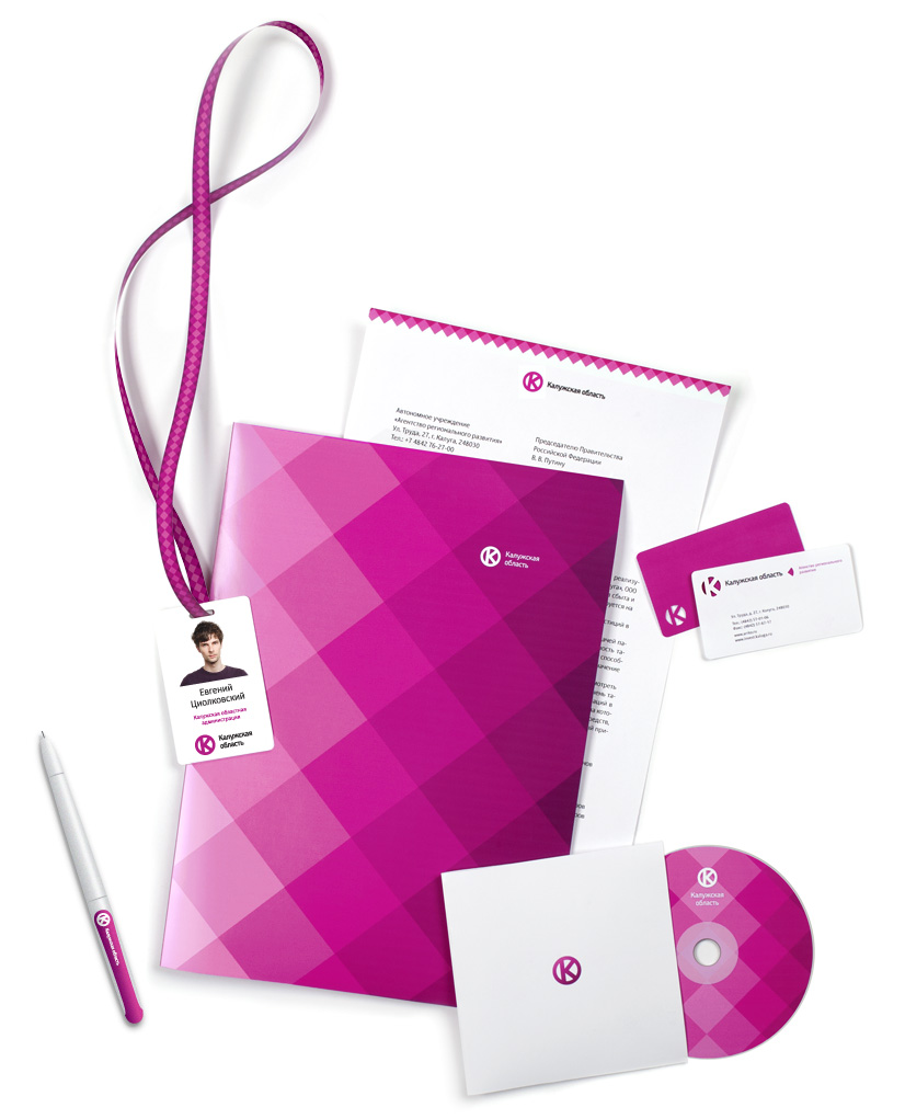
A section of the manual on business stationery

Order a design...