Client: A brand of clothing for the entire family. Matching clothes for children and their parents or for couples. A family look.
End product: matching / paired clothes for mom and daughter, dad and son, and the entire family.
Business model: online first, mail delivery. Later, offline stores.
Packaging: premium monogrammed cardboard (white).
Price segment: medium+ / premium.
Markets: Russia, Switzerland.
Brand equity: apparel that is a reflection of love and harmony in your family and emphasizes the unique time you spend together.
Brand name and logo: La Même (LM).
Design ideas:
Letters L & M as silhouettes of swans (a big one and 2 small ones?) (swans are the embodiment of grace, family values. Also, Lebedev is the name of the owner family)
Colors: classics—black and white? white and gold?
Claim: La famille. L’amour. La Même.
First designer: The first approach is to do this intellectually. Premium monogrammed cardboard obliges.
Almost illustrative, looks like Hermès but not as upscale.
1–3. Mother and daughter in matching dresses lie on the grass, the mother is pointing at something in the sky. Theme of happy family memories.
4–5. Simply a family, classic happy moments.
6. Tried it in one line but it looks lonely.
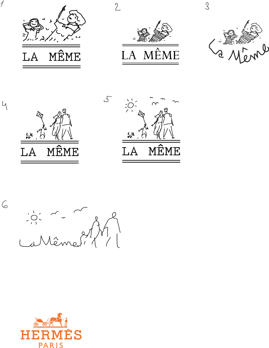
Art director: You can develop the one with the family on the grass. Where is their dad?
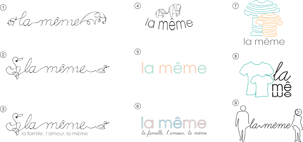
Second designer: Tried a few things but without illustration, so it stays more or less simple.
Art director: Boring. Although the left one in number 2 is neat.
Third designer: I thought about the name, manufacturing technology and the style of their clothes.
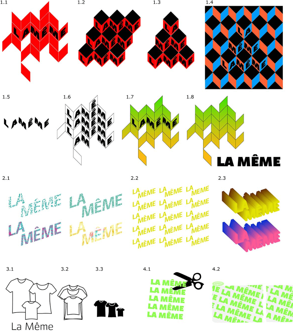
Art director: You can take the top three cubes in 1.3 and look for more ideas with them.
Third designer: Cubes and surfaces.
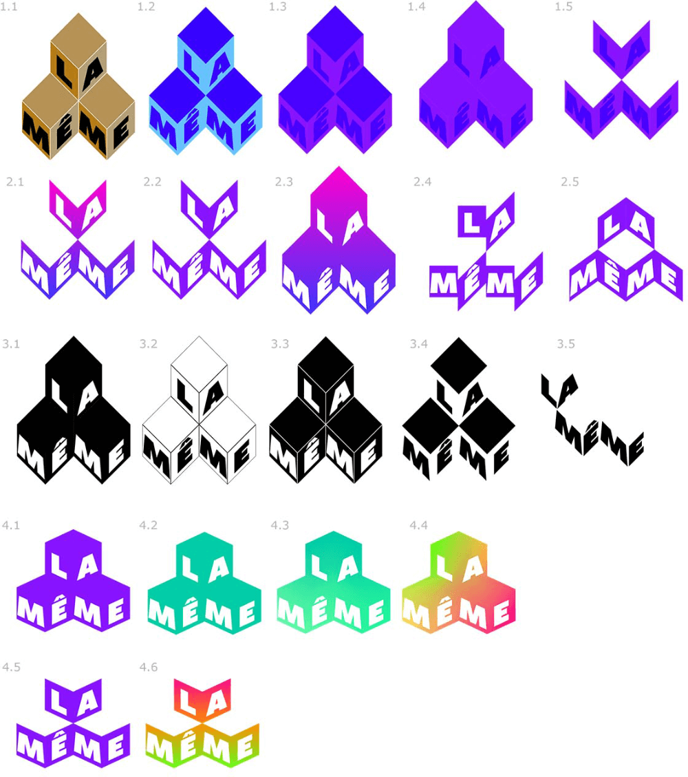
Art director: 3.5
Second designer: ?
First designer: Something in between. I’m trying to find a clear silhouette with few small details. That’s the reason there was no dad, the third person adds those details. The daughter and the mom seemed like a nice warm setting although they indeed may imply a single-parent family.
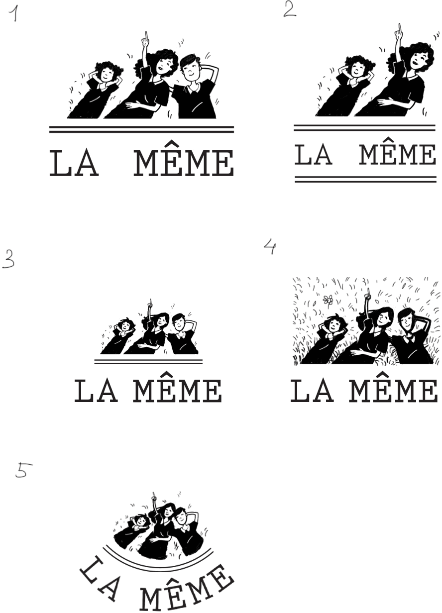
Art director: The grass looks like two-day pubic bristle.
Third designer: I tried to make it more readable and tried it out on media.
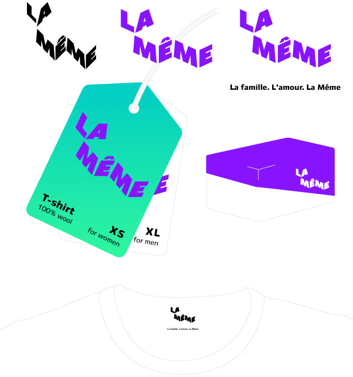
Art director: This looks 90% ready.
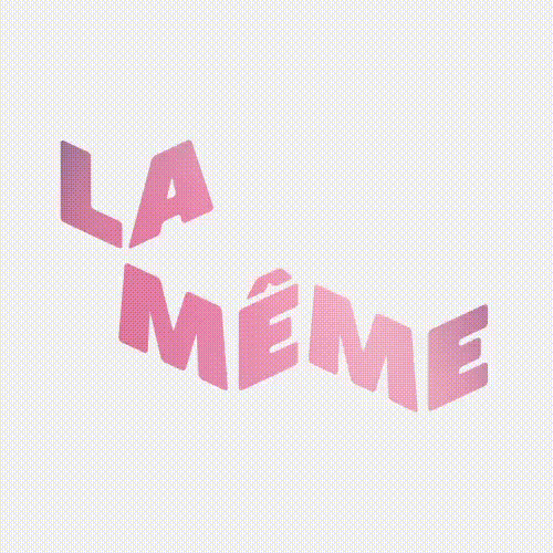
Third designer: Tried it in different typefaces and colors.
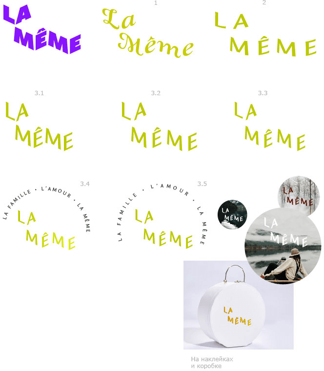
Art director: The thickness was better before, all it was missing was some softness and a different color scheme.
Third designer: Variations with no substantial changes.
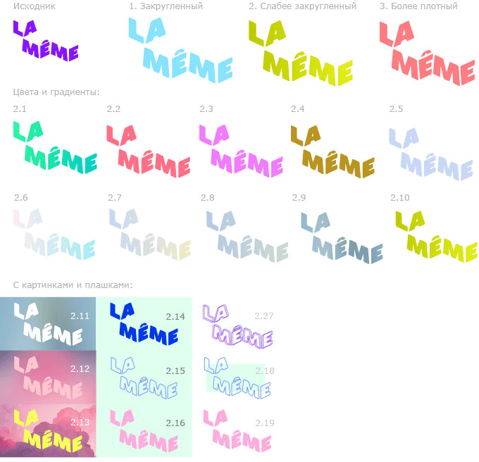
Third designer: Played a little bit with the shape of the circumflex.
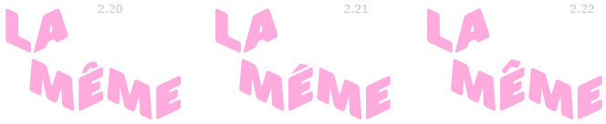
Art director: 2.22 is OK. Check with Lyuba to make sure it’s readable. For color, let’s go with black.
Second designer: Version 2.22 is the one that is the most readable.
Art director: OK, let’s proceed with this. I’m waiting for a black 2.22.
Third designer: 1. Black 2.22
Tried to fix the slight impression of reverse perspective and adjust the circumflex outline: mechanically by making the letters slightly more narrow in 2 and manually in 3.
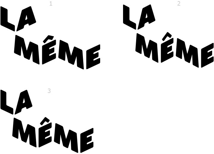
Art director: 3 is OK.
