Client: Our Lighthouse mobile app is a geolocation-based social network that was launched June 7, 2017. Lighthouse helps not only to discover interesting events nearby, but also to find like-minded people through creating your own events including for meeting new people, but most importantly — for live communication based on shared interests. As journalist and traveler Mikhail Kozhukhov said, “There is nothing more interesting in this life than people.” The image of a lighthouse symbolizes the concept of our project.
Our wishes for the logo:
—to maintain the English name of the application: Lighthouse;
—to maintain the existing color scheme, the combination of blue and white colors (see attachment);
—to have an application icon;
—to have a splash screen for the application :)
Our wishes for the identity:
—to show potential use of the logo and the identity on the website that doesn’t exist yet :)
—to have a business card and a letterhead.
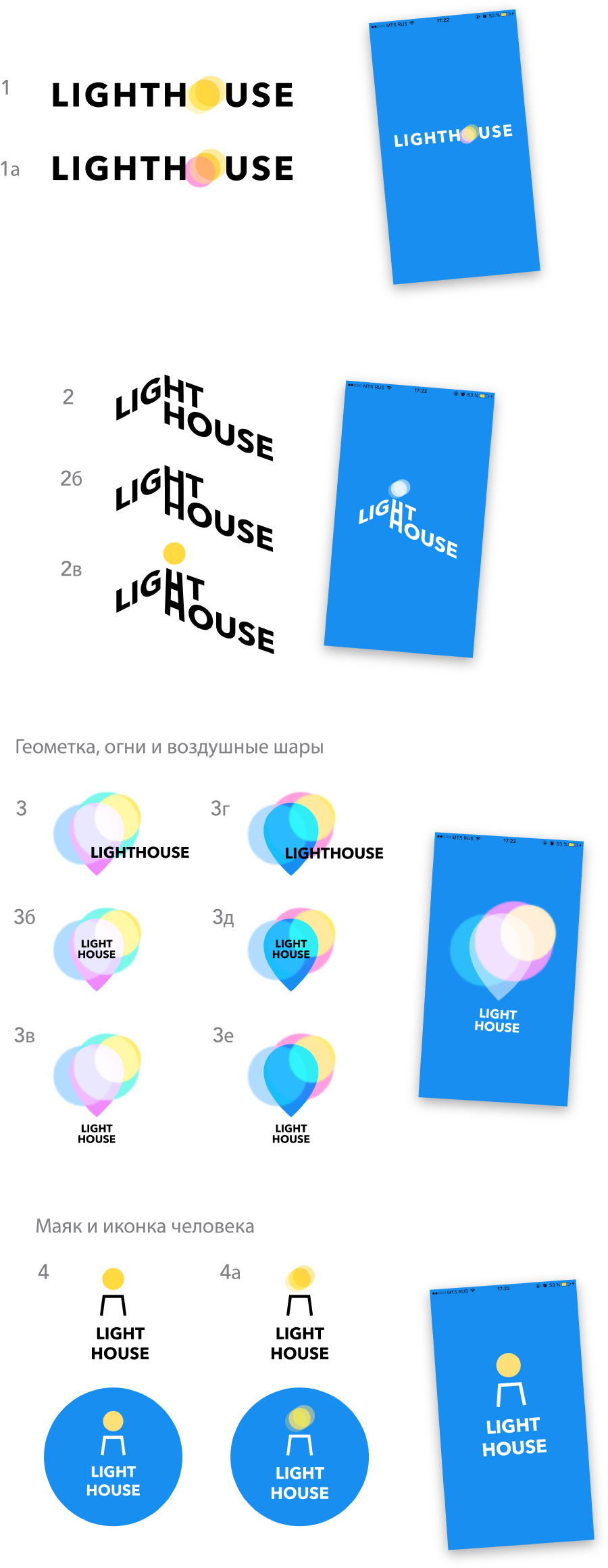
Designer: First ideas.

Art director: 3D isn’t too bad but you need to change the colors to be less girly and ice-creamy.
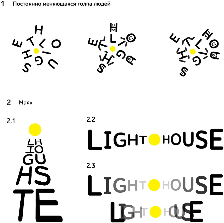
Second designer: More ideas.

Art director: 22 is OK on it’s own, but overall it’s not what we’re looking for.
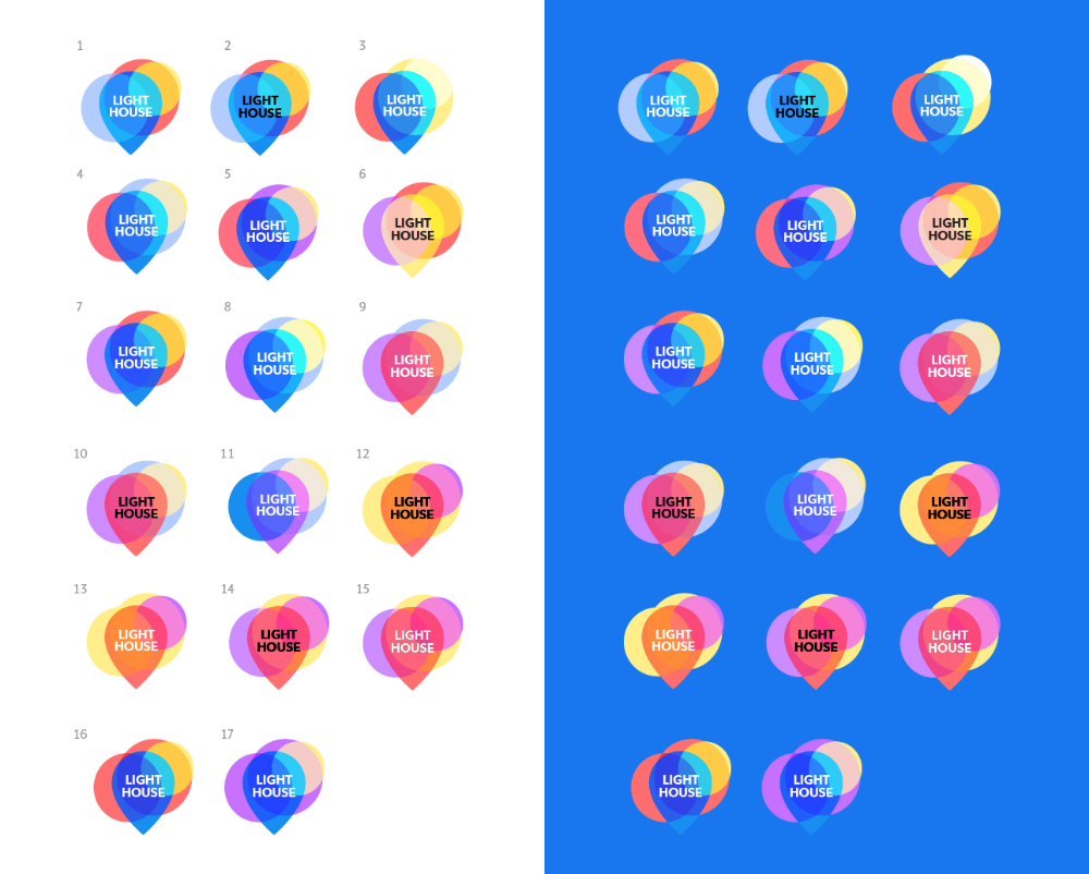
Designer: Tried it with different colors.

Art director: 1 is OK.