|
Artemy Lebedev
§ 120. Hanging punctuationOctober 19, 2005 |
|
One of the sine qua nons the breed of professional typographers is known by is hanging punctuation. Punctuation marks, brackets, hyphens etc. are lighter in weight compared to characters. In beginner designers’ eyes any text is a grey body sent in by the customer with no other aim but to make its beauty disfigured, while those who care take the trouble to visually make up for such drawbacks of layout (yes, manually, dammit). |
|
On the left |
|
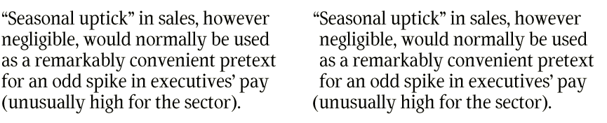
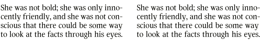
Quotation marks, brackets, and bullets are put beyond the left margin. Em dash (if used to indicate direct speech, e.g. in Russian) is not hung. |
|
|
On the right |
|
Quotation marks, brackets, periods, and commas are set outside the right margin (if it’s straight). Hyphens (both in compound words and between the syllables of a word that’s divided at the end of a line) should not fall outside the margin full-length, but rather be hung one third or half of their length. |
|
|
On the web hanging punctuation was first used on all pages of the website www.artlebedev.ru. There’s a point in hanging punctuation when you compose any “leisurely” texts and get a terrific kick out of it. |
|
In newspapers and magazines, punctuation must be hung in the layout of captions and large text bodies, in books—everywhere. |
|
|
|