|
Artemy Lebedev
§ 130. Five quotes from Roma VoroneshskiFebruary 24, 2006 |
|
I subscribe to every single word of the quotes listed below. If students of all design schools were familiarized with these ideas at the first lesson of the first term, this would be a different world to live in. |
Quotes from Roma Voroneshski’s website narisoval.ru |
|
This work’s central theme is that one should quit living in a world of conventions. So anyone fiddling with scientific approaches should be paid off with knocking his brains out. Say there’s been a survey to find out where people look when they google. The survey showed they look at the upper left corner of the page. The thing was published. You bet your sweet bippy there’s some moron now preaching to someone that everybody’s eyes are glued to the upper left corner of the page, so that’s the place where all essential things belong. Surveys suck. In truth, they can be very interesting sometimes, but you can’t deduce any laws from them, because it’s neither physics, nor algebra. People’s glances are cast towards the place where there’s something to watch, never in any definite direction. |
|
An assertion that everything necessary must be on the first screen is tantamount to the assertion that all crucial facts of the novel Crime and Punishment must be listed in the first paragraph. (What’s the point in reading it then?) I mean, if your novel is crummy, the first screen won’t help. If it’s the other way round, folks will thumb through it four hundred times and ask for more. [...] |
|
Another curious shibboleth: if something’s not seen on the first screen, well, if it’s way below, users think it’s not there—even in the event they’ve seen it before. Which means that users are creatures who, having turned away from a wardrobe, forget about its being there. That’s what some guys, never mind who, believe. To put it shortly, there is no first screen. [...] |
|
Illustration: how many people won’t guess that there’s something way down? 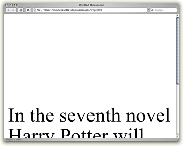 |
|
Color is a phenomenon of ideology. The ideology is this: a color per se does not mean anything. Not a thing at all. Bragging about some colors that don’t match other colors is a mumbo jumbo that outstrips horoscopes. “Red is for danger”, says a man who ate a tomato earlier in the morning and didn’t flinch. “Black is too gloomy”, says another, who earlier in the morning read black letters against a white background and chuckled. “Grey is dull”, complains a third one. Your mama is dull. Look at Buster Keaton—all tints and shades of grey and as merry as a grig. “Blue is for hope, green is for renewal”, says designer pulling wool over your eyes. Designer, don’t. You’d better break it to the customer: here’s 16 million colors (RGB) or a fan (Pantone), point with a finger. We’ll paint it any color you want. But the “Delete” button will remain red (the customer never argues with that). When I’m told that red and green don’t match, I get into a snit. Look at a strawberry bed, bubblehead! |
|
When people wave off the meaning and immerse themselves into god knows what—the aura of a word or something like that, it’s a safe bet that a cripple is going to be born. Overheard by myself: “adverb not provokes negative associations on the user’s part”. Wanna know what phrase it referred to? [...] “Not far off the mark”. |
|
|
|