|
Artemy Lebedev
§ 156. Design is warDecember 22, 2008 |
|
Graphic design can serve purposes more sophisticated than simply decorative. Let’s take for example the history of the debate between tobacco producers and health groups. |
|
All around the world, as well as in Russia, cigarettes used to be an everyday product for the majority of adult males. People were allowed to smoke anywhere—on the bus, in the restaurant, or in an office. Throughout the 20th century, smoking spaces reduced. Personal experience: smoking wasn’t allowed in movie theaters, but the author did smoke a lot on planes. |
|
Housekeeping |
None of new planes—neither Boeing, nor Aerobus—have ashtrays in the armrests anymore, but there are still ‘No smoking’ signs above each seat. |
|
Cigarette packs were designed much in the same way as candy bars—a designer was free to decide what they should look like. There weren’t any requirements or restrictions. |
 |
Chisinau cigarettes. USSR, 1970s |
|
Smokers barely responded to anti-tobacco campaigns, but decisions were to be made by national ministers of health. In the early 1980s, the World Health Organization introduced a new standard, and tobacco producers in the USSR were obliged to put a text message warning of the dangers of smoking on each cigarette pack. The Russian expression meaning “Ministry of Health warns” became a catchphrase. |
|
The text could be positioned anywhere on the pack. For the sake of better design, it appeared on its end or side. |
 |
Visit cigarettes. USSR, 1980s |
|
It’s least likely that anyone who quit, or never even started smoking, did that because there was such a warning. But the fact is many people all over the world did take up smoking, and keep doing it, because they like a particular brand of cigarettes and their pack design. |
|
The present requirements for the appearance of health warnings are meant to ensure at least the following: the text is set in a highly readable font, it is highlighted and placed in a separate section, and occupies no less than one quarter of the frontside. This is how it looks in Europe: |
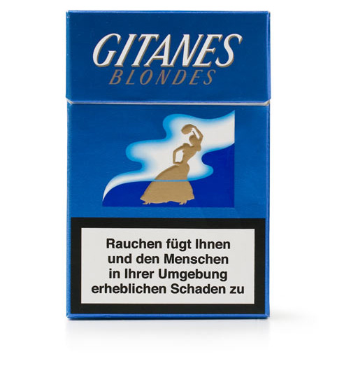 |
Gitanes cigarettes. Germany, 2007 |
|
In countries with slacker regulations, it’s much different. For example, the message may appear in gold letters over silver background. |
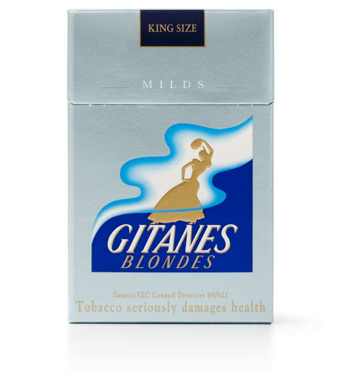 |
Gitanes cigarettes. United Arab Emirates, 2006 |
|
Tobacco producers are not really afraid to make the warning more readable, but they are reluctant to do that, just in case. They wouldn’t want the time when they must put images of lung cancer on the packs to come too soon. |
|
Among all the developed countries, Russia is exceptional for its careless approach to health warning design (even Ukraine uses the relevant European standard). And it’s not that the country refuses to follow the world’s standard—the reason is it’s not yet obligatory. |
Heavier health warnings are to appear in Russia by 2010 |
|
Russian cigarette packs are designed in the we-can-if-we-want-to kind of way. And here is the result: |
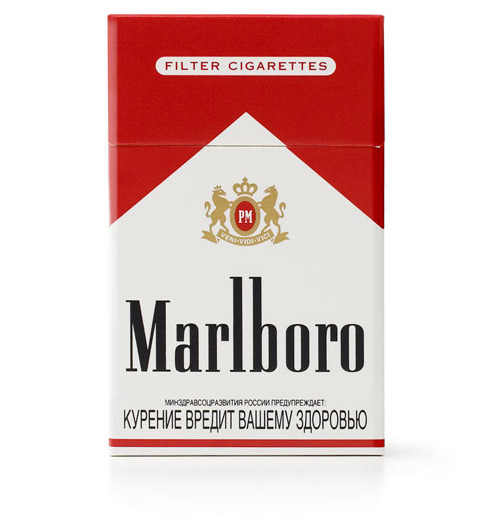 |
Marlboro cigarettes. Russia, 2007 |
|
What you see here is an example of pure disregard for legibility. Firstly, the words are set in all caps, which undermines readability. Secondly, the letters are deliberately narrowed, which yet again makes it less readable. Thirdly, the very message in its wording has hardly changed in 30 years, so it’s lost its meaning (no one really noticed that “Smoking is bad for your health” got replaced with “Smoking harms your health”). Using the same wording is essential. If it kept changing, people would start paying attention (in the US and Europe, there is a tremendous variety of warnings). Fourthly—and this is the most important—the text is intentionally made part of the overall design—it is completed with a line of the corporate red. For smokers the warning is rendered as meaningless as the fact that the coat of arms on the pack features the motto “I came, I saw, I conquered” in Latin. |
Also see § 150. Ad absurdum
|
|
Let’s compare our findings and the European cigarette pack design: |
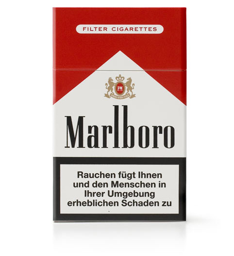 |
Marlboro cigarettes. Germany, 2007 |
|
Housekeeping |
The main purpose of hard packs, initially marketed as flip tops, besides protecting cigarettes from getting crumpled, was to make smokers take the whole pack out of their pockets. Soft packs always stayed tucked, and cigarettes could be fished out through a hole in the top. No one bothered to design the hard packs as comfortable to use as the soft kind. You could no longer take a cigarette out of your pocket without pulling out the flip top. |
|
Design is war. Using their knowledge of psychology and ways of perception, the enemies keep finding new ways to fight each other. No one wants to reveal everything they know all at once—either of the adversaries prefers to wait and see the other’s response to each new piece of information. So we have to put a health warning on the pack? Okay, here it is, on the side of it. It should be placed on the front side, huh? No problem, here you go, gold text on silver background. You say it must occupy one third of the pack? Splendid, we can now offer you special pack holders that cover up just the right part with the disturbing message. And so on forever. |
|
There is a great example of strong confrontation of the kind in Chile. Each and every cigarette pack features an image, half its own size, of Don Miguel, whose 20 years of smoking left him with a hole in his throat. If you look close, you can see it there. |
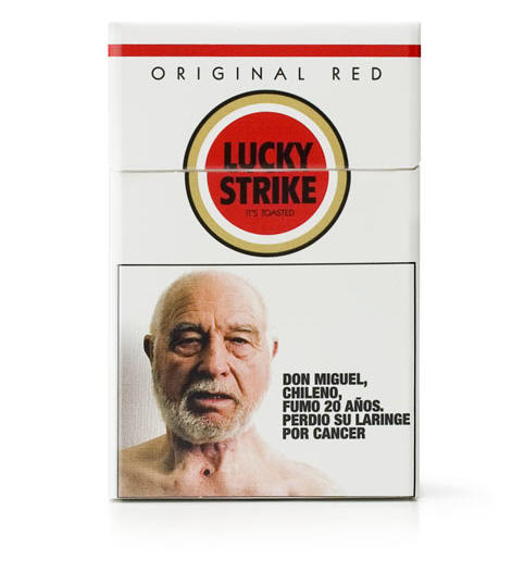 |
Lucky Strike cigarettes. Chile, 2007 |
|
Anti-tobacco activists celebrate success—they’ve managed to put the revolting image on each pack. But they got tricked—Don Miguel’s image is done so well, that one may think he’s the kind of person to appear on the cover of Esquire magazine. The face of the man whose disease, cancer of the larynx, is supposed to scare smokers looks like some celebrity’s face. And the fact that it can be seen everywhere, far too frequently, eliminates any effect. |
|
Canadian anti-smoking campaigners have a far less flexible attitude. Here the warning too occupies one half of the pack’s front, but it’s the upper one (pack holders won’t help). It too features an image, but this one really does revolt. And the photographs on different packs vary constantly. For a Canadian smoker, it is as if his cigarettes came out of a rotten mouth, which is rather gross. And along with this, in Canada you are not allowed to smoke too close to a restaurant terrace. |
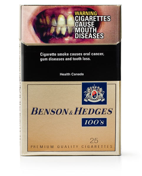 |
Beson & Hedges cigarettes. Canada, 2006 |
|
Obiter |
Decision makers in the tobacco industry are smart enough. They do understand that long-term prospects for the business (10, 20, 50 years) are not bright. Constant banning and limiting, and occasional trials cause investors and stakeholders to lose interest in the industry. Every tobacco corporation has already found an alternative of some kind, but all of them continue producing cigarettes while there is still legitimate demand. To delay new regulations, and also keep them less rigid, tobacco producers are putting forward “voluntary agreements,” such as, for example, the International Tobacco Products Marketing Standards signed by British American Tobacco, Japan Tobacco and Philip Morris back in 2001. The parties promised each other to ensure that the promotion and distribution of tobacco products would be directed at adult smokers and not at youth. This document could otherwise be entitled “We are nice, please don’t hit us.” |
|
Now let’s look at what came out of the voluntary agreement concluded by tobacco producers of Russia. |

“18+” sign. Russia, 2000s |
|
As a result, every tobacco ad in Russia now features not only the obligatory health warning, but also the recognizable logo with large “18+” in the middle. There are guidelines for its appearance, and it cannot be altered or modified. |
|
This logotype is also seen as symbol of responsible attitude, and small stores often stick it on their doors. It may seem to show care for youth. But it is actually a brilliant solution for the future, when tobacco advertising is banned. The sign, which will in the long run become even more recognizable, means literally: “Cigarettes sold here,” and allows you to smoke if you are older than 18. |
No health warning could keep the author from smoking, three packs of harsh cigarettes a day for 16 years. No health warning helped him eventually quit smoking. |
|
|
|