|
Artemy Lebedev
§ 77. There came the euroDecember 26, 2001 |
|
On December 31–January 1, 2002 a new hero named euro came onstage. |
|
The euro sign is exotic for Russia so far. Ad designers still don’t have the euro character in a standard designer palette. Any designer dealing with shop signs and ads and having a fair dose of self-respect still must make shift with older versions of the symbols of a modern Russian city—Brush Script, Betina, Parsek. |
|
We are also in for a spate of home-bred euro signs to be daubed by schlockmeisters. Keep an eye out for currency exchange offices. |
|
Let’s get a little back into history—the early seventies. Chief Designer of the European Community Arthur Eisenmenger who supervised the development of the European flag and the CE sign (see any product supplied from Europe), draws a squiggle, crosses it with a sign of equality and retires. |
Kate Connolly, “Inventor who coined euro sign fights for recognition”, The Observer, 23.12.2001 |
|
Years pass. In 1992 the European nations’ ministers come together and decide to coin a new currency. In 1997 old Eisenmenger watches TV and suddenly sees President of the European Commission Jacque Santer demonstrating a 16-feet squiggle from organic glass that the governments of the European nations had adopted as a sign of the new European currency. “Matilda, look! That’s my E, my E!”, the old man hollered to his wife and hopped up from his armchair. |
|
The intrigue is that the European Commission has never let anyone know who the author of the euro sign is. We know the names and positions held by the people who developed the euro banknotes and coins. As for the design of the sign, it was reported to be picked from 30 variants considered at internal meetings. At first 10 out of 30 variants were reportedly selected, whose number then diminished to only 2. And then Jacque Santer and Yves Thibault de Silguy (a commissioner in charge of the euro) made the final choice. |
|
That’s Belgian democracy in action. On the other hand, it’s no wonder. Our money wasn’t made a public forum’s discussion point either. Just printed 100 rubles with Advertiser’s Gothic on it before anyone could say boo. But our money is one thing—it’s for one country, after all. The euro is being issued for a lot of countries that at least have a tradition to speak about crucial issues in public. And these countries were fobbed off with a postmodernist hoagie. And they are chewing it in silence. Because the European parliament’s taste is just as good as that of the Commonwealth of Independent States. Or that of the Warsaw Pact countries. |
|
The more old farts of ministers huddle up, the more chintzy will be the outcome of their aesthetic ambitions. The design of the euro money is a superb example thereof. Its style reminds one of a meager document file from some COMECON conference during the Soviet standstill. |
|
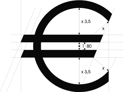
Nonetheless, it’s all we got. The main thing followed later. The European Commission hired some visual identification standards consultants (i.e. the guys who tell you how and what to draw). And these guys gave out this: |
 |
It’s worth noting that the parallel bars are skew at the ends. Outside the C symbol the two bars are positioned one above the other. Inside the symbol the lower bar is shifted to the left for a distance computed by prolonging the directrix downwards at the angle of skew of the upper bar. Official euro sign in different formats |
|
Additionally, any other ways of using the sign were prohibited. I will refrain from describing the particulars of indignation felt by the community of designers, but it eventually caused the European Commission to rewrite the rules of using the sign several times. In the end they decreed that there’s the official sign, on the one hand, and some features that have to be present if this sign is drawn for a specific type face, on the other. |
|
The euro sign gives rise to problems all the time. First, old Eisenmenger never meant to make this sign stand for currency. He was simply obsessed with the character “E” that his last name had started with ever since his childhood. Second, the sign was presented by the European Commission as a logo, not as a symbol to be widespread in public use. It’s as if there were the one and only way of drawing the character “Q”: whatever font you take, it should always look the same. Bullshit? You bet. So it’s the same with the euro. |
|
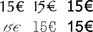
Unfortunately, many font producers hurried to add the logo, not a new adapted character, to their fonts. The euro sign must be part of the font to which it belongs in all respects: |
 |
|
How does the European Commission describe the new sign at its official website? What does it stand for? The parallel bars are suggested to symbolize the stability of the new currency. The E sign is said to be a hint at the Greek letter epsilon that dates back to Greece viewed as the “cradle” of the European civilization. Finally, the whole thing is the first letter in the word “Europe”. |
|
Another problem with the sign is that it was designed as a character to be placed before the figure, while many countries tend to do that in the reverse fashion. In France, Holland, Russia and other countries the currency symbol is put after the figure. |
|
We can only offer congratulations to each other now that one of the ugliest characters has become available on the keyboard. |
|
|
|