|
Artemy Lebedev
§ 78. Pictograms and ideogramsDecember 26, 2001 |
|
There’s nothing simpler than a pictogram. Its function seems easy to understand: conveying a message in a shorter, quicker, plainer and more effective way than a word can do. |
|
At some point of graphic user interfaces development it dawned on producers and then on users that the interface was the only pebble on the beach worth picking. All of a sudden, literate and educated people started to reveal a genuine passion for pictograms and ideograms. |
|
Housekeeping tip |
A pictogram is a glass drawn to indicate a glass. An ideogram is a glass drawn to indicate a glass, booze, whoopee, the glass industry, the percentage of intoxicated offenders etc. in any grammatical form. |
|
After going through the torture with ideograms, people devised the alphabetical writing system. Using this system, the author wrote the text you are reading now. And by all accounts, you are doing fine. So it’s not as bad as that. Now take a look at the following illustration: |
 |
|
This is the navigation bar of Adobe Acrobat Reader. What you are seeing in the red circles is what should be paid attention to. Now, attention! Try to answer a simple question: what do these five pairs of arrows stand for? Of course, it’s something more than just “right—left” and “back—forward”. But what exactly? |
|
To find out, you’ll have to launch Acrobat, move the cursor to each arrow and read the prompt message. This message will certainly be written in good old letters that the interface developers were so shy of. |
|
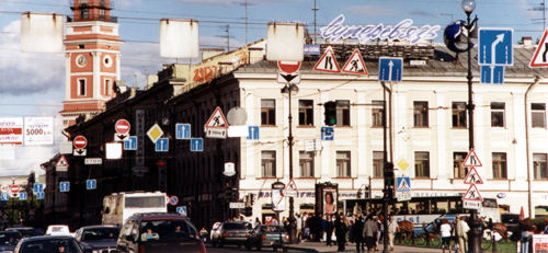
All right. And what if we take signs whose meaning is always unambiguous? Say road signs. A superb example of simplicity and perspicuity. Let’s check out how things are in St. Petersburg in the Nevsky Avenue: |
 |
|
The camera grabbed forty-five signs hanging above the crossroads. With advertising thrown in. In reality it looks still more terrible with the same amount of road signs for people driving the other way. The good intentions of people who hung these signs are evident: they wanted drivers in each lane to have all the clues they might have needed. But the driver takes a broader look at the world—a little bit more than 180°, to be more correct. So he sees all signs within eyeshot. And advertising thrown in. |
|
A person can instantaneously see and recognize a certain limited number of objects (say seven). These objects ought to be different not to get meddled up into a mess that takes a great deal of time to analyze and unravel. In an ideal navigation interface the user should face no difficulties answering the questions “Where am I?”, “What am I to choose from?” and “Where will I get?” |
|
If pictograms and signs can be construed in several ways (thus becoming ideograms) or appear hard to understand, they should be provided with text explication. |
|
|
|
|
|

