The making of the logo and visual identity for May Market supermarket chain
Overview Process
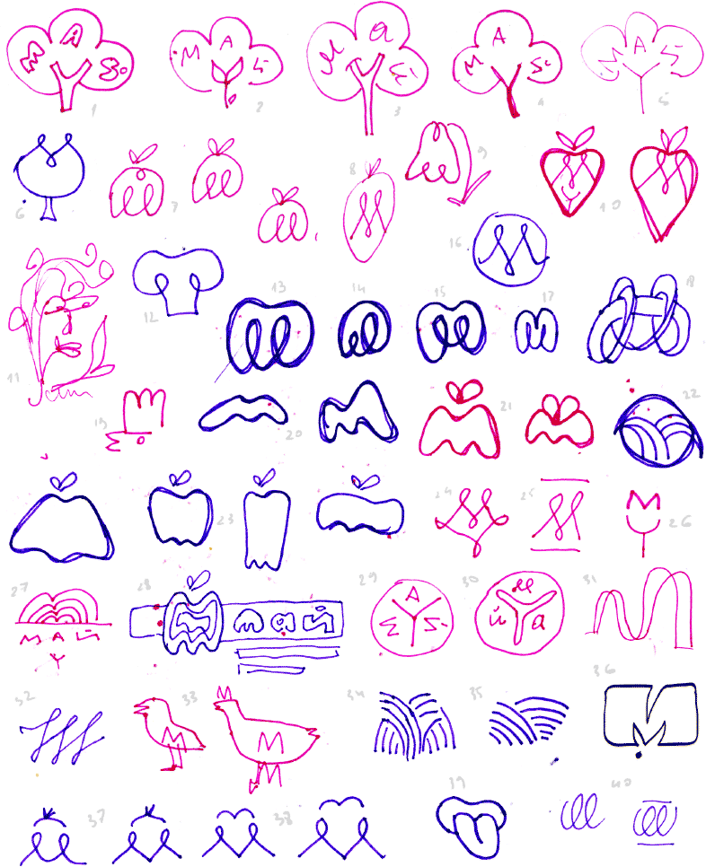
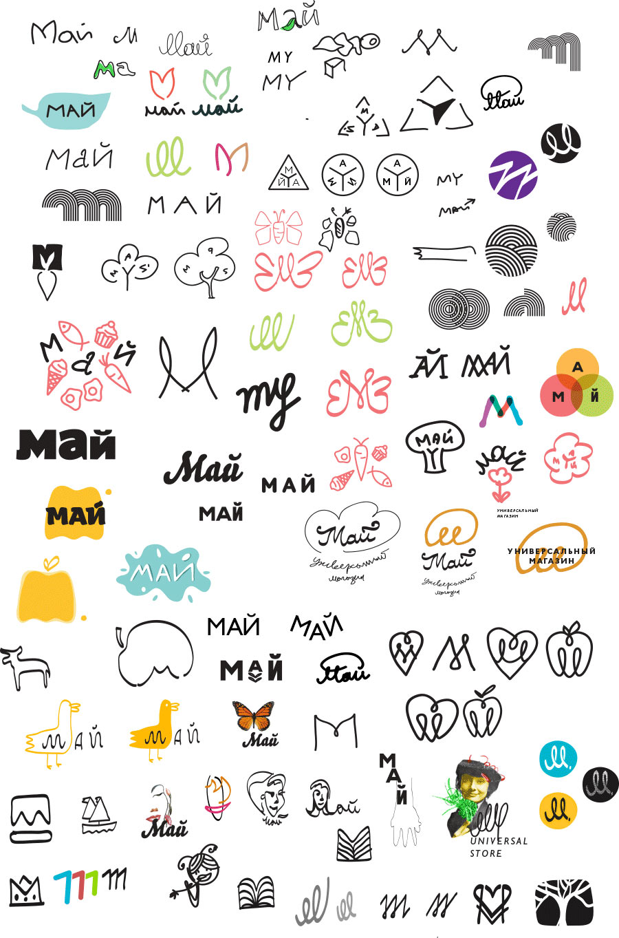
Piling up ideas.

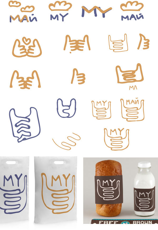
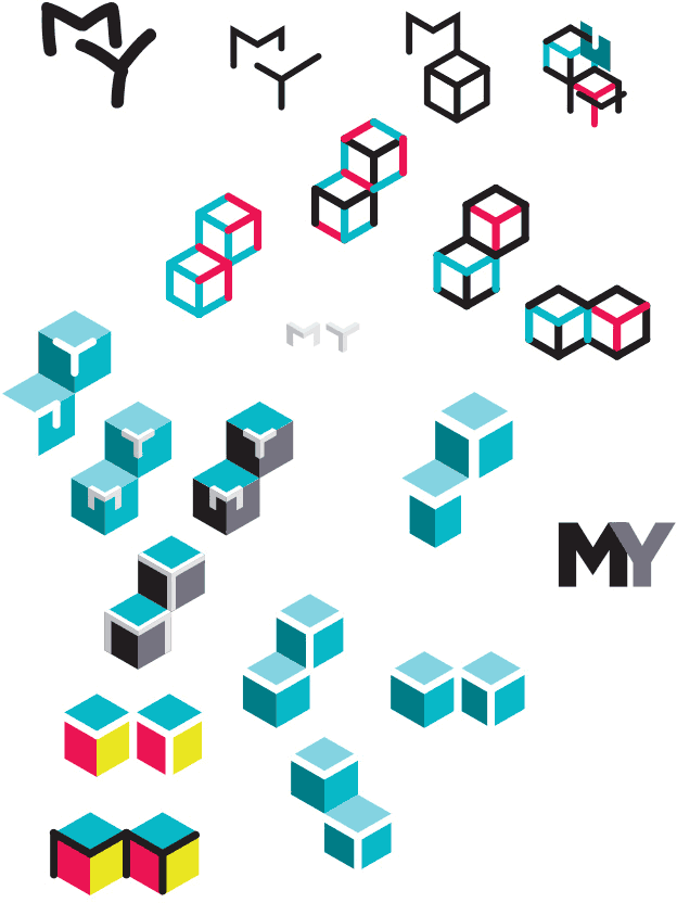
Choosing the most promising ones and showing them to the client.

Looking for more.
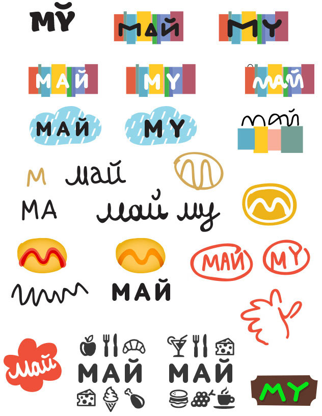
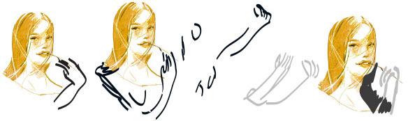
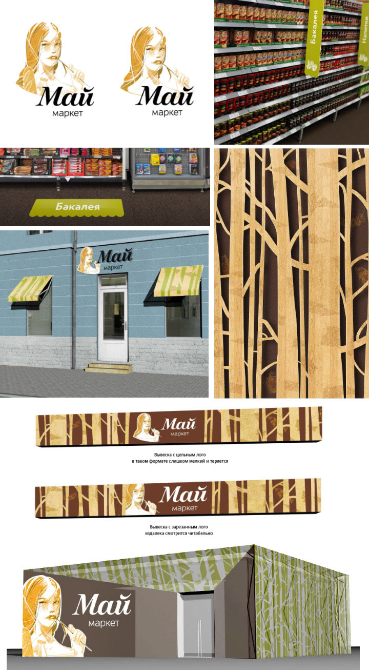
The artistic director suggests depicting a woman with a straw in her mouth.
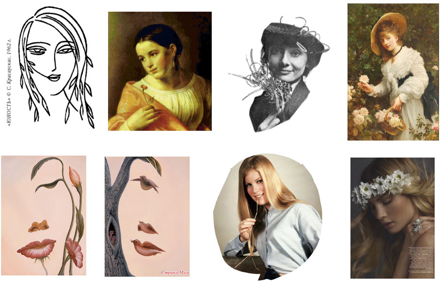
Drawing.
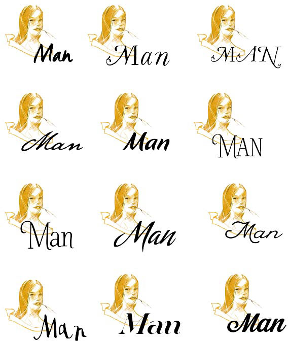
Sketching the letters.
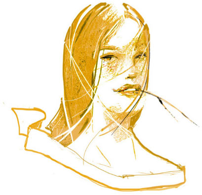
The straw looks like spit. Adding a hand.
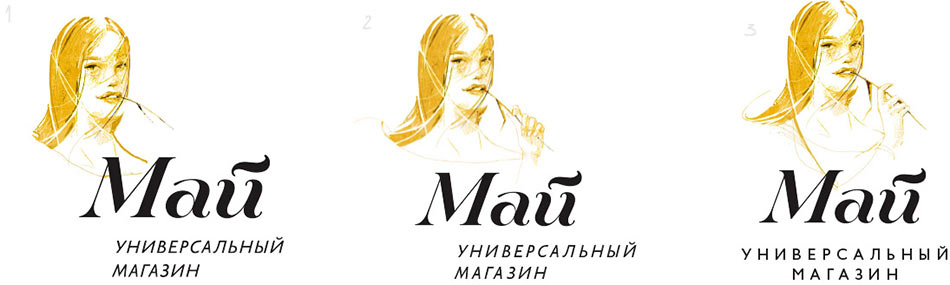
The client likes it, but the logo lacks a connection to food. Adding a bottle of milk and a baguette.

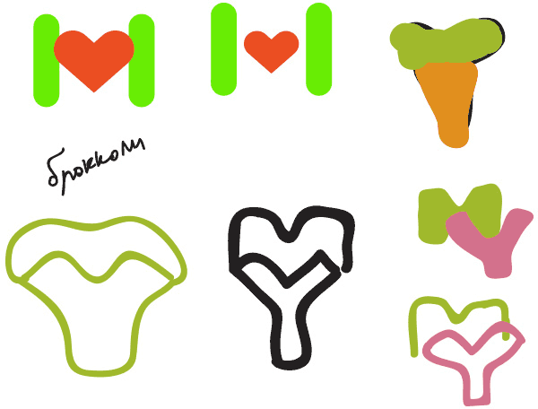
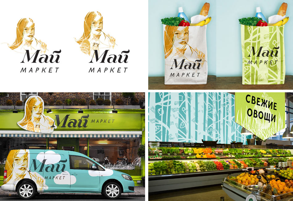
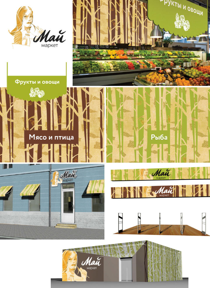
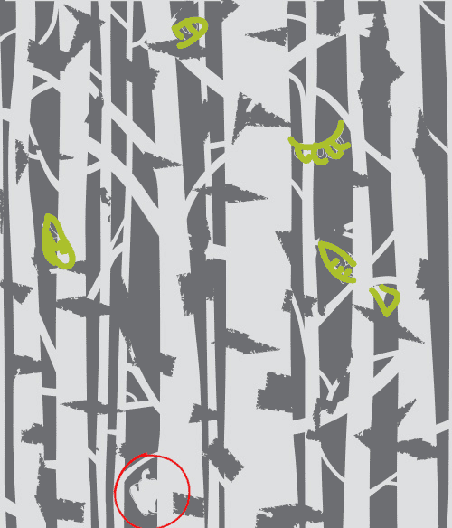
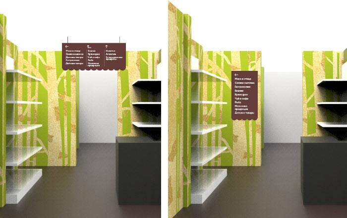
We also need to make a wall pattern. Let’s stick to the country theme and entwine food with birches.
Working on the typeface.
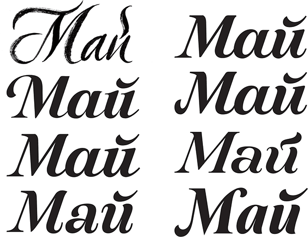
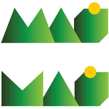
The art director doesn't like it.
Making new sketches.
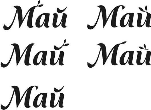
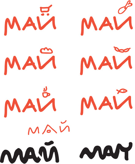
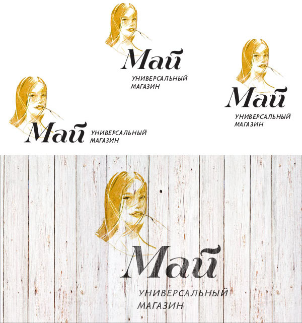
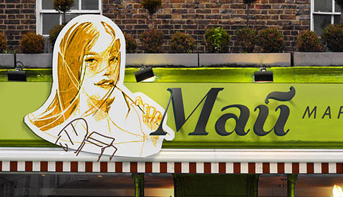
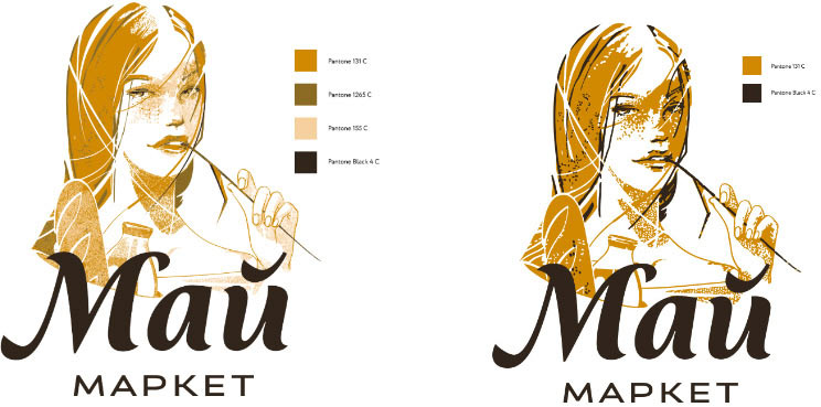
These are better. Choosing one and adding a caption.
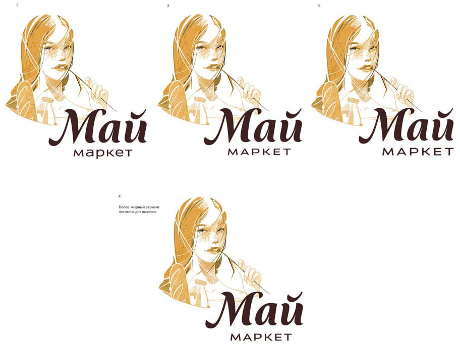
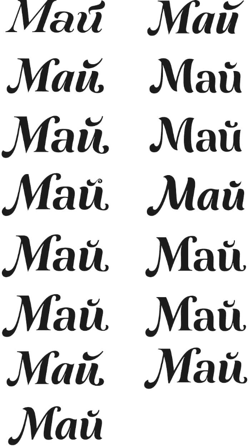
Type designer: Here are several designs of the caption. The logo on the bottom picture is bolder, but probably not bold enough to put it on the sign. So what do we do with the sign: make the whole logo bolder or lower in contrast?
Art director: The sign version of the logo can be the main one.
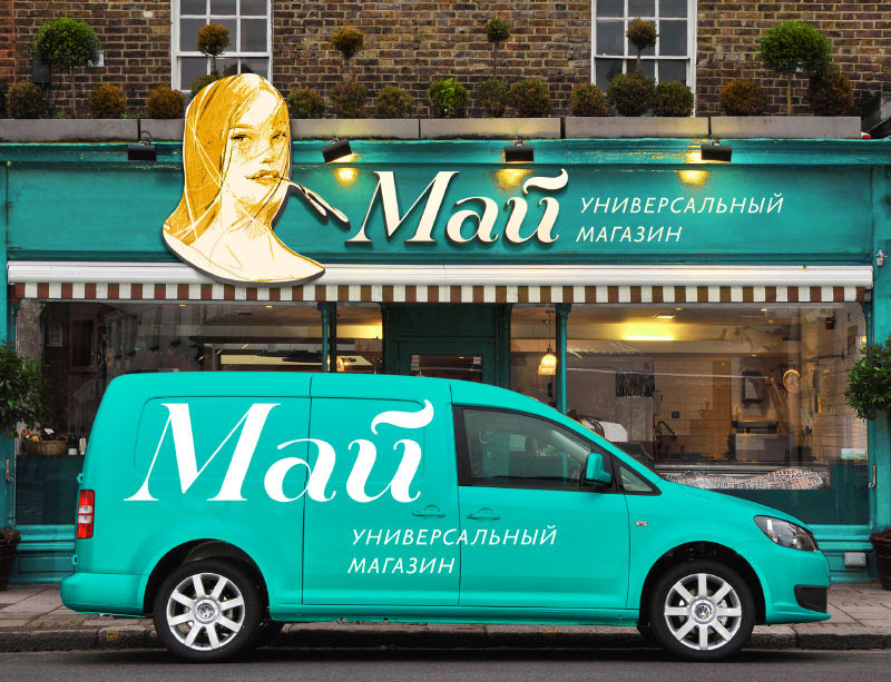
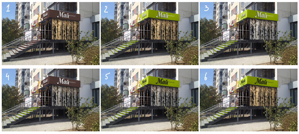
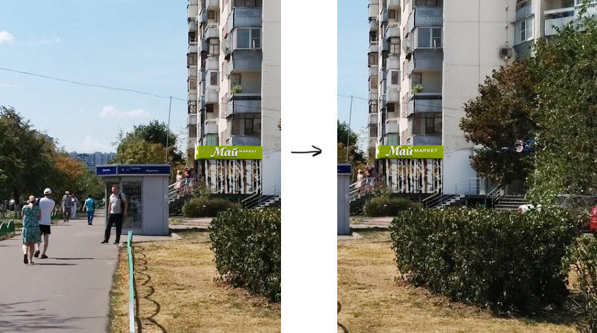
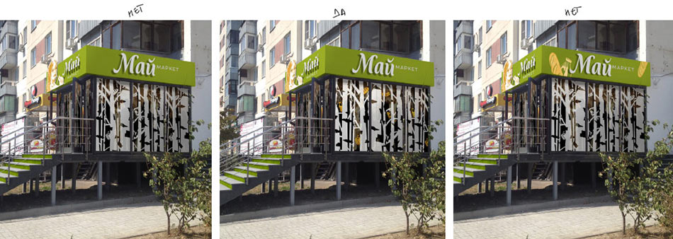
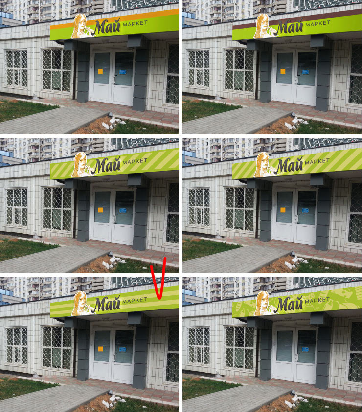
Thinking on the store entrance design.
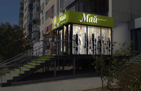
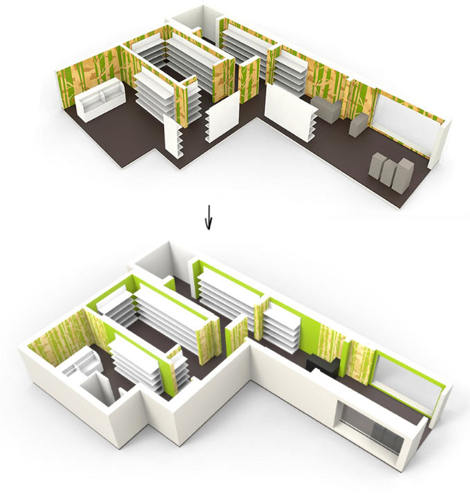
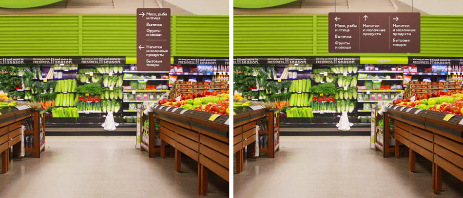
Working on the interior.
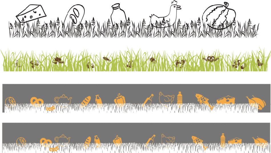
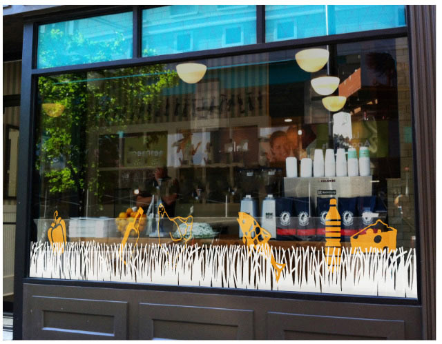
Coming up with a grass pattern for store windows to complement the one with the birches.
Studying how the logo looks when printed in four and two colors.
Adding stripes to the background to make the sign more recognizable.

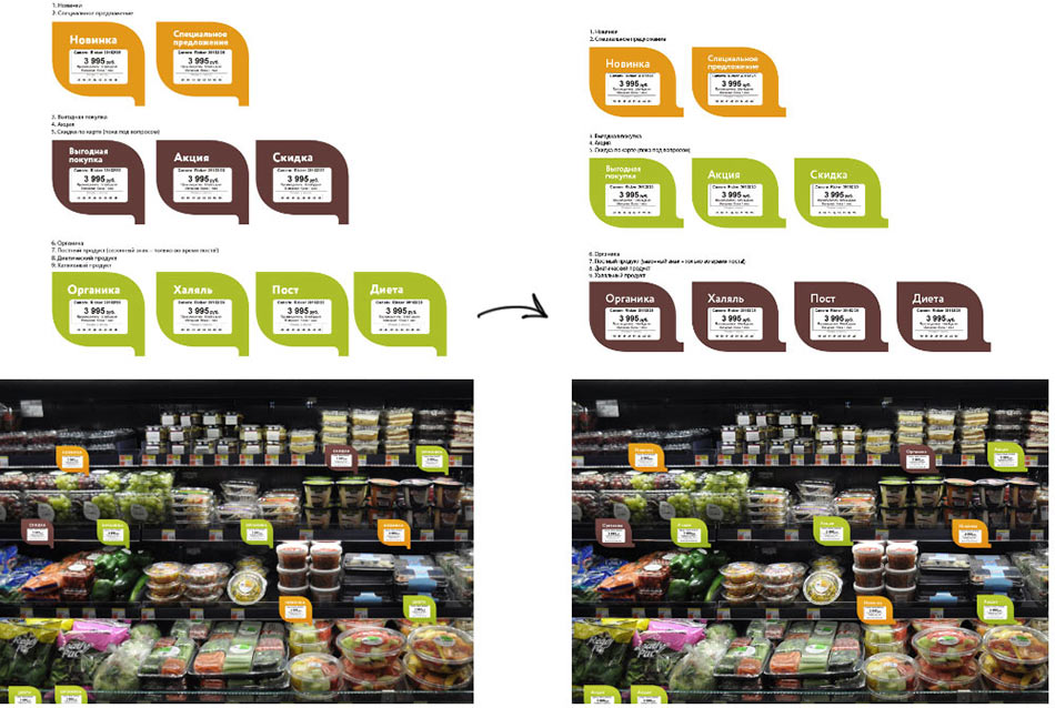
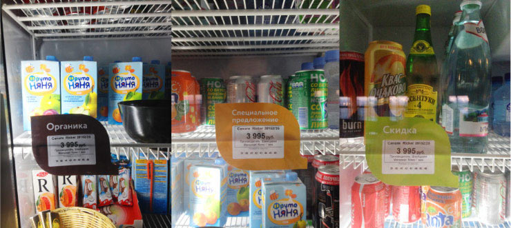
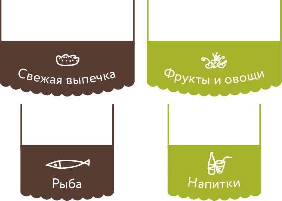
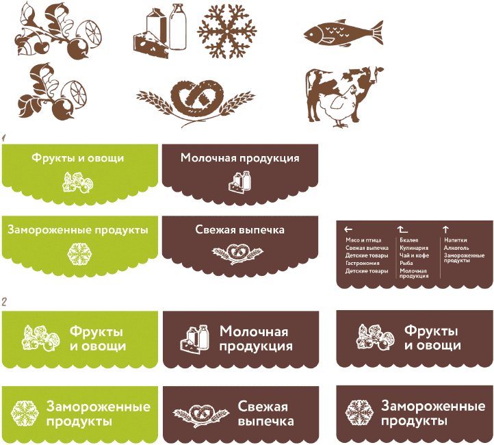
Designing price tags and trying them on.