1.0 1.5
The making of Mega app for iPhone
Overview Process
First attempt. Searching for interesting ideas and concepts.
Second attempt.
Going further.
No, right now the app looks like hundreds of others. We need to find something different, something that will emphasize Mega’s unique benefits. We get an idea to split the application in two parts: the user part will have various shopping information; the store part—the map, list of stores, sales, promotions, etc.
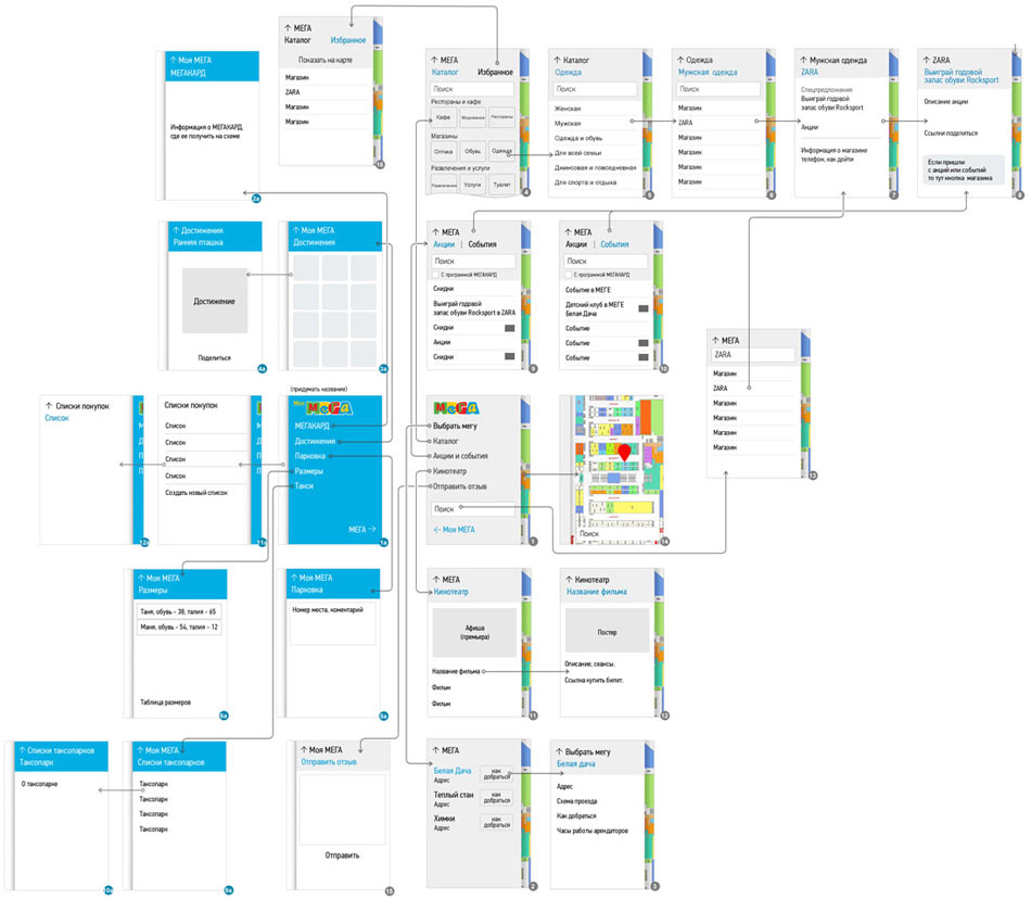
In the new concept, the map is always at hand. It’s accessed by flipping to the left. The user shopping list is always available and accessed the same way. Drawing a detailed diagram of the app.
The idea is good, but it looks boring. The art director suggests to take a look at Mega’s website and move closer to the overall style. Adding blocks to the application’s design.
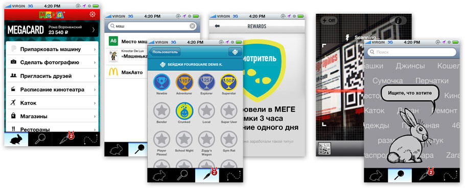
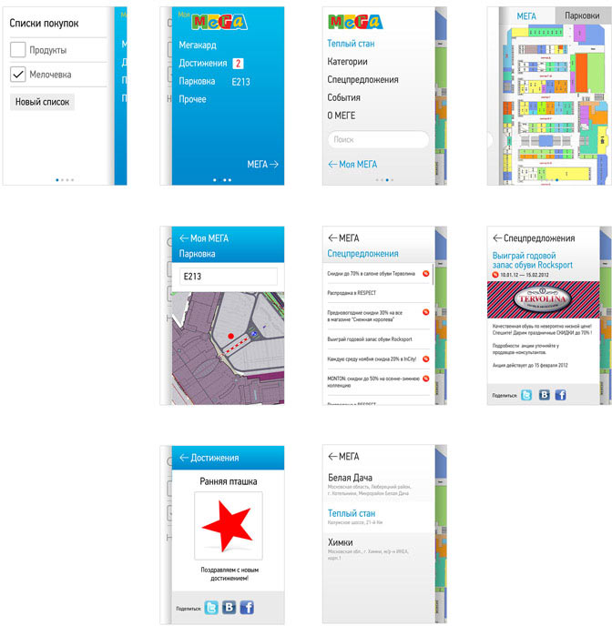
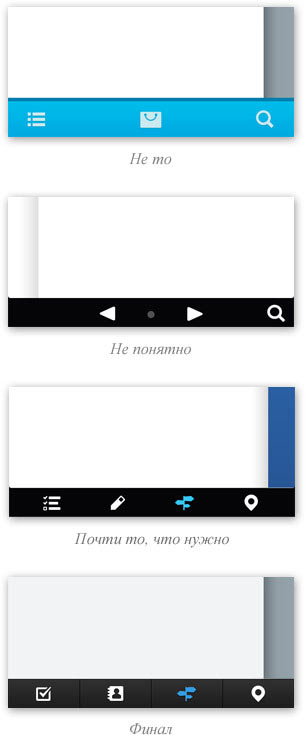
After some testing, we realize that “flip-through” navigation is not enough. Adding the bottom menu. Making the prototype.
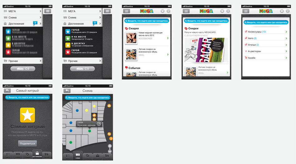
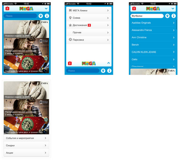
Designing all the screens.
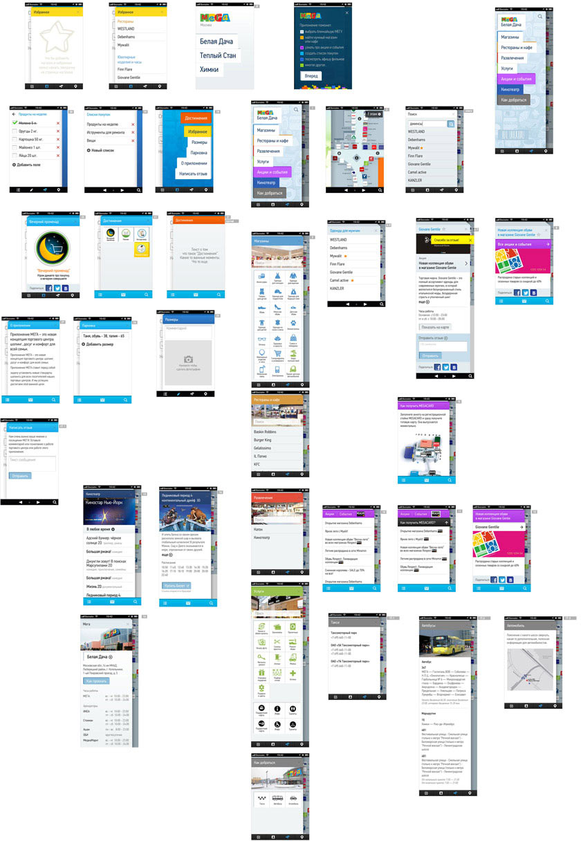
Making clear, animated examples for the programmers.
|
|
|
|
|
|
|
|
|
|
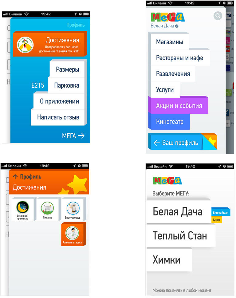
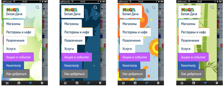
Adding a selection of various backgrounds on the main screen, for holidays and special events.
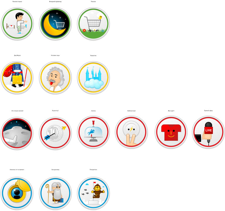
Making graphics for various achievements.
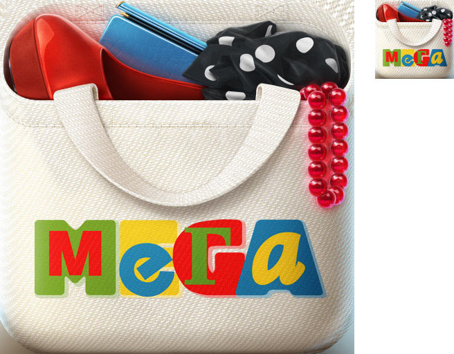
Creating the app’s icon.