Client: My name is Darya Chernenko. I am the founder and leader of the popular internet project Menu of the Week and the Good Housewife Culinary School. It’s not just a website with recipes, I have created and now promoting a system of home cooking that includes everything from menu planning and buying food to cooking, freezing and storing.
I help women who cook for their families reduce time, energy and money spent on cooking and everything related to it.
I need a logo and a corporate identity that I would be able to use on all platforms of the project: the website, social network groups, educational materials (webinars, video tutorials, presentations, books, etc.), something that would unite all materials with a single style and concept.
Right now the platforms are linked only by the name Menu of the Week and similar content, visually each platform is different.
As for preferences, I would like to use white and green (preferably #d6ee96) colors. Associations with health, healthy eating, cooking + time management.
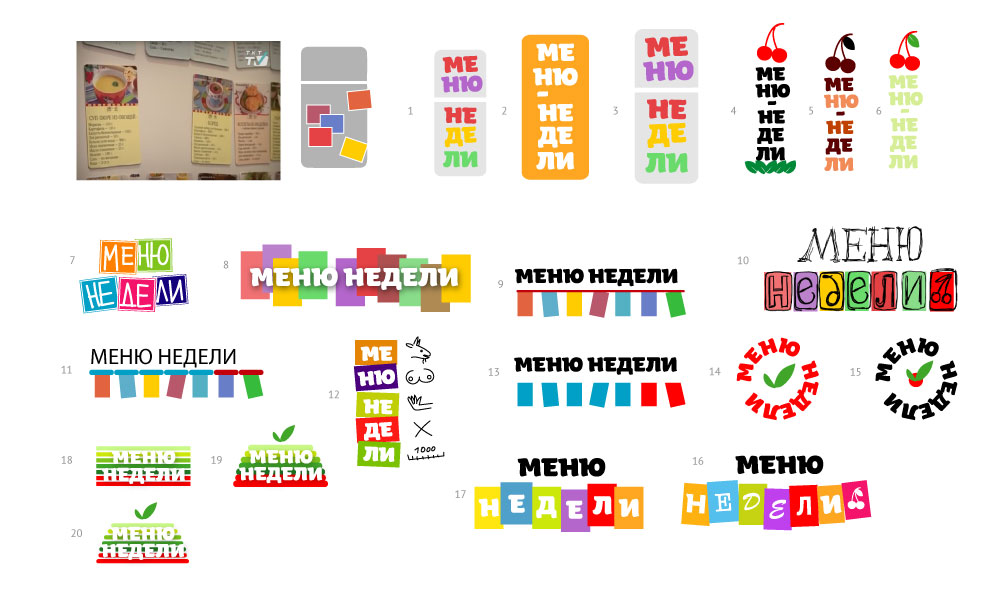
Designer: The client makes fridge magnets with quick recipes.
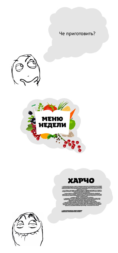
Designer: More food for thought.
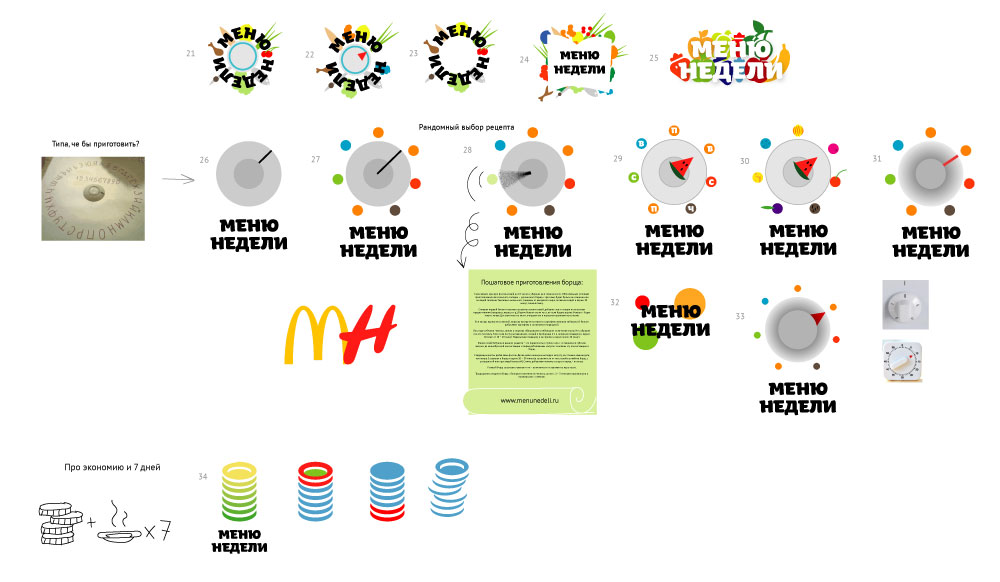
Designer: A logo like that, plus we can show development with an interactive spinner.
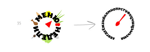

Art director: I love number 12. But 24 is more appropriate.
Designer:
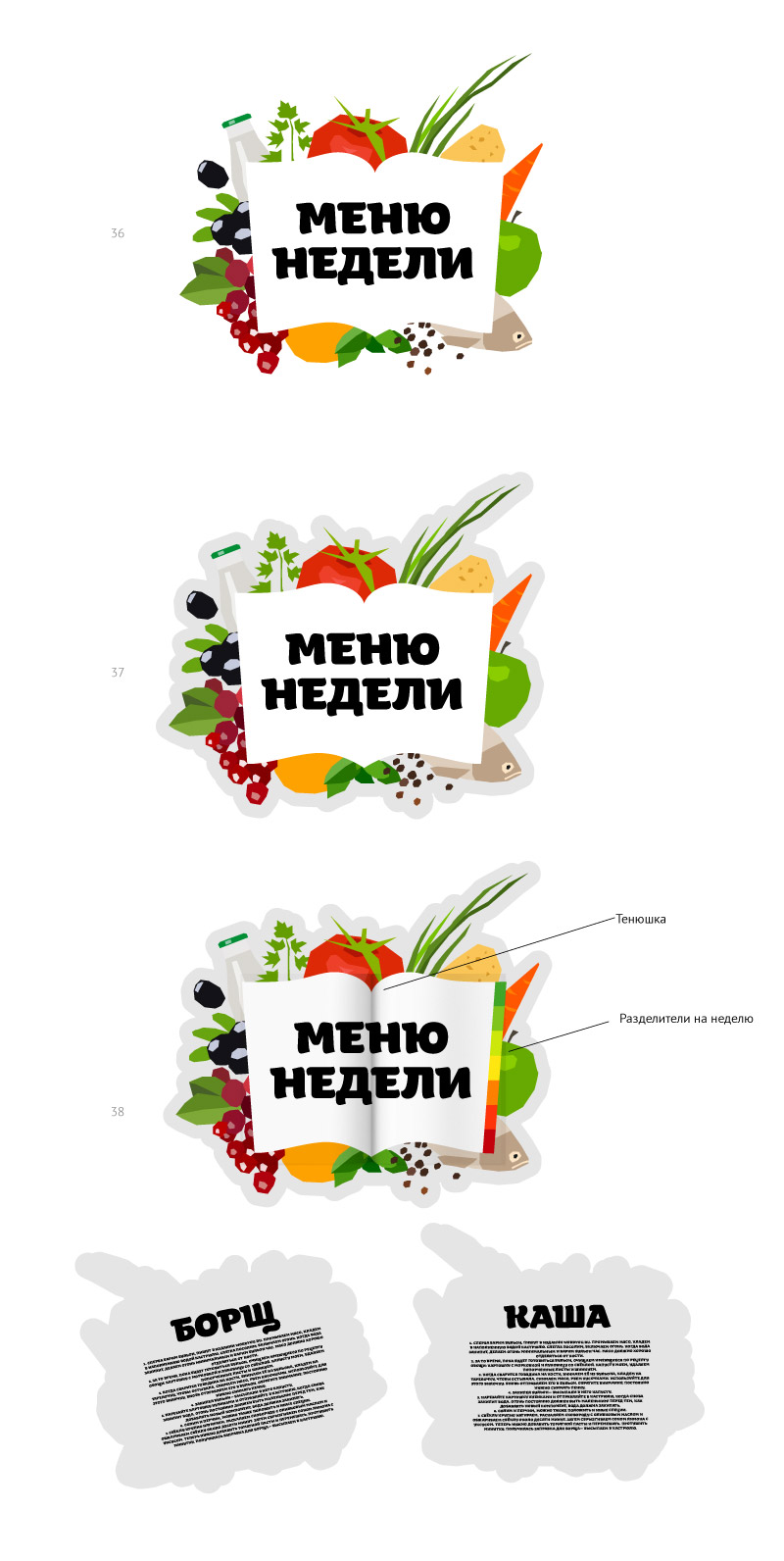
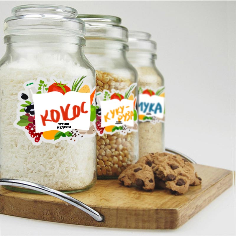
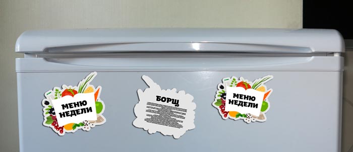
Designer: We can also add an outline to the thought bubble.
Art director: It would be best to make the overall shape more cloud-like so it would be easier to produce magnets and stickers. And let’s replace the open book (which looks more like a shoulder patch on school uniform) with seven rectangles (the recipe cards).
Designer: I have no problem with the cloud, but I can’t make the cards work: they either blend in with the background or disappear entirely. Maybe, we can try another shape instead of the open book? Like a chopping board or a placemat? And then we can grow the style by putting photos and texts for social networks in that shape.
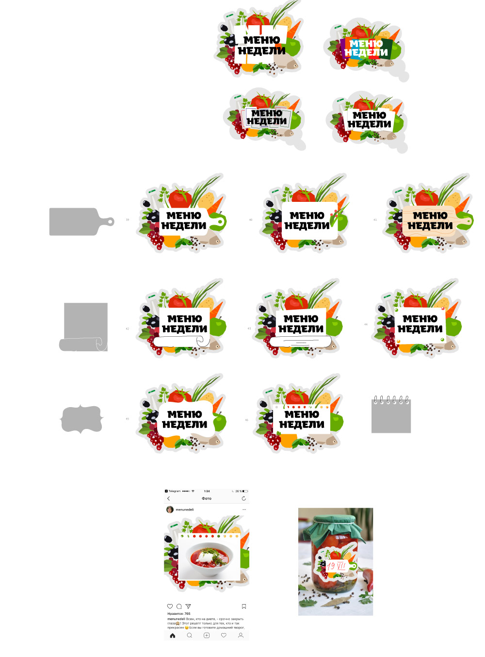
Art director: You didn’t number them. The second from the top and to the right is roughly what I’m looking for.
Designer: Whoosh.
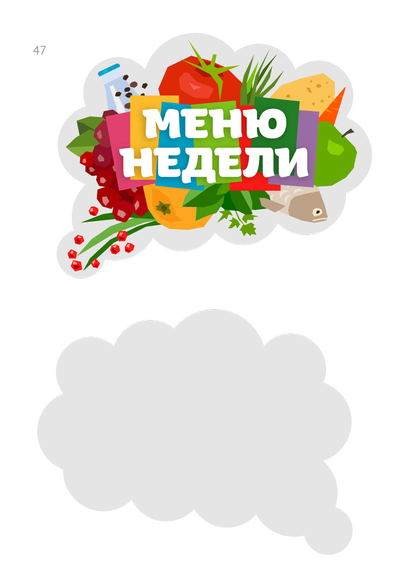
Art director: Everything looks good, but let’s make the cards white, otherwise the result is too noisy. And let’s throw in a chicken leg somewhere, right now it looks like a vegetarian set.
Designer: Cards with different angles and overlaid produce.
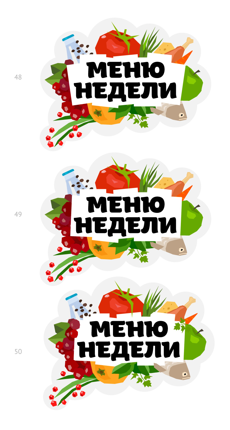
Designer: I fixed repeating elements in the last picture.
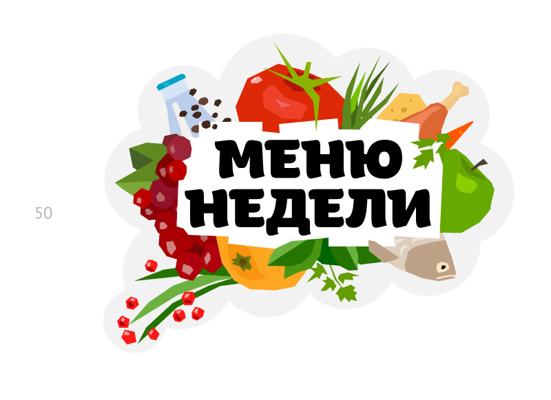
Art director: Go with 50, just make the fish happier. And make the level of milk in the bottle horizontal.
Designer: Two options for the fish.
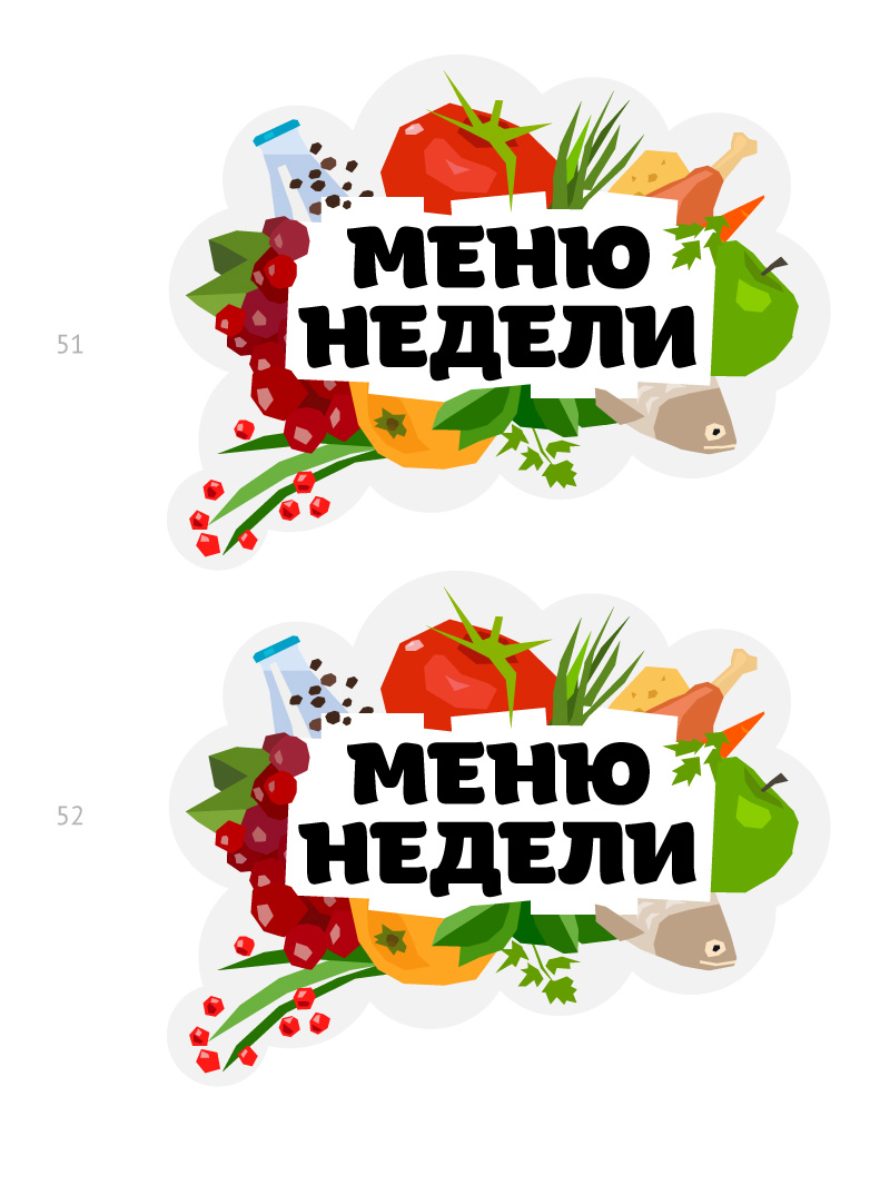
Art director: 52 and it’s done.
Designer: I don’t like the white blob in the center. Because of all the overlaps, the cards seem to have lost their shape. Maybe, move them to the top (54) or add a bit of shadow to make them stand out (55)?
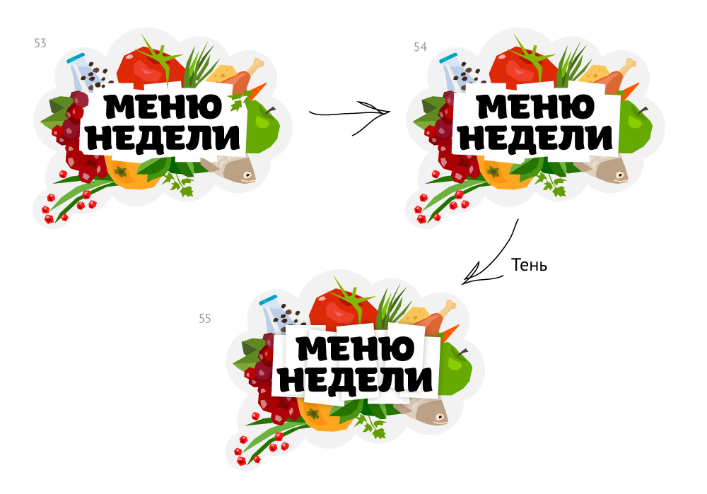
Art director: 54 is better.