Client: Our company MindAqua is planning to promote and develop aquafitness in Russia. This branch of fitness is hardly familiar to the wide audience which is why it is so underrated. A recognizable logo is just what we need to make the first step in the right direction.
We have a huge desire to let people know about the benefits of water as an environment for any kind of physical exercise. And most importantly, to move people away from stereotypes like “grannies in the water.”
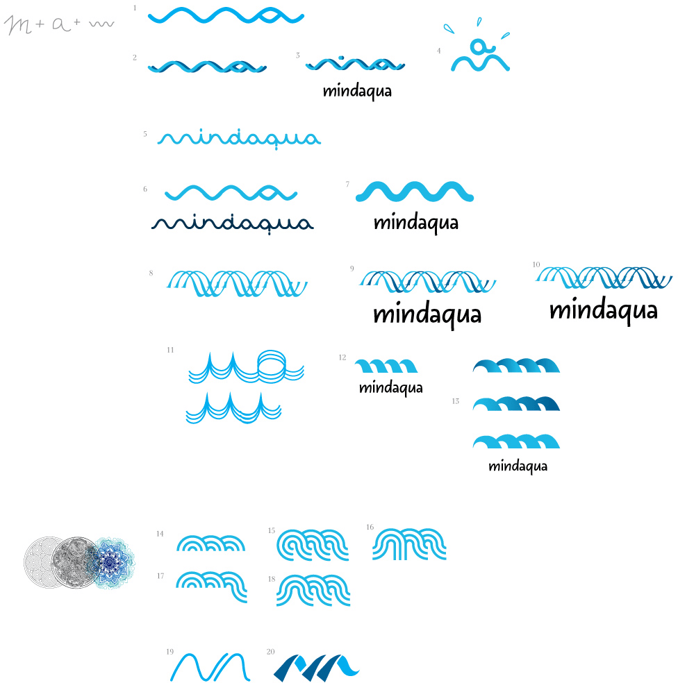
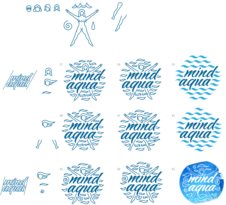
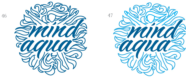
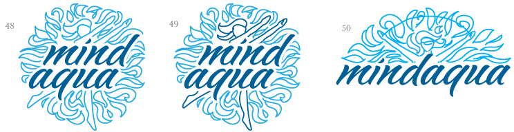
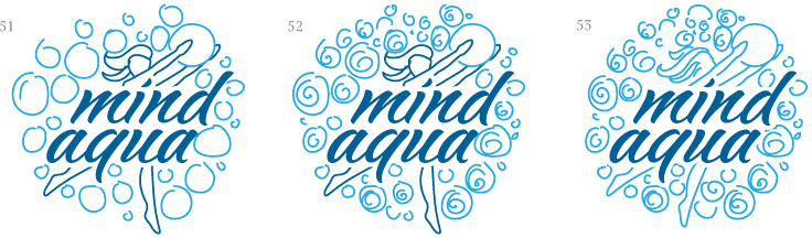
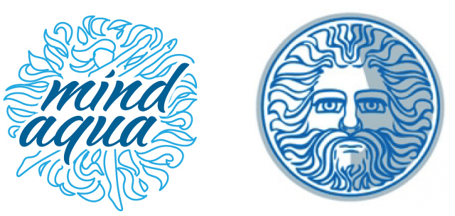
I’ll start by saying that I’ve never seen a good logo about water or aquafitness, which is why it’s difficult for me to have any expectations. My company is called MindAqua, this is how I’m trying to communicate a mindful approach to water-based training. I see the logo as a mandala or its part and a silhouette of a person working out in the water. Unfortunately, I’m not sure: is a logo just a symbol or both a symbol and a name? I would like to have both graphics and text, for example a mandala and a MindAqua caption. Both for the logo and the corporate identity I see a prevalence of blue colors and water motifs with a pattern made of the logo.
Designer: The first ideas that surface have waves rhyming with the letter M.
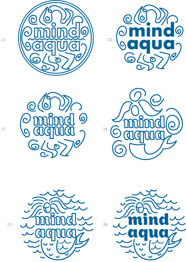
Art director: It can be something between 23 and 24. But no mermaids. And be sure it doesn’t look like an Aqua Minerale logo.
Designer:
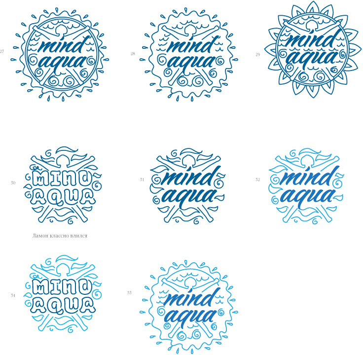
Art director: 31 is OK. Just make sure whatever’s below the person doesn’t look like balls or underwear. And make the water look more like leaves.
Designer: Hairstyles and legs.
Designer: Or like this.
Designer: Or this.
Designer: Looks like the old Bonaqua logo?
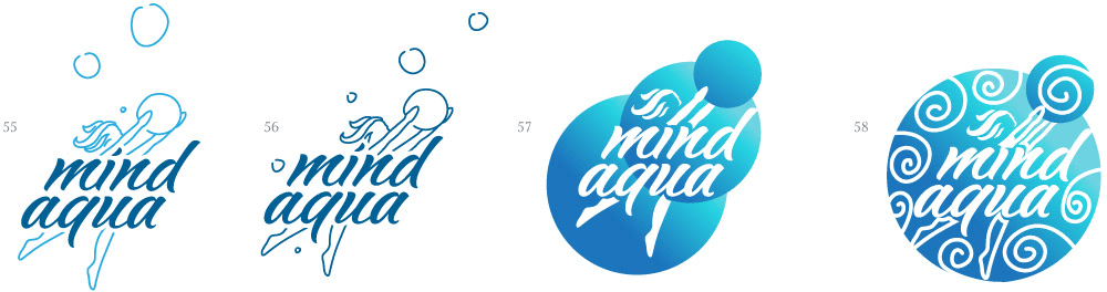
Art director: Yep, but 58 looks interesting. The text is barely readable though and you can’t make out the girl.
Designer: There you go.
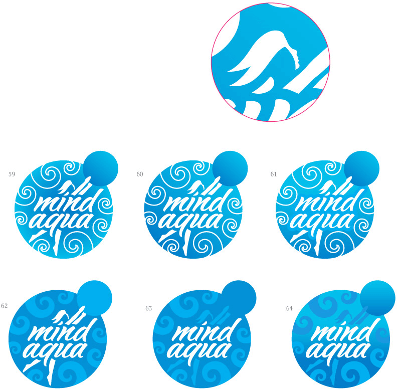
Art director: 62 is OK. You can keep 59 as an alternative version.
