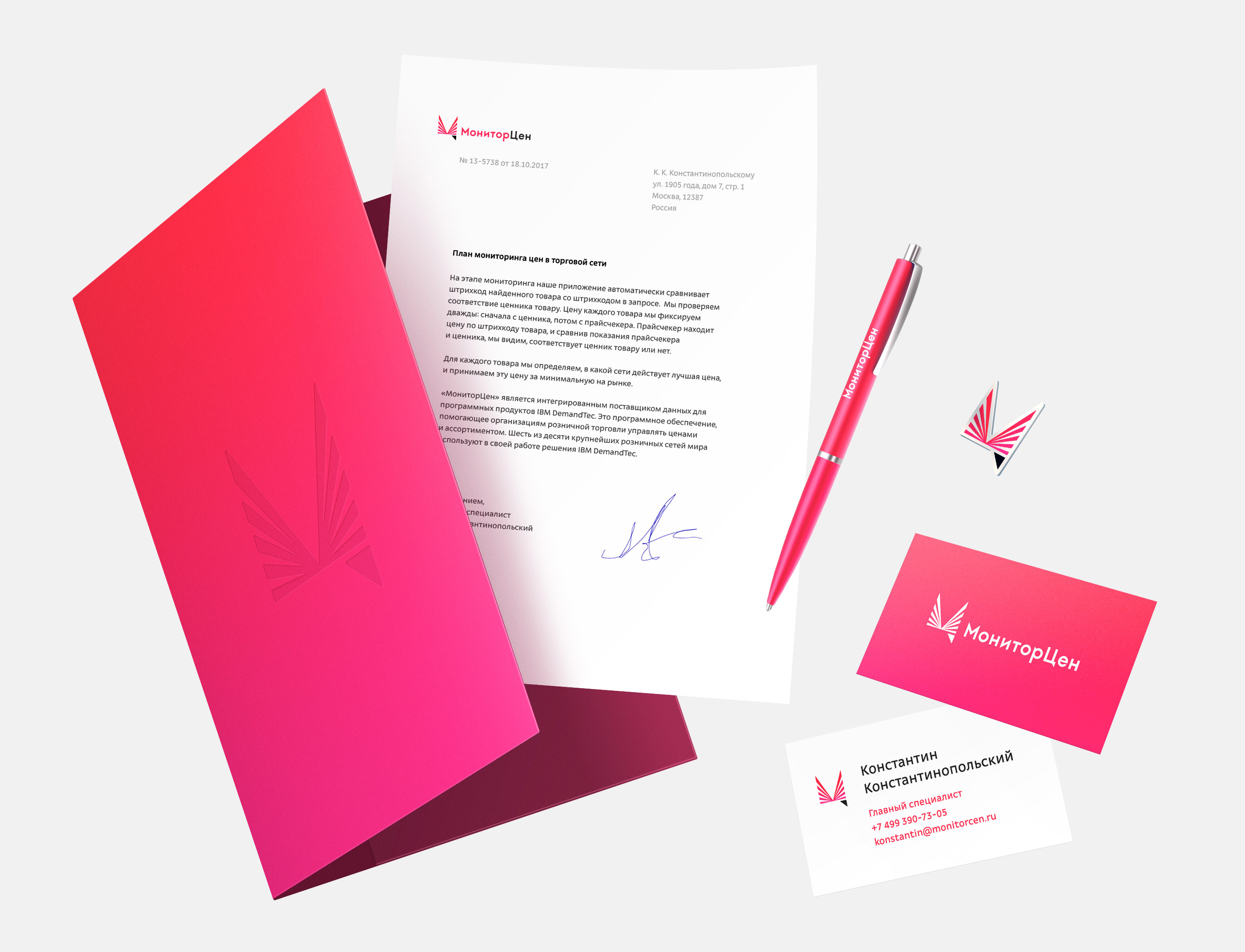
Monitorcen tracks prices in Russia’s supermarkets and hypermarkets and reports on them (the data is collected using shelf tags and price checkers almost completely eliminating errors and outdated information).
The new logo brings together all relevant key images: a scanner, bar code, store shelves and even letters М and Ц.
The logo is made of the company’s name and a memorable graphic symbol.
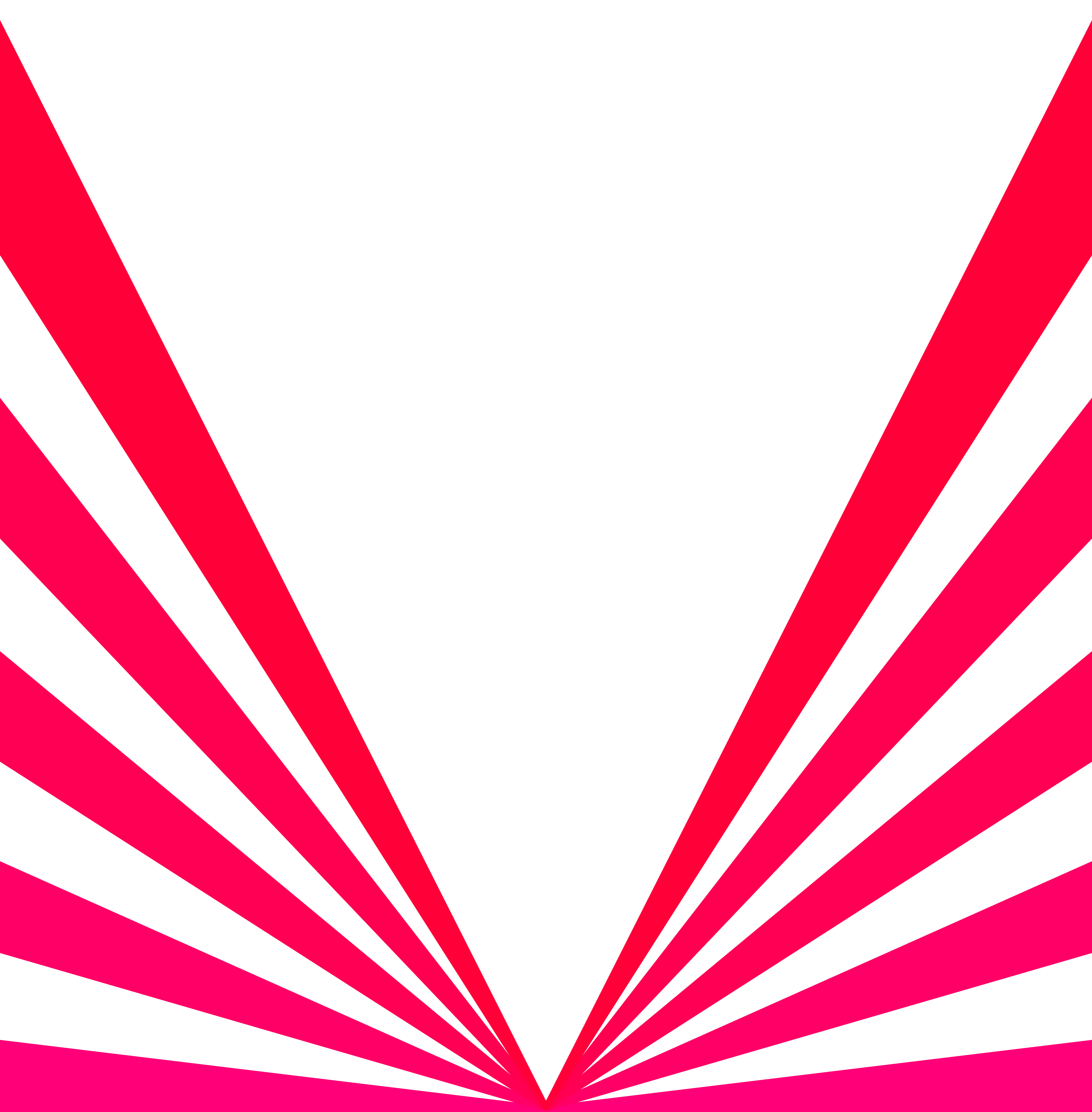
The symbol displays almost all aspects of the company’s operation: the rigid bottom strip with a triangle corner hints at a store shelf with a mount; the lines symbolize barcode scanner beams and the varied thickness of the lines resembles a linear barcode.
The symbol elegantly incorporates the key letters of the company’s name, М and Ц.
The situation with the М is pretty obvious: the letter’s outline emerges from the logo inconspicuous like the 50 Years of Victory nuclear-powered icebreaker.
The story of the Ц is much more interesting. The letter is written in the logo subtly, with a single black triangle rhyming with the tail of the letter Ц in the word цен.
The use of the triangular element is warranted not only semantically, but also aesthetically. The eye-catching black tail brings dynamics and the clever double rhyme of shapes and colors to the full version of the logo.