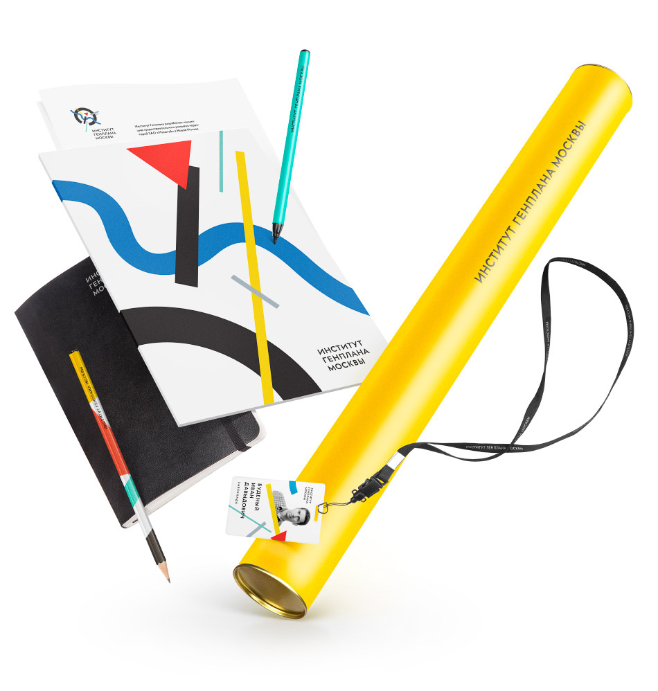
The Scientific Research and Design Institute of the General Plan of Moscow (Genplan Institute of Moscow) consists of around 30 scientific, engineering and administrative units that carry out pre-drafting, design, research, lawmaking, regulatory and procedural work, create databases and information systems, publish materials and provide various services in the area of urban planning covering long-term development needs of the capital and the region. A logo and a corporate identity inspired by Moscow and Russian avant-garde were created at the studio for the institute.
Logo and corporate identity for Genplan Institute of Moscow
Overview Process
Planning is also an art
|
Release date: March 28 2014 Casting artistic director
art director
designer
Evgeny Zorin
type designer
Taisiya Lushenko
typesetter
Mart Abramzon
editor
Katerina Andreeva
project manager
Svetlana Kost
|
At the core of the logo is an extremely simplified Suprematism-inspired map of Moscow. The plastic of letters in the logotype is characteristic of mid-20th century Moscow architectural typography.
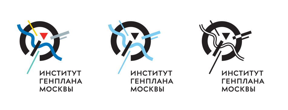
The main, two-colored and monochrome logos for various tasks
Two color schemes—a strict and a bright one—were developed for use on various printed materials of the institute. All elements of the corporate identity—the logo and it’s versions, corporate colors, typefaces and business documentation—are described in a brief guide.
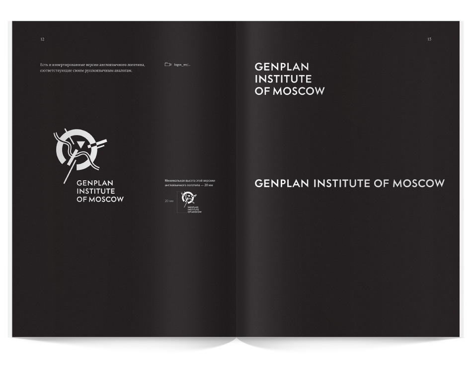
Opening of the guide on the English version of the logo
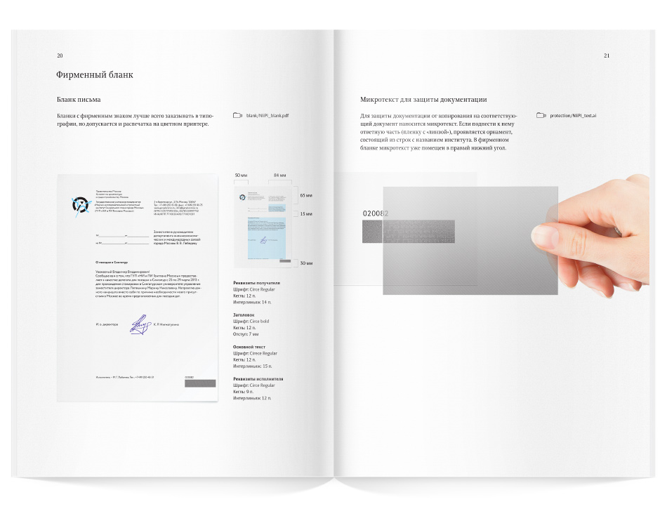
Opening about the corporate letterhead and ways to ensure documentation security

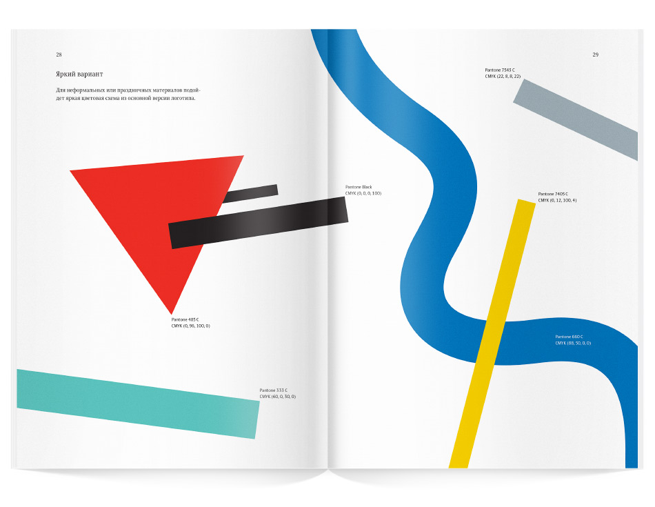
Opening on the bright corporate colors
All according to plan
Order a design...
