The making of the logo and corporate identity for Genplan Institute of Moscow
Overview Process
Starting to think about the new image of the government company.
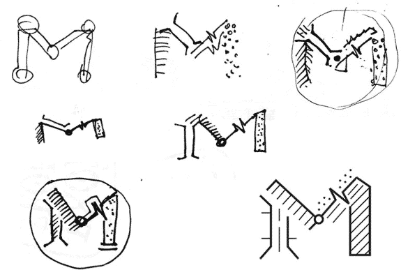
We get an idea of an M-compass-Kremlin combination. Archaic, of course, but let’s lay it aside for now.
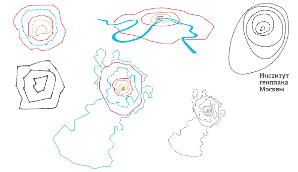
Another portion of ideas.

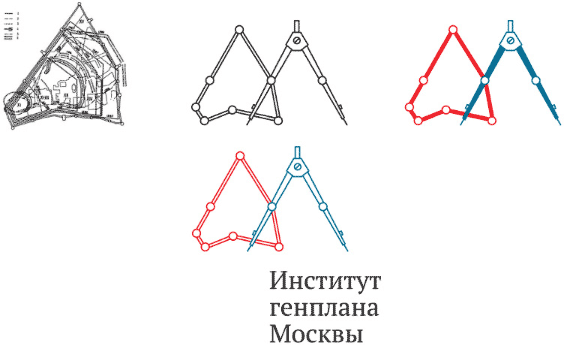
The art director picks out a couple, we develop them. Thinking some more.
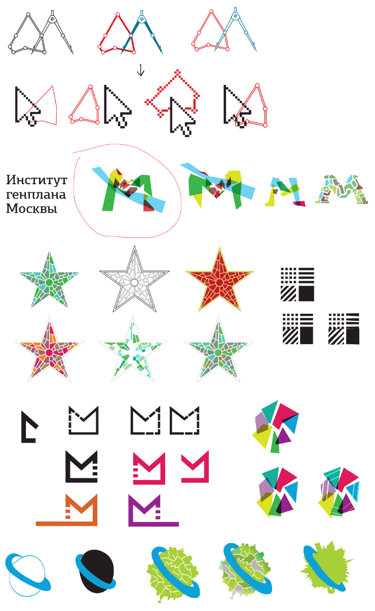
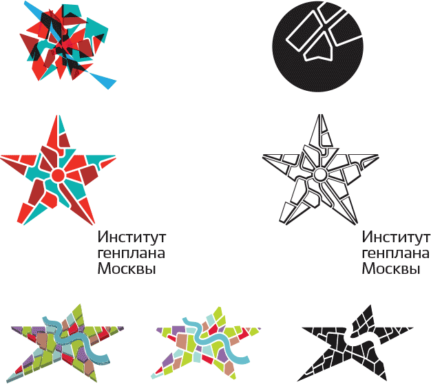
Taking the better options and presenting to the client.

Many participants of the discussion liked the star idea, though it was decided it was still to early to settle on a single design. Instead, the client outlines the overall direction.
List of requests:
1. To leave in thee lements of stained glass, mosaic and city block division.
2. It would be nice to keep the river as one of the elements of the logo.
3. It must be possible to easily simplify the logo to the extreme for specific uses, there must be a monochrome version. It is desirable to use no more than three fundamental colors.
4. To show the dynamics of growth and development.
5. To abandon trying to build the logo around a letter.
6. To abandon the rigidness of borders and authoritativeness of legibility.
7. As an alternative, use elements of a real map or plan of Moscow.
OK, back to work.
What if we use a cell?
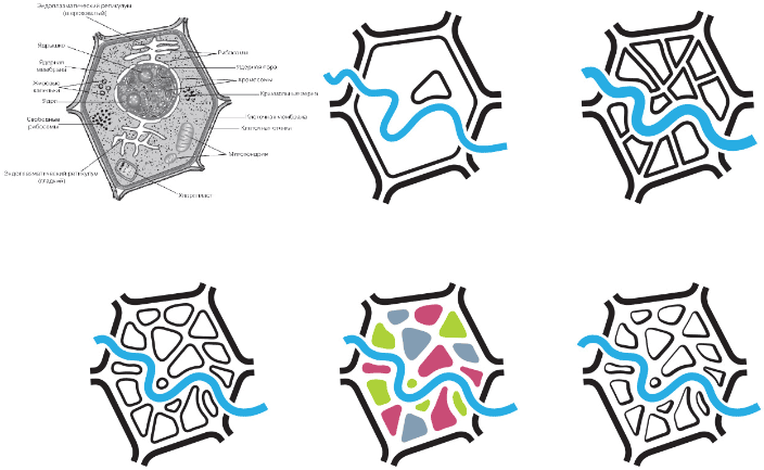
Or a beehive cell made of stained glass? Looks promising, exploring.
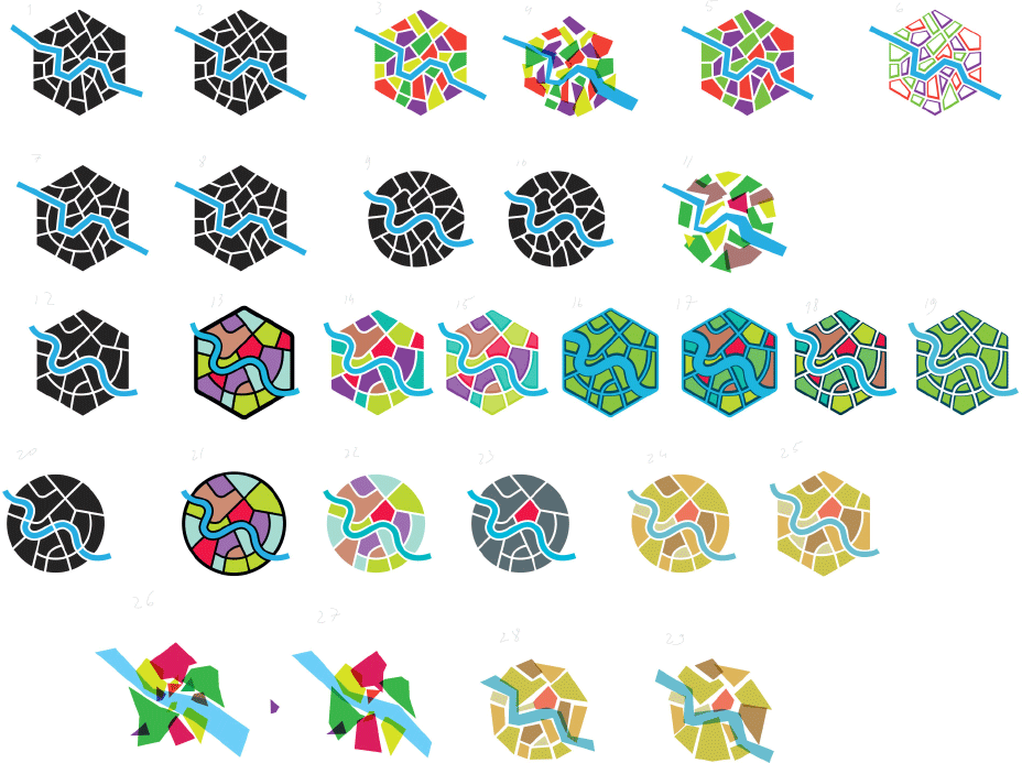
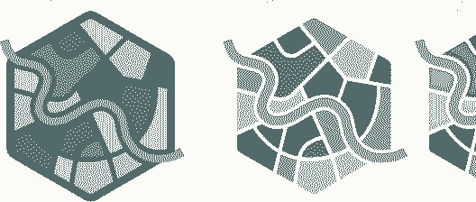
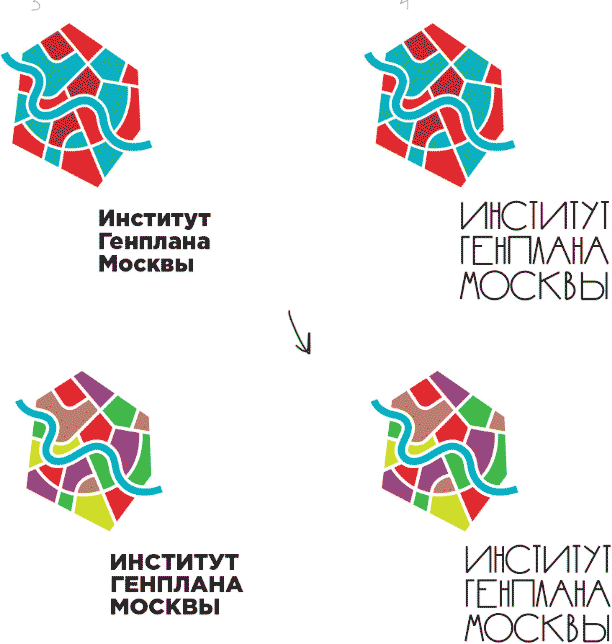
The river has low contrast against turquoise, but must be recognized instantly. Amplifying the colors.
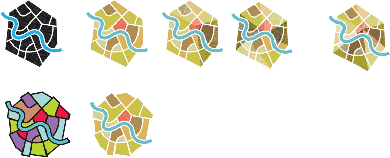
Another idea—an abstract plan of Moscow.
Designer: I’ll try Suprematism, but with a slight modern twist, with polygons.
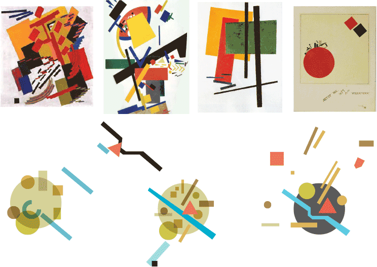
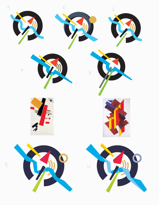
Art director: Doesn’t really look like Suprematism, I would rather draw honest circles and rectangles that would make up Moscow and the river.
Designer: Two strips on the left are Shosse Entuziastov and Novosovikhinskoe Shosse, the first one goes through, the other one branches out from the Moscow Ring Road. The green circle is Losiny Ostrov National Park.

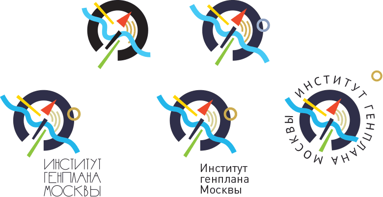
Art director: Out of all the Suprematist solutions I like numbers one and two, but you’d better work on the colors and line widths a bit more. I’m all for minimalism.
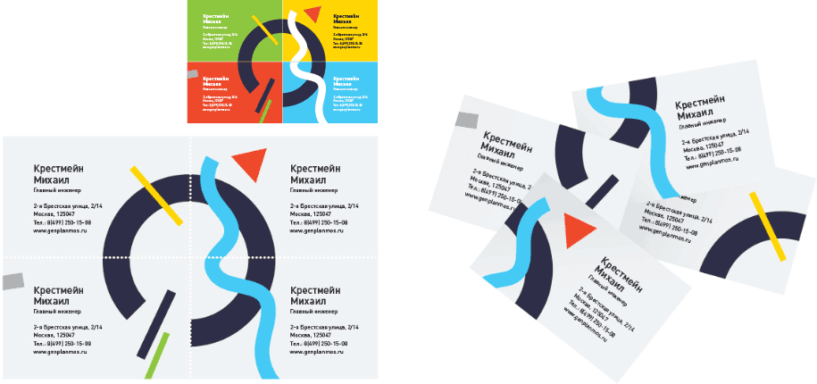
Designer: We can tie it into business cards somehow like that.
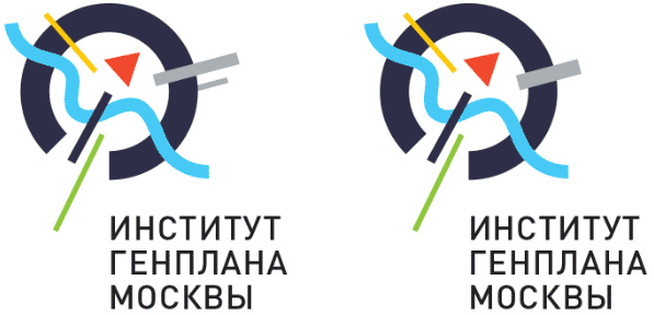
Art director: I don’t think they’ll approve, but we can still show it. In both logos I want to rotate either of the top lines (left or right, yellow or gray) slightly more to the vertical. As to which one to choose—with two lines on the right or with one—it’s your call. One more thing: I would make the blue circle a bit thinner, and the straight blue line a bit thicker.
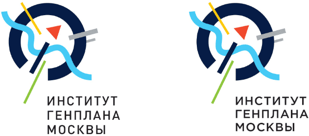
Art director: Number three from the previous list seemed to be better in terms of length of the gray strip (it was longer there) and angle of the yellow one. If I remember correctly, you were against the triangle with the horizontal top side, but maybe we could still give it a chance?
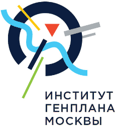
Art director: How about we make blue the typical post-modernist blue?
Designer: I get the feeling that the light color is too loose, the darker circle holds the whole composition together more confidently.
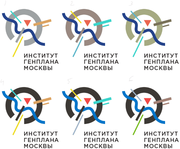
Or like this:

Art director: There are two paths we can take here: either we increase the similarity with Suprematism motifs, then we will have to make the colors more clear and honest. Or we simply create a replica, then we will need to choose colors based on a single principle. For example, using pastel or aniline colors. I like the first alternative, but we can do it differently. What do we want to say with this move? In any case, the black color would be better rendered as an honest black.
Designer: Here we use the first slide to speak about the classic presentation, then we show a sort of a modern interpretation. Personally, I think there shouldn’t be any strict color borders here and there should be only one color constant—the black circle (Pantone black on the preview makes it look a bit too light, I admit). The contrast is the key. The pastel story seems weak and uncertain to me. A light circle can’t seem to hold and connect the rest of the logo together.
At the same time we get an idea of a Vitruvian plan made of stained glass.
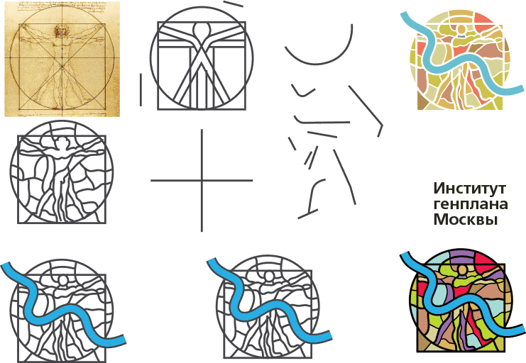
And another interesting solution—a mixture of Mondrian and block titles.
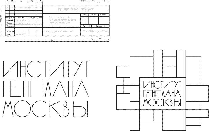

And here is another even more abstract generative thing. Basically, planning is akin to playing with cubes.
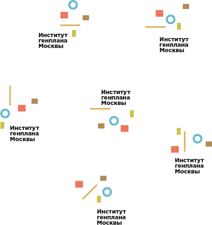
Artistic director: The best of all is the Suprematism idea you had in the very beginning. The one with the Vitruvian man is total trash.
Presenting the successful alternatives to the client.
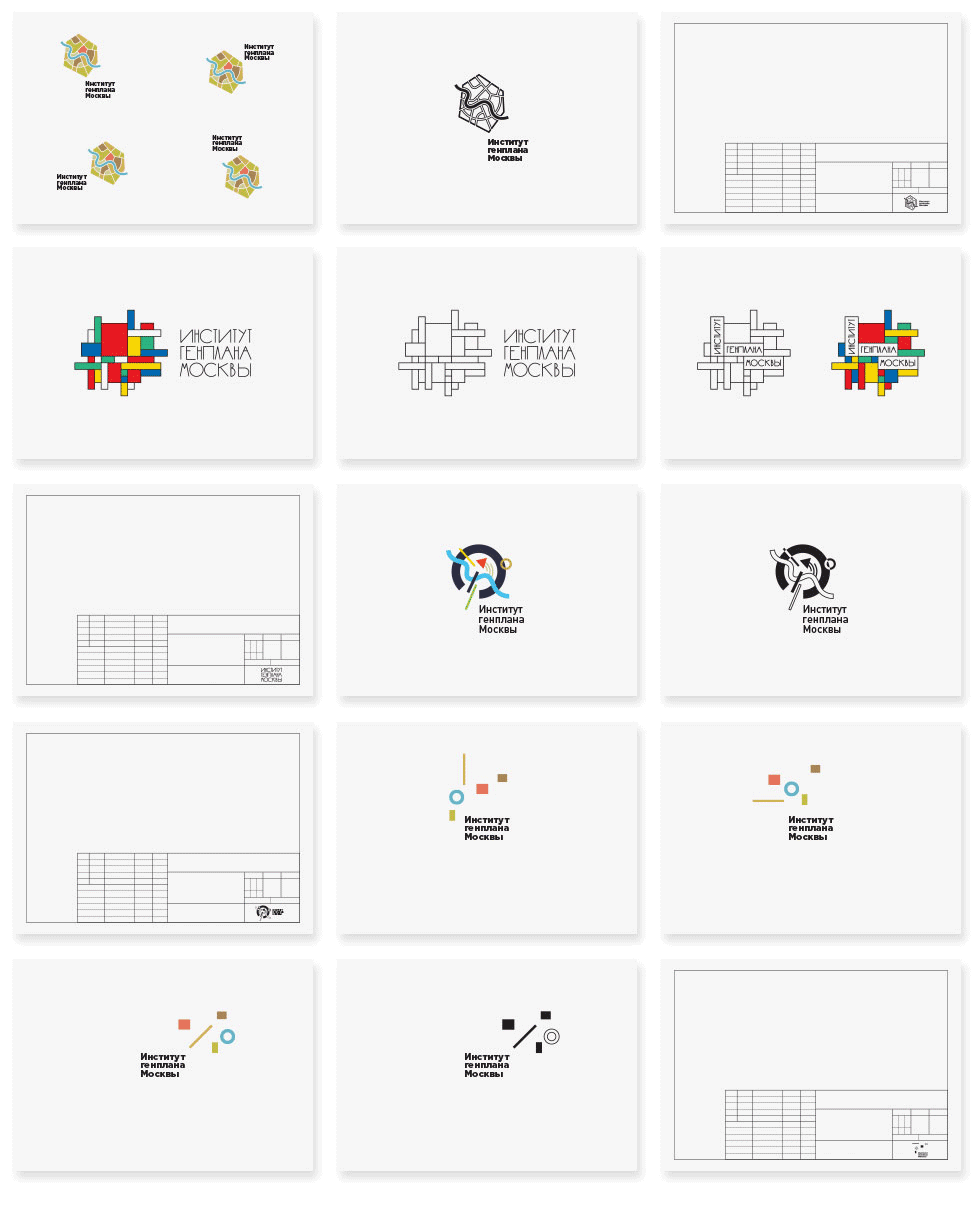
The client likes two of them: the hexagon and the Suprematism with the circle. Showing them finalized.

The artistic director suggests to combine the ideas: replace the triangle with the star.
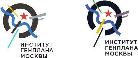
Client:
1. We have settled on Suprematism.
2. We’d like to see the elements of the logo rearranged or normalized. Right now the logo lacks stability.
3. We didn’t like the Suprematist logo with the star in place of Kremlin.
4. Think over the monochrome version, maybe make the circle less heavy relative to other elements.
5. We’d like to see several options for the text part of the logo or some sort of finalization of it.
6. Again, we’d like to have the ability to use the logotype and the logo separately.
All right, moving on.
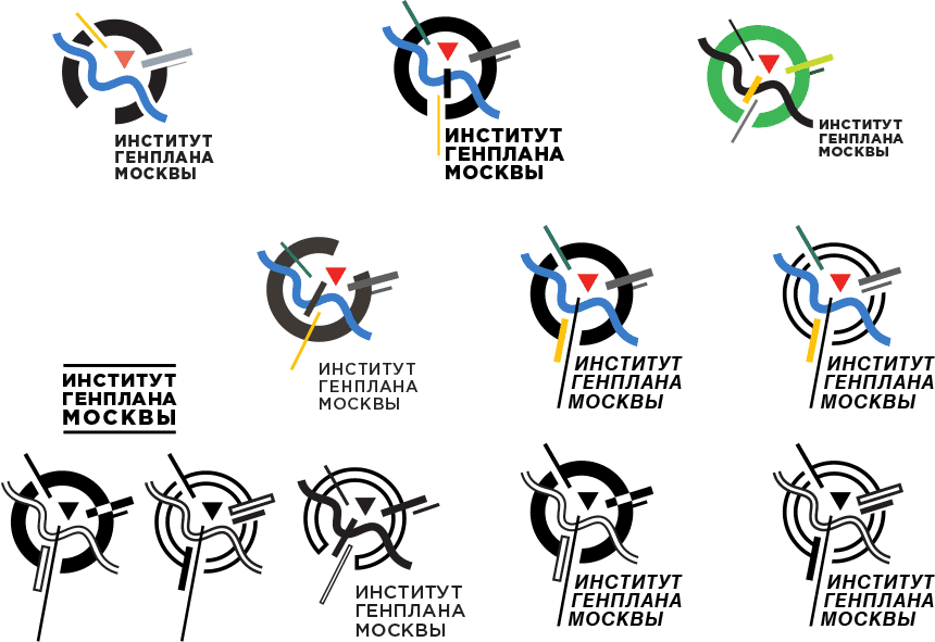
Art director: The new ratios of all the elements are possible, but I wouldn’t tie the logo to the line, it looks archaic (yet), especially since the line is too long and its position lacks dynamics. The type could be a bit more modern, too.
The type designer creates the letters.
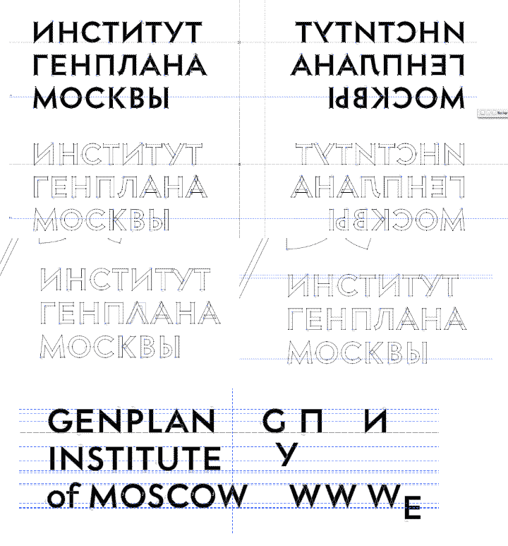
For the type we’d like to use a geometric grotesque with a hint of Moscow in it, as if it was taken from a book on architecture published in 1950–1960s.
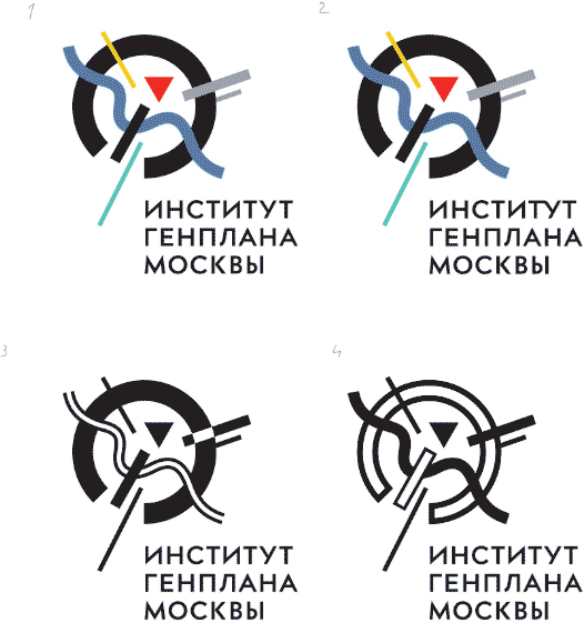
Art director: They are almost the same, but the left one looks more wholesome. Maybe we should fill in the overlapping in the monochrome version where the stick intersects the circle on the left? Maybe, make the bridge a bit thicker in all of them?
Designer: In the second one, I think the ligature doesn’t belong here. I’d go with the first one.
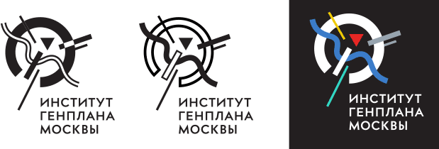


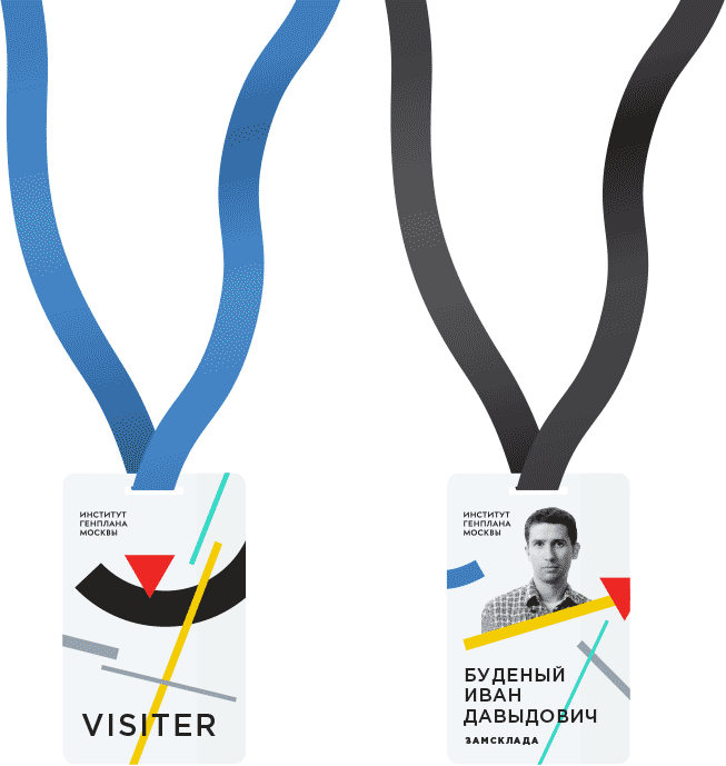
Putting together a badge.
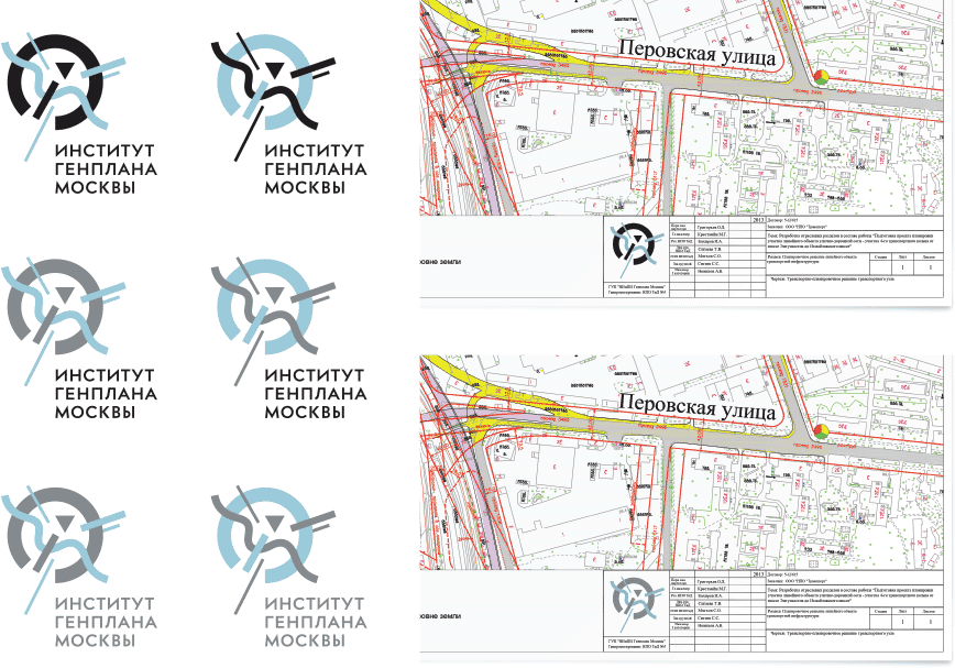
The client asks to make a two-colored blue-gray-black version of the logo for use in official documentation.
Trying to find the best way to place the logo on a photograph.

Streets are our brushes,
Squares are our palettes.
Everyone is happy.