Client: The company’s name is Newmark. Our audience are people aged (roughly) 28 and up who ran into temporary financial difficulties and would now like to get a loan but time after time are being rejected by banks.
Very soon we will open access to the system that is designed to help our clients greatly increase their chances to get a loan. We called it Rejection Liquidation System. It is a full-scale online service that reveals real reasons behind a refusal and helps remove them.
The system includes three key automated functions: Credit History Autoscanner allows to see your credit history, Credit History Workshop helps improve it the only proper way, that is by adding new positive records on top of old negative ones. It is important to note that we are not “erasing” credit history, not deleting or “doctoring” anything. We are improving. And doing it the right way. In addition, Rejection Liquidation Workshop checks over a hundred different factors that influence credit history.
In the end, our Rejection Liquidation System is a sure way to control and quickly, drastically change your situation to be able to get a loan to solve your impending financial issues.
We realize that credit histories, contracts and bank checks are all serious things not entirely understood by many people. Which is why the service includes additional elements. The themed Borrower’s Expert Reference section and the Rejection Liquidation System video tutorial contain simple step by step instructions and answer to major questions about borrowing.
We hope that the logo and the corporate identity will become a way to identify not the company itself, but our online service. It would be great to use color coding for various elements of the system and use the corporate identity as the “basis” for interface design. Colors are ideally contrasting, but not acid. Our clients are mature people, even though they may be in a difficult point in their life. Obligations, responsibility for their family, urgent needs make them seek a way to get a loan. Often in such situations people feel somewhat uncomfortable and depressed. Our task is to bring some enthusiasm into their life, to encourage them by offering a powerful, comprehensive and effective product.
What we don’t like: cliche attributes of financial services, application aggregators, credit brokers (piggy banks, coins, credit cards, purses, etc.) as well as ubiquitous speedometers and graphs used to illustrate credit score and credit history.
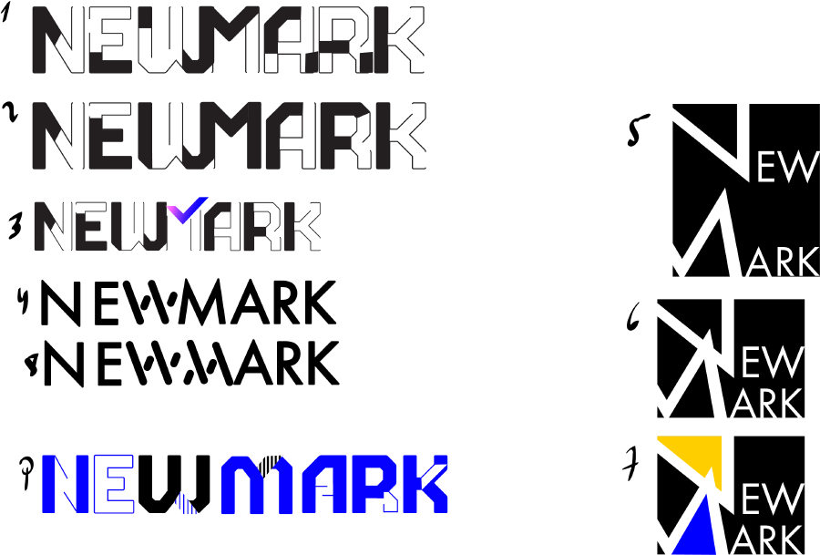
First designer: The service is designed to fix a person’s reputation, to change the verdict from “not too good” to “OK, we can trust him”, a cross to a check mark. Check mark! A positive and inspiring sign, the result of work of this very complex service.
Art director: Think of something else.
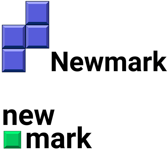
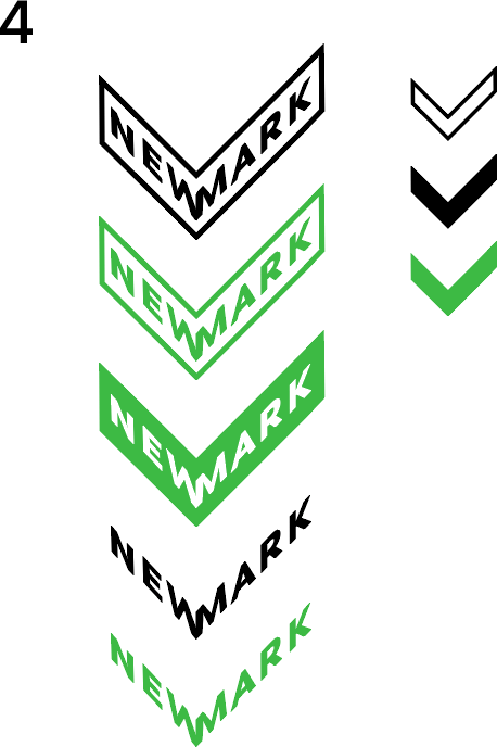
Second designer: The company adds missing positive records to credit history. The analogy is filling rows in Tetris. The shape looks somewhat like an N.
Art director: No, search for new metaphors.
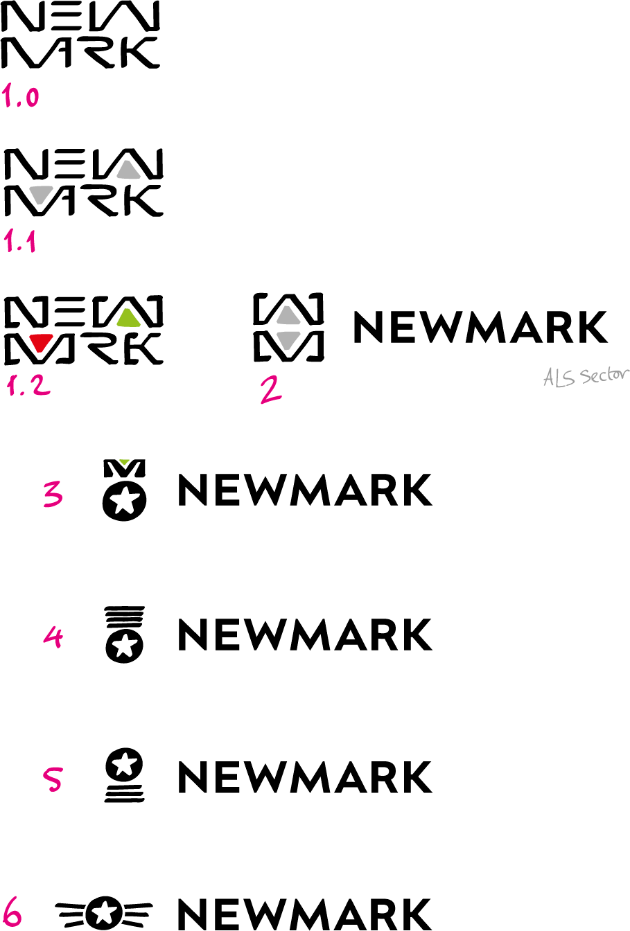
First designer: The complexly packed word Newmark as a symbol of a magic technology. While I was drawing and coloring it, I came up with a symbol made of W and M, like an elevator button with up and down arrows. This is to say that the service will help you rise up. Also, variants of the logo with medals as symbols of improvement.
Art director: No.
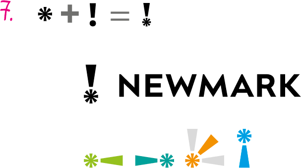
First designer: Suddenly, a new punctuation character. An asterisk and an exclamation point combine to form a positive symbol that can be used in other corporate identity elements.
Art director: Let’s keep this in mind and continue searching.
Third designer: The first things I thought about were movement and multifacetedness. The service analyzes, improves, educates and conducts a lot of internal operations. Plus, an effort to find elements that can be used to create a corporate identity.
Art director: No.
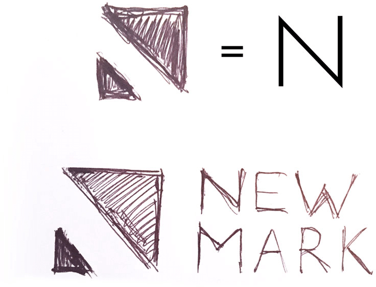
Fourth designer: A symbol made of the counterform of the letter N resembles an arrow. The bottom triangle is the past. The top one is movement forward, towards a better credit history.
Art director: This can have some potential.
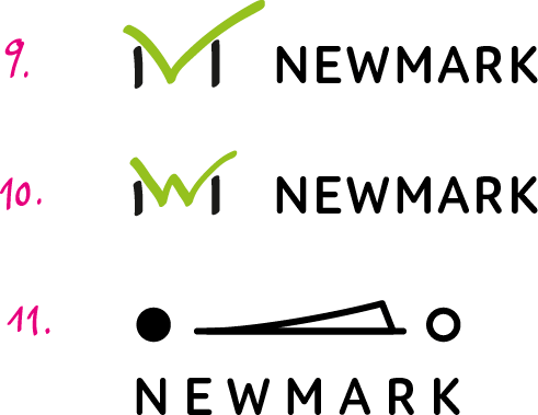
Fourth designer: We can write a check mark (loan approved) into the word.
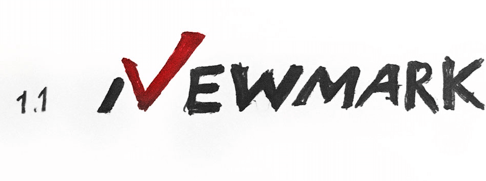
Art director: Reads like IVE. Maybe play with the W instead?
Fourth designer: A symbol of stairs in the symbol’s typography. We move forward one step at a time. The service helps solve the problem of the client’s poor credit history.
Art director: But it reads Mark New.
First designer: What if we use the image of Ivan from the old Russian fairy tale about how he magically transformed after bathing in three cauldrons? Three cauldrons as three components of the web service (analysis, synthesis, tuning), Ivan the Fool becomes Ivan the Comely.
Art director: We don’t need dated images, we need our own new ones.
Fifth designer: Associations: a free path, from deadlock to development, green wave, you can proceed.
Art director: Re-read the client’s introduction, especially the paragraph about what they don’t like.
Fifth designer: A positive progress bar with the letter N. They don’t want speedometers and graphs, but this is more about “online service that reveals real reasons behind a refusal and helps remove them.”
Art director: No.
Fifth designer: The name of the company in the shape of a check mark. In smaller sizes the text turns into a symbol. I can work further on the shape and the letters (this is just an example). We can also take a square modular typeface to better show the connection between W and M. Or add 3D volume.
Art director: No.
First designer: M with the check mark, OK mark. But there is probably a shitload of logos like this from the 1990s. Or maybe as a light switch, on and off.
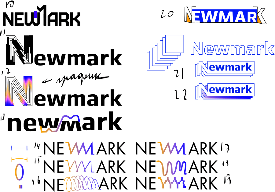
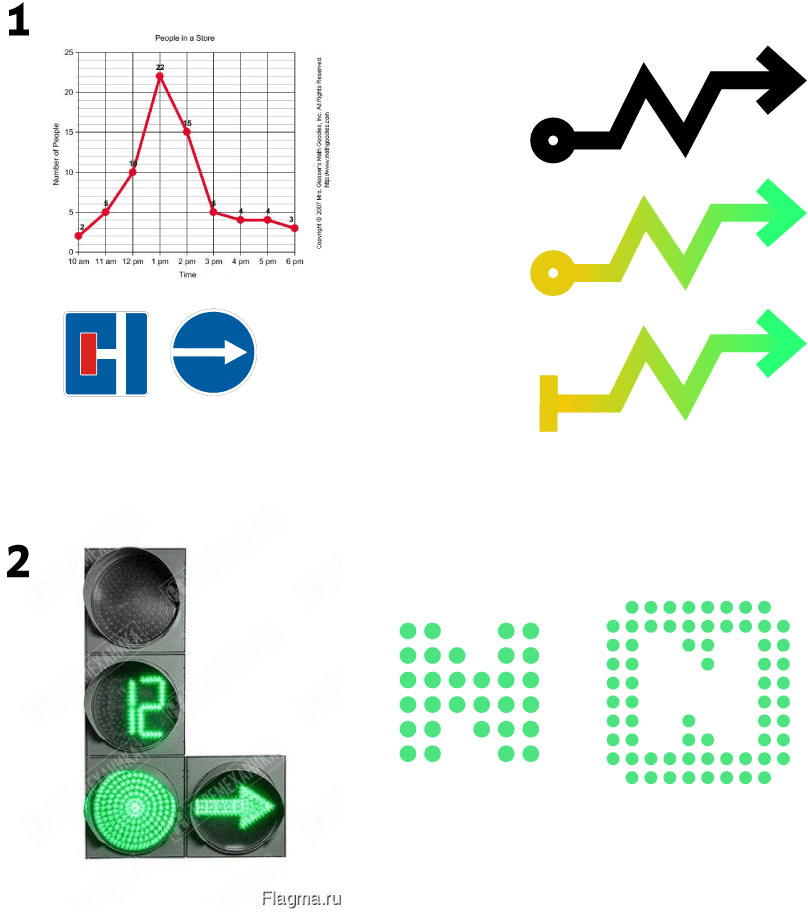
Art director: Let’s try 11, but have an arrow pointing from one circle to another.
First designer:
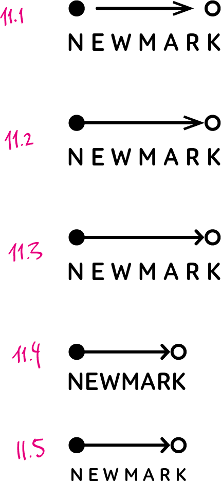
Art director: Something like 11.1 but try different arrows, longer, thinner, etc.
First designer: Various arrows.
First designer: All of them bad?
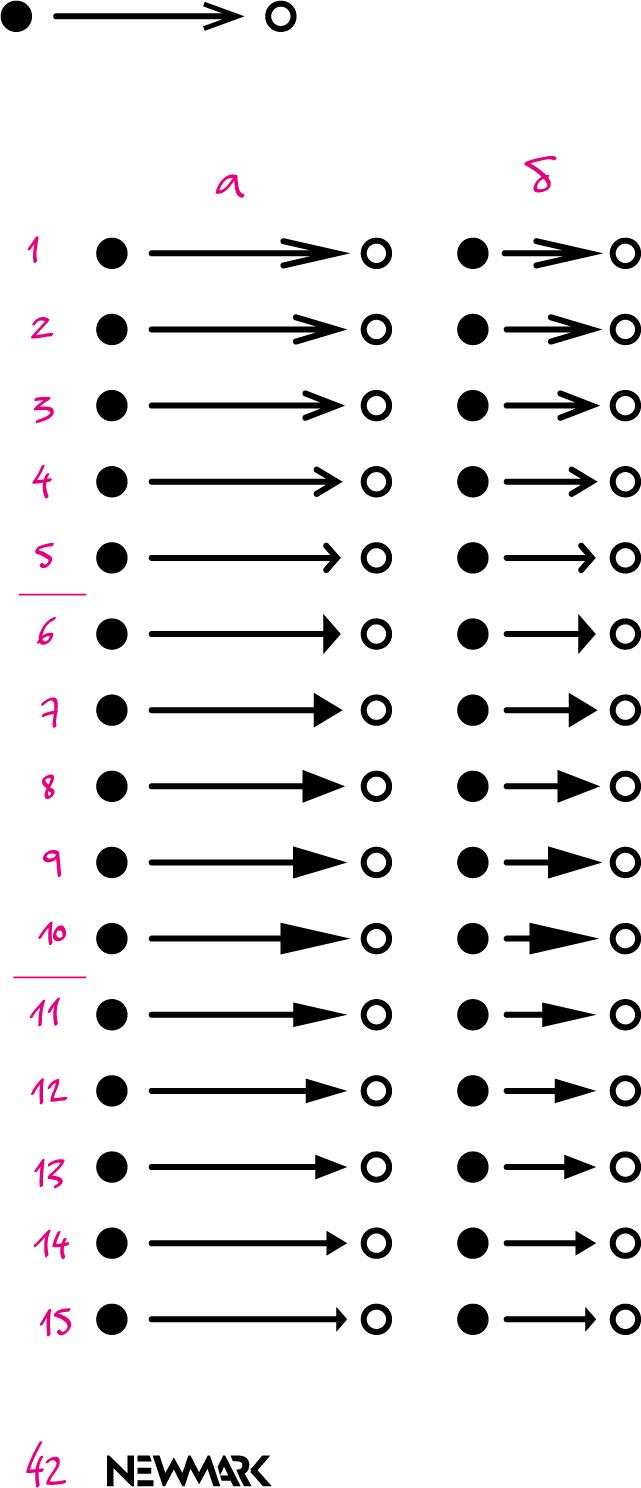
Art director: Let’s go with 4.
First designer: Arrows with rounded and straight edges and the text in different typefaces. Also variations with just the circles in the logo, like phases of moon and enlightenment.
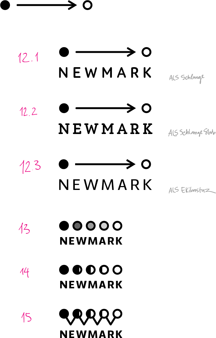
Art director: 12.1.
First designer: Here is the logo against their corporate colors. And quickly-made icons for the service’s major functions.
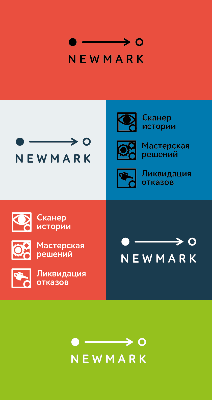
Art director: OK.
