The all-Russian children’s center Orlyonok grew out of the legendary Pioneer and Komsomol organization and today comprises nine children’s camps on the Black Sea coast. In Soviet times, a ticket to Orlyonok was considered incredibly cool and children who visited the camp were envied by their peers. Today, best students and winners of scientific and creative competitions study, rest and communicate in the camps.
The camp’s logo was restyled at the studio, retaining its recognizable image.
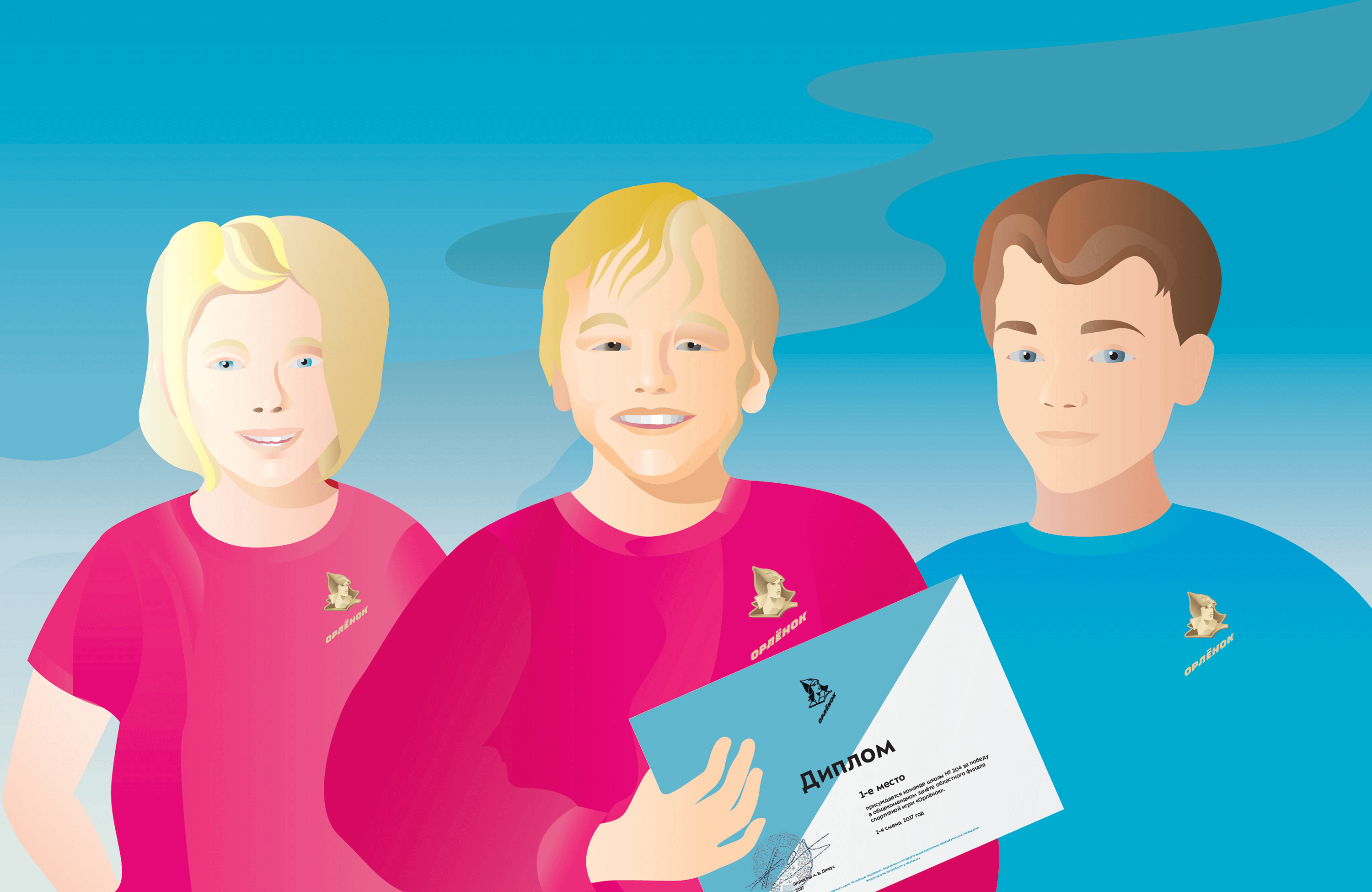
At the heart of the logo is the familiar image of the boy (he has long become the camp’s symbol and without him the logo would have lost its meaning). Pay close attention to his budenovka hat: it is now historically correct and does not resemble a strangely shaped knitted hat anymore.
The main color of the logo and the identity is golden. It emphasizes what wonderful, smart, talented, simply golden, children come to Orlyonok.
The geometric triangular pattern reminds of mountains and the sea and calls to conquer new heights.

The logo is presented in two variants: gold and multi-colored. The colored logo has shades of blue and navy, a metaphor for the sea surrounding the camp.
The text element of the logo can be printed and embroidered on signature t-shirts, hoodies and any other clothes. The logo and the pattern look great on business cards, awards and letters.
art director
designers
- Albina Gainullina
- Natalya Agafonova
- Yana Moskalyuk
designer and typesetter
- Yaroslav Bondarenko
illustrator
- Lena Petrova
typesetters
- Mio Horii
- Elizaveta Alpatova
type designer
- Ksenia Erulevich
secret advisor
- Iskander Mukhamadeev
editor
- Aleksandr Nosikov
project manager
- Olga Pismerova
