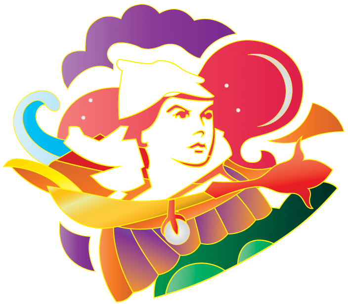
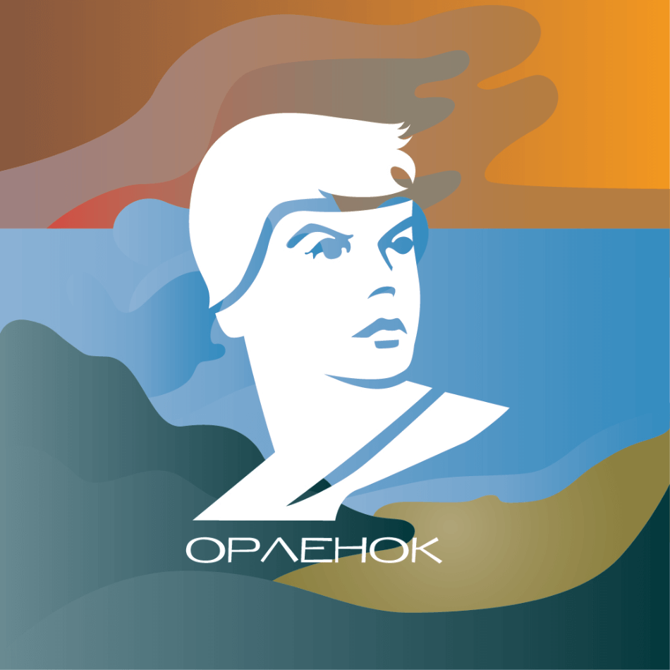
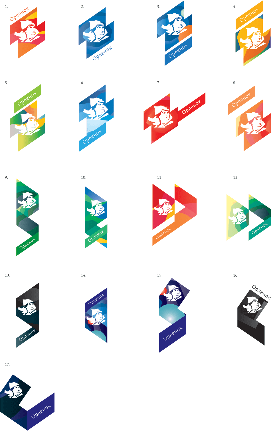
Drawing the first sketches and showing them to the art director to determine the direction. Using the traditional Orlyonok symbols in almost all of the logos: a circle with a campfire and three flowers, as well as important additions: the observatory, the sea and a pearl.
The art director chooses variant 19 but asks to remove Oriental motifs and add the Orlyonok boy to the composition.
Making the changes.
The art director doesn’t like the result: still too Oriental. He also asks to make the boy flatter.
Doing so.
No, now it looks like an enameled pin. We need to rework the symbol and add more patriotism.
Starting from scratch.
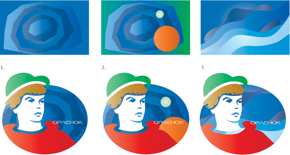
The art director believes these versions are better but asks to think of a way to make the boy more modern (maybe by adding headphones or a baseball cap with a scarf and some modern clothes).
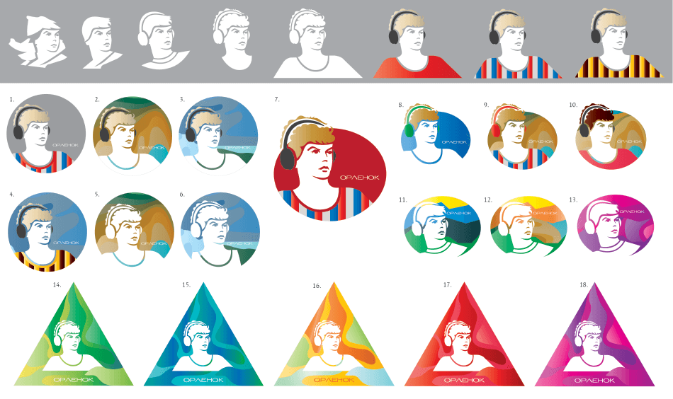
Art director: 7.
Designer: Am I to treat it as complete (as a concept)?
Art director: You need to create a couple more characters in the same style. And find a suitable background.
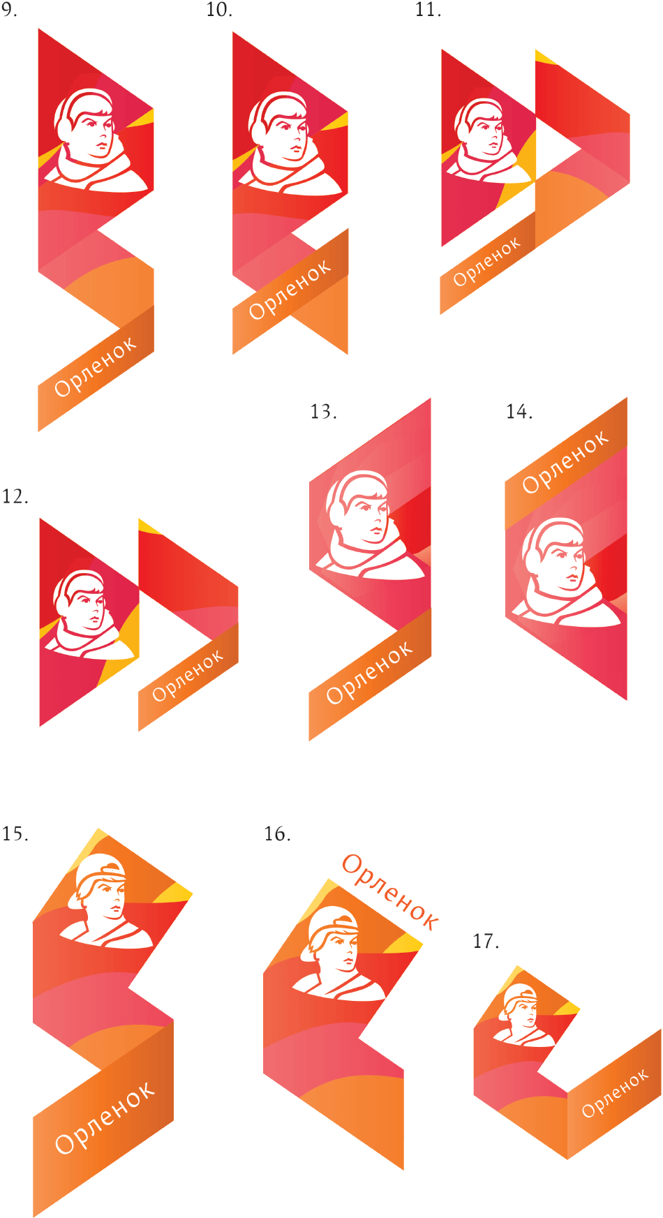
Suggesting variants of the boy.
Art director: The new logo shouldn’t be worse than what they previously had. And this is two times shittier.
The art director asks to go back to the original head.
Art director: This will be fine as a sketch. But the style is endlessly lame and Komsomol-like. We need something modern.
Designer: I think that this is because the existing logo has the boy from old Soviet pins, although I can be wrong. What should I do with the sketches? Can we use them in a presentation?
Art director: Shrewdly observed. And you need to make him more modern. Why is the oval, the typeface and the overall impression look like they’re from the 1980s? We can’t show this. You need to work on it more.
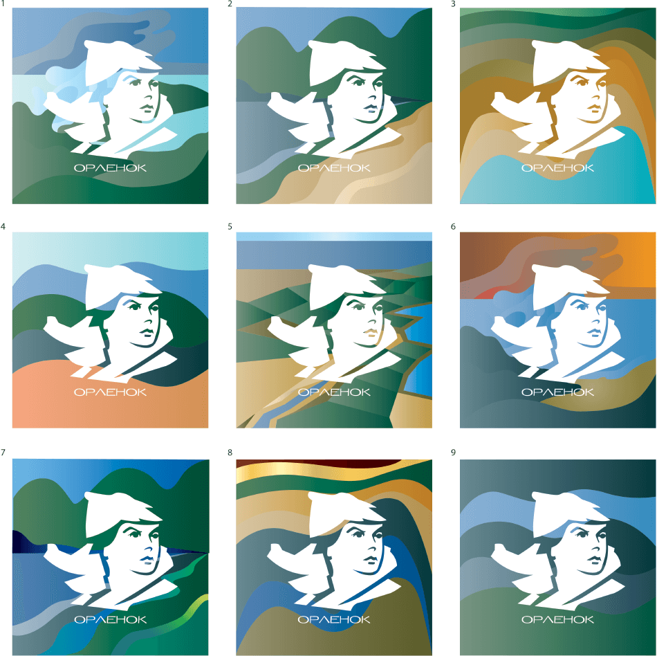
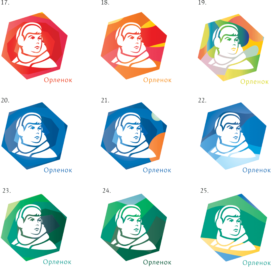
Changing the shape and the typeface.
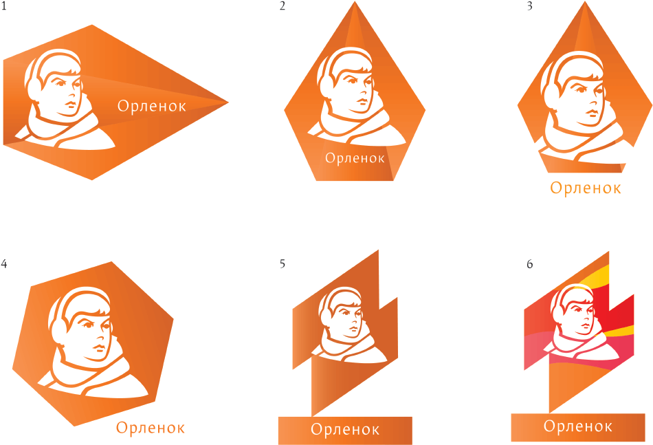
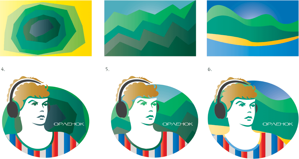
Art director: 6 is getting there.
Changing backgrounds in 6.
Art director: Also try the hexagon that you had under 4, I think. The text position is shitty, too.
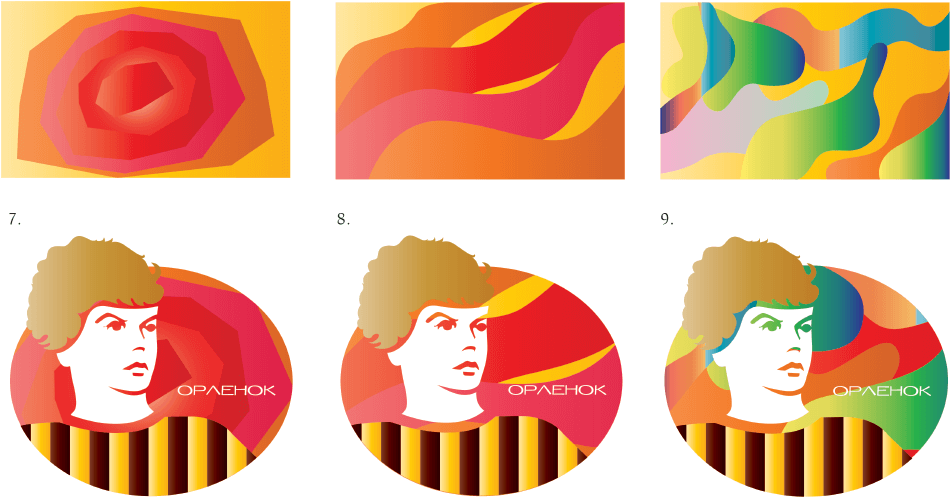
Art director: Better. Also be sure to try darker backgrounds: blue, black. The text is still shitty.
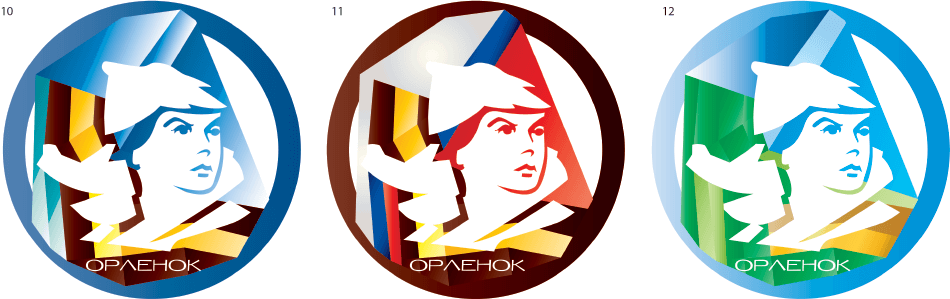
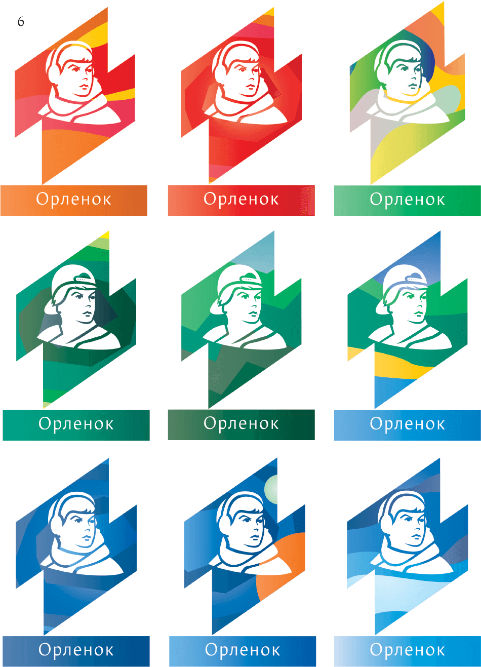
Art director: Yep, this is what we’ll show to the client tomorrow.
Designer: All of them?
Art director: Yes, it will be easier that way. But we’re missing variants with black background.
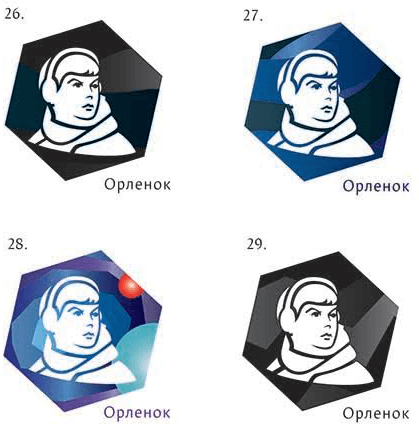
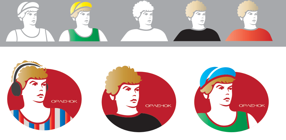
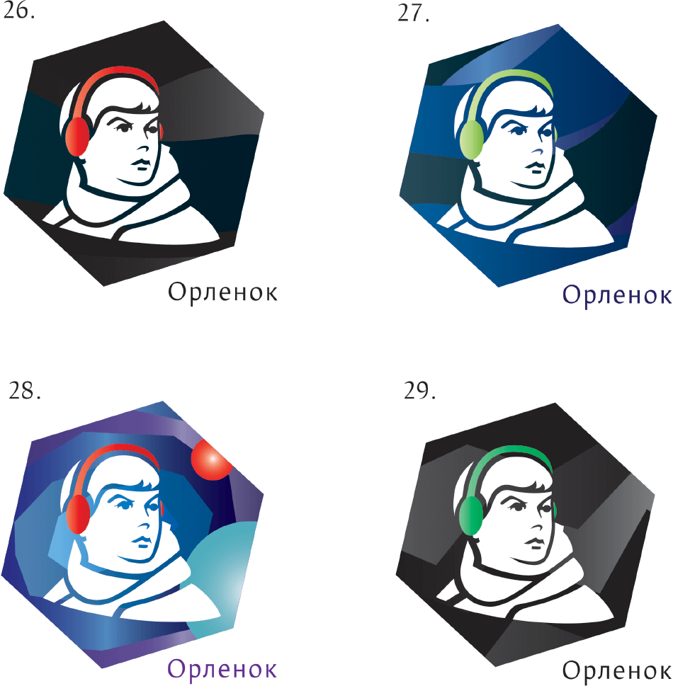
Art director: OK. But make one of the elements more noticeable, like red or green headphones for example.
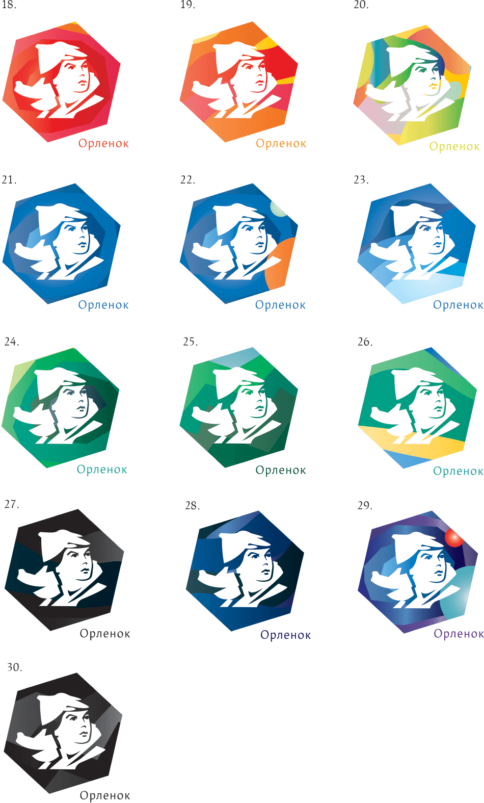
Getting feedback from the client.
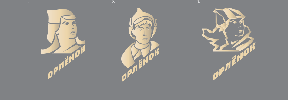
—We need to retain history, and it is embodied in the legend connected with the Orlyonok boy in budenovka hat.
—The result looks like a logo for a ski resort, not a summer camp.
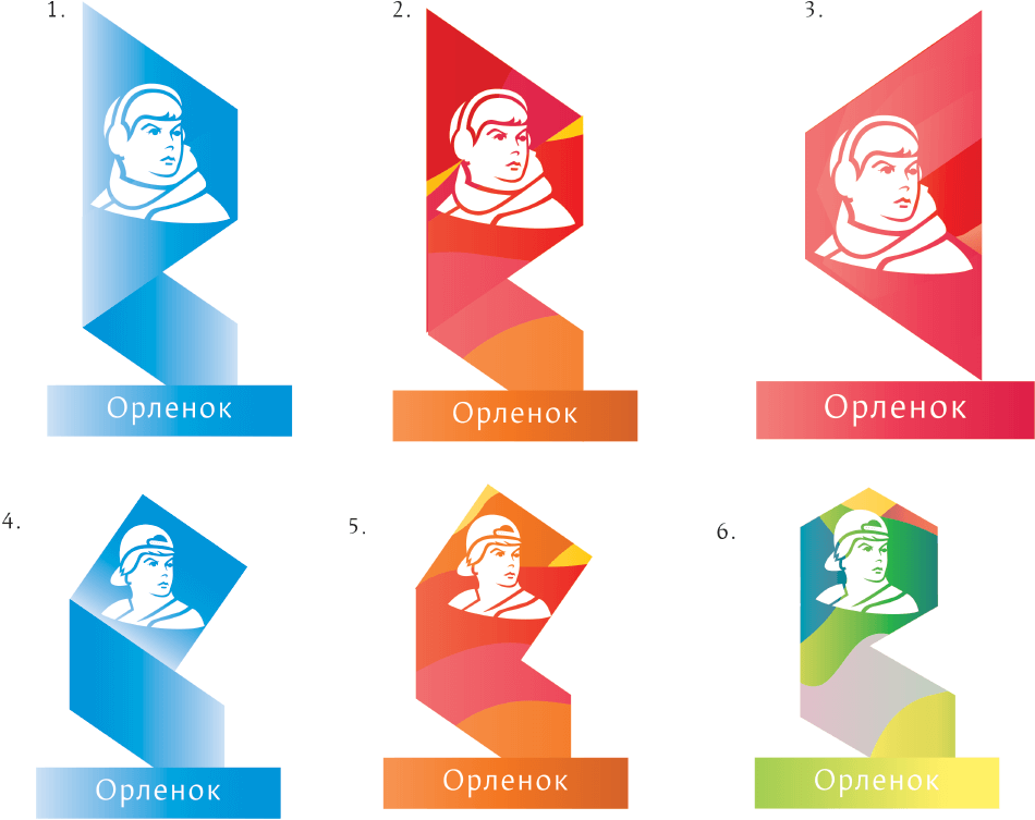
Art director: We need to make a choice.
Client: We’re not against fun backgrounds, but they look too simple, they don’t symbolize anything.
Art director: The logo is OK but the text is lame.
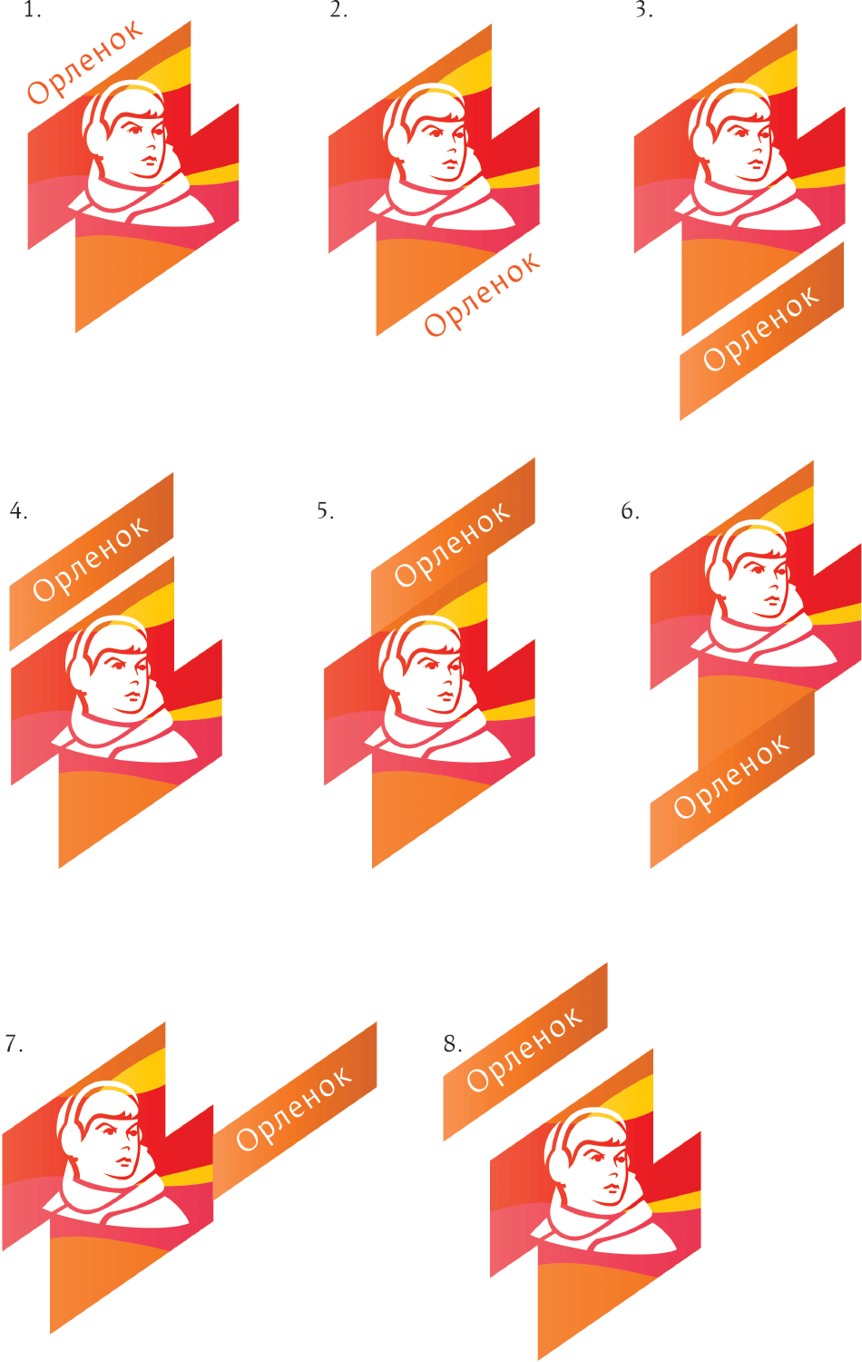
Designer: What if we make it more compact like this?
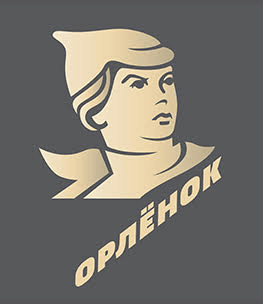
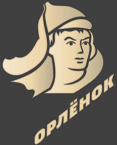
Art director: Just go with a fat dense typeface.
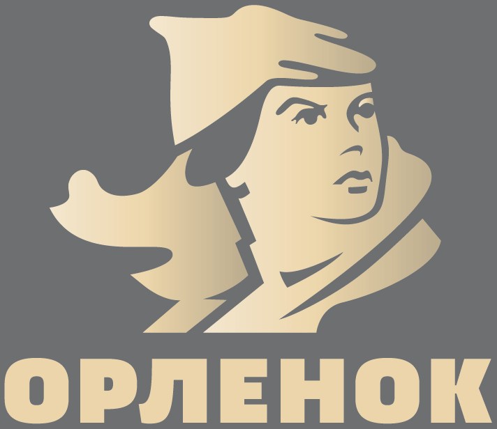
Art director: Something like this. And use the letter ё.
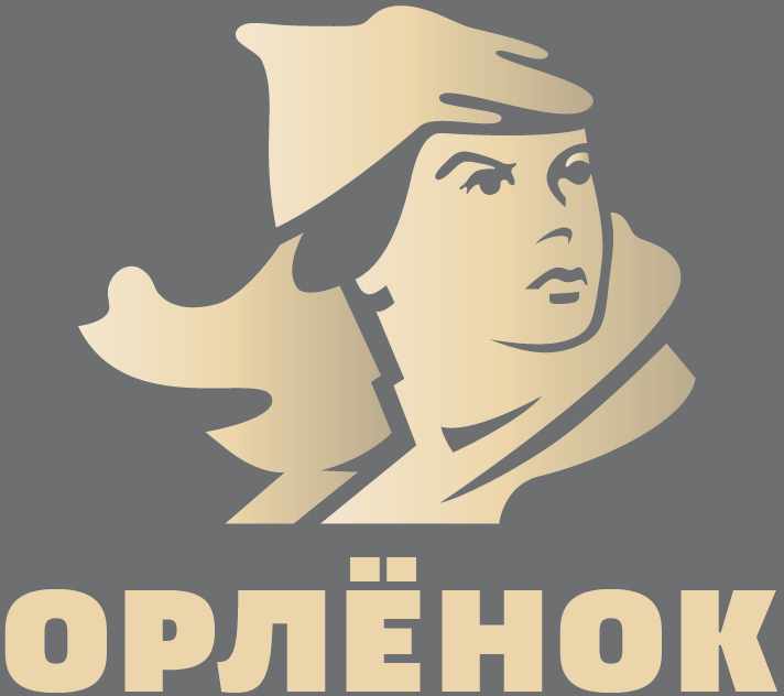
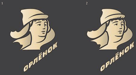
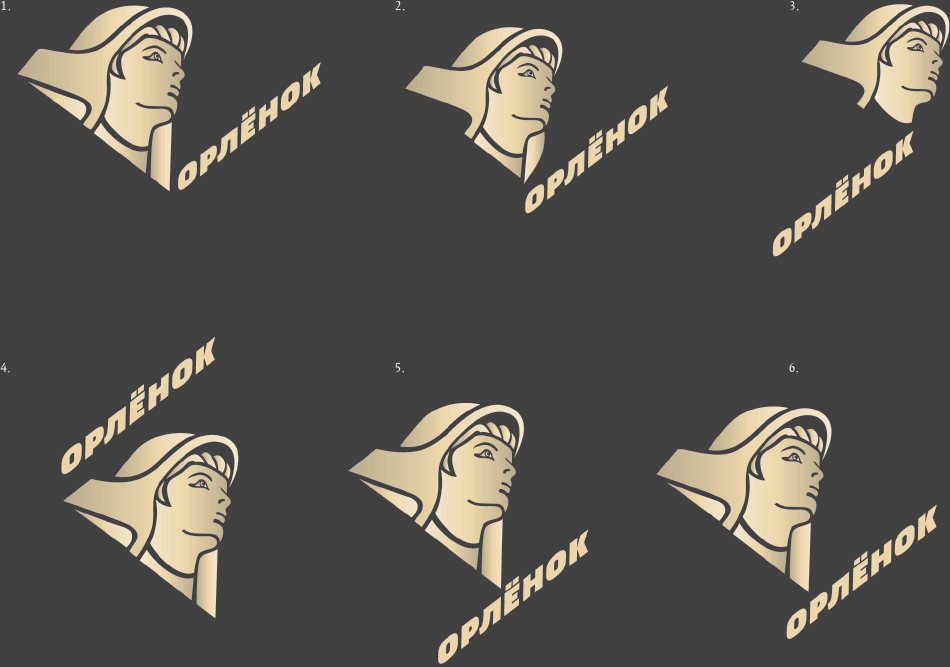
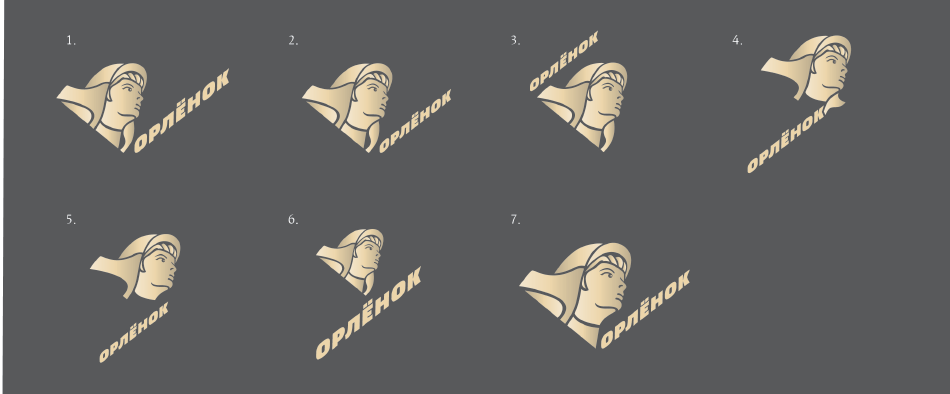
Art director: Make it a bit more compact. And position the text differently, for example at an angle.
Designer: Make the text itself smaller?
Art director: Just place it better. Anything will do.
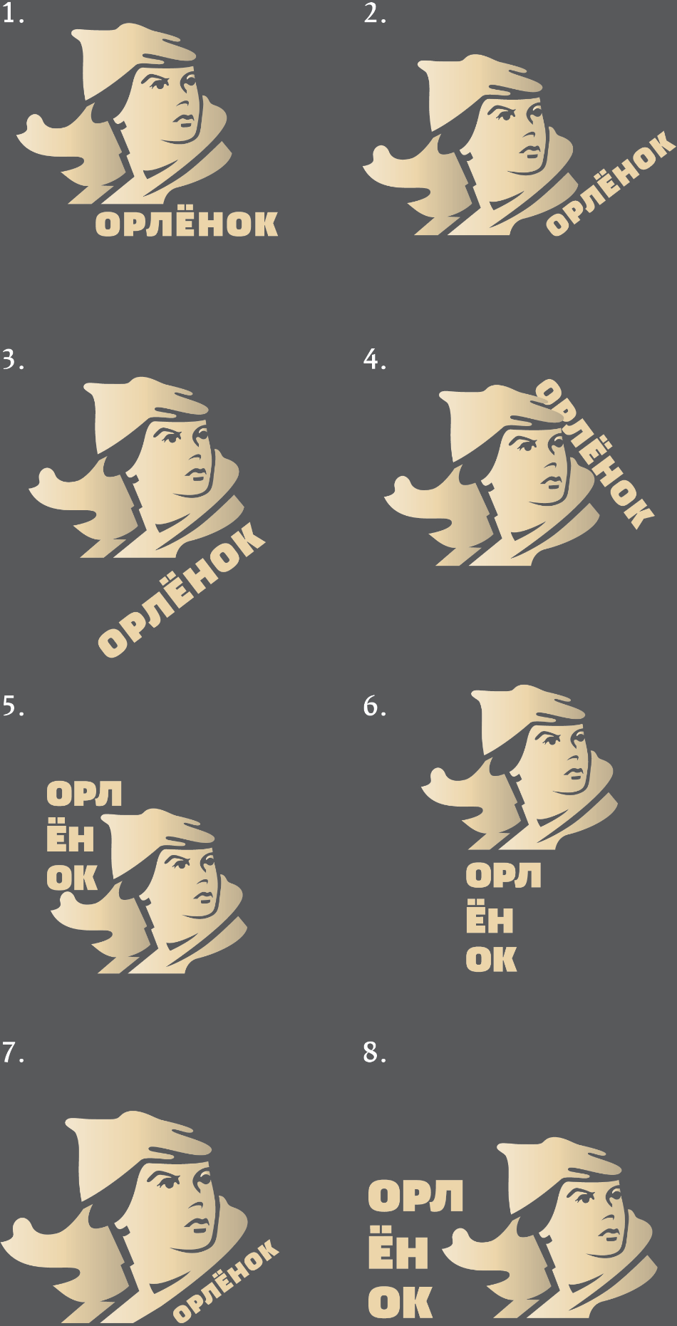
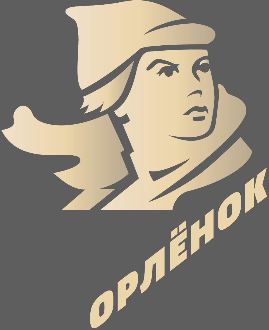
Art director: Something like 3. What if we distort the letters so they’re straight but the line maintains the angle?
Art director: That’s what they used to do before they invented computers.
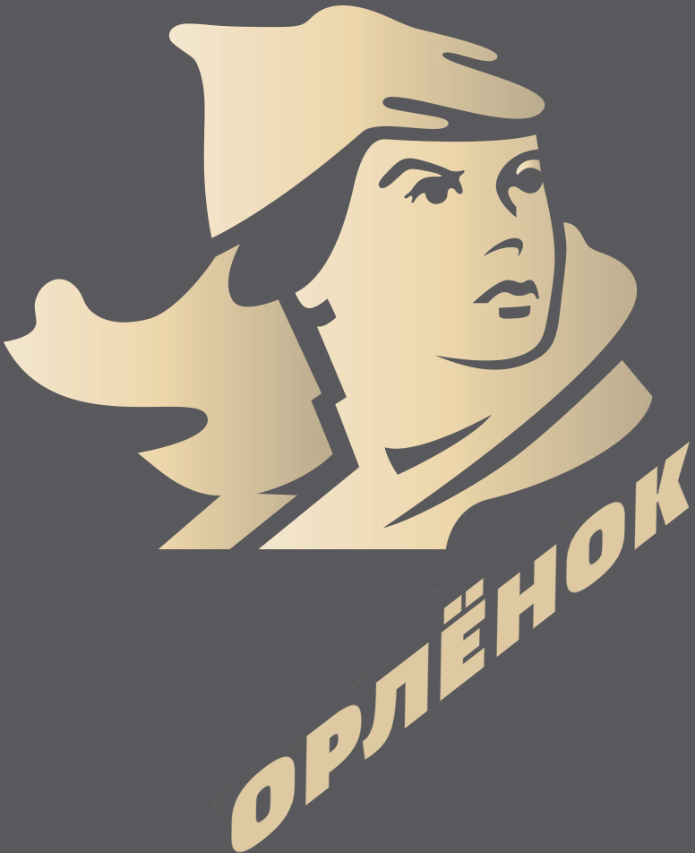
Art director: Yep, that’s it.
Client: Questions and feedback for the logo.
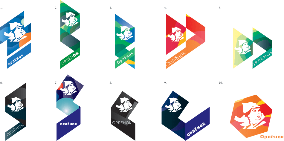
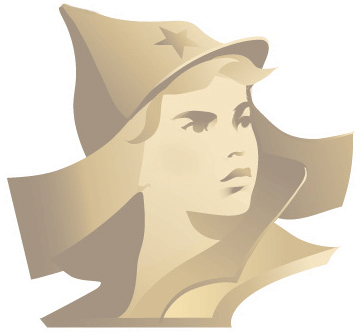
—the hump on the hat is a rudiment of a star that once was there; now it’s gone, so the hump needs to go too. The golden Orlyonok is a good solution.
—How will you incorporate the theme of childhood? Will there be more elements, reliefs? Or just the head with the text?
Designer: Made a new version based on the feedback.
Art director: Looks like he has a condom on his head.

Art director: Now it’s a stupid sauna hat.
Art director: OK.
Client:
—The boy needs to change. Going with the way he used to look doesn’t make sense: why did we start it all in the first place? Where is the modern reading?
—The peak of the hat is associated with Smurf hats. We would recommend you to study the design of budenovka, especially its side elements.
Designer: I’ve created a new boy. What do you think?
Art director: A Smurf from Yakutia.
Designer: What about this?
Art director: He’s got a khinkali on his head and a look of an idiot.
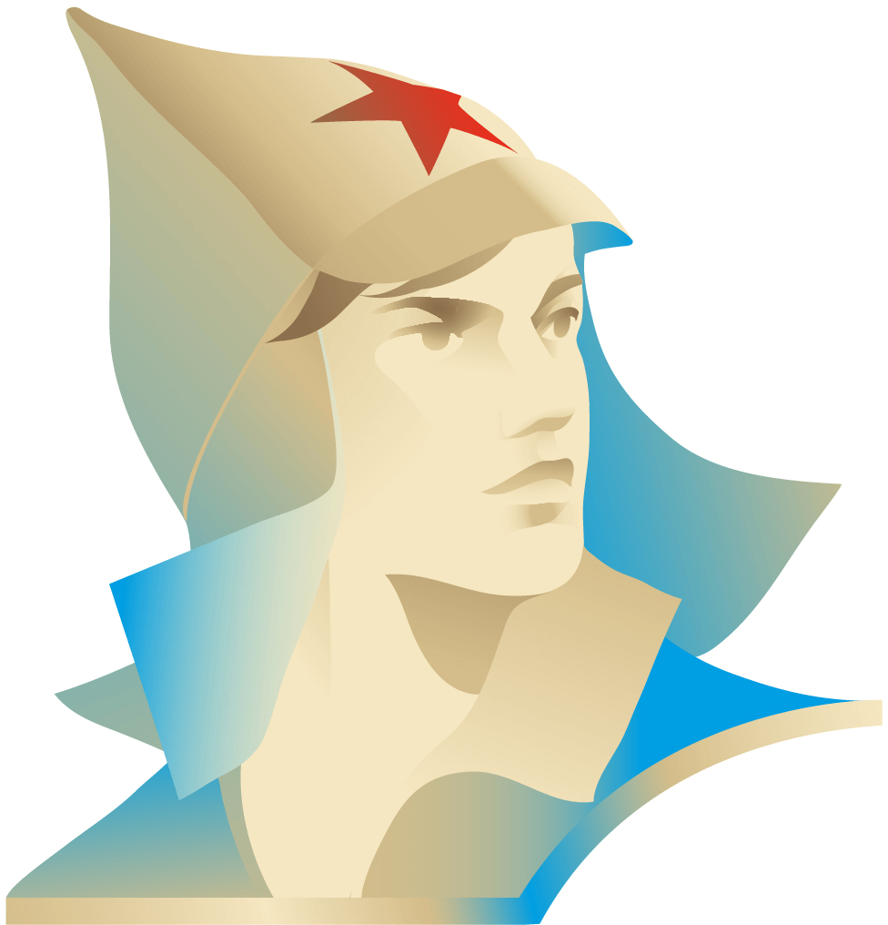
Instead of the pin, trying to use the monument located in the camp as a reference.

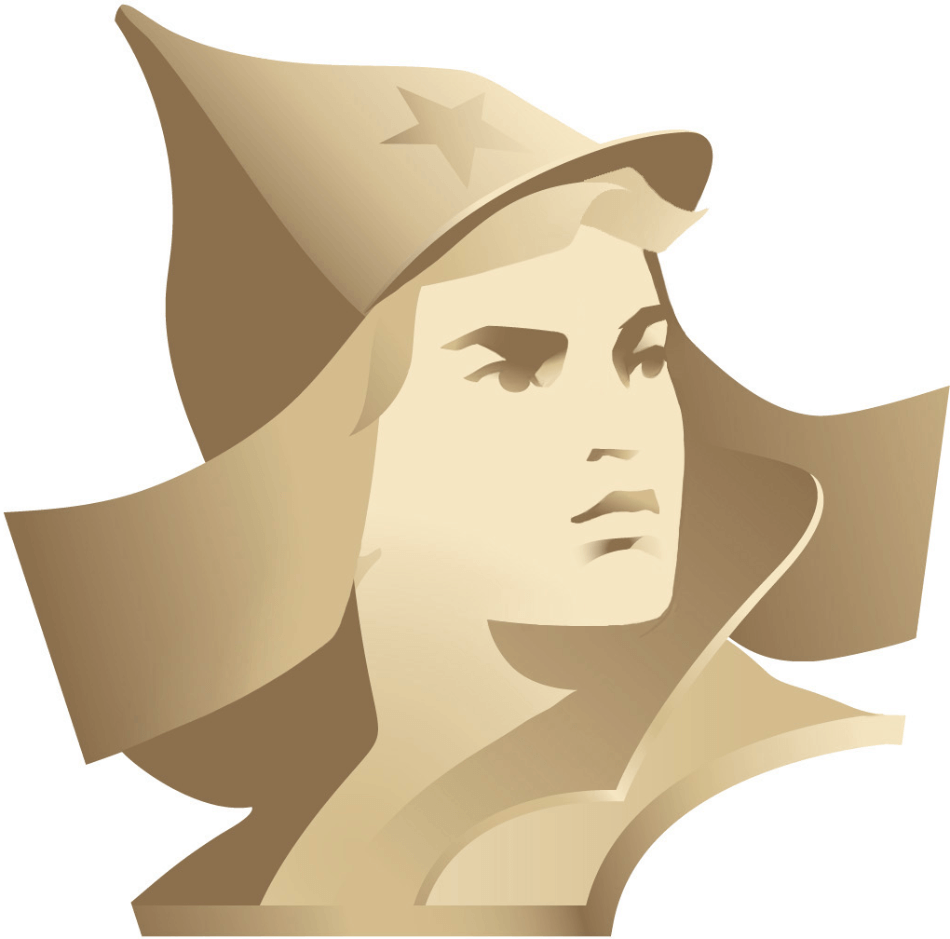
Art director: Not bad, but he should be facing right.
Rotating the head and slightly adjusting the neck and the face features.
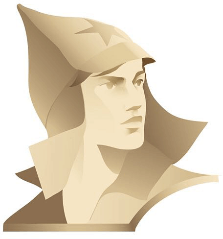
Art director: He doesn’t have a motivated gaze. Looks like a corpse.
Designer: What about this?
Art director: 4, 5, 7 are OK.
Client: No. In the new version Orlyonok became unattainable, flying high above over us. A teenager won’t compare himself to him, won’t want to walk beside him but instead realize that he is not worthy and follow him with his eyes as the dominating guy in something indiscernible on his head flies high above him. There is no feeling of involvement. We don’t accept the boy. This image is foreign to us.
Designer: Hi! I’ve got three versions of the logo (the last one I drew after our conversation). What do you say?
Art director: Good (really) but looks like a negative image.
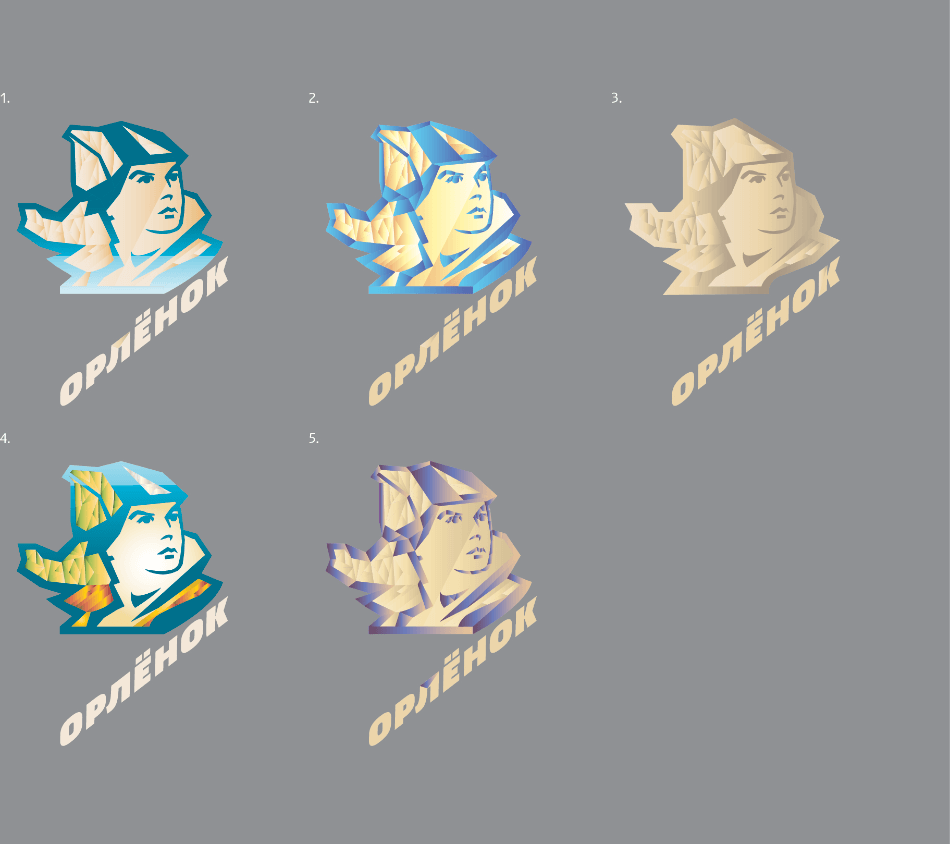
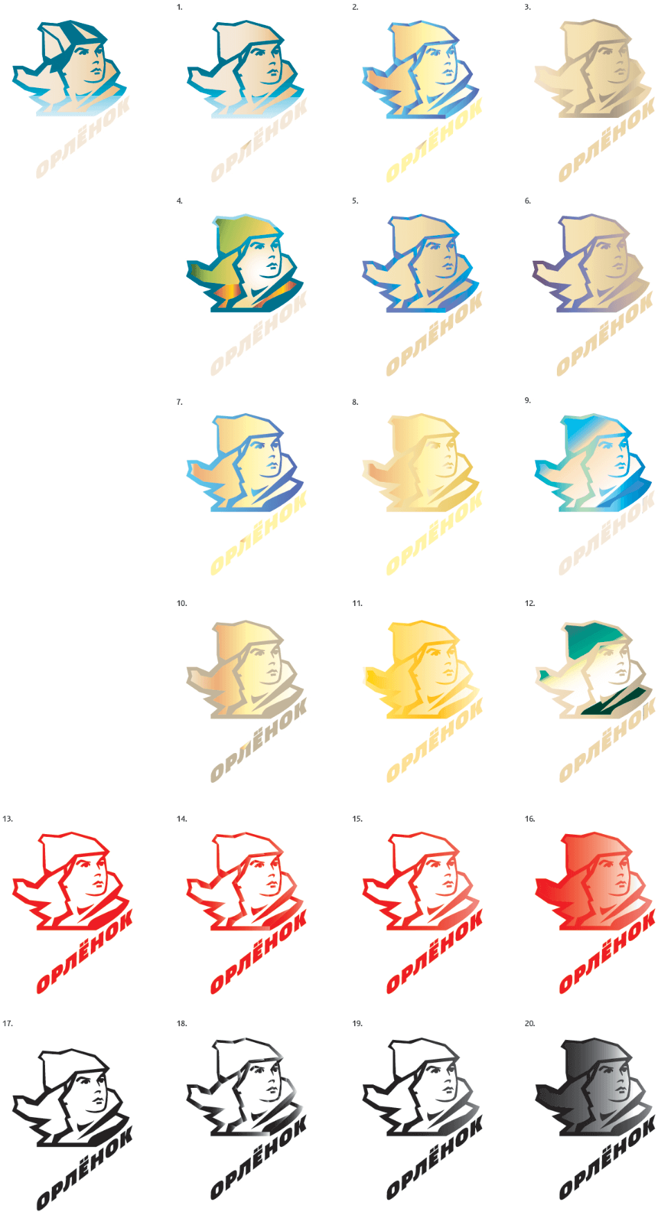
Art director: Sure, you can also create more like these, just with neater hats. Right now he looks drenched in some shit. Make the color cleaner.
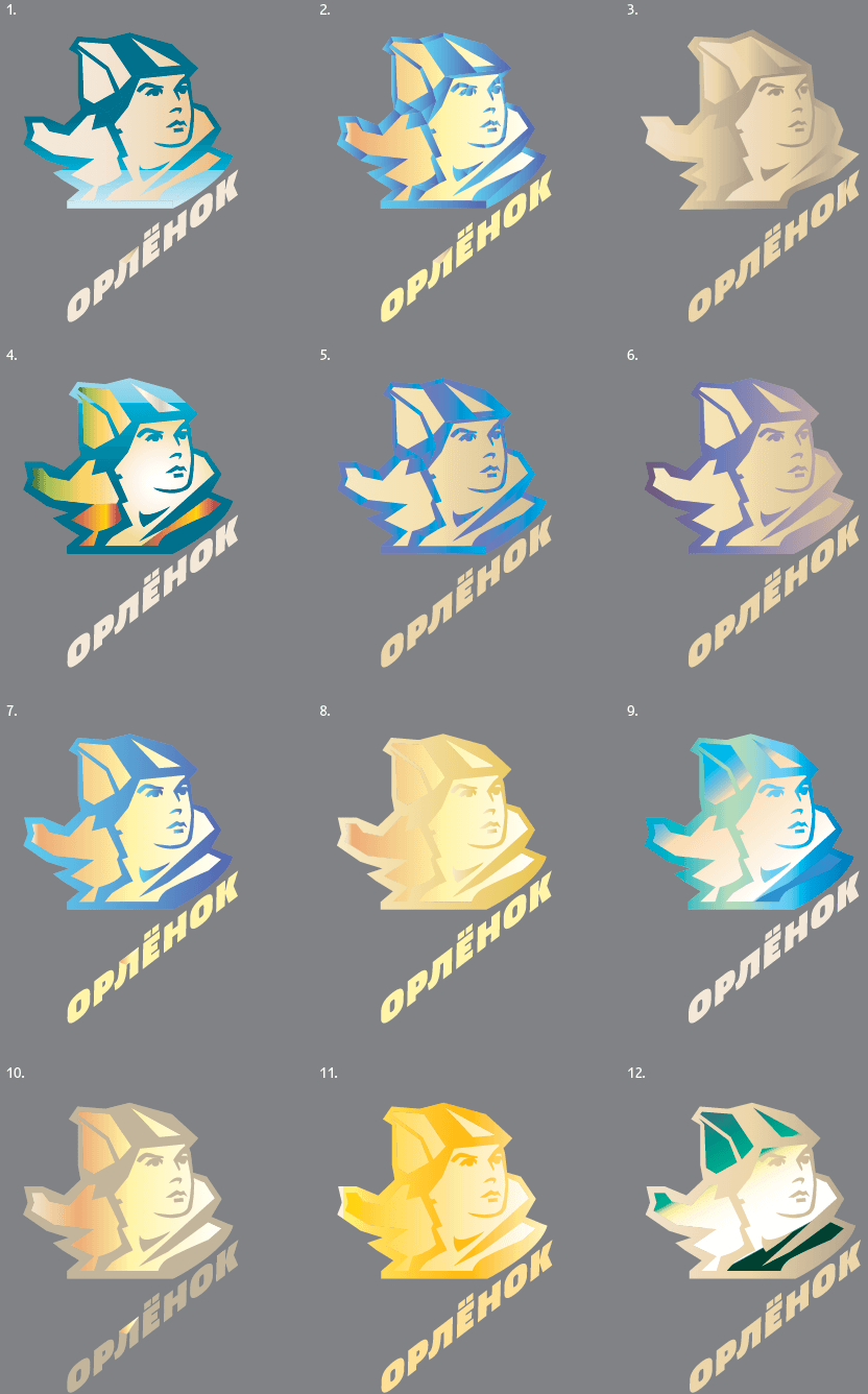
Art director: All are OK. We’re only missing the simple designs, red and black.
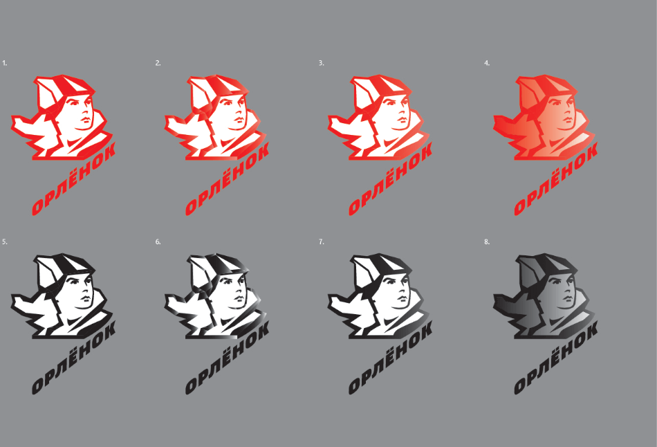
Art director: OK.
Showing the designs to the client. The client asks to cover the empty space with a side flap of the hat.
Art director: OK.
Client: Again, you did not understand the design of the hat.
Art director: Yep.
Client: We’ll take the “golden” boy and the design with the sea wave. Our director asks to change the excessively smooth shape and bring back the star.
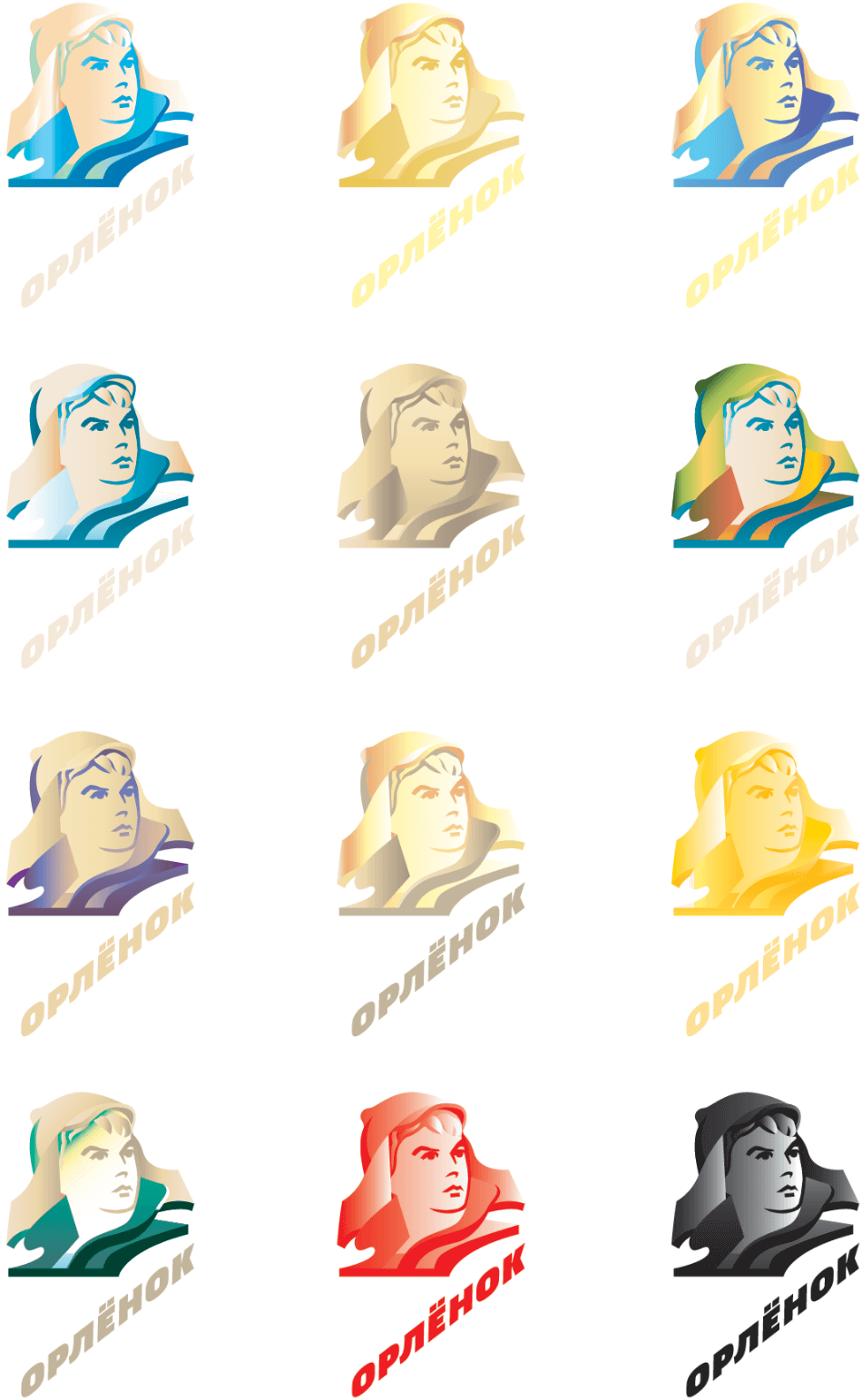
The second designer joins in and tries to make the boy look more courageous.
Art director: We’ll show it to them so they have a choice.
Client: The boy should look like a boy, not something average.
Art director: OK.
Client:
—The boy became too beautiful.
—The peak of the budenovka can’t be the same as the peak of a baseball cap.
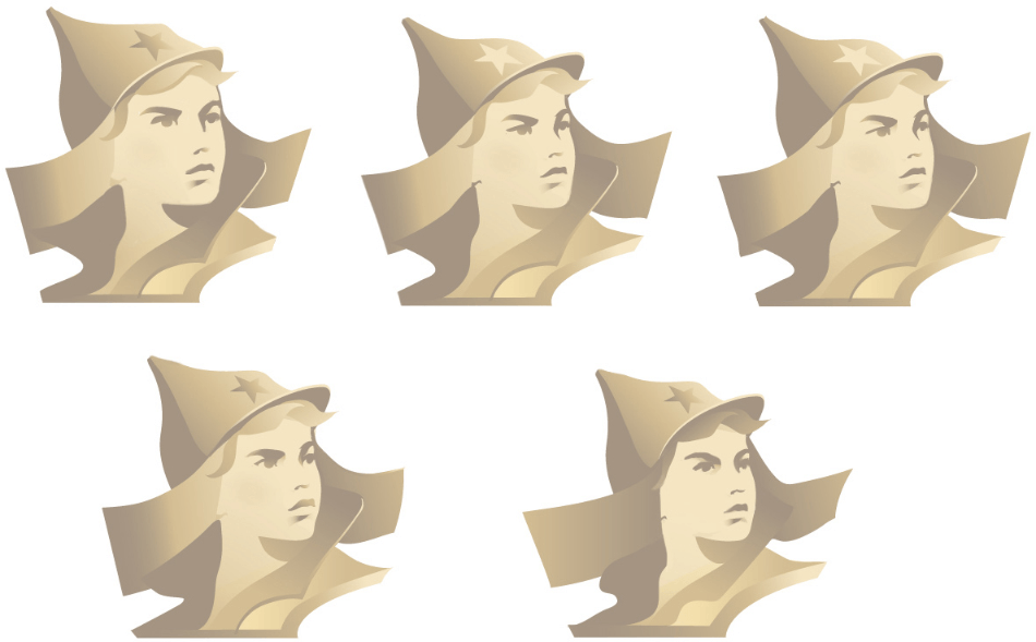
Second designer: Here’s a different Orlyonok.
Art director: We can send it to the client.
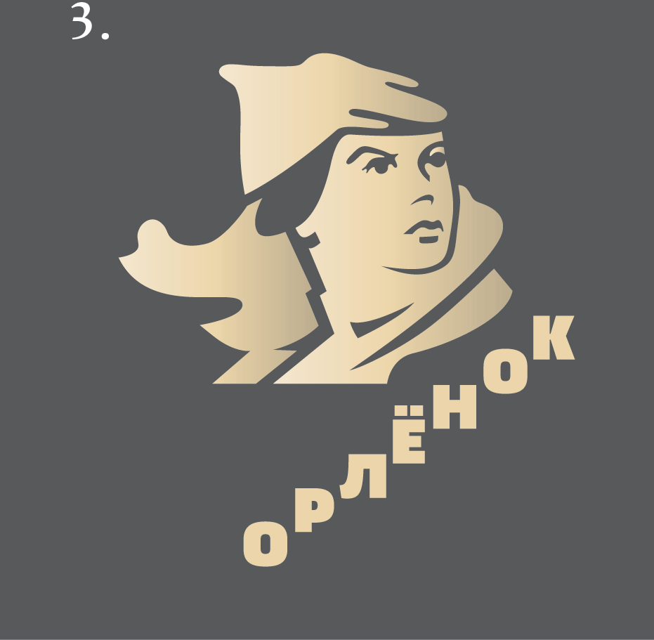
Client: Now it’s good. Let’s create a version with a red start and add more contrast to the shadows.