Ostozhenka 19 identity
Ostozhenka 19 rents out office space in two business centers on Ostozhenka. The idea behind the business is reflected by the elegant identity.
At the core of the logo are expressive circles. They emphasize the role of the building as a space for creativity, equality and mutual respect.
The logo also makes use of the window, a symbol of openness to the world. Its outlines repeat those of the original window frames on the building’s façade.

The logo is friendly.
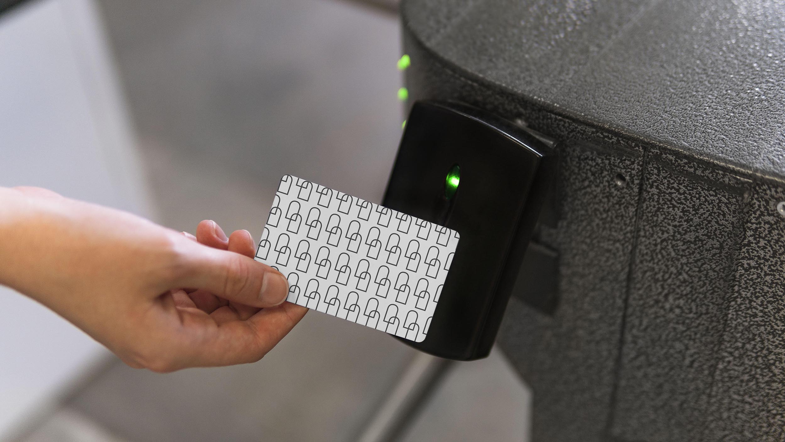
Access cards have signature patterns with windows.

Stickers look cool, too.

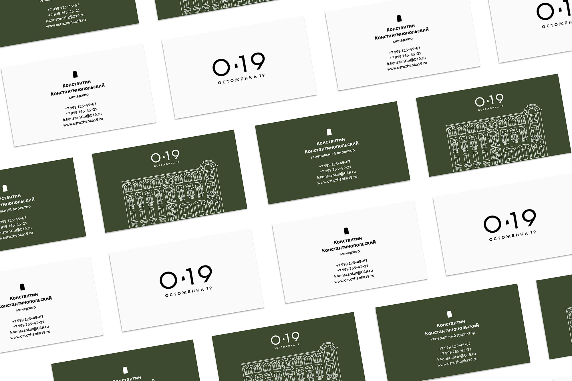
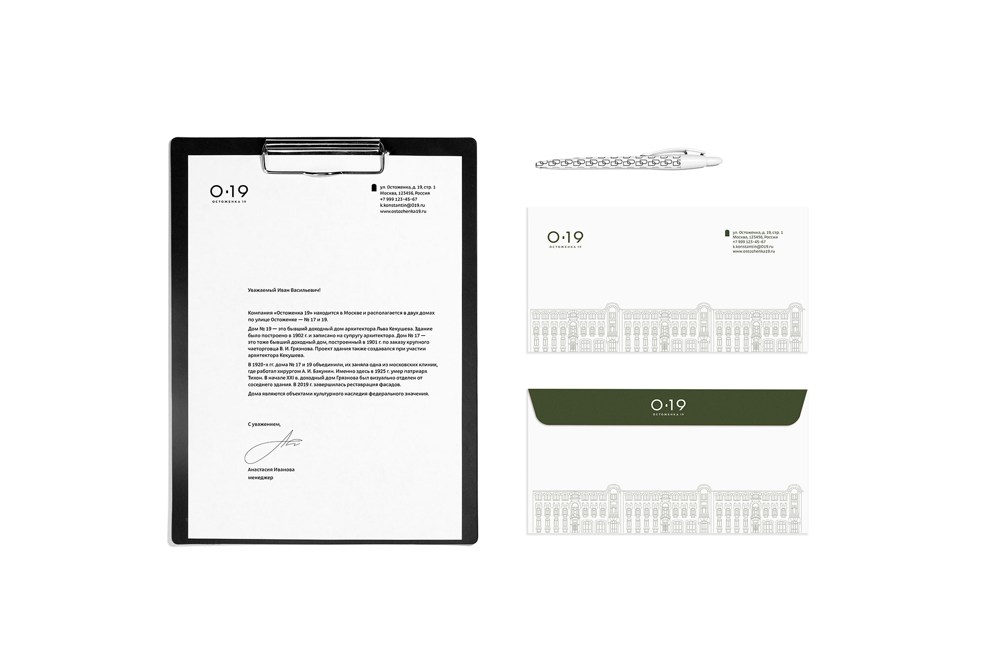
Employees and the director have business documents in the corporate style. Those of employees are decorated with a minimalist pattern while those of the director have an image of the entire Ostozhenka 19 building on them.
The primary colors of the identity are black and white. Additional color is green, the color of the building on Ostozhenka.

art director
type designer
- Ksenia Erulevich
