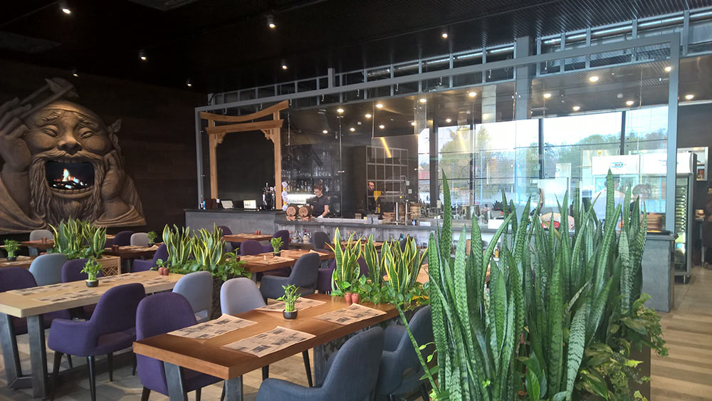
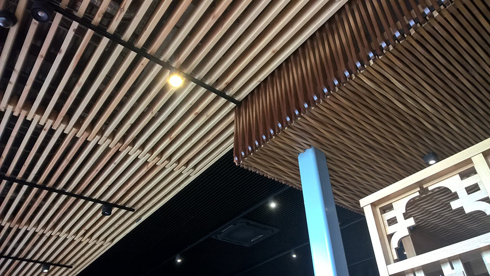
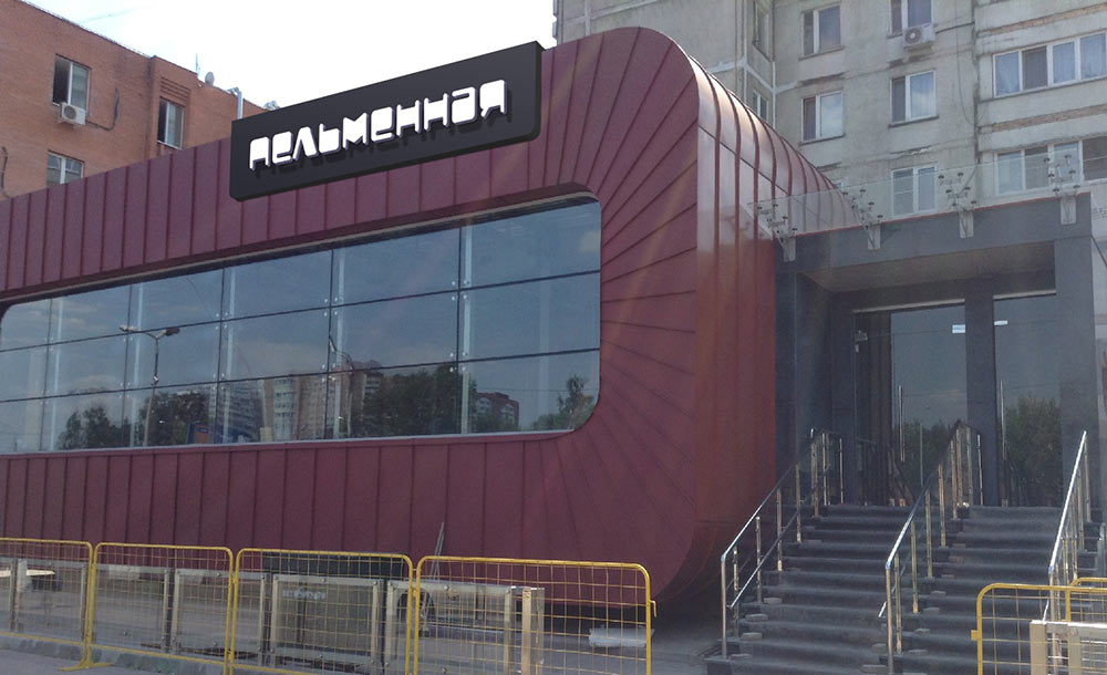
Receiving the task to create a sign for a pelmeni restaurant. Going to Zheleznodorozhny to get acquainted with the object. The building looks trendy and futuristic with a modern interior inside.
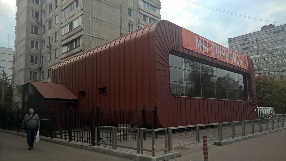
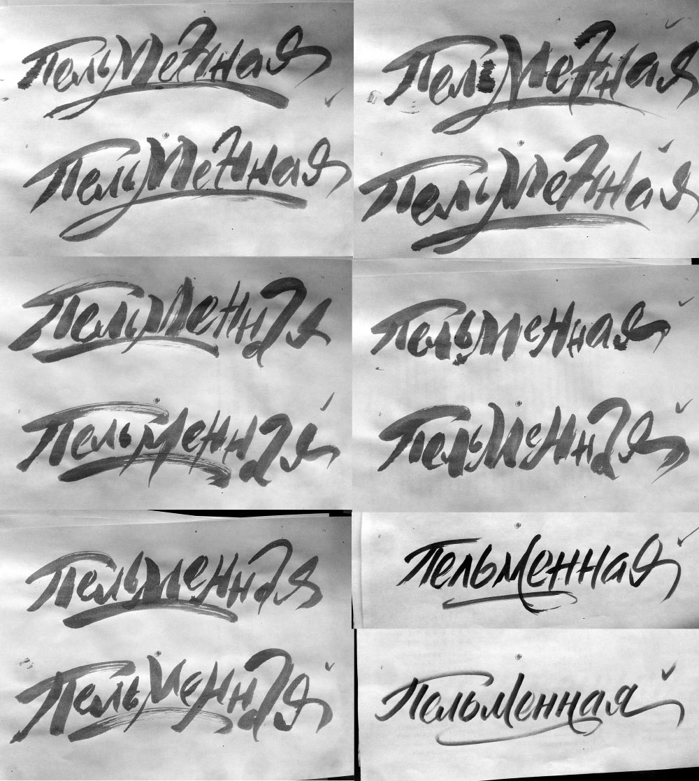
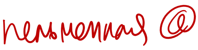
The sign should match the unusual façade. We have an idea to suggest a handwritten text, although not in a classic calligraphic tradition but in a more free and radical style. Taking the instruments and starting to write.
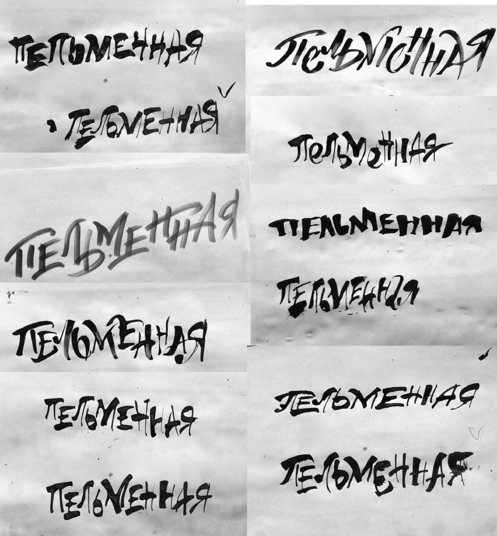
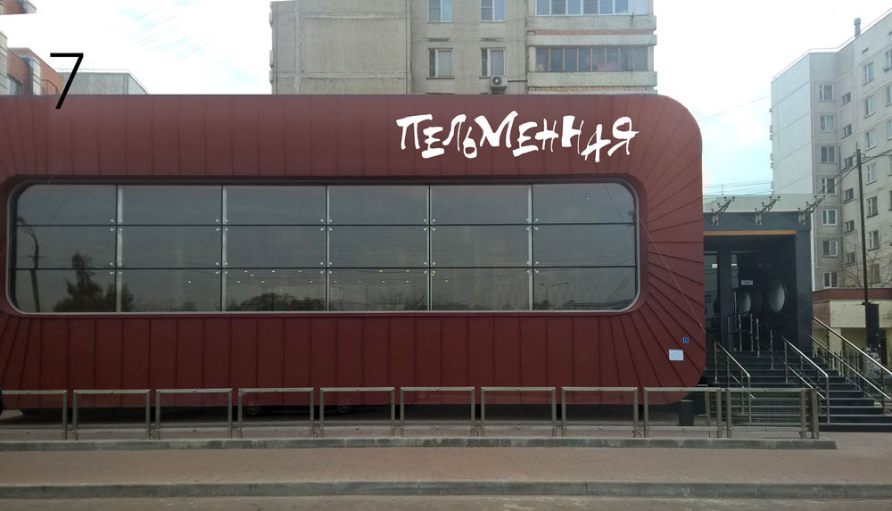
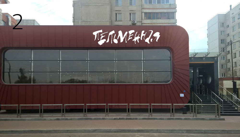
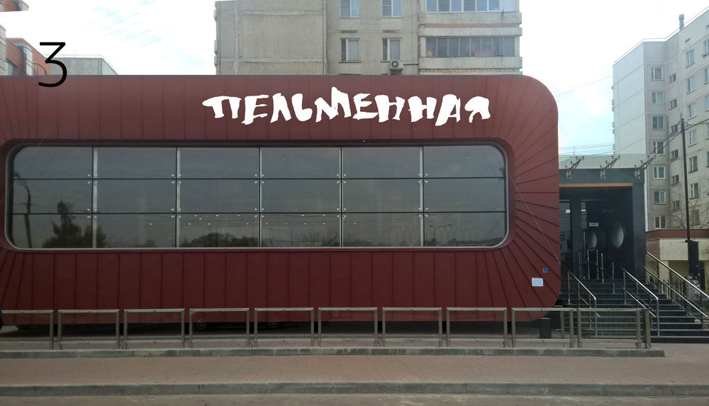
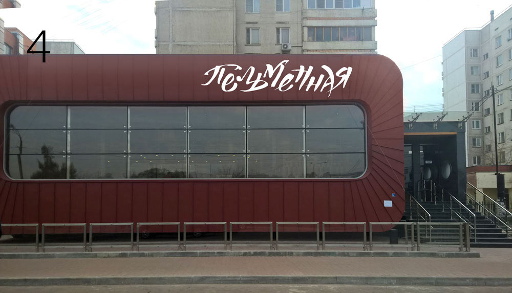
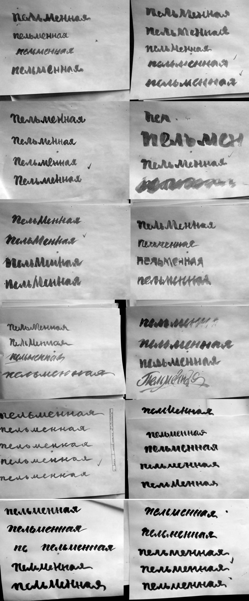
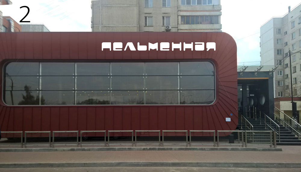
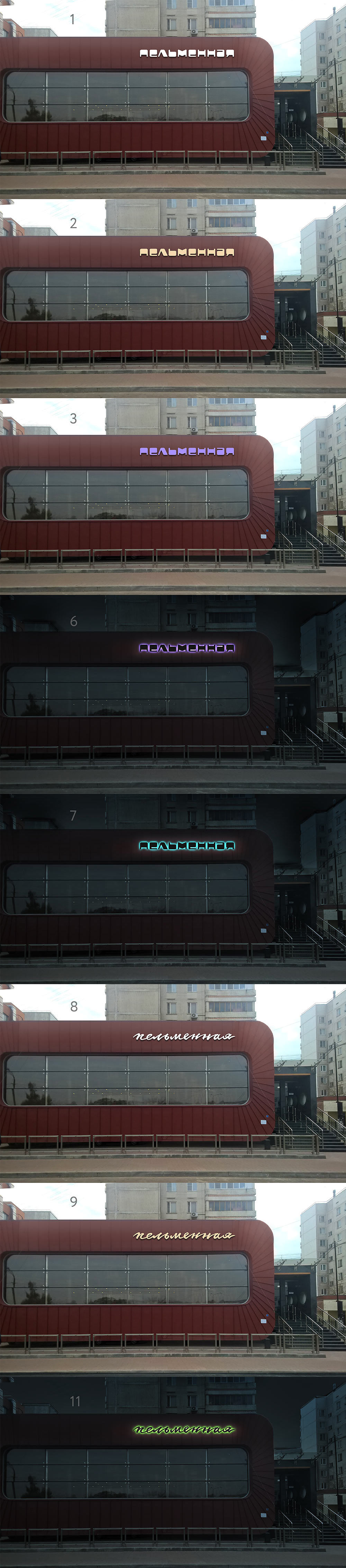
Choosing the better designs and trying them on the façade.

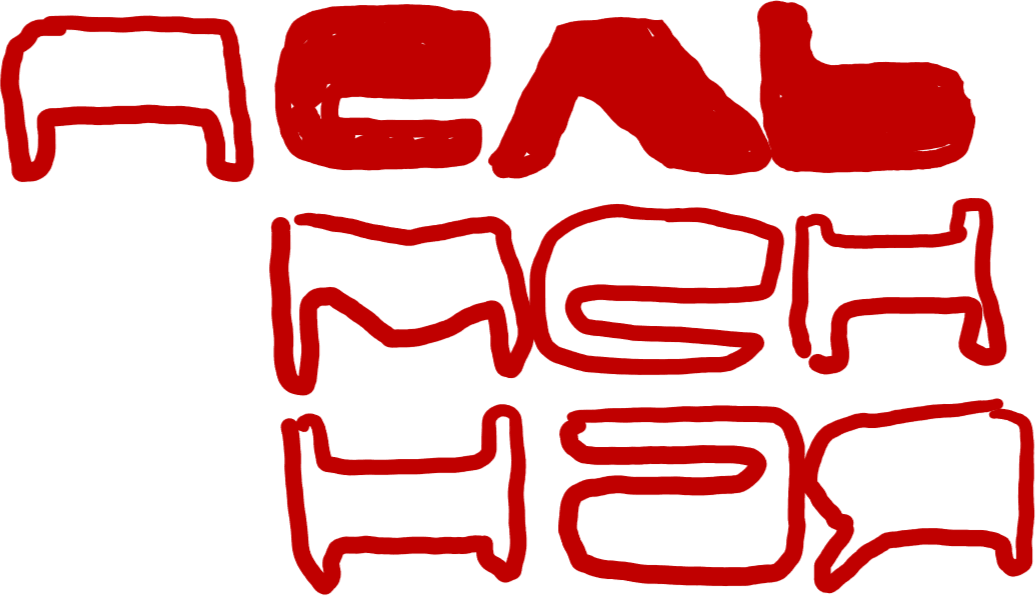
And a couple more of crazy grotesque faces for good measure.
Showing everything to the art director.
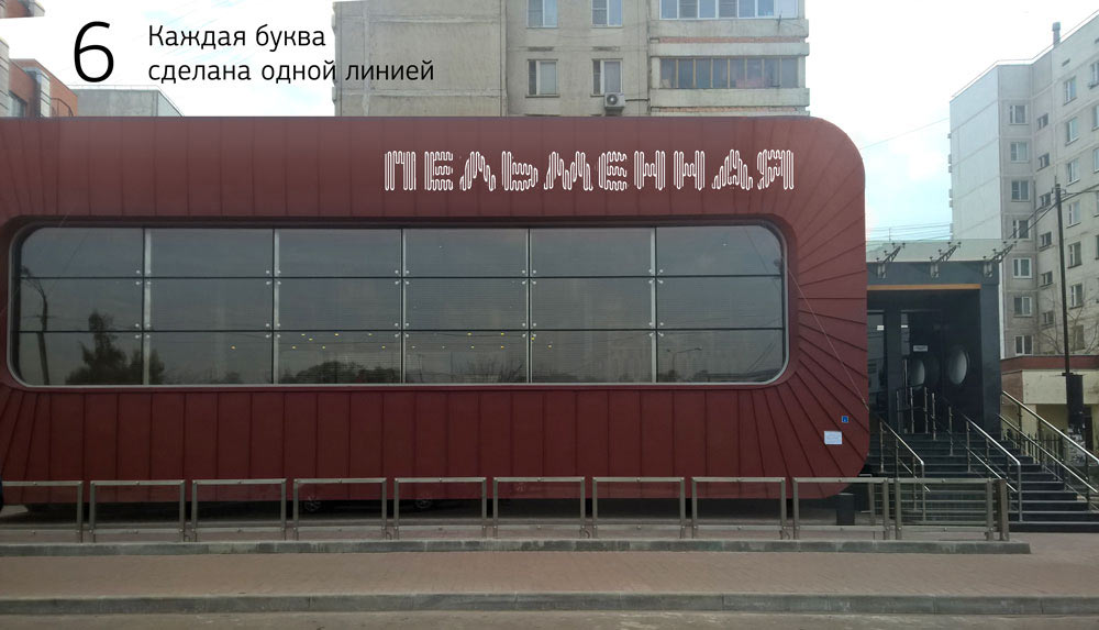
Art director: Looks a bit monotonous right now. I suspect this is due to the fact that all the letters are equally active. In the handwritten ones you shouldn’t use uppercase letters only, while in the grotesque you shouldn’t try to make every letter unusual.
Writing some more.
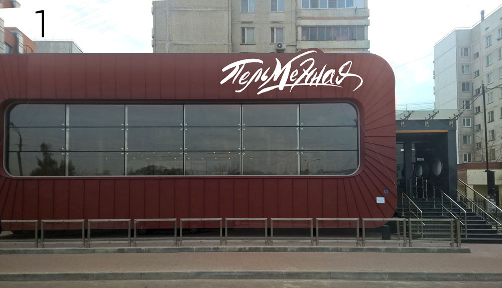
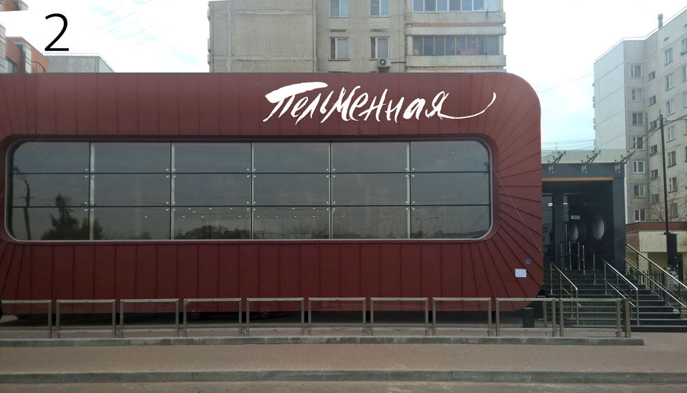
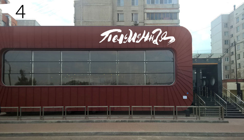
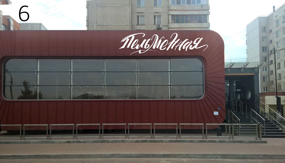
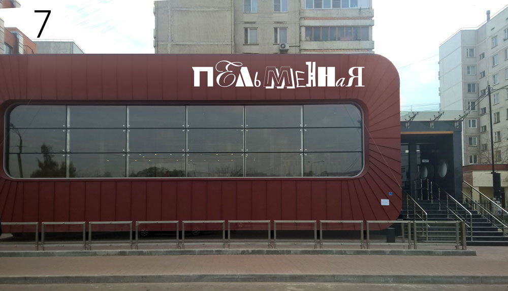
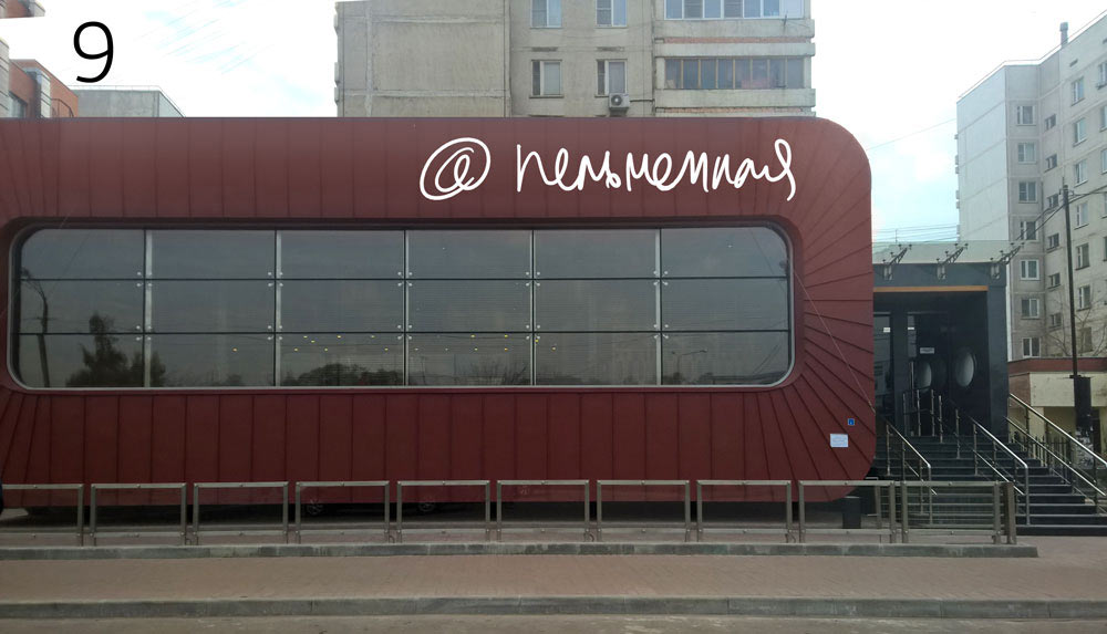
And testing the results as signs.


Some more experiments.

Showing to the art director.
The art director sends his own sketches and asks to generate more ideas.

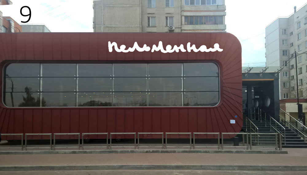
Continuing our calligraphic exercises.
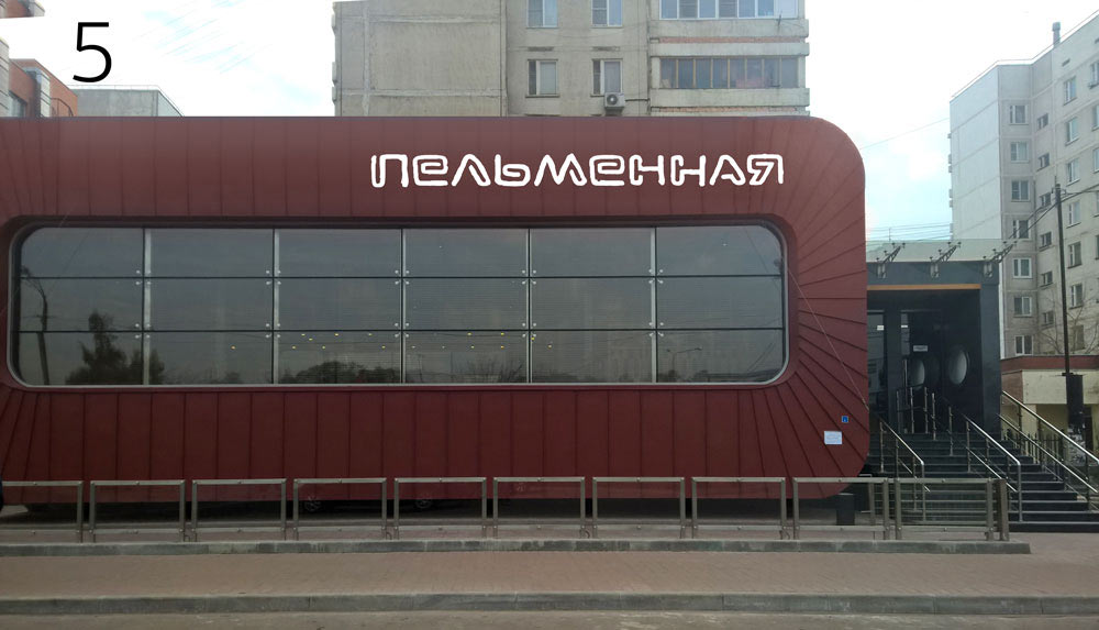
Choosing and testing.


Elaborating the art director’s ideas and adding a few of our own. Discussing.


The art director sends in another design.
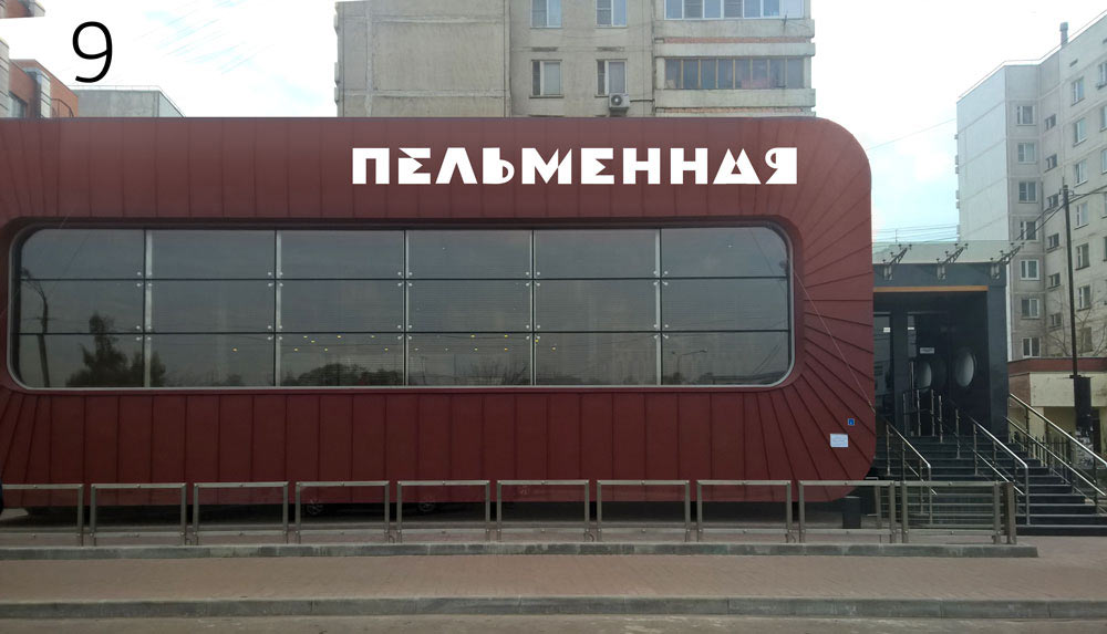
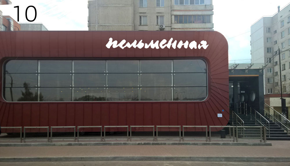
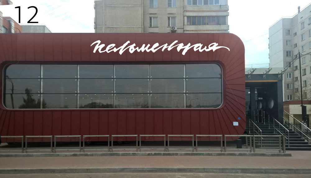
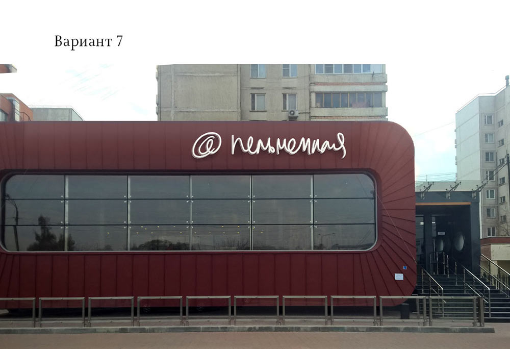
Trying it on the façade, too and finalizing chosen ideas from the previous batch.
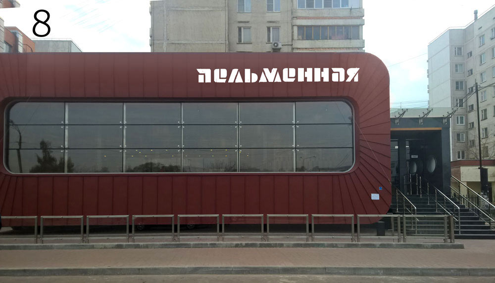
How about this?
Looks trendy, but would fit a pasta place better.
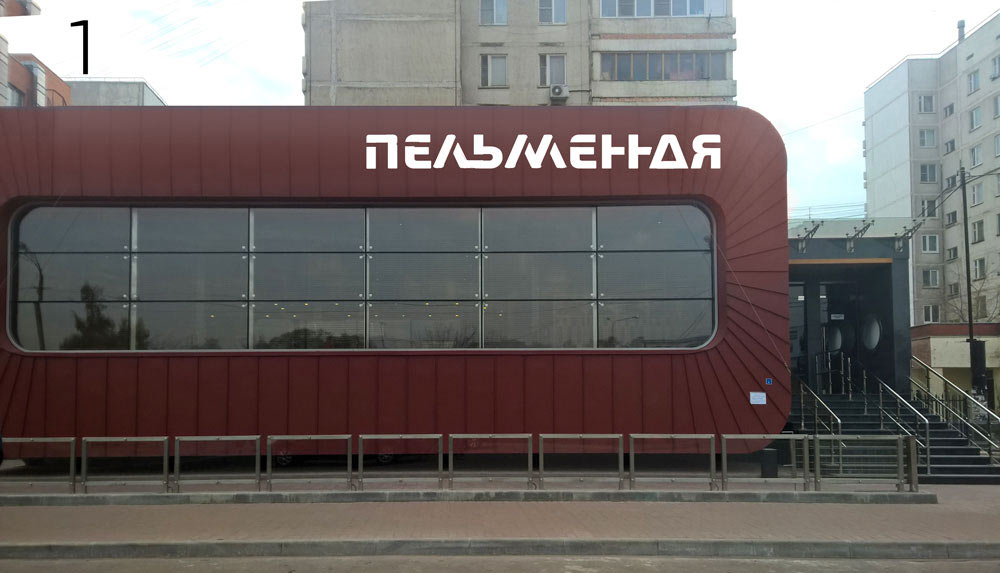
Ultimately, creating a short list of ideas.


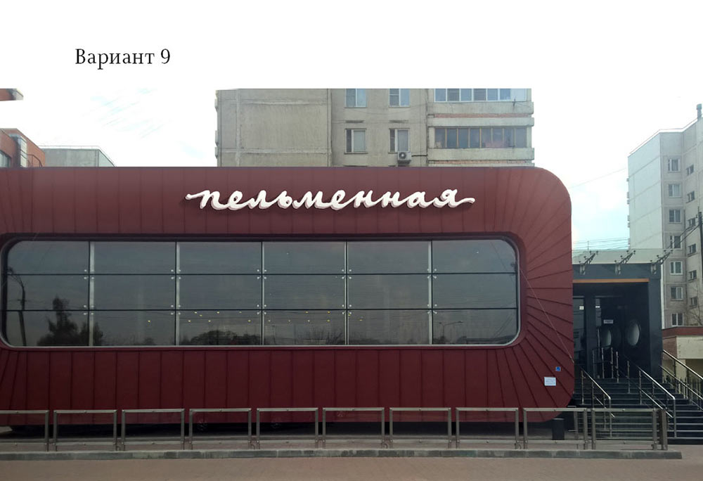
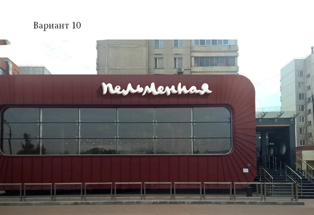
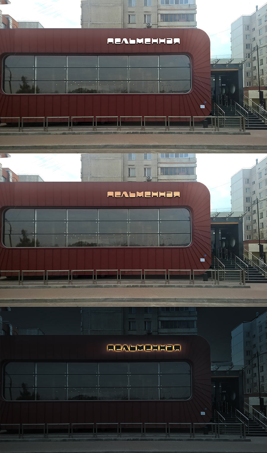
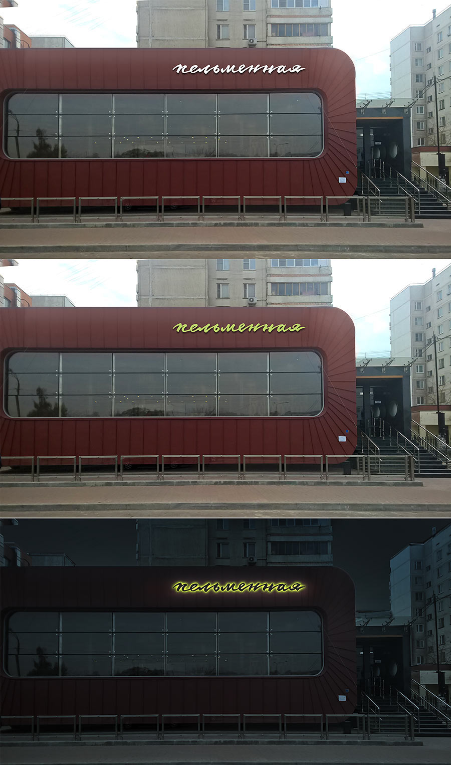
The client likes two of the designs. Working with them further, spending more time on the colors, night backlight, size and position of the sign.
Designer: I suggest to implement it as flat letters with a metallic reflection and a night backlight. It would look more futuristic than volumetric lightboxes and will be cheaper to produce. Also, the first design (not the calligraphic one) will be easier to install.
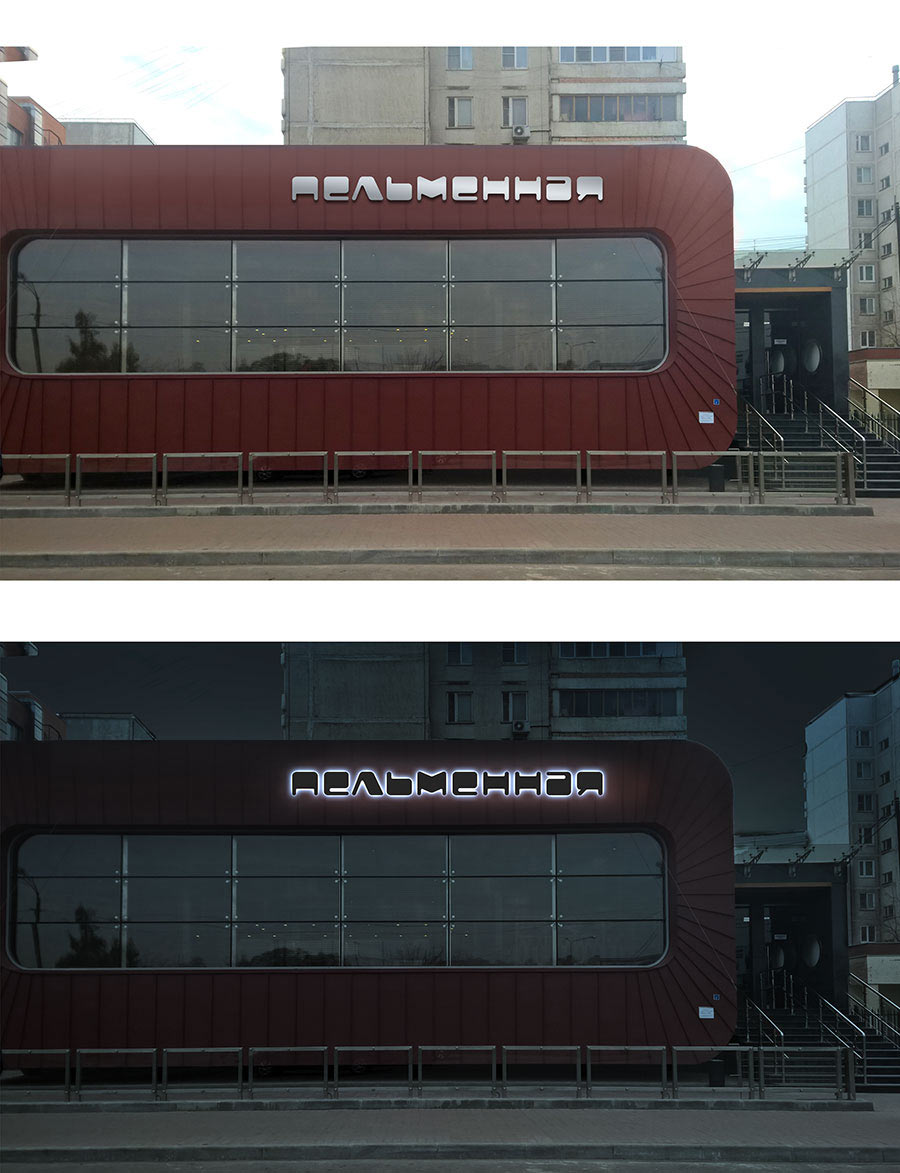
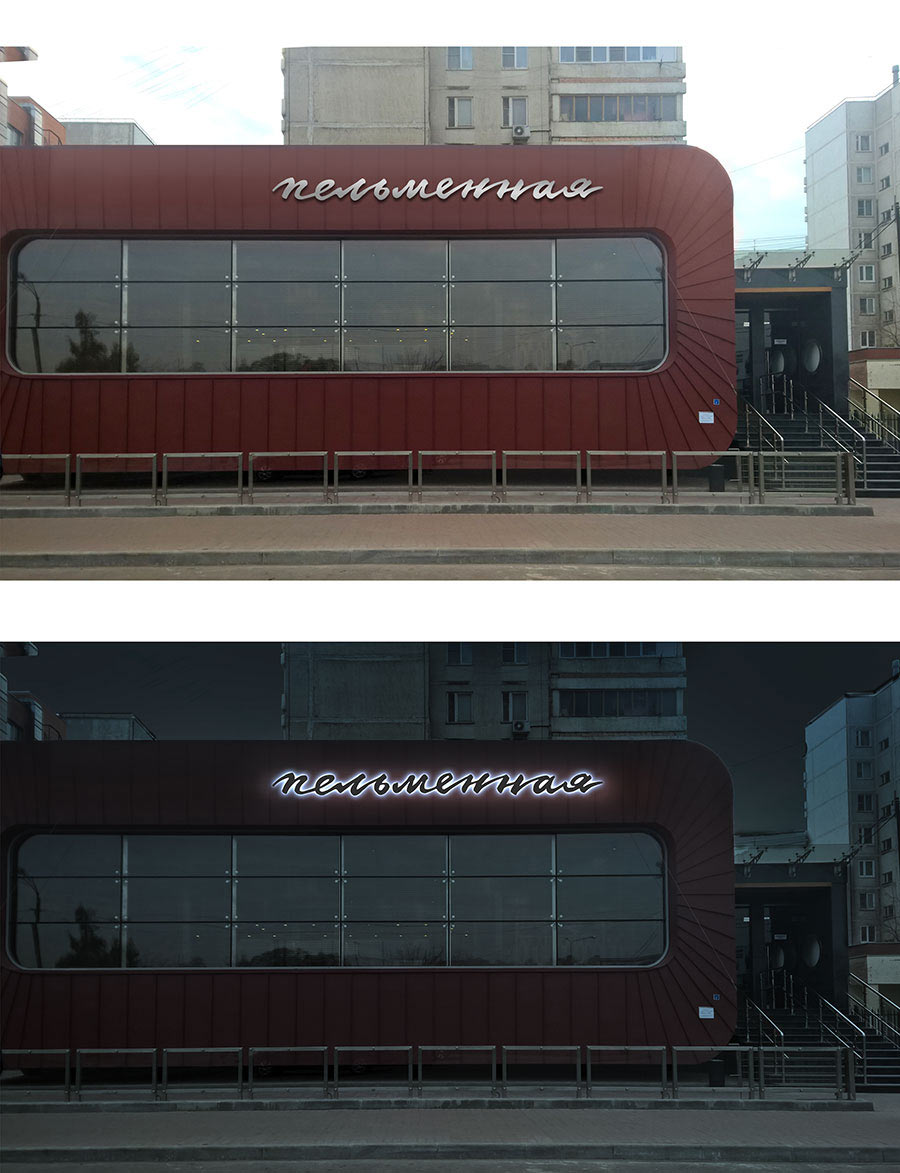
Art director: Matte and glossy metal would look nicely dramatic but wouldn’t really fit a food establishment. Try to think of a color maybe (including white).
Experimenting some more.
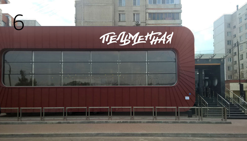
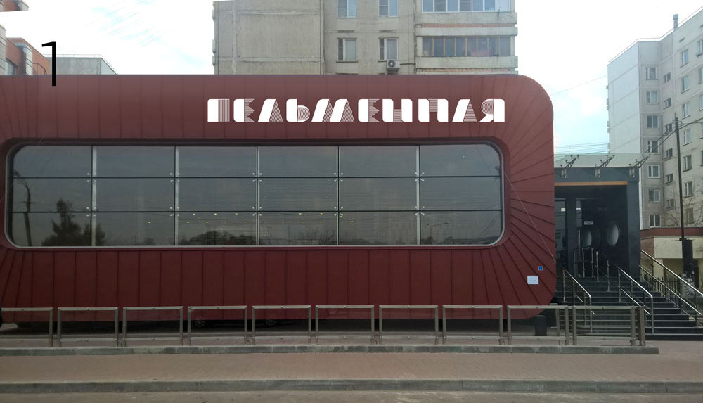
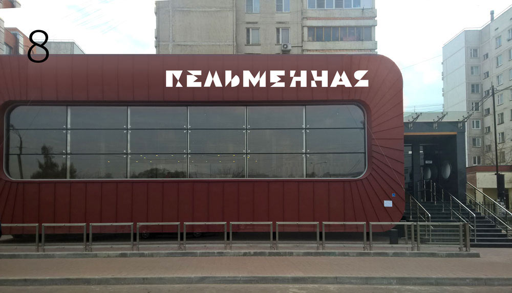
Ultimately choosing deciding to go with white with a wooden texture (coziness and all that) and lime (to maintain the spirit of originality).
The client makes the final decision and says that due to technical limitations we won’t be able to attach the sign directly to the façade and will have to anchor it to the roof.
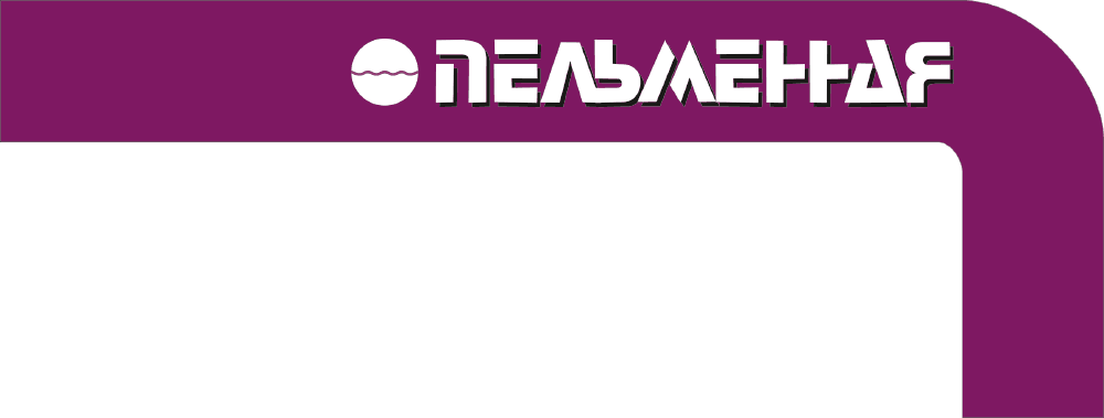
Thinking of a way to solve the problem and suggesting two designs with a background bar. Deciding to go with purple color which is unusual and matches colors of the interior well.
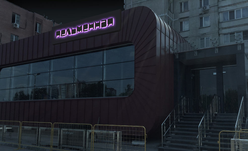
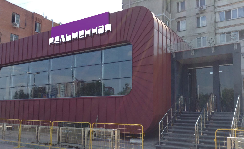
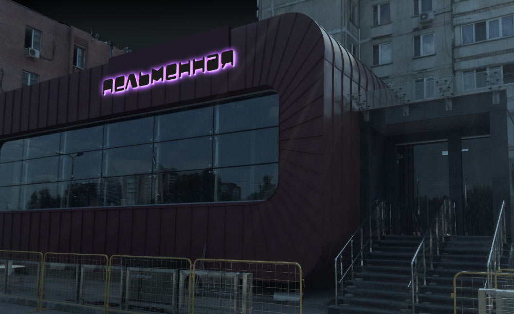
The client chooses the first design. Preparing the mock-up.
