The making of the Pizza Pi logo and corporate identity
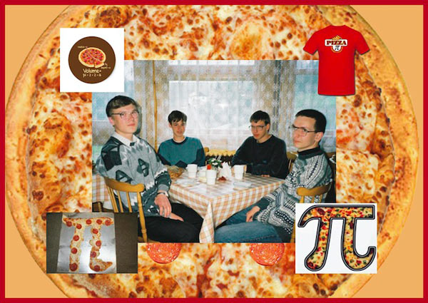
We need to come up with a modern nice-looking logo that would look good on a sign. A quick run around the internet confirms that there are a lot of cafés that have already utilized the math side of pizza-making. All the diameters, angles, kitchen algebra and stove-top geometry are giving people pretty much similar ideas. There is even a pizza cutter in the shape of letter Pi. The style of all the places has an air of sad student nerdiness. Geeks in da house, a round of pepperoni to everyone!
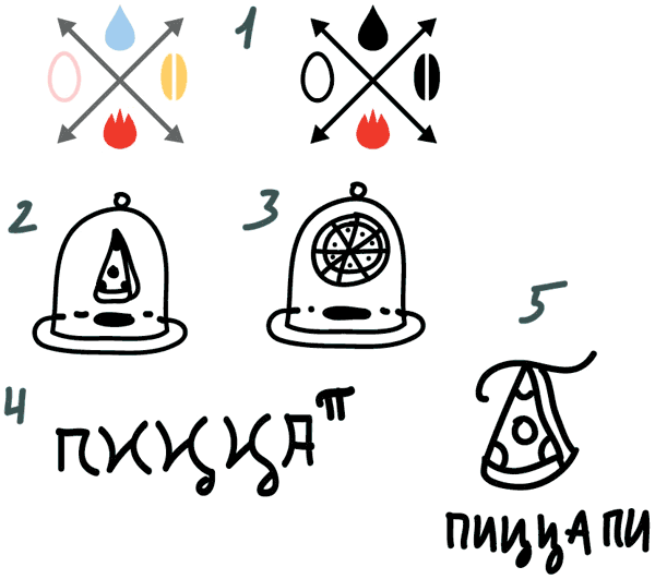
But our client plans to open up a proper restaurant: in gold and beige tones with wood and metal accents, antique knick-knacks and all that coziness. Means we need to look for something better than a sector of a circle with a slice of sausage on top. Or go deeper. For example, pizza crust looking like the angle sign on drafts.
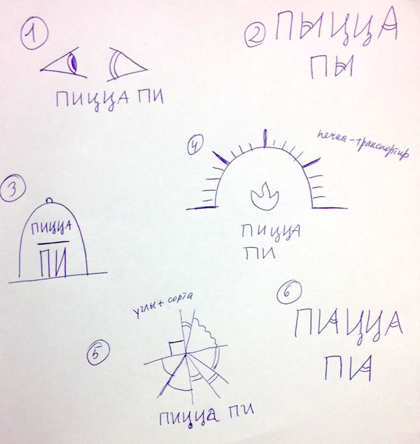
Art director: Number 5 would be interesting to develop.
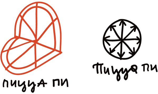
Here it is, and also pizza sketches, pizza-blueprint-heart and pizza cut along the diameters.
Art director: That’s worse.
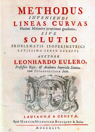
Meanwhile, the client sends us pictures of the furniture and interior of the future cafés. It’s all patinated, rustic and dingy, as if with a history. Looking at how Euler, Kepler and Leibniz decorated their work: allegories in the title and flowers in the drawings. Maybe we should explore divine proportions and the beauty of creation. Just without this naked guy in the square and circle, let’s give him a rest this time.
Art director: Can be.
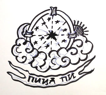
Starting to draw. Settling on simple colored lines so as not to devolve into pseudo historicism.
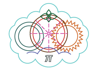
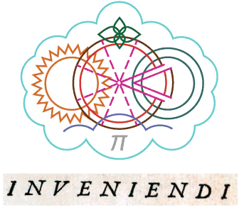
Art director: Looks good. Only I can’t really see a pizza here. Maybe, take one sector out?
Slicing the pizza, moving a slice to the left, then per the art-director’s advice to the right, adding a caption with suitable letters.
Art director: That we can demonstrate.
Assembling a presentation, piling up ideas for the menu, delivery, business cards, etc.
The client doesn’t like the result: too much astrology, alchemy and esoterics. The second attempt, new ideas. Four elements, standards, balance, pizzas inside a word and all that.
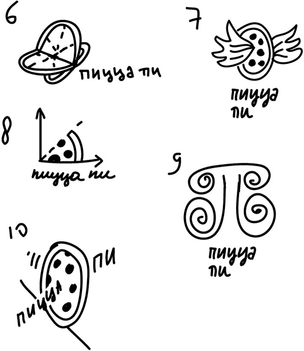
Art director: Let’s show the ideas just like that.
The client chose the potential directions. Working on the graphics, searching for the typeface and the colors.
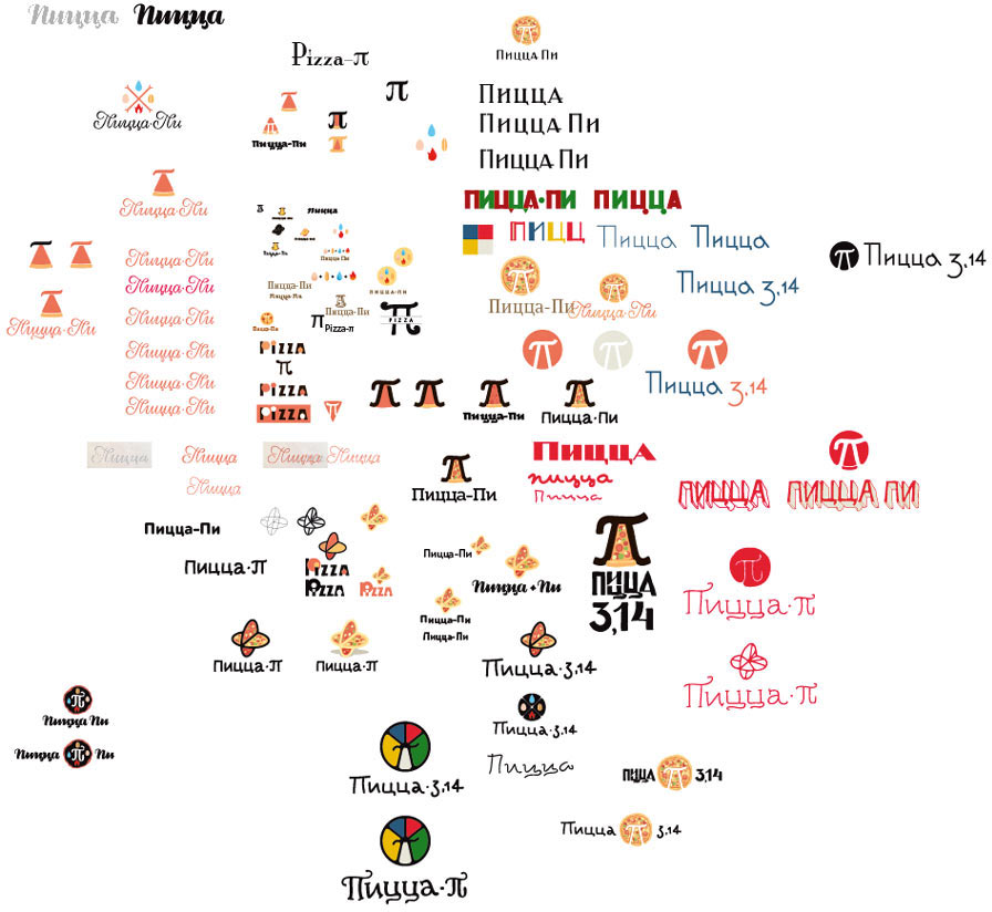
Choosing the most viable alternatives and sending to the art director.
He approves all the options. Preparing a presentation for the client.
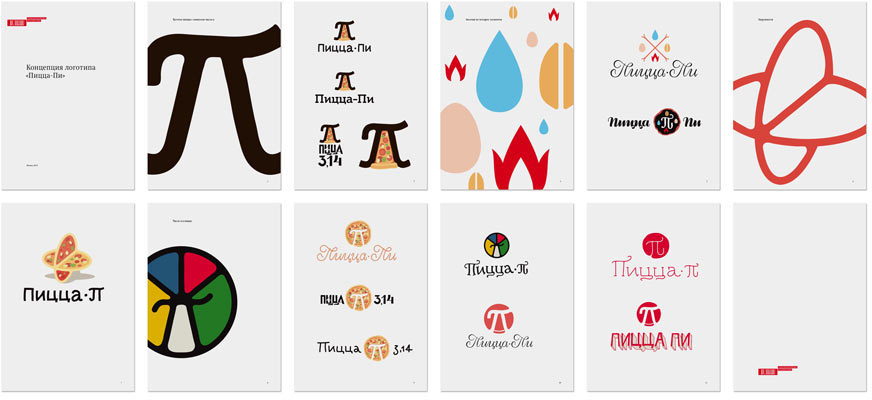
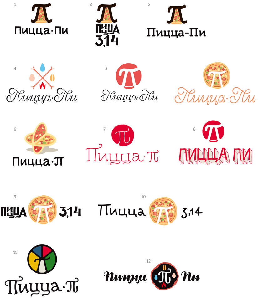
The client takes his pick. Trying to find a shape for the letter Pi without losing the image of the pizza slice. Simultaneously looking for a nice way to write the name. We will also need to search for good colors. Definitely, we need something not archaic, but rather Italian, though not too hip. While we are trying out different color options, we get the idea to display pizza ingredients as vegetable pieces. Later this idea will become the Pizza Pi corporate pattern.
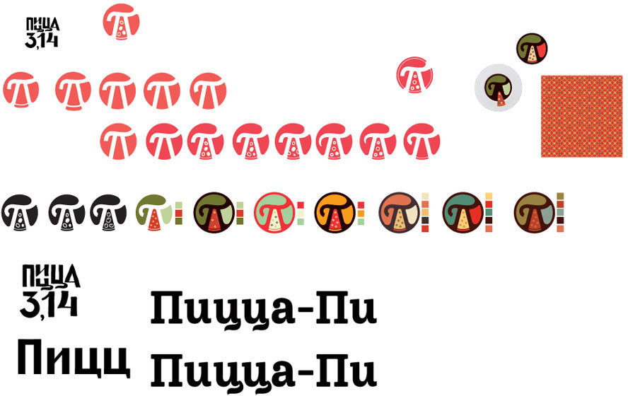
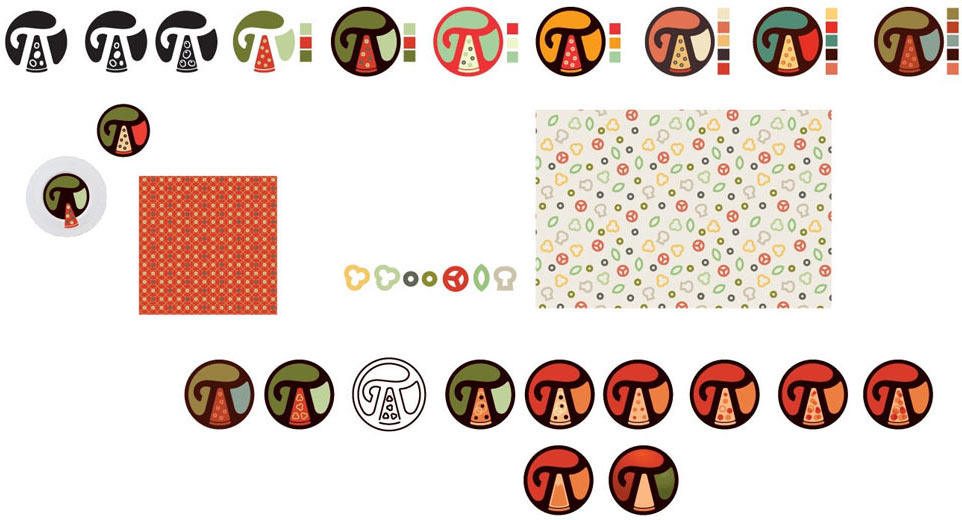
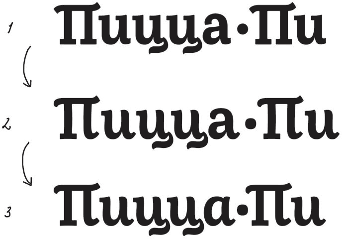
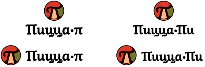
Asking the type designer to polish the letters in the name. Correcting the shapes of the characters. Diversifying the row of similar serifs on top. Paying a bit more attention to the shape of the dot. Now it’s better. But letter a falls out of rhythm slightly, so we draw a circle variant. Placing the letters closer together.
The client asks to give two options for the text as there is still the issue of name registration.
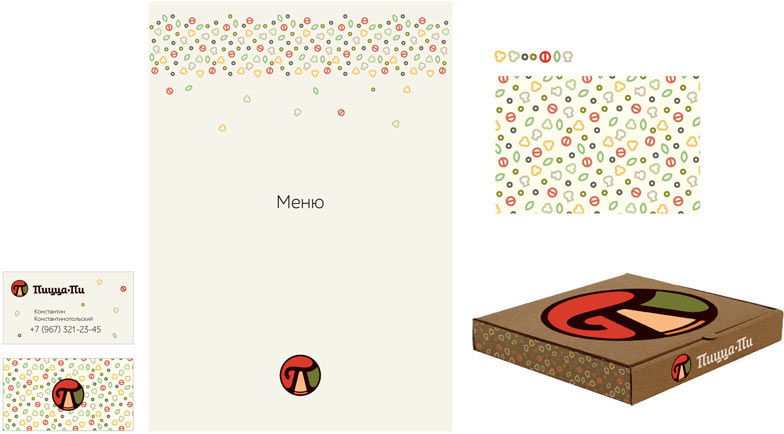
Trying out the result on various media.
Meanwhile we are tasked with designing a sign. Starting to sketch.
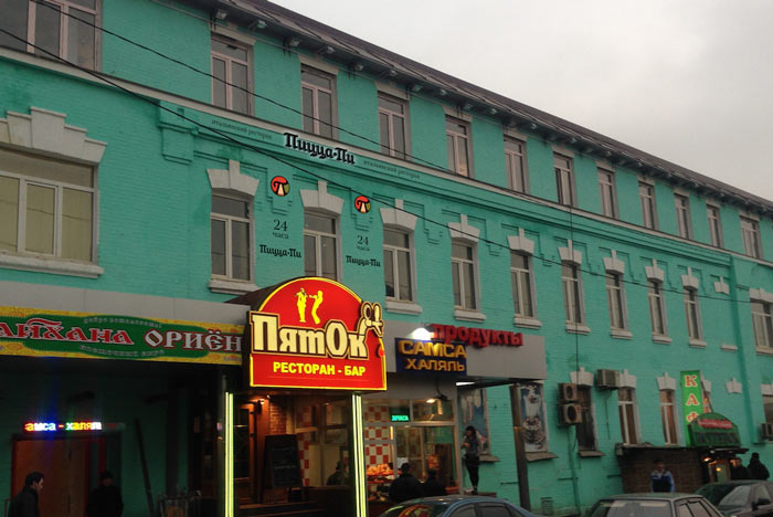
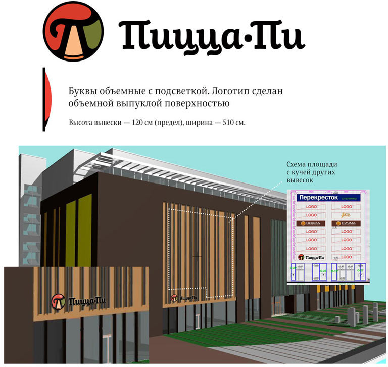
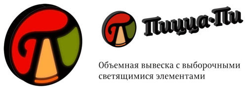
The art director chooses the second option but the client asks to draw a plate at the back as there will not always be a smooth surface to put the sign on.
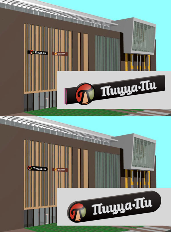
Developing the chosen direction.
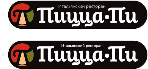
The art director asks to replace the typeface.
Designer: We suggested Schlange as an additional typeface. We used Gross Kunst on the sign. What would be best here: to use Gross Kunst everywhere or make an exception like we did with the sign?
Art director: Up to you. There really isn’t anything bad about using different typefaces.
We also need to typeset the menu template.
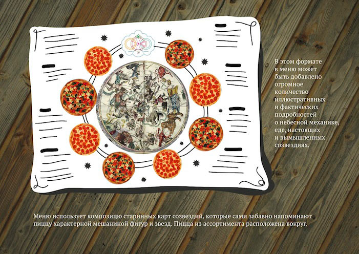
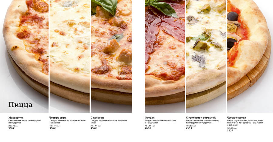
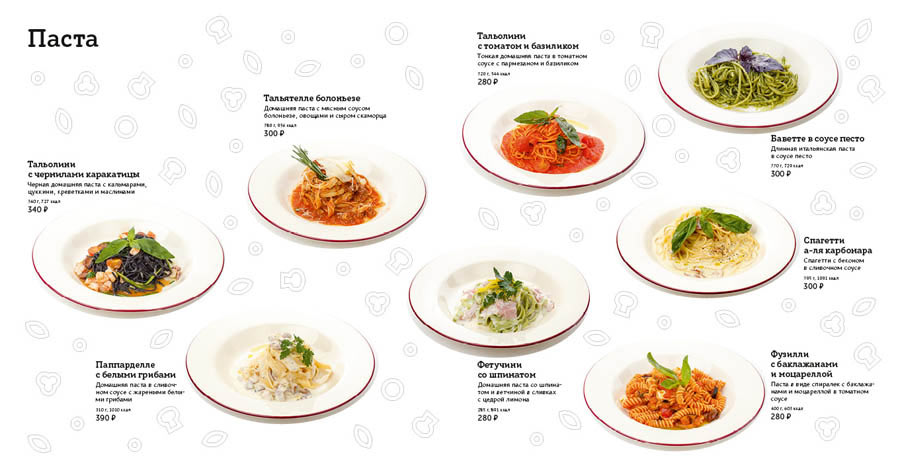
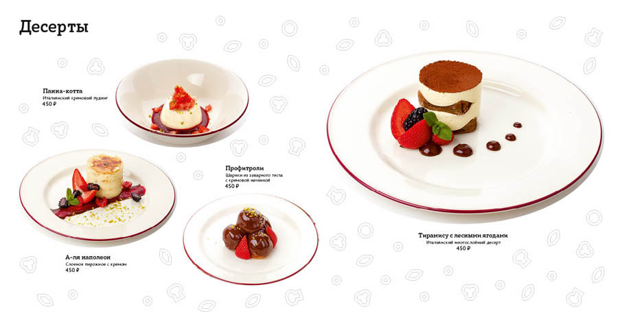
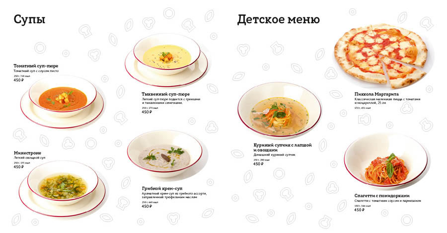
Designer: Let’s take pictures of all the dishes from above and place them liberally in the menu—we’ll turn it into a catalog of a culinary art exhibition. It will look even better if the plates are of different shapes. We can also show the main or most popular dishes larger than the rest.
Typesetting and showing to the client.
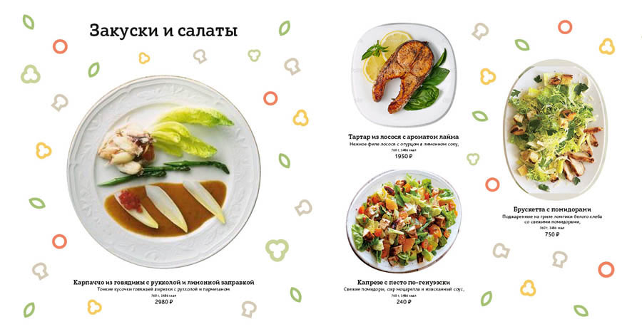
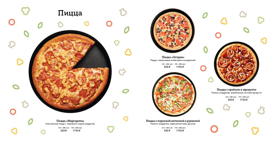
The client likes the way pizza looks on black skillets, he will keep it in mind for the future, but in the cafés pizza will be served on wooden boards. And the bright pattern makes it look like a menu for kids. Also, there is no opportunity to hold a new photo shoot of the dishes, we must use the pictures we have. And we need to fit more dishes on every opening.
Placing the pictures sent by the client (keeping in mind the hierarchy), typesetting the text, calming down the cheerful pattern. The client asks us to emphasize the pizza section, so we do something special.
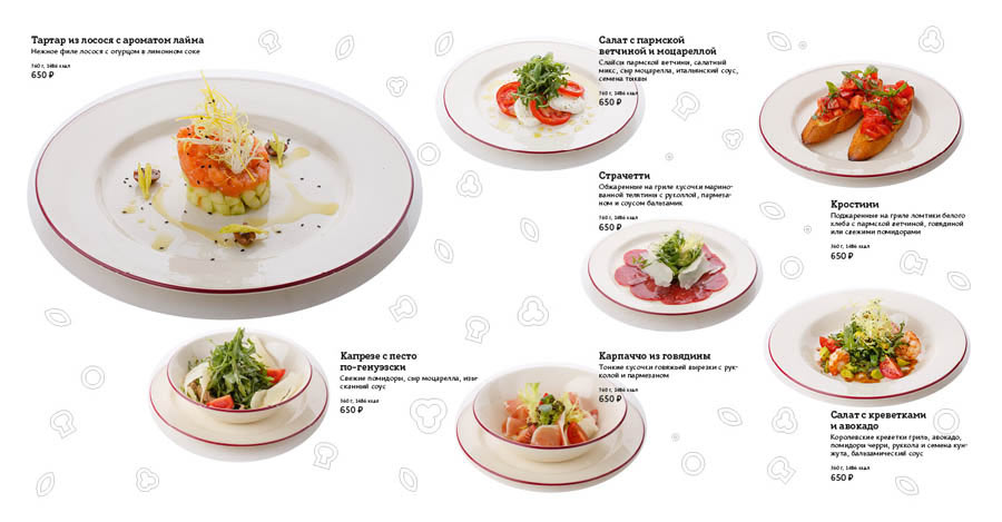
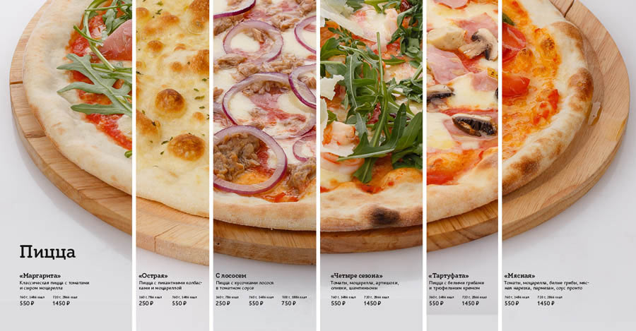
The client likes it all. Typesetting the final version of the template. Proofreading the text, checking the layout, adjusting the grid and the columns, making photos brighter, sprinkling a bit of pattern, equalizing photos, text and pattern on every opening.
Assembling the brand book, preparing the sign mock-up for production and writing the announcement.
