Making of Rambler News
Overview Process
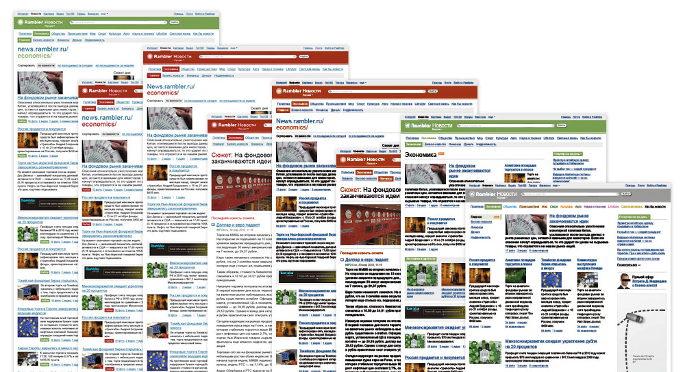
Having read the design brief and studied the new editorial project policy, we were to decide on the general feel of the website, from minimalist to loud and newsy.
Seemed a bit timid, so we threw in some more nifty features.
All the new distinguishing elements piled together. The type for web addresses there really hit the spot.

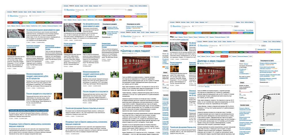
What we created so far wouldn’t go well with the rest of the portal, so we had to make it simpler. More white space, yet the same visual and information density. Every section should look like the front page in miniature—readers should be able to see related topics, links to top news, users’ comments, and have easy access to other sections.
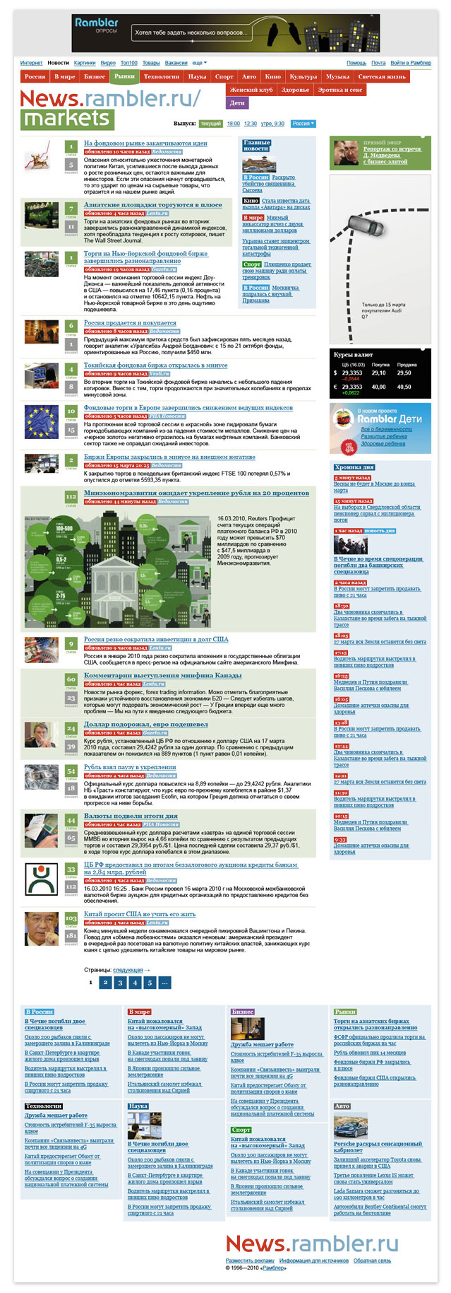
Making it simpler still, until clearly arranged. Trying various designs for the header and menus.
Simplicity won.
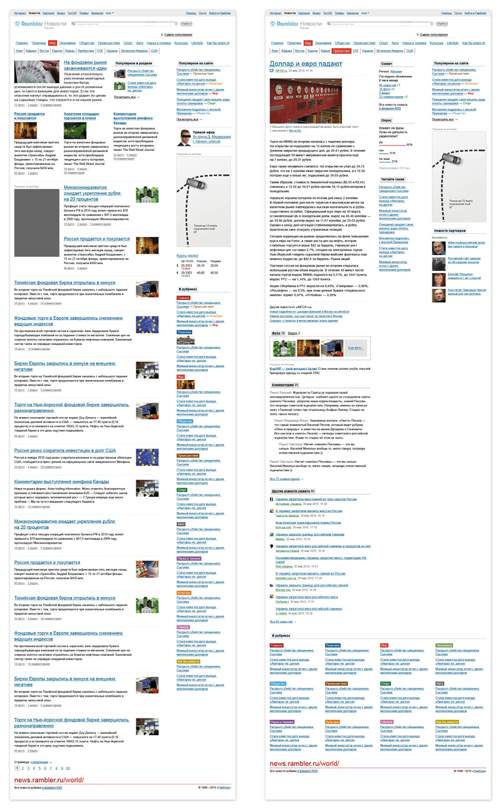
When put together the website appeared somewhat sterile, so we added icons for media files.
Working on the rest of templates and loads of small details.