Client: We are a small chain of greengrocery stores, loved by clients. We sell fresh vegetables, fruits, nuts and berries, and always have an extensive range of seasonal products, from artichokes to wild girolle mushrooms. If someone wants the biggest and freshest cherries, the sweetest tomatoes or the hottest peppers, they come to us. Most our products are grown on our own farm. The best restaurants in town want to work with us. To grow and expand further, we need a logo and a basic corporate identity.
Our preferences:
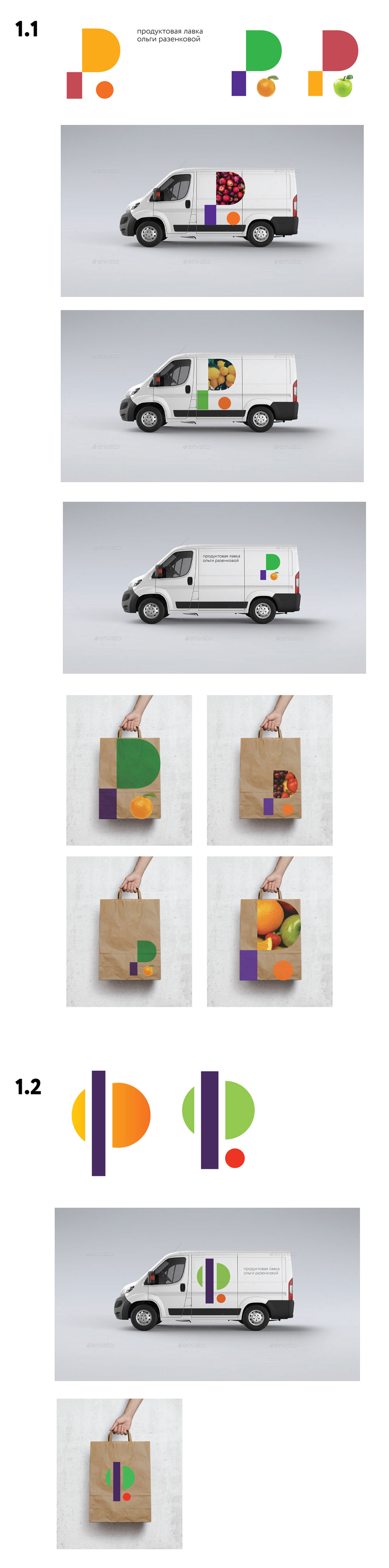
The logo should be clean and clear, simple and beautiful, memorable and reflective of our mission—to sell delicious, nutritious, high-quality products. Ecological references are welcome (we have our own farm and growboxes). The logo needs to look good on the sign and on craft bags. As for the corporate identity, we plan to use it on media of different sizes, from business cards to service vehicles, so it needs to be reproduced accurately and without distortions to the meaning.
Designer:
1.1. The letter P + tree + fresh fruit. Fruit pictures are different on different media. Or photos are pasted into the letter that is used as a mask.
1.2. The first two letters of the owner’s name and surname + tree + fruit.
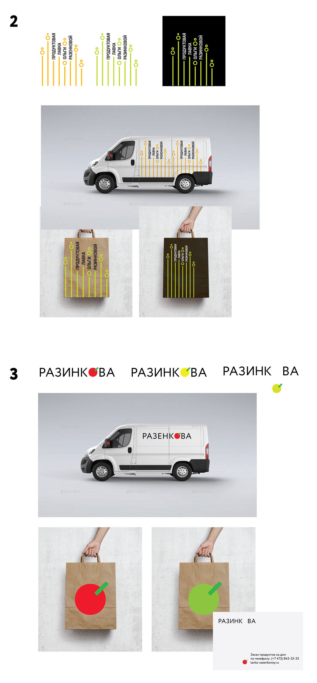
2. Corn spikes + company name.
3. The letter O that changes colors.
Art director: A grocery store is not about vegetables, so forget about it. Let’s add the text ‘vegetables, fruits, berries, nuts’ under the name Razinkova. Number 1 is OK.
Designer:
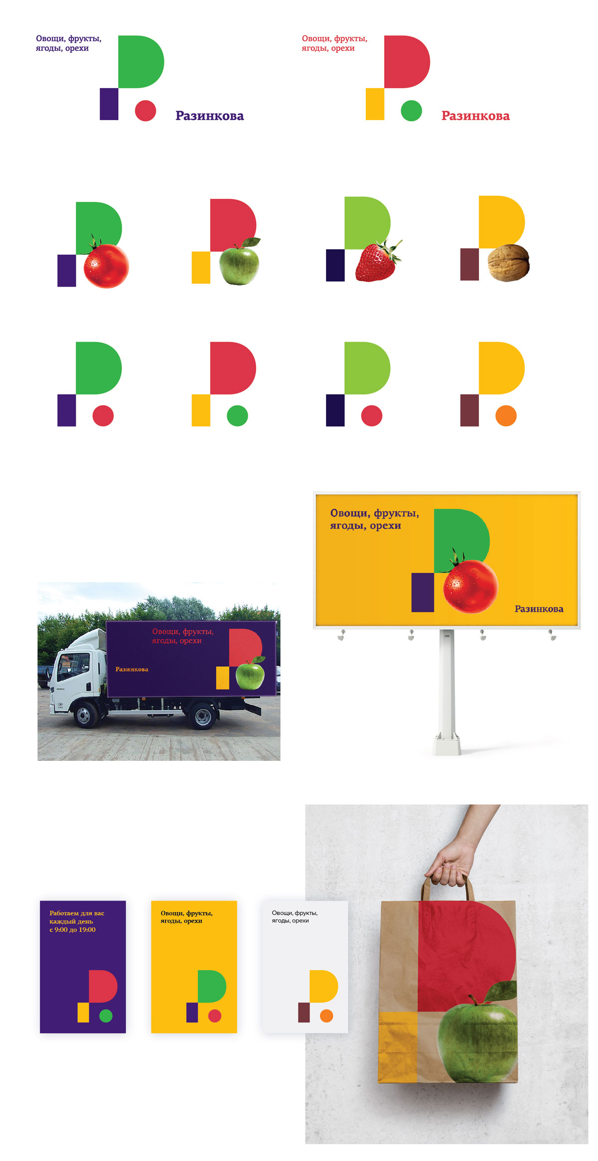
Art director: The fallen fruit makes more sense to me than a macrocephalic apple. Let’s change the name to ‘Olga Razinkova’ for more clarity.
Designer: Made fruits and veggies smaller, added the name.
Art director: No, with the name it looks like a business card. Let’s change it back to ‘Razinkova’, only make the text bigger and closer to the sign. It should be a part of the logo.
Designer: I tried different arrangements and point sizes. The first three are more or less classic, but I’d rather not use them, because they look too formal and official.
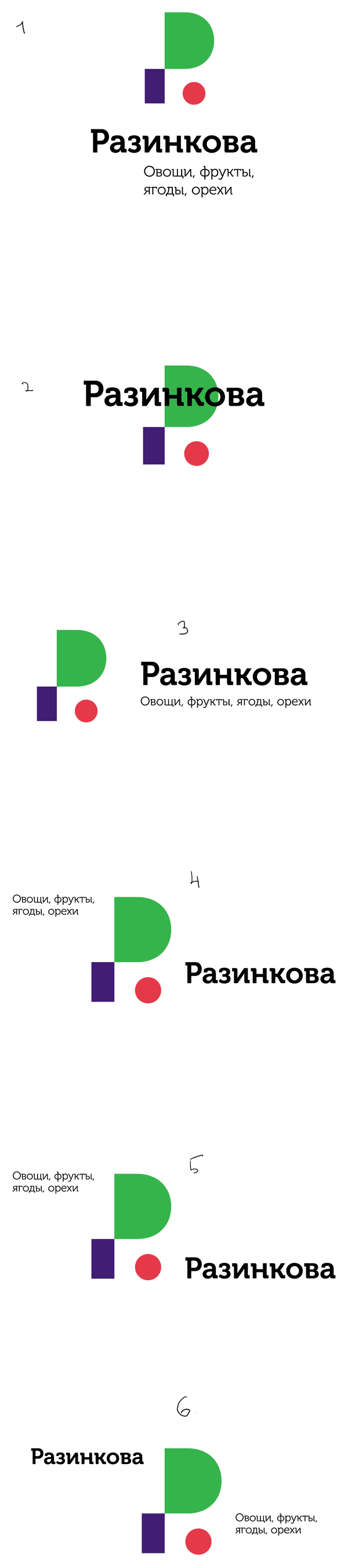
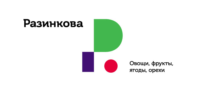
Art director: Number 6, but drop the text on the right down to the floor.
Designer: The second version has different A and З.
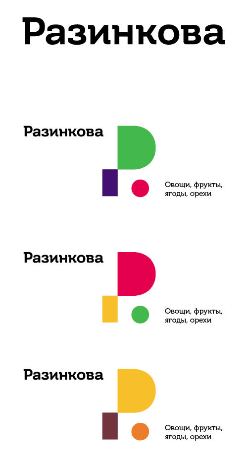
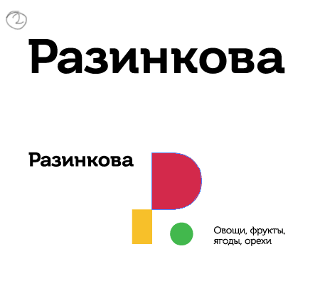
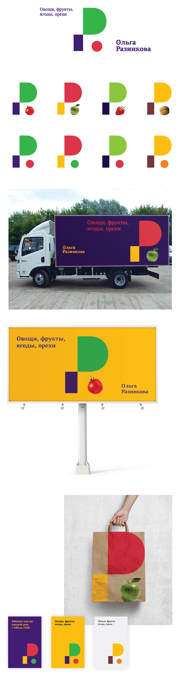
Art director: OK. Only let’s make the tree green and the apple red.
Designer:
Art director: OK, prepare the presentation :-)
