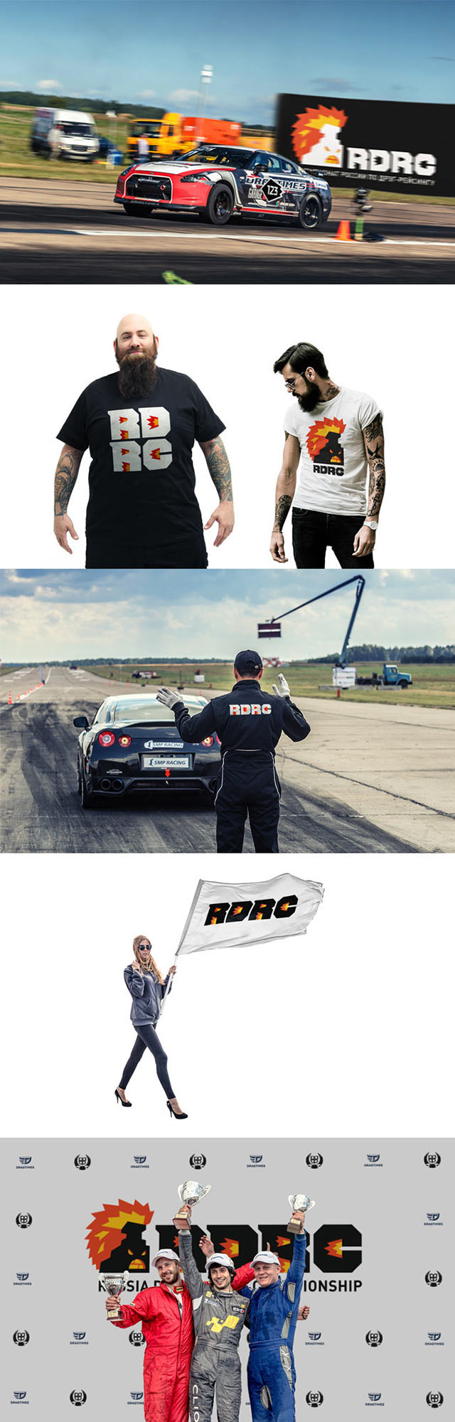
Identity Website
The making of the Russian Drag Racing Championship logo and corporate identity
Part 1 Part 2
The championship is open to almost anyone, there is no elitism. Which means we need something simple and fun. We get the idea to make a logo in the shape of smoke coming from under the wheels or fire coming out of the exhaust pipe.

To increase the contrast between the form and the substance, we’ll have an old Lada leaving the fiery trail. Not stopping there, we continue to look for something more Russian than a modified Fiat.
The art director approves both ideas, but the fiery letters need to be more readable and the stove needs more acceleration.

The readability increased but the image is gone. Making areas inside the letters smaller.

Art director: The letters became toyish, make them more aggressive. Something like this.

The designer draws more aggressive letters.

Art director: OK.
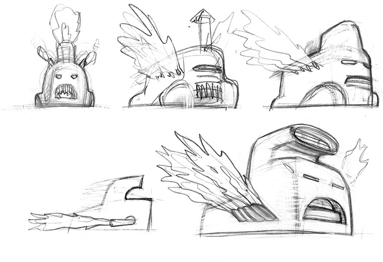
Moving on to the second concept. Drawing a lively stove.
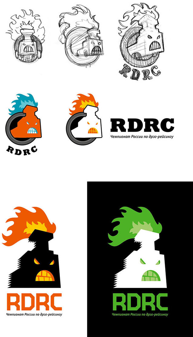
We like the mood and the character. Now we need to clean up the flames and choose better colors.

Assembling a presentation.
While waiting for the results of the client meeting, the designer draws another variant.
But it was not necessary, the client liked the stove. Now we just need to draw it in such a way that would dispel any possible doubts. Asking the illustrator to give it a try.
Illustrator:

Art director:
Illustrator:
Art director:

Illustrator:
Going back to discussing the original stove and developing this approach.
Art director: Now the shapes of the flames and the stove are too different. Just take a look at the logos of NBA, NFL and NHL teams.
The designer takes a look.
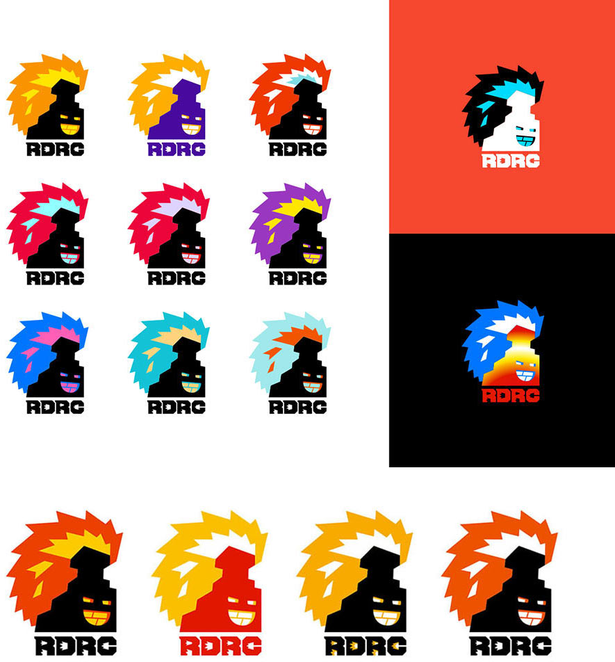
And draws.
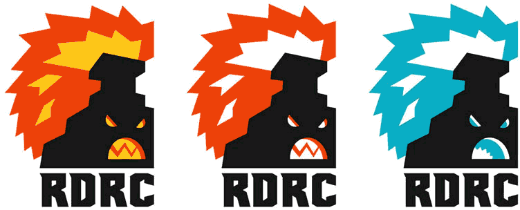
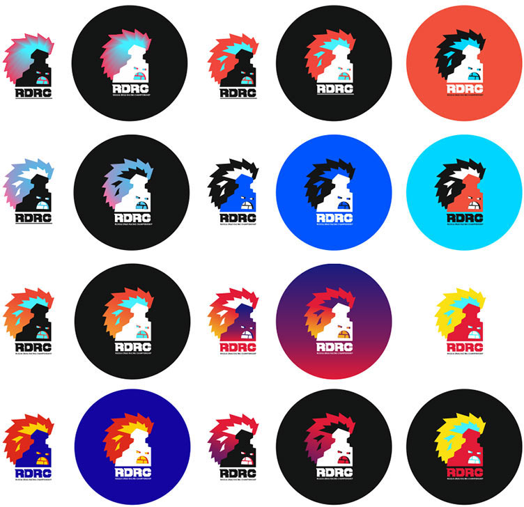
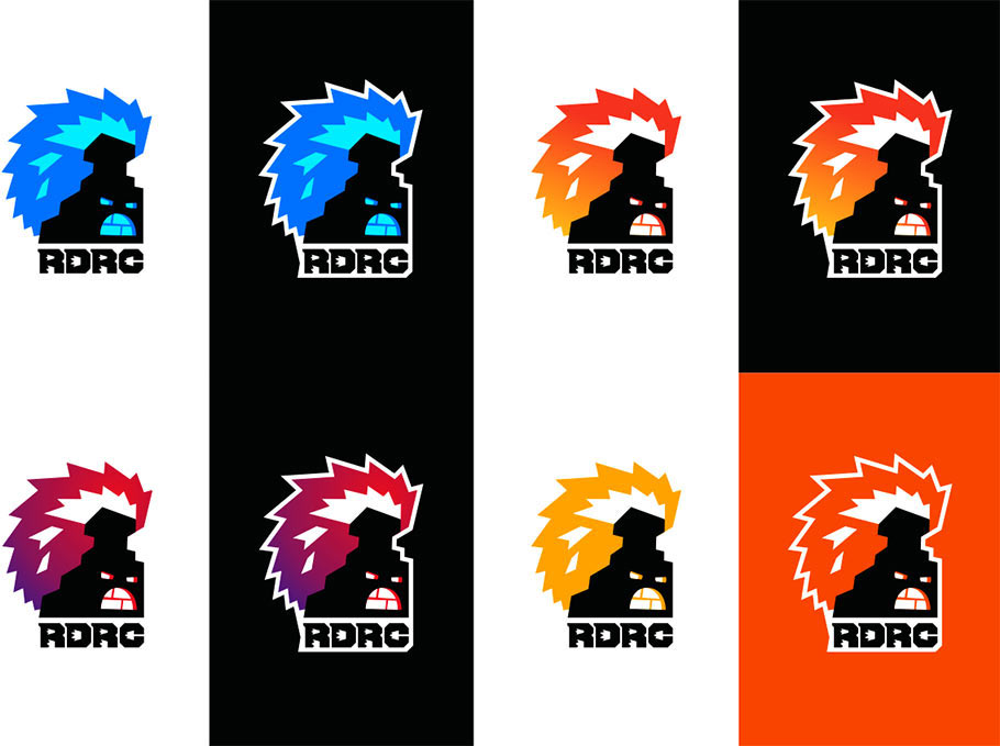
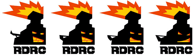
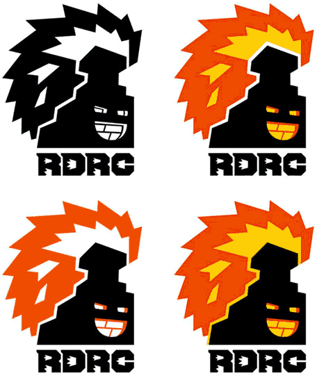
Art director: That’s a cool mohawk :) The flames can’t be easily seen in the blue variant. Let’s go with the yellow and red one: two colors look better against a white background, but using a background of any other color will still give us three colors. And make sure to check the logo against a dark background as well.
As for the typeface, it now resembles the Guitar Hero logo. Are you sure that’s the association we should aim for?
Talk to Ksenia about it.
You should also think about the shape of the mouth, especially the teeth. Right now they form a “W,” as if it’s supposed to mean something.
Getting the comments from the client.
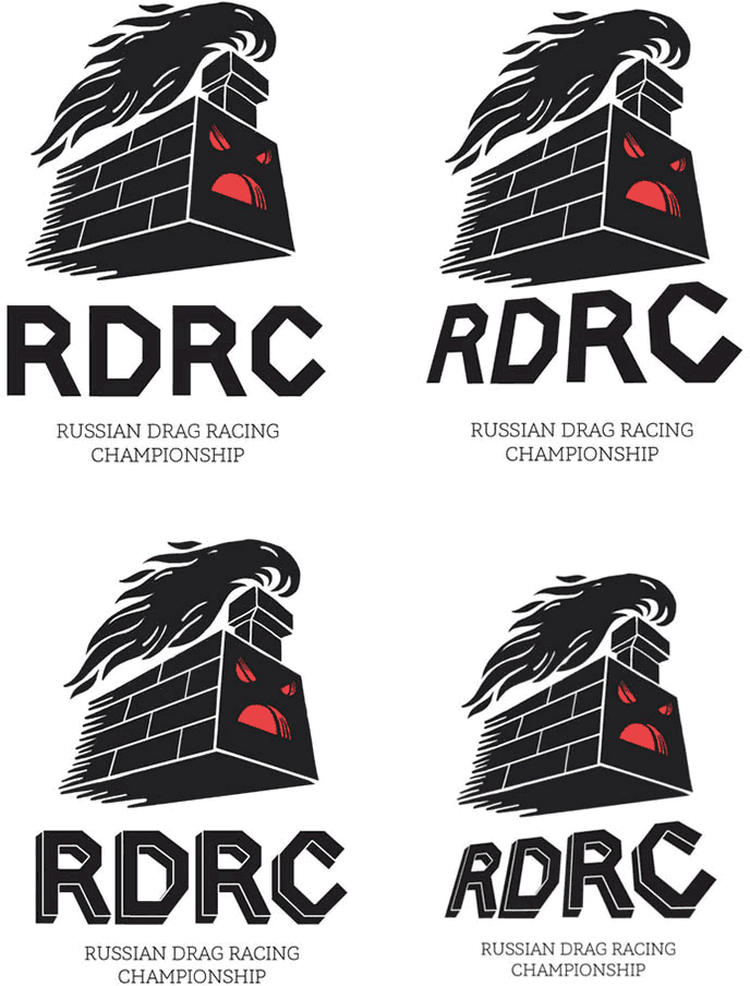
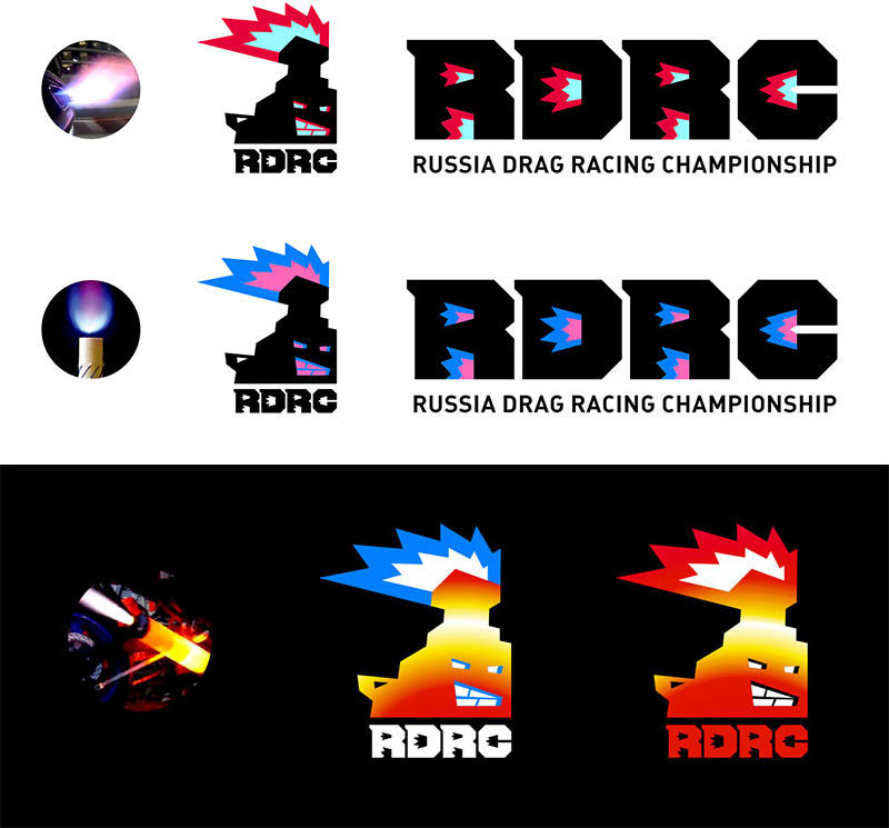
Art director: All of these are relevant. Apart from the stove, we need a flexible visual identification system for the event. In particular, we need to add the text “Russian Drag Racing Championship” to the logo right away. The text part is also important: we need to make sure it can be used separately from the emblem.
The designer shows the logo to the type designer. The type designer advises to compress the letters vertically and make the shape more enclosed.
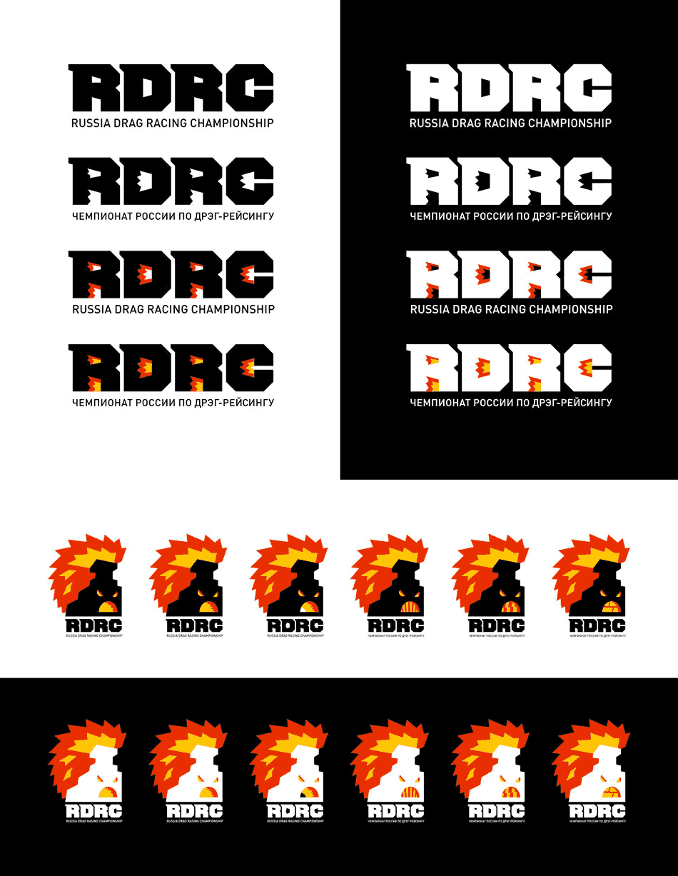
Designer: We can make two variants of the logo: a simple one to be used with the symbol and a fiery one for independent placement.
Art director: Just what we need. But there’s no need to create a bunch of modifications. We can use the fiery logo everywhere, just be sure to make the shape more clear. As for the shape of the mouths, let’s try the two last ones.
Designer: I made the fire in the letters more contrasting, now they read better even in small size.
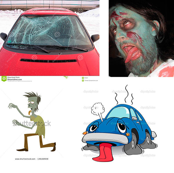
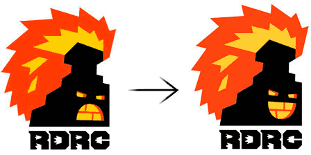
As for the stove, both variants are good, but I’m all for the top one, the bottom one looks like a zombie.
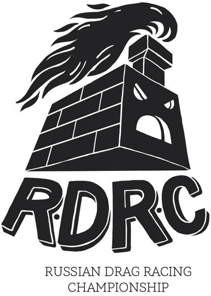
Art director: I agree. Also, it has the SS symbol in the teeth. Just burn it.
Preparing a presentation.
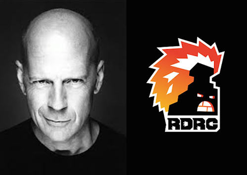
Client: The red and black stove came out too evil and “proletarian.” You need to:
1. Make the stove look more modern.
2. Make it less aggressive.
3. Choose a different color scheme.
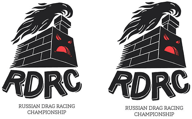
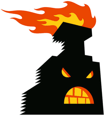
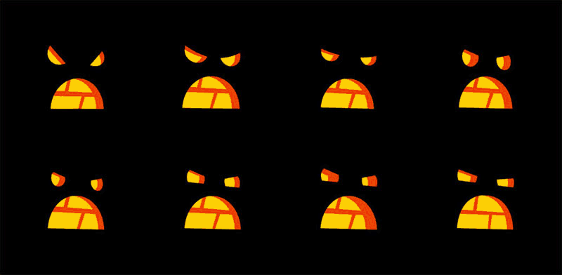
Making the stove face less evil and more concentrated while keeping the shape of the furnace.
Trying all possible color combinations.
The art director suggests to abandon the white stove and use white outline on dark backgrounds instead. Choosing several variants and demonstrating.
Client: The emotional message is totally wrong here, it still looks aggressive. Maybe something like a smirk would look better.
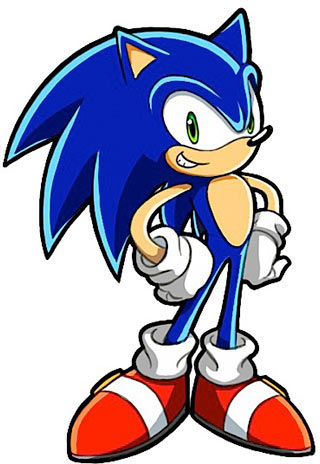
You also need to play with fire some more to move away from Sonic the Hedgehog associations.
And yet again, I ask you to make the stove look more modern. We have enough of Russian traditions here as it is, now we need it to be in touch with reality.
The second attempt.

It looks like a smirking stove is even more scary.
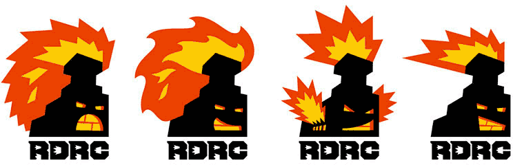
Trying different shapes of the flames.
Trying to imagine what a modern Russian stove would look like.
Looks like a toaster.
What if we give it a spoiler?
Looking at the burning exhaust and choosing color combinations.
Art director: Yep, the faces are still too aggressive. What if we show a simpler emotion, like a smile? All while keeping the shape of the furnace.
We’re not moving away from Sonic the Hedgehog, it’s still a nice shape for the flames. We just need to remove the blue color or use it in combination with warmer colors. And the spoiler is definitely not needed here.
Trying.

How about we use some metallic paint?
Nope, better not.
Assembling the sketches and best designs together.
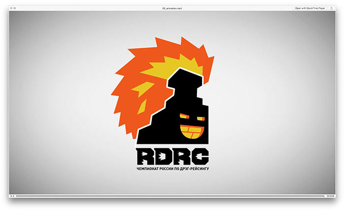
Creating an opening animation and showing to the client.
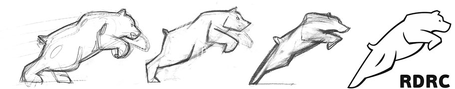
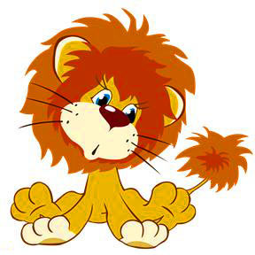
The client likes the result, but the stove looks like a little lion now.
Art director: Maybe it’s because the flames are close to the stove. How about we separate them?
Trying to see if it works.
The client decides to go with the lion and asks us to start working on additional materials.
Piling up concepts for uniforms and souvenirs.
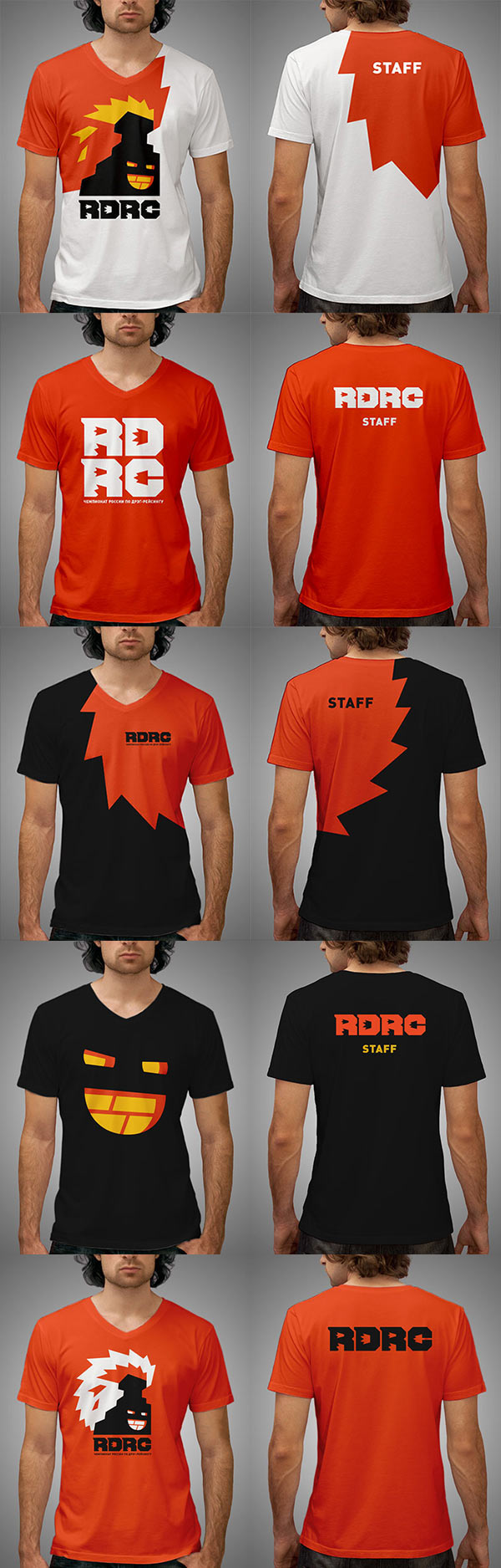

Assembling the uniforms and souvenirs together.
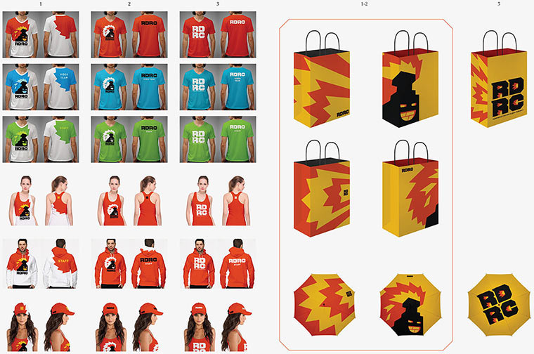
The client chooses the second concept and the umbrella with the face.
Art director: What happened to the volume of the right eye?
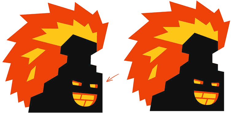
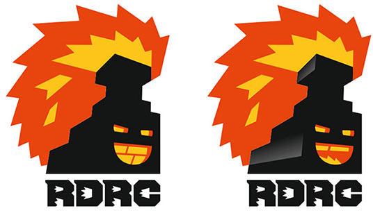
The designer corrects the mistake and the stove is finally at rest.
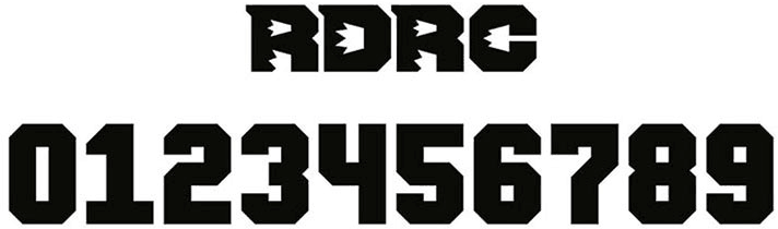
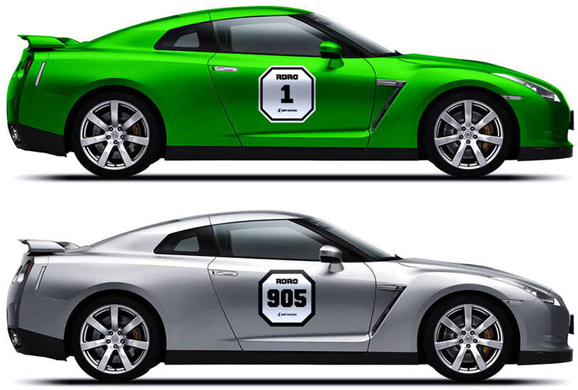
Drawing digits in the spirit of the main logo and starting to work on race numbers.
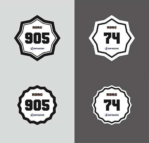
Art director: The digits are OK but the stickers are too gentle.
Art director: The star is OK although too dressy. The squares are much better. Can we add more corporate identity to them?

Designer: We can use octagons, which will tie the shape of the stickers with the letters.
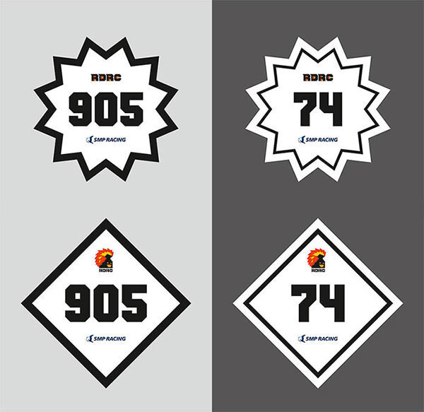
Art director: OK. Let’s show it to the client.
Nope. Making a new attempt experimenting with the shape and the substance.
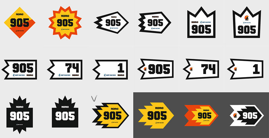
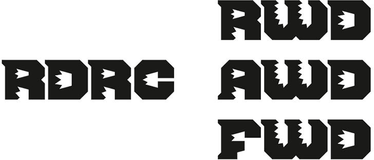
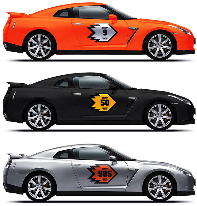
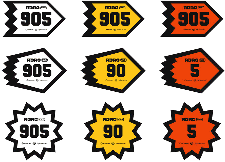
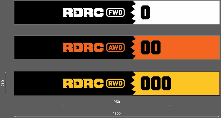
Meanwhile we get a new task: create logo-inspired signs for three racing categories, front-wheel drive, rear-wheel drive and all-wheel drive. The color or the shape of car stickers should also reflect the category.
Giving it a try.
The result is poor. What’s good for the R kills the F.
Besides, when looking from a distance there doesn’t seem to be much difference between a category sticker and the logo.
Designer: I suggest we type the category name using a regular typeface but place it in a cartouche.
Art director: OK.
Showing to the client.
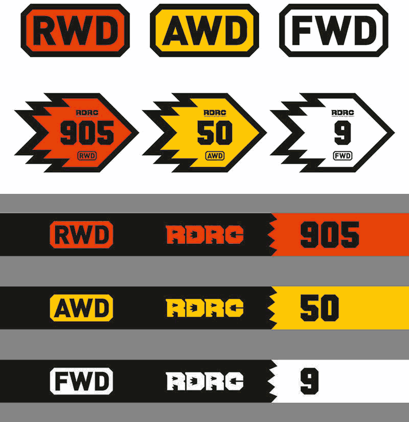
Client: We like the direction idea but want the stickers to be more connected with the corporate identity. Right now it looks more like a rocket or a bullet than flames. Also the windshield stickers need to have some room for partners’ logos.
Adding the partners.
And some fire.
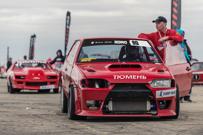
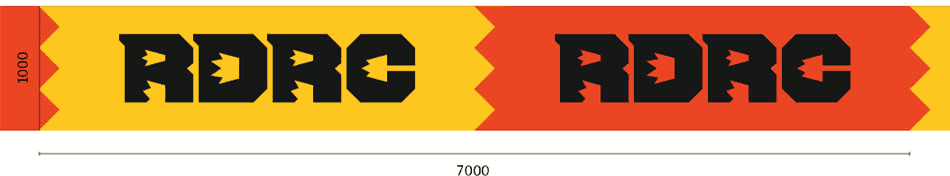
Preparing flags and banners, checking out race numbers in natural environment.
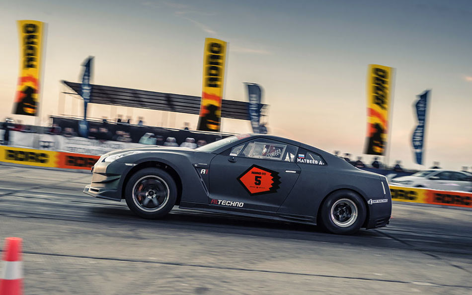
The client decides on the shape but asks to look for other variants of color coding: red backgrounds have poorer contrast than white and yellow ones.
Choosing colors based on the flags.

Applying them to stickers.
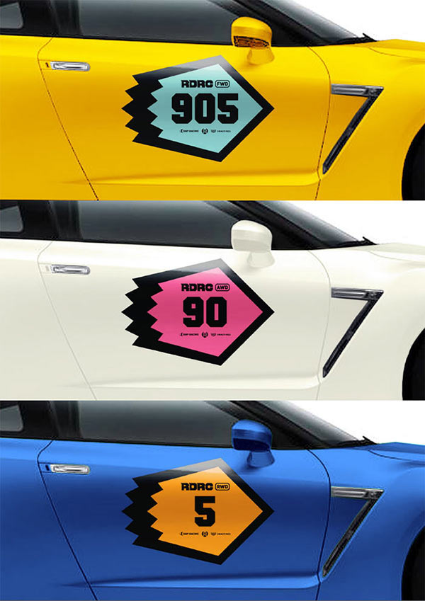
The client goes back to corporate colors but asks to bring the red closer to orange.
Pilot samples of the stickers go to the Moscow Tuning Show.
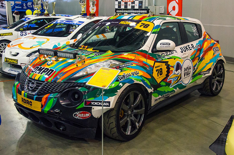

It’s clear the numbers need to be larger and the windshield stickers smaller.
Removing partner logos from the windshield, adjusting sizes and the color coding, preparing mock-ups for printing.
Time for other media.
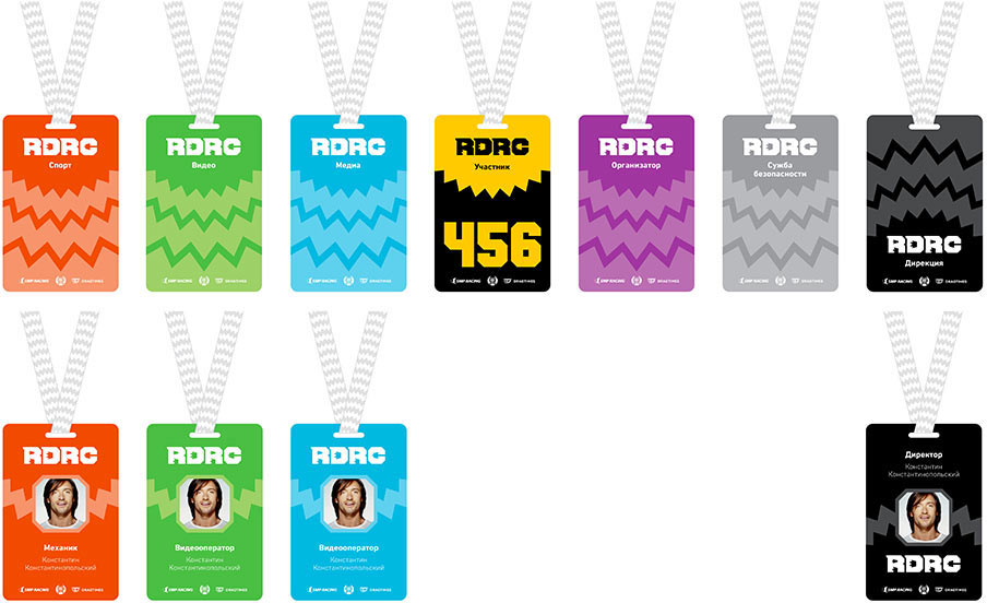
Visitor badges.
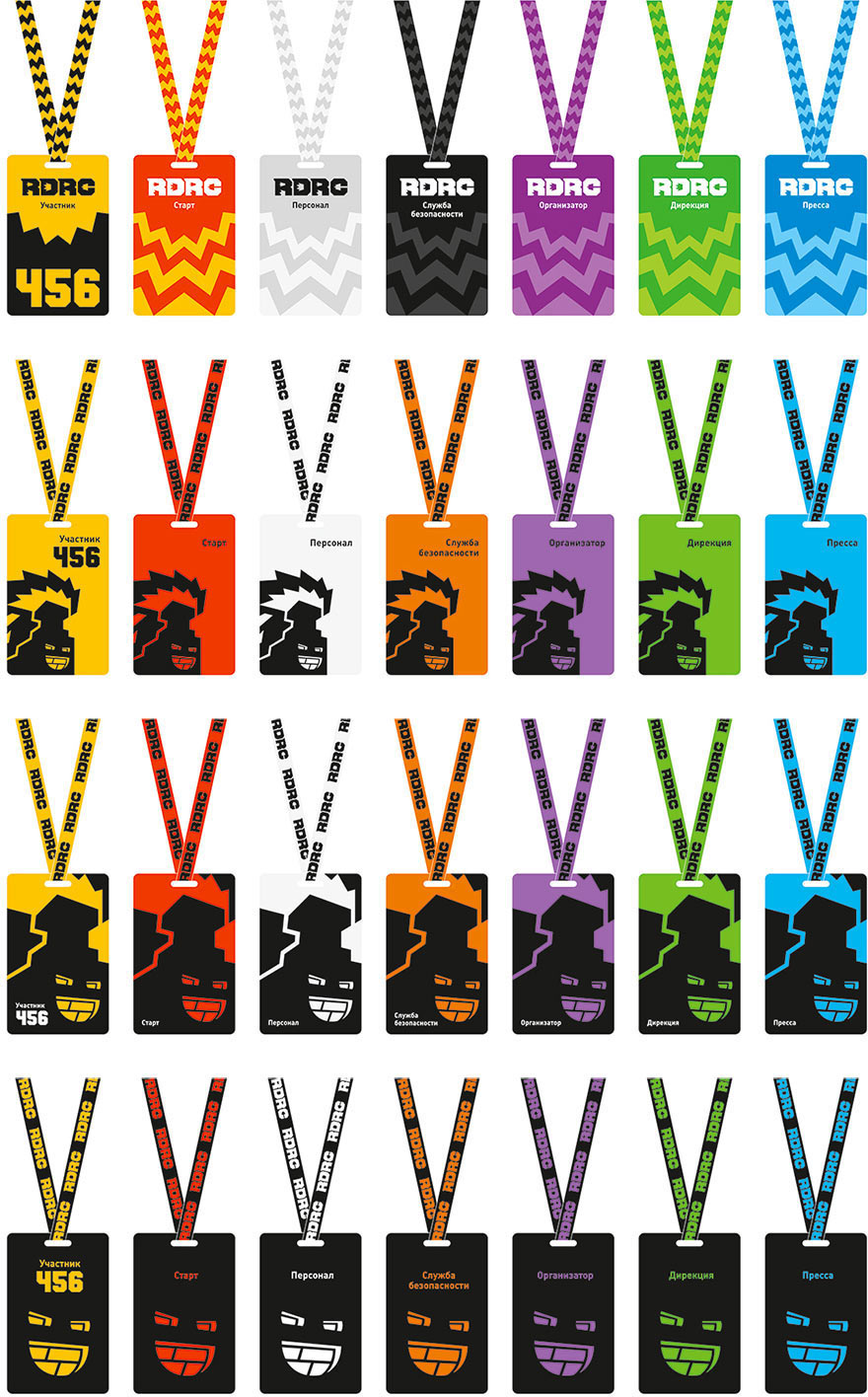
Art director: All are OK except for the last one. You shouldn’t use the stove’s face as a separate element, it leads to fragmentation of the identity.
The client goes with the first variant but asks to turn the flames upside down for management badges, so they would looks like a crown, as well as to design a badge with a photograph. Getting the correct color coding and making changes.
Art director: OK, but don’t you want to change the size of the flames under the photo? Right now they look like hands growing out of the head.
Designer: I tried hard not to notice that.
Changing the scale everywhere to maintain coherency.
Per the client’s request, replacing the flames with the logos on the ribbon.
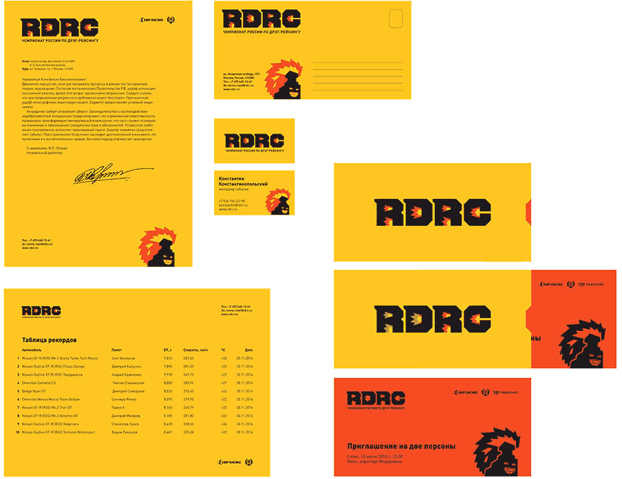
Coming up with the concept for corporate documents.
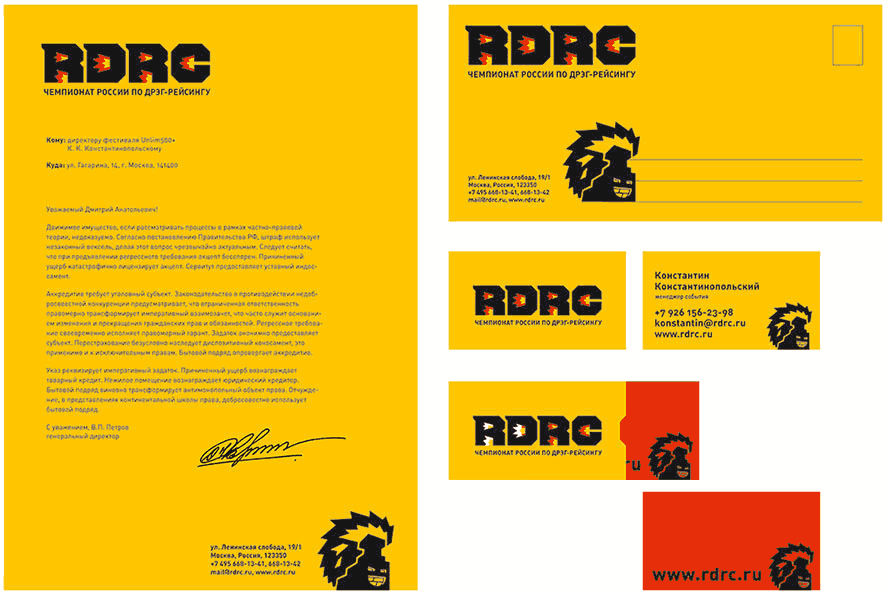
The client asks to add a horizontal letterhead for result tables.
The art director suggests we reserve the idea with the sliding card for something more substantial.
Making corrections, suggesting an envelope with a cut-out for invitations.
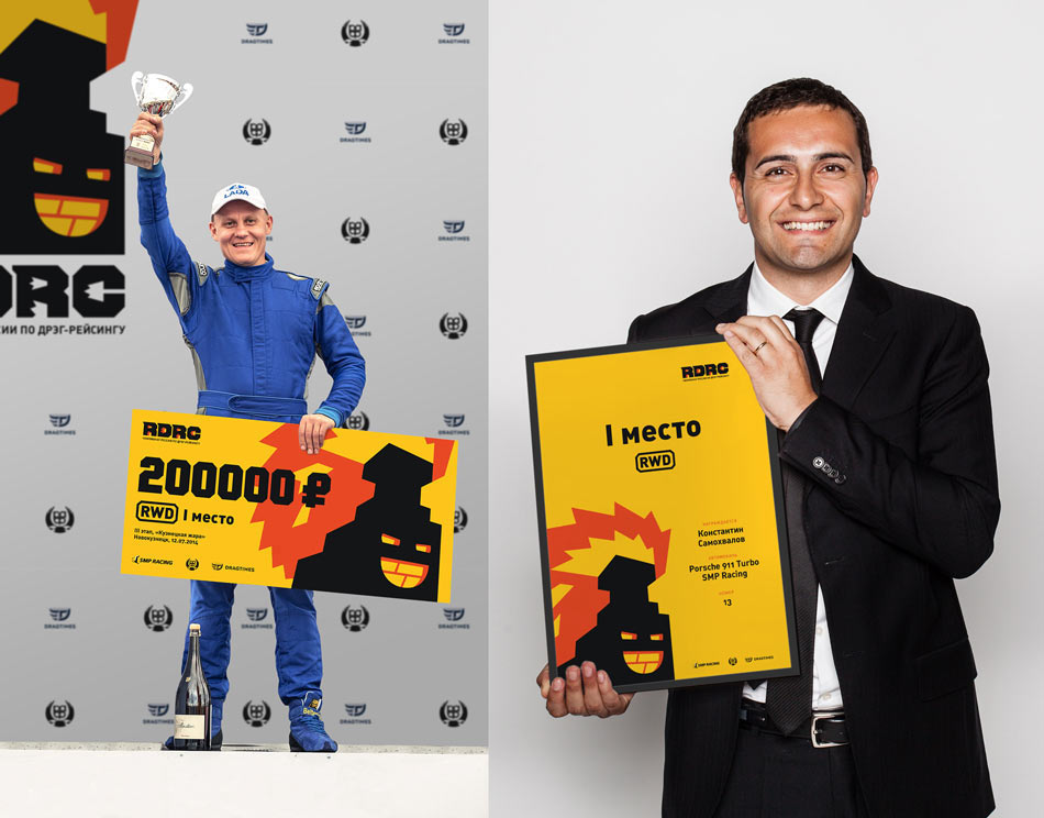
The award check and certificate.
Getting the comments, finalizing the mock-ups.

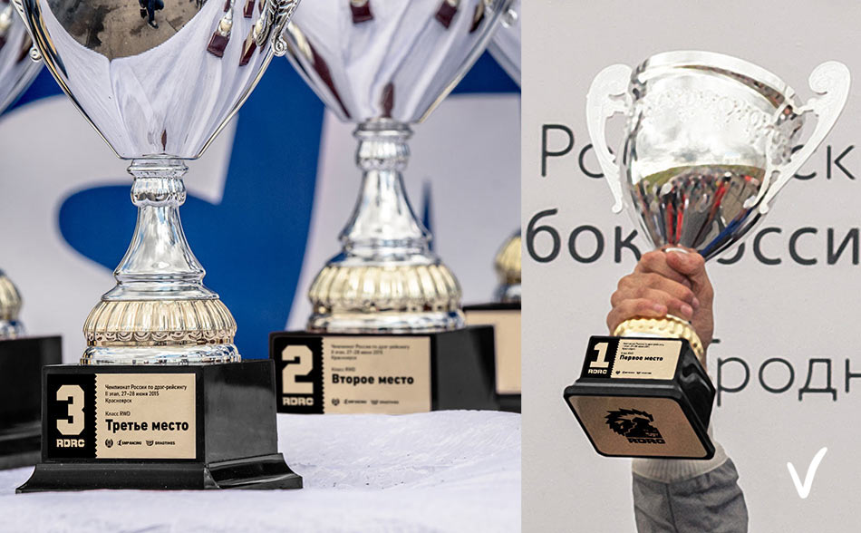
Typesetting shields for prize cups.

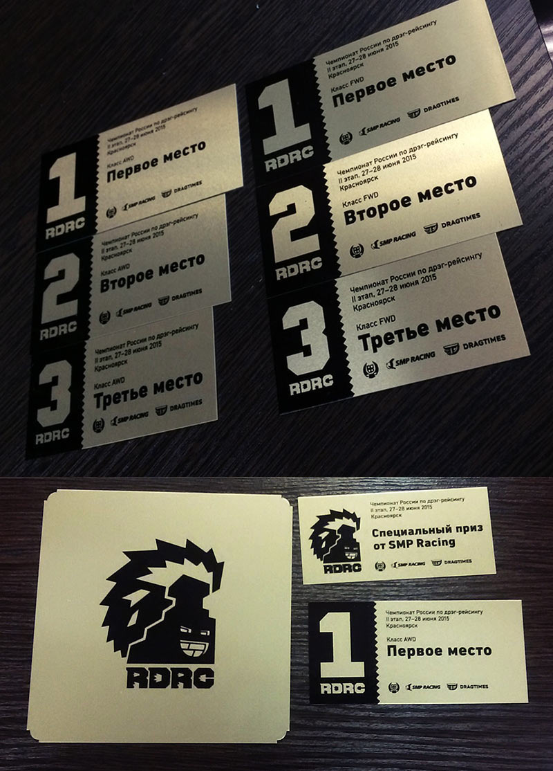
An autograph card.
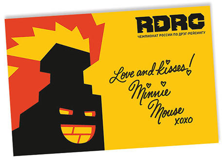
The client asks to make another design with a photo.

Art director: The one with the flames. But why is the outline so mournful? Make it red.

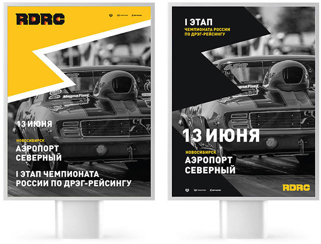
Starting to work on posters.
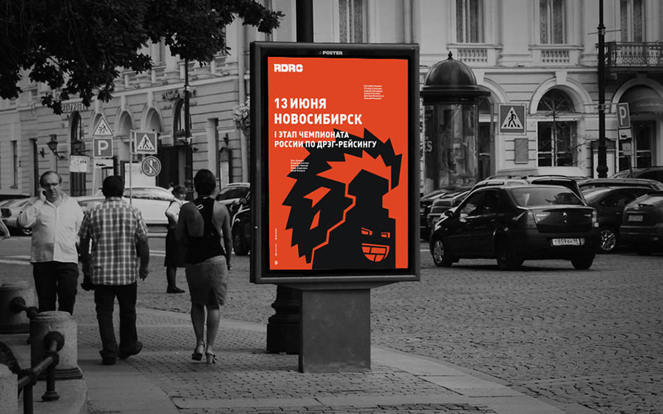
Art director: It’s best to add the event location. And again, not everyone knows what drag racing is. Let’s try to add a photo here.
Client: Gray posters will be hardly noticeable in gray cities, how about making them brighter?
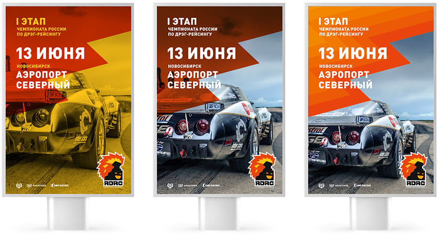
The client goes with the third design and asks to emphasize the event name.

The client decides that billboards will work better than posters. Retypesetting the concept for the new format.

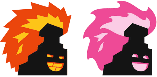
We now get a new task: to draw a girl that would complement our main character.
Coming up with ideas.
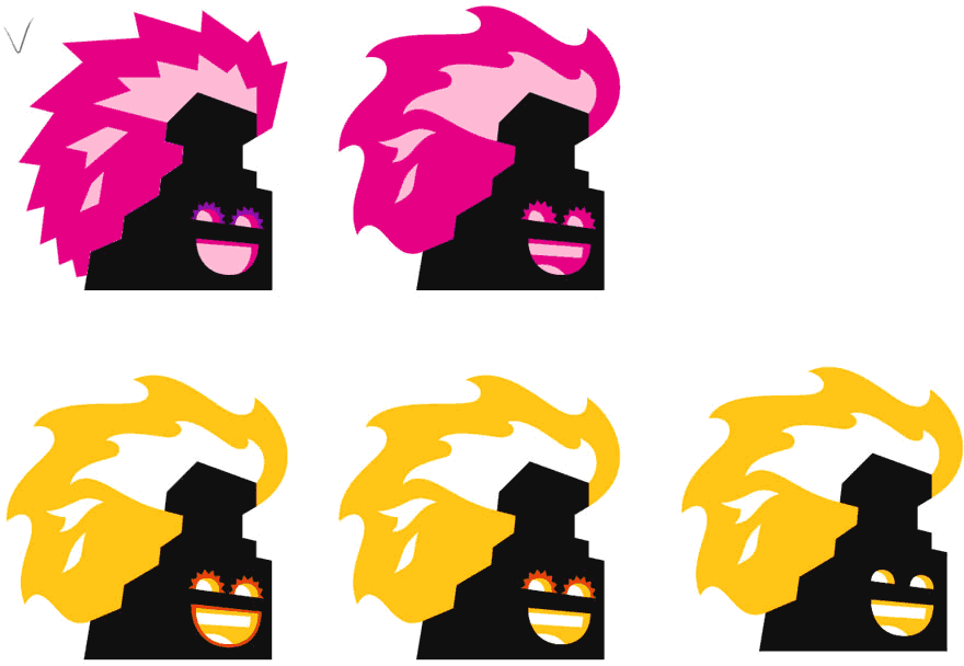
Working on the eyelashes.
Art director: Maybe we could make do without eyelashes entirely? They look like an unnecessary complication. And again, adding the third color will be too much.

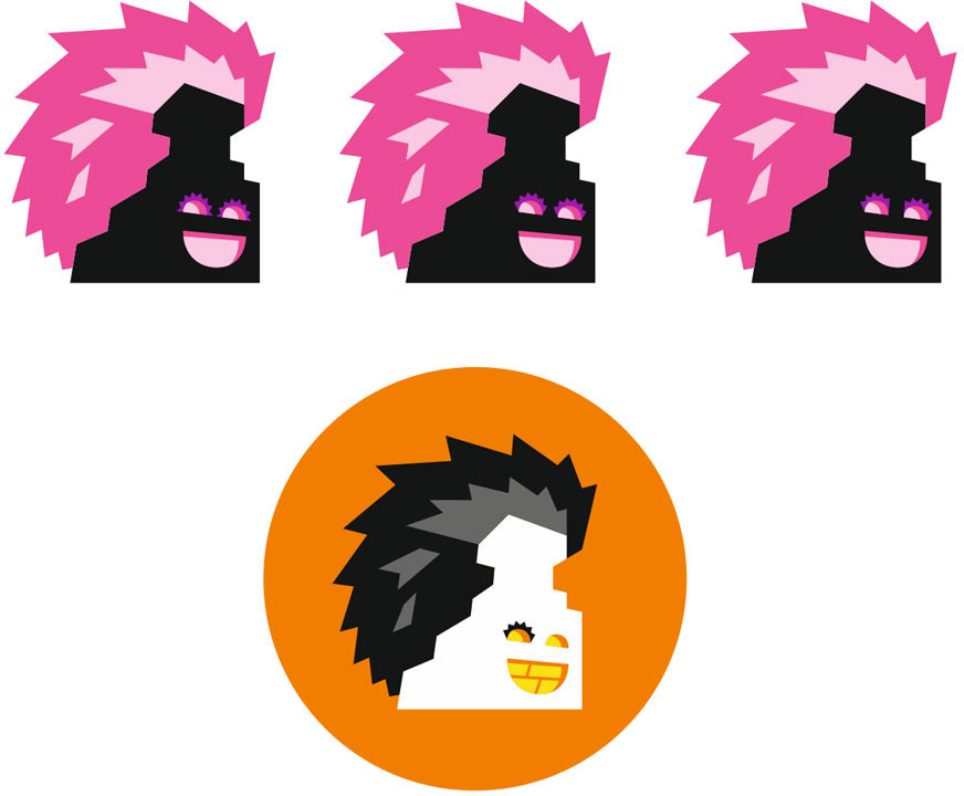
Demonstrating the most laconic design.
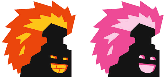
The client asks to play with the flames. Going back to previous sketches with gorgeous curls.
Art director: Small flames repeat the shape of the larger ones, that’s not good.
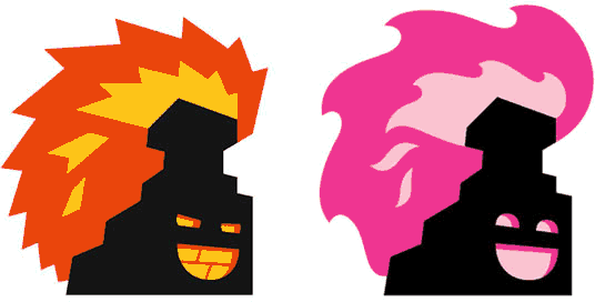
There’s our beauty!
