Restoraids finds the most interesting, profitable and unusual discounts in bars and restaurants in Russia (Free soup for an issue of Aeroflot magazine! Free chicken for children under 6 and adults over 70! A shot of whiskey for a fridge magnet!).
It helps people enjoy free stuff and allows restaurants attract new customers and increase their profits. Two bombastic logos for the service were created at the studio.
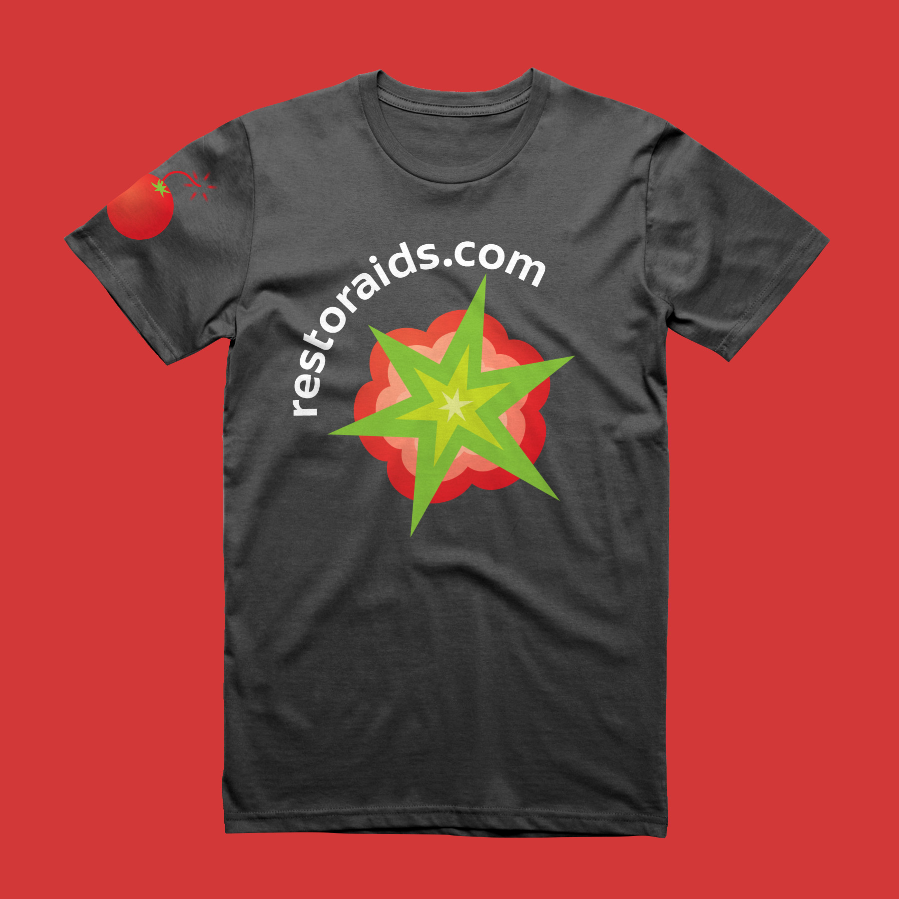
Historically, the app had a tomato as its logo. The service has a channel in Telegram where people use a tomato emoji to like the most interesting promotions.
A bombastic discount and a tomato: combining the two ideas into one and drawing a tomato bomb.
The website name contains an interesting word play.
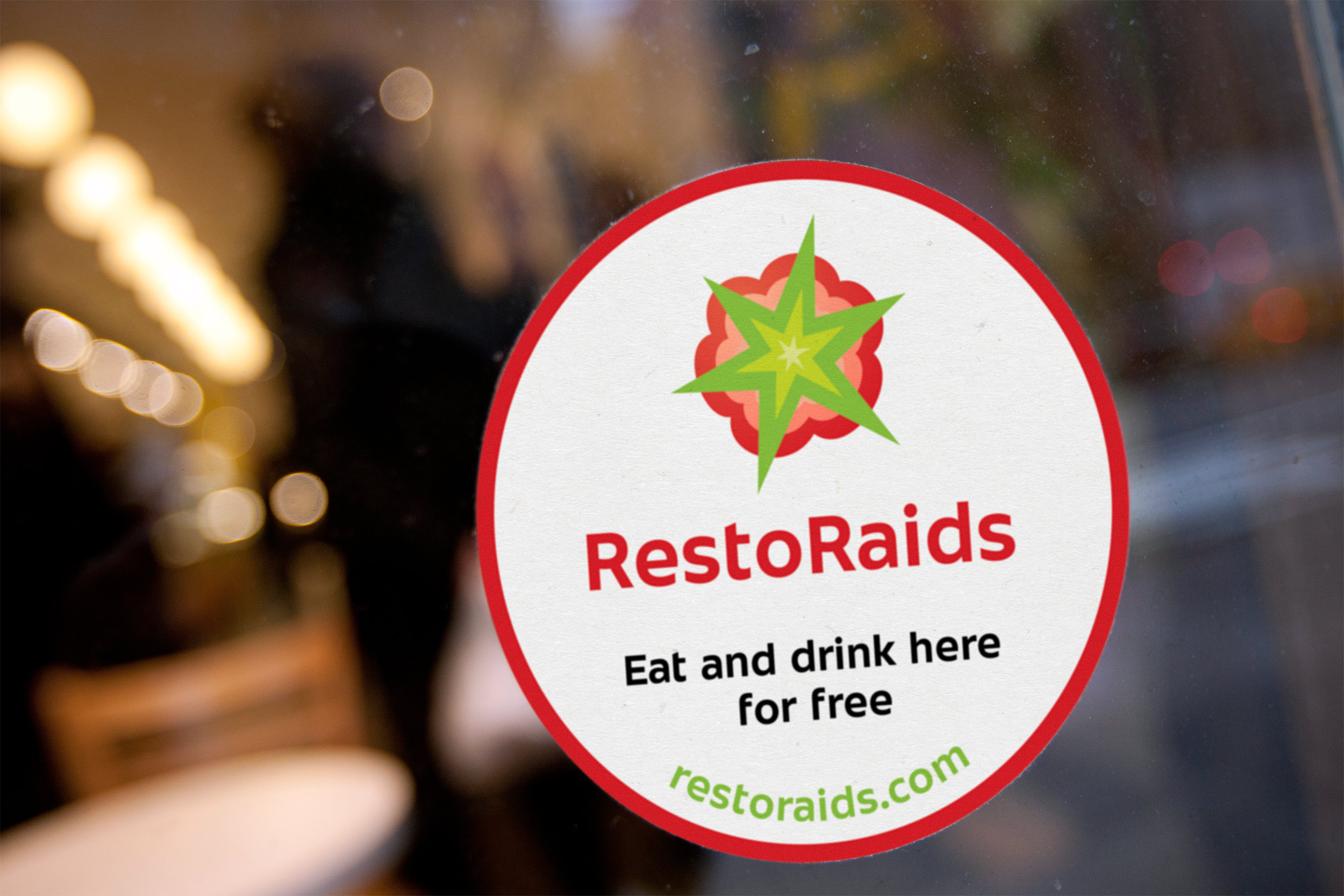
Restoraids can be written in two ways: RestoRaids and RestorAids. The first one puts emphasis on raids (customers overrunning restaurants) while the second—on the word “aid.”
Deciding to create two versions of the logo, one for customers and one for restaurants.
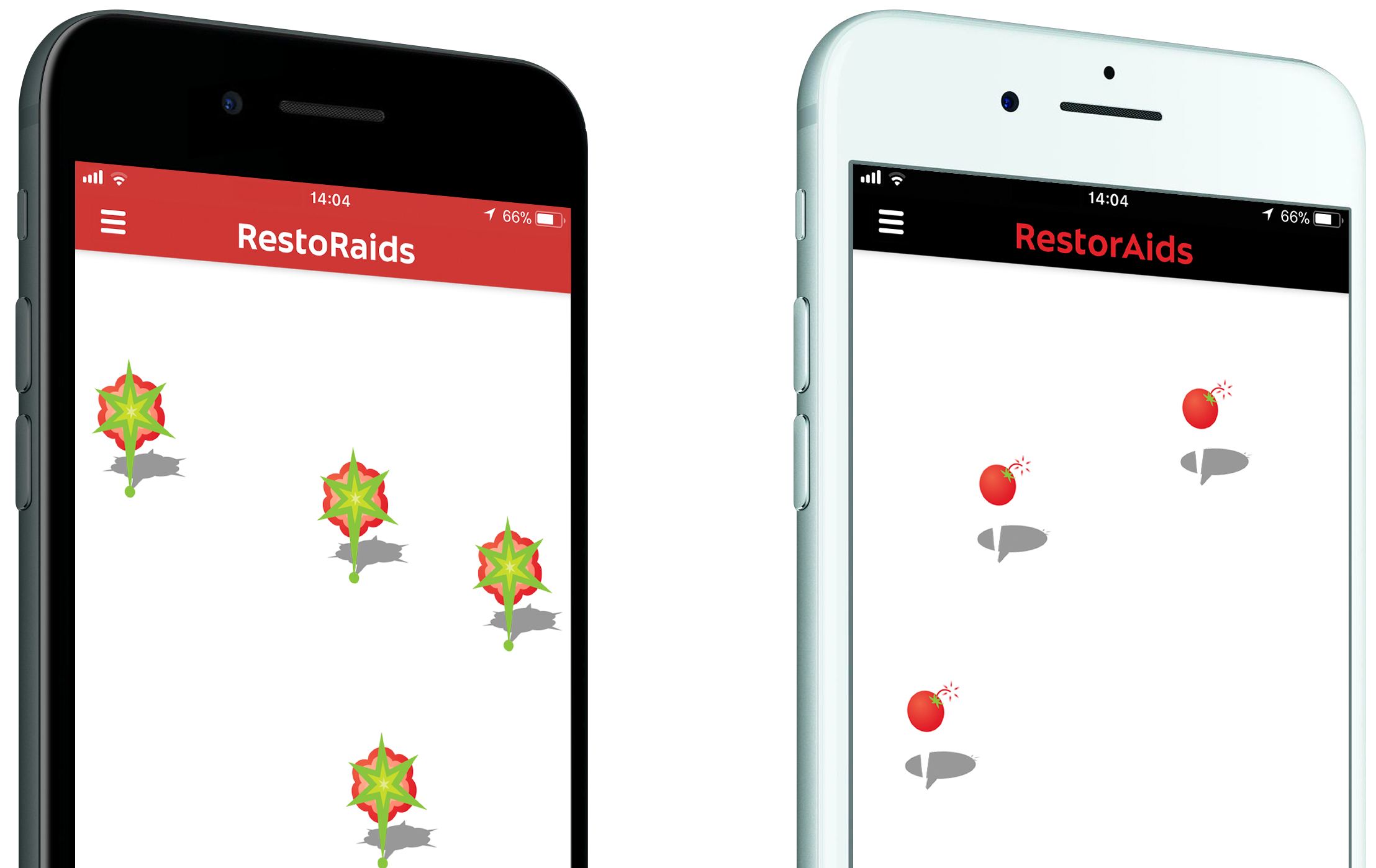

The ticking tomato bomb symbolizes the start of a promotion and its explosion signifies its end.