Client: Our project is to offer good fish for delivery around Moscow (fishmart.ru). It all started with a small shop at a fish factory of the same name that produces quality products without chemicals or preservatives, carefully follows all technological processes and doesn’t pump fish up with water to bring up its weight. We offer very tasty smoked and salted fish, quality frozen products as well as seafood and caviar without preservatives. What we would like to get: a logo that would look like a logo of an excellent online fish store with great products. Where it will be used: on the website, in social networks, on signs at retail locations and in elements of corporate identity.
Defining the task. Getting inspired by photographs of sea fishes and trying to go with a minimalist approach.
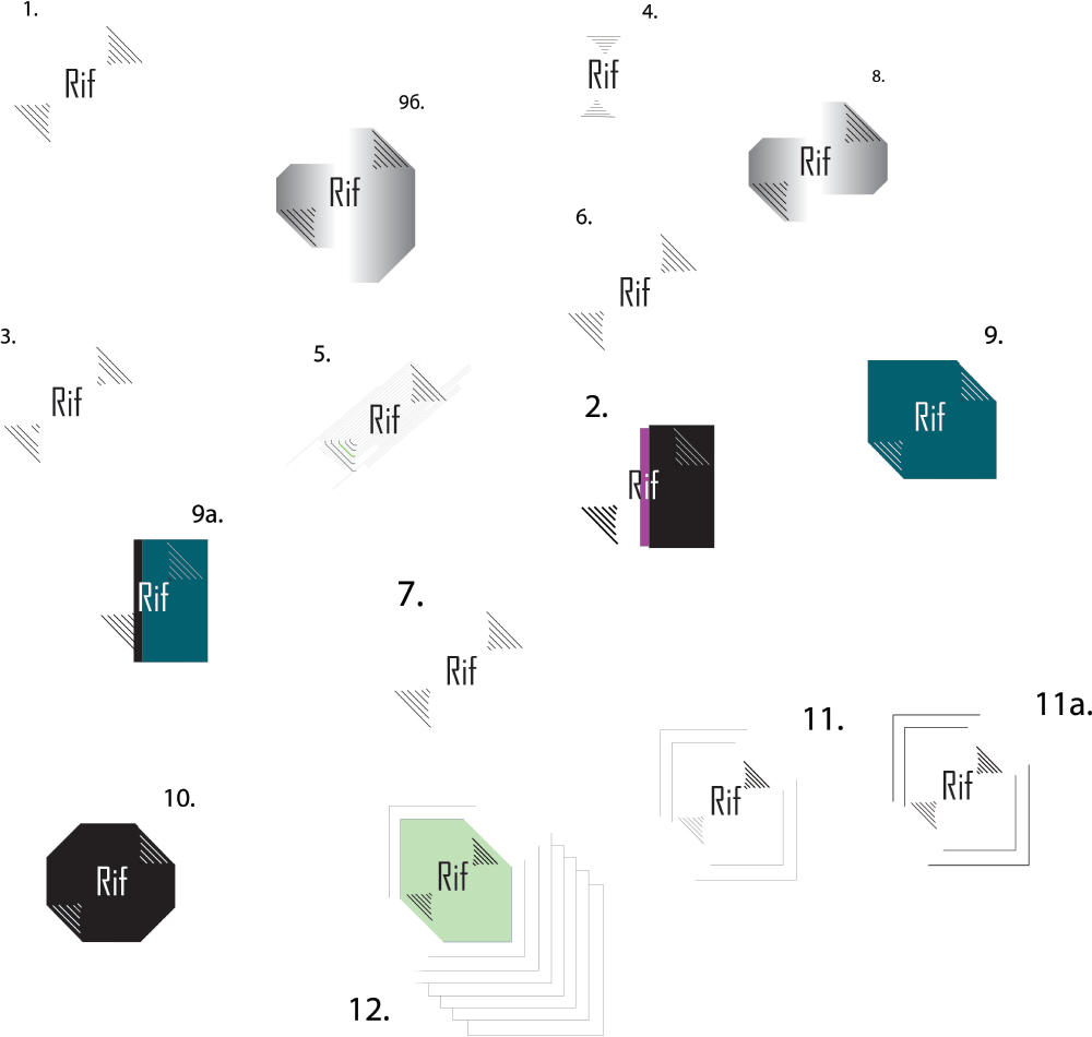
Art director: Number 9 is OK, keep working on it.
Trying to draw a silhouette of a fish.
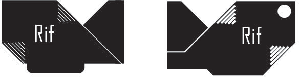
Art director: The fish should be facing right. Remove the eye. Why is the name written in English? And where is the “fish store” caption?
Designer: OK.
Choosing a typeface.
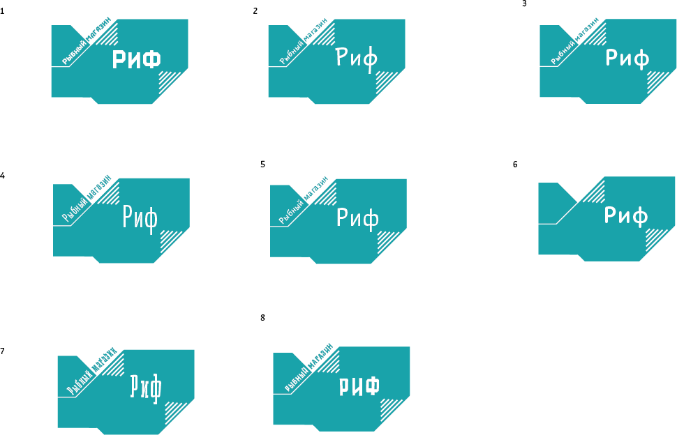
Art director: Go with 1.
Lining everything up properly and choosing colors.
